The architects behind the new Apple Brompton Road have revealed the materials used, and the sense of history retained, for the new London store.
Apple first entirely new UK store in eight years, Apple Brompton Road follows the company's track record of unique retail spaces. It's bespoke, not looking like any other Apple Store, and it is also built to honor its location.
Speaking to the ArchDaily architecture site, the Store's designers said that working with both the building's history, and the area's natural light, was key.
"Apple Brompton Road is a calm oasis in a bustling and vibrant part of London," said Stefan Behling, senior executive partner at Foster + Partners. "Customers interact with Apple's incredible range of products and experience their personalized customer service in a unique setting which incorporates historic and natural elements."
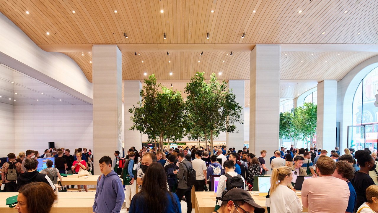
The store is a single square floor that at its peak is 7 meters (almost 23 feet) tall. Its central feature is an undulating timber ceiling that rises over a series of 4-meter (13 feet) high arched windows.
This creates a central arcade in the store, through which visitors pass — and which is part of the store's nod to history. The new central arcade mirrors the dimensions of the original Brompton Arcade, built on this spot in 1903.
Positioned in the windows and out in a line across the center of the store are eight Ficus trees. The architecture publication says this is a specific nod to London's nearby Hyde Park.
Each tree is in a planter that also acts as a seat or resting area for visitors. The leaves of the trees also filter the store's natural light
Apple Brompton Road also features a newly designated Apple Pickup area, similar to the one first opened in China in May 2022.


