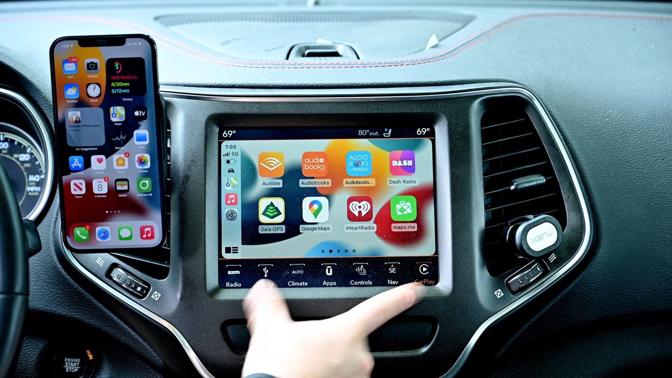
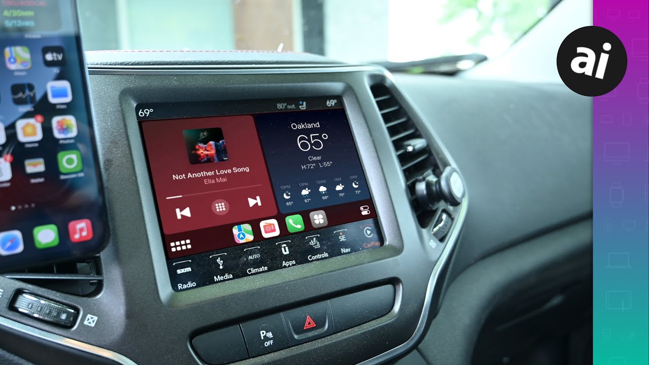
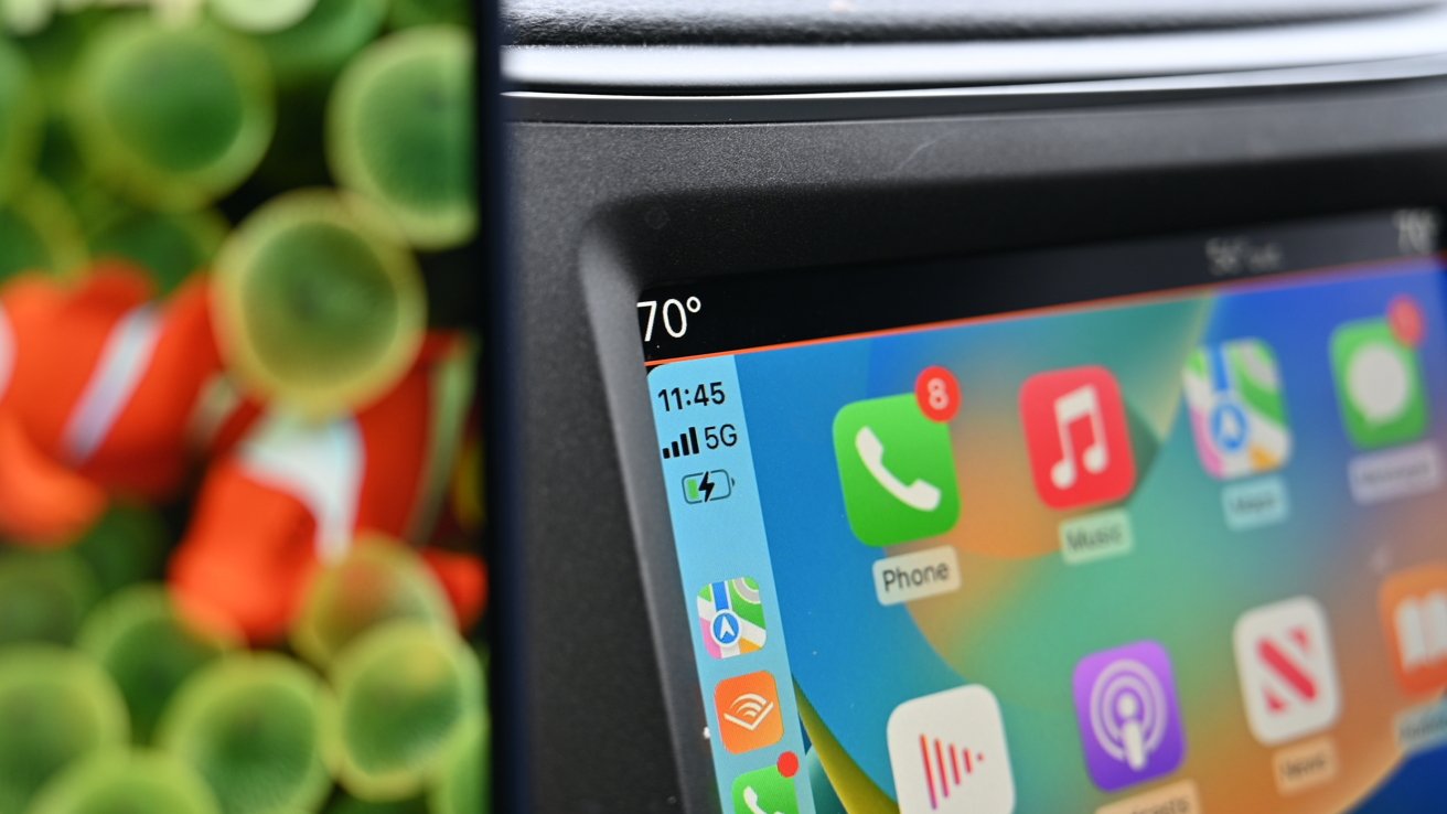
Apple's CarPlay has relatively quickly become a must-have feature for any iPhone user getting a new vehicle, but the technology has some issues that need addressing.
Apple first released CarPlay in 2014 and auto manufacturers started building it into their systems shortly after.
As CarPlay isn't much more than mirroring your iPhone's display to your vehicle's dash, the technical requirements weren't incredibly high. Your iPhone still did the heavy lifting.
Once Apple began iterating on CarPlay, cracks started to appear. Today, there are two primary problems plaguing CarPlay and Apple has thus far failed to address them.
A disinterest in adopting CarPlay's features
While most vehicles now support CarPlay, auto manufacturers have a penchant for neglecting new features.
Take wireless CarPlay for example, Apple introduced this feature in 2016, yet most vehicles sold today still require a wired connection. It was only in the last year or so — five years after release — that many mainstream vehicles started adopting this feature.
Apple also allows CarPlay to display information and navigation information on the vehicle's instrument cluster. It too is woefully under-supported.
There are various reasons why automakers have neglected these features. One, if not all, of them, could be to blame.
Automakers prefer their own infotainment operating systems to ones controlled by Apple or Google. That way they have a tight grip on the user experience and can upsell additional services, such as navigation.
There's also seemingly little push from Apple in having these features adopted. Users don't necessarily know to request these either, allowing automakers to continue to avoid them and do the bare minimum.
Apple's overhauled CarPlay experience is promised for late 2023, nine years after release. But, history has given us little comfort that anything but the most expensive vehicles will deliver support.
Poor app quality
The second pain point for CarPlay is the quality of its apps. This isn't just on Apple, but it also applies to most third-party developers.
Many apps are overly simplified, parred-down experiences that don't deliver the compelling design that their iOS companion apps do.
Sure, for use in a vehicle the UI needs to be streamlined and easy to use while on road. The apps can't distract the driver and should be safe.
But they can also do more than they are doing now. Take the Sirius XM app for example. Its CarPlay experience is pitiful, making it a pain to discover content with boring list view after boring list view.
And those list views? They aren't even current with what's playing, making it even harder to find out what's playing.
The most recent update did force an update from time to time, but it's not what you'd call often. Nor accurate.
Another new "improvement" is the "go live" button. In theory, this is supposed to bring you to what's playing now on the channel, versus what may be playing from 20 or 25 minutes ago because of various factors.
But, it seems to do nothing.
Making that worse, the in-dash XM receivers have the same list view — but more features. The in-dash stereos have the discovery licked. You can set a favorite artist or song, and every time that the artist or song comes up on one of the channels, it will pop up a giant dialog box telling you so, with a large touch target.
The Uconnect 5 system in our Jeep and a Dodge-specific model in a van one staffer owns, also designed for safe use on the road, both have a far more user-friendly experience, quick access to favorites, and verbose search tools. It's a night and day difference.
CarPlay came to the market to save users from the subpar interfaces automakers put forth, making the current low-quality CarPlay apps entirely unacceptable. In many ways, stock systems now offer better experiences.
We could go on and on with examples like this. But we do know that in most cases, this is less on third-party devs putting little effort into these apps.
It is more about Apple. It needs to update its UI guidelines and resources for CarPlay apps.
Apple has done very little to enhance CarPlay apps over the years, instead slowly adding new device categories such as fueling apps or getting emergency auto support with iOS 16.
A change needs to happen
At this point, there's plenty of blame to go around. Devs need to work on their apps, automakers need to support new features, Apple needs to push automakers to adopt new features and to educate users, and users need to make sure they're vocal in wanting these features.
Without pressure, Apple and automakers are likely to continue the status quo with users ultimately paying the price.
