While the Apple World Trade Center retail store does not offer anything different than what other Apple Stores do, it is the location that it resides by that makes it special.
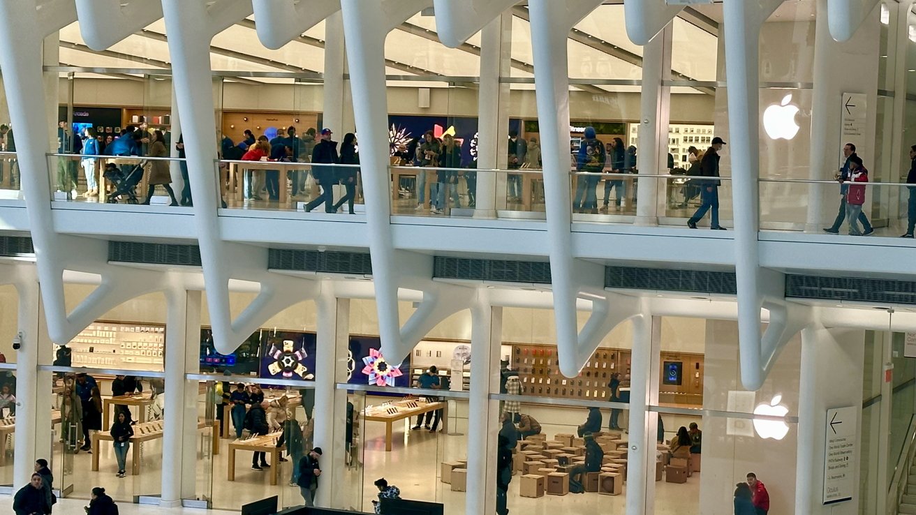
Located 1.5 miles away from Apple SoHo, which is one-of-several other Apple Stores in the state, the retail space sits right in the middle of the mall while many people walk and run through it to get to their trains.
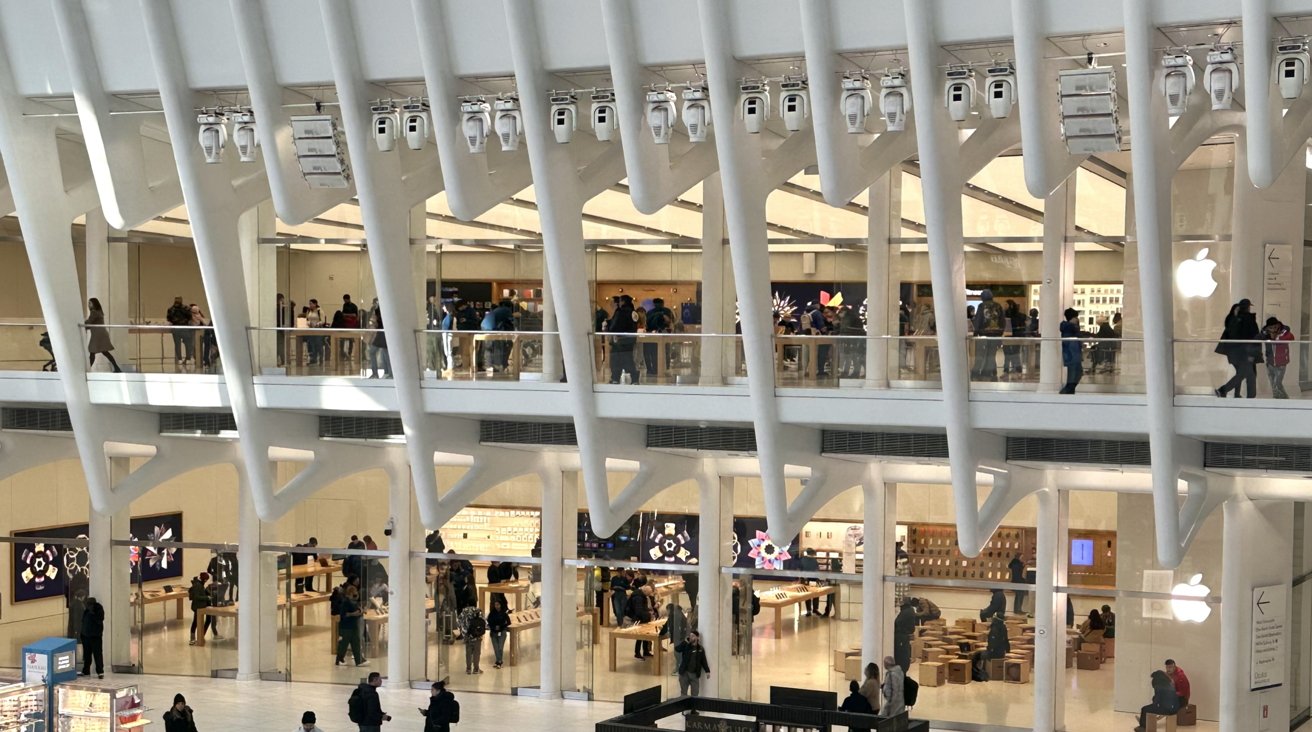
The Westfield World Trade Center mall, also known as the Oculus, is located near the area of the tragic events of September 11, 2001. The structure that the Apple Store lives in is two levels — one level more than what the previous mall was — and offers a unique white exterior design that curves outwards. Construction on the mall started in 2007.
Apple World Trade Center sits comfortably in the center of the hustle-and-bustle of people coming from trains or touring the area, and while the Apple Store still offers its trademark design, it fluidly fits into the appealing interior that the Westfield World Trade Center has introduced to the public.
The history from the inside and out
Apple World Trade Center opened on August 16, 2016, and became Apple's tenth retail store in New York City at the time. The store draws inspiration from the surrounding Santiago Calatrava-designed structure that bathes in light from the windows placed above.
"We're honored and humbled to have a small and supporting role in the rebirth of the World Trade Center," said Angela Ahrendts, former senior vice preside of Retail and Online Stores at Apple, back when the store first opened.
The store was designed by Bohlin Cywinski Jackson, the architecture firm that is responsible for Apple Fifth Avenue's iconic cube design, who wanted to make sure that the store connected with the public atrium, the accompanying retail spaces that surround the retail spot, and the adjacent train lines that pick up and leave off riders who pass through the mall.
Oculus was a center of controversy when it first was announced to be built. Apple, along with other retail stores in the space, had issues with the design elements of the building.
One of the biggest issues was the rib-like curved columns that can be seen inside and out conflicting within the mall and obscuring windows and signage.
Nonetheless, Apple likes to build in prime areas, and since this location is busy with commuters and tourists, it makes sense why the tech giant would want to set their place there with not one floor, but two floors of retail space.
Traditional Apple Store layout split into two
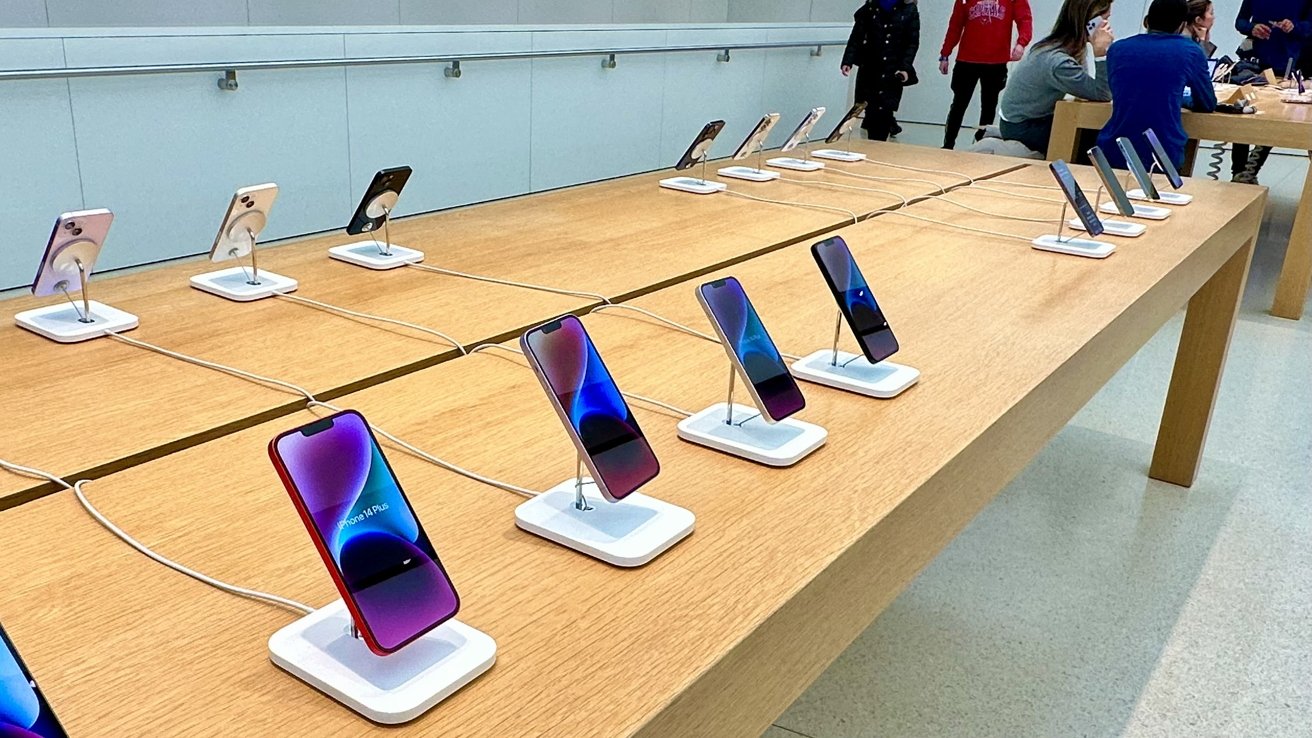
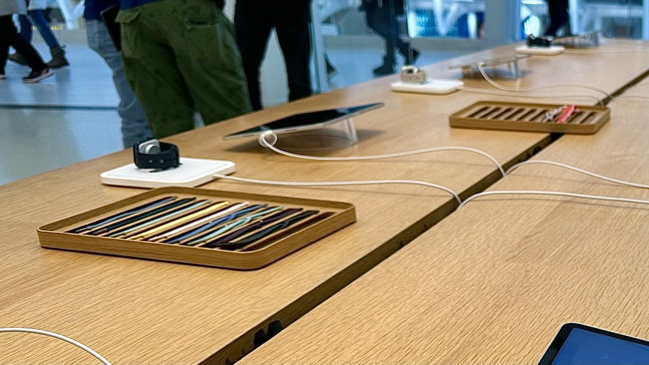
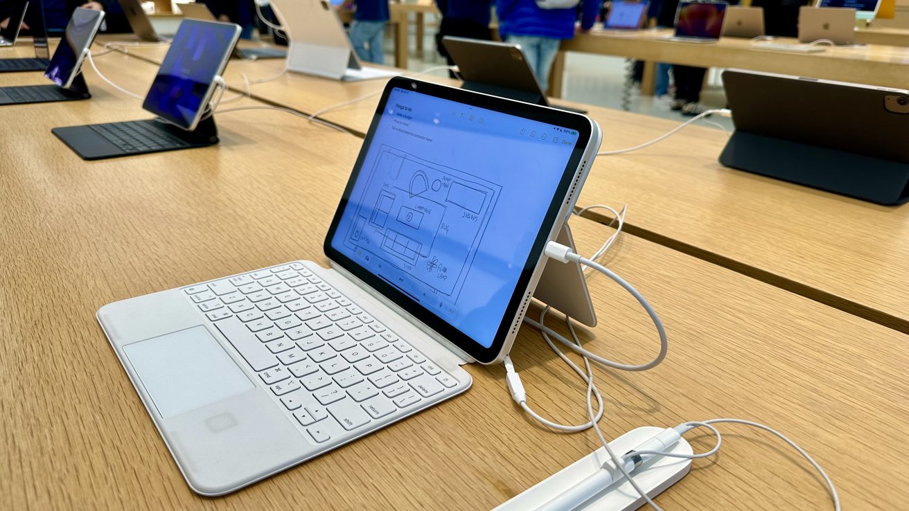
While early January is not the best time for retail stores due to it being right after the holidays, the Apple store still had people walking in and out of it to check out and play with the device laying on the traditional wooden tables seen in every Apple store.
Apple World Trade Center fits in nicely with the design of the Oculus, and while it resembles a traditional Apple Store on the inside, it blends in smoothly with the architecture of the mall on the outside.
The store can be accessed from its two entrances on either floor, and big wide windows make it easy to figure out which level you want to be on depending on the Apple product you want to look at.
There is a staircase located next to the iPhones on the far left of the store when entering that allows you to go from either level of the store at any time.
Walking into and through the store, you may notice that the lower level seems more interactive than the upper level. It felt as if the upper level was the attic of the store where there was more to see, but not as interactive as the base floor.
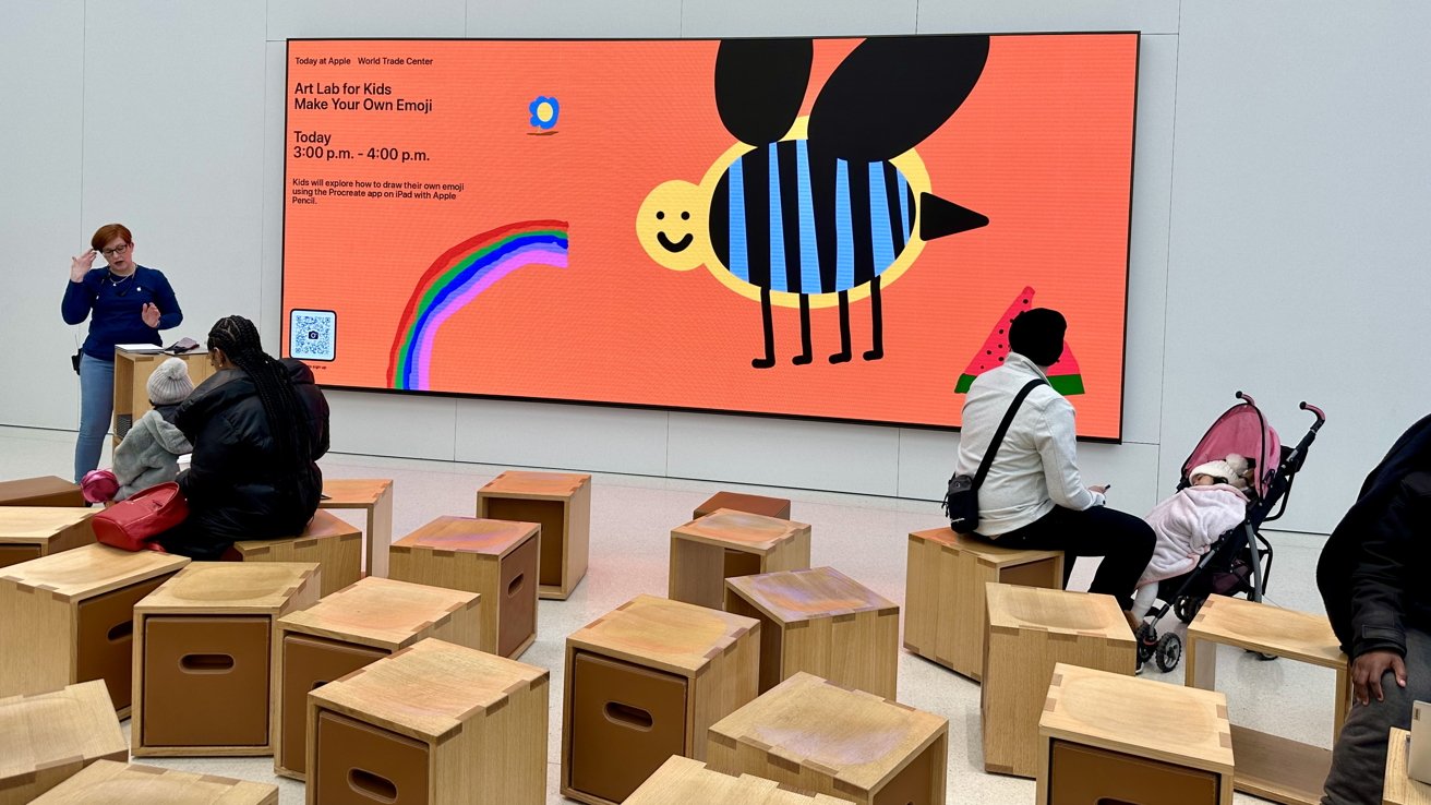
Downstairs houses iPhones and iPads to look at and interact with. To the far right is the Today at Apple section that demonstrates Apple products and features to audiences and doubles as a sitting area for people as well.
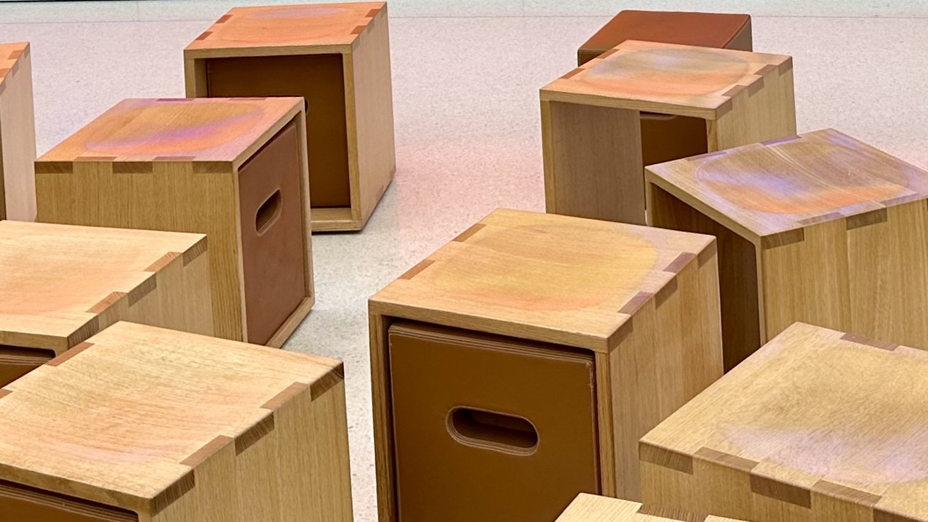
The noticeable wooden blocks are spread out across the section but do not clutter the area, making walking around them not a hassle. Their block layout is fluid and does not seem too restricting.
There is a dent in the blocks to make sitting in them more comfortable, and some have smaller leather cubes inside of them that come out.
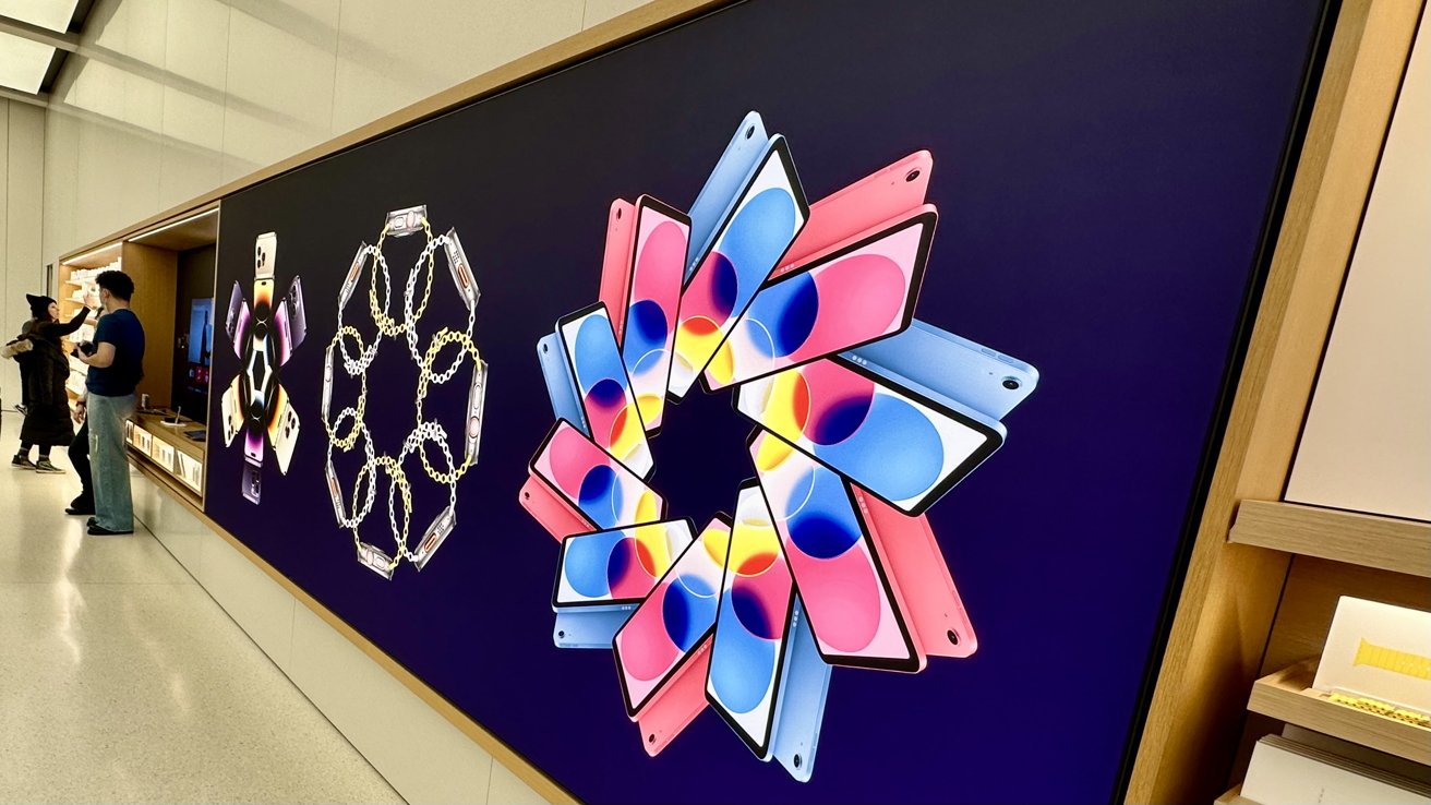
A big screen towers over the blocks that allow employees to AirPlay content that they are demonstrating to a mass amount of people or anyone just walking by.
The upstairs continues with a similar floor layout that showcases Macs and other Apple devices and services. More iPhones can be found up there as well.
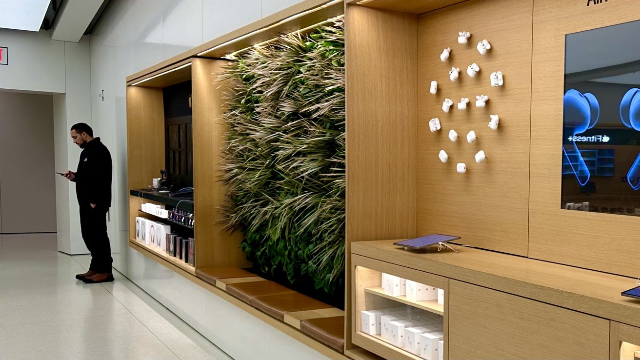
On top of the Today at Apple section — on the second floor — stations a wooden display that showcases all models of AirPods. In that display is an environment-like background for people to sit in front of. While the store did not have the potted trees that other stores have, Apple still found a way to bring a sample of nature into the Apple World Trade Center.
The whole store lies sandwiched between the big glass entrance and the wooden displays showing what Apple has to offer in the form of products and services.
While the location is amazing and beautiful to see, the store offers the same Apple retail store experience that you may have come to know; while still blending in with the unique design of the Oculus.
Fitting in
Apple is a staple in Oculus by occupying two floors of retail space, but still blending in with the interior of the mall so that it does not become obnoxiously overbearing that an Apple Store is there.
While there are other stores surrounding the naturally-light center of the Westfield World Center, none of them are as big as the Apple Store.
It is the location that will bring you to Apple World Trade Center, and not the store itself. The layout and interior design are similar to other Apple Stores and do not offer a huge difference like the one on Fifth Avenue does.
It is built beautifully and smoothly transitions back and forth from Oculus to Apple Store due to the designs of both architectures.
As people go through and come visit the World Trade Center, Apple World Trade Center will be there to stay connected with the public atrium and the community that surrounds it.
