The tvOS 17.2 beta included a redesigned Apple TV app emphasizing Channels and app navigation. Here's what changed.
The Apple TV hardware runs the Apple TV app, where the Apple TV+ service lives as a Channel. Until now, the Apple TV app was a mishmash of every piece of content available with minimal sorting options.
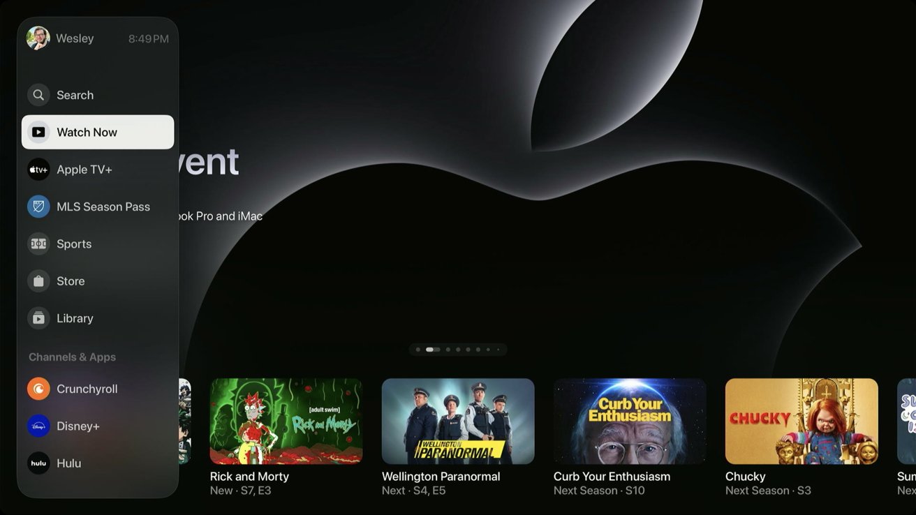
With tvOS 17.2, users get an all-new Apple TV app design. The primary Apple TV app experience remains mostly unchanged, but the top menu and navigation are much better thought out.
First, the top tab switcher has moved to a sidebar with many more options. The sidebar emphasizes available content sorted by Channels, but Apple TV, MLS, and iTunes content get the top spots.
And no, there isn't any way to remove the MLS Season Pass or Sports Channels. Apple will let you hide unwanted channels or apps but not any of its apps or services. (Coming to an antitrust case near you)
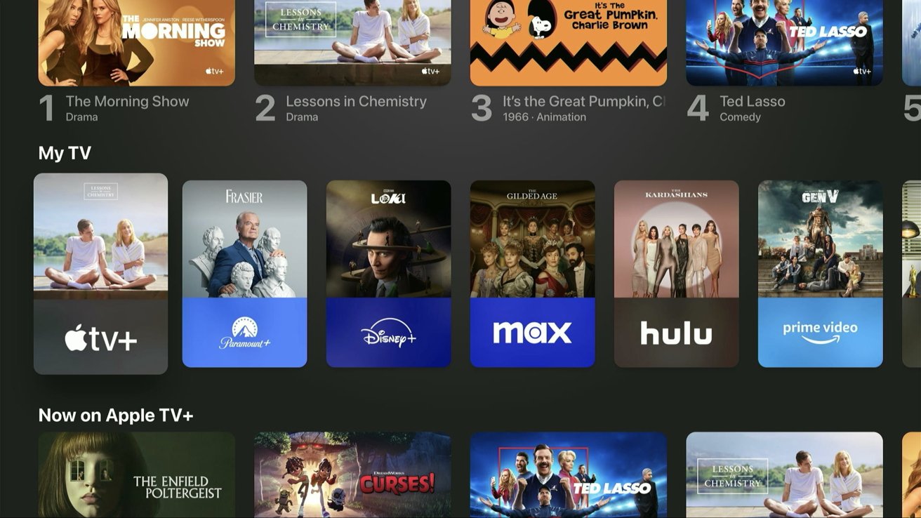
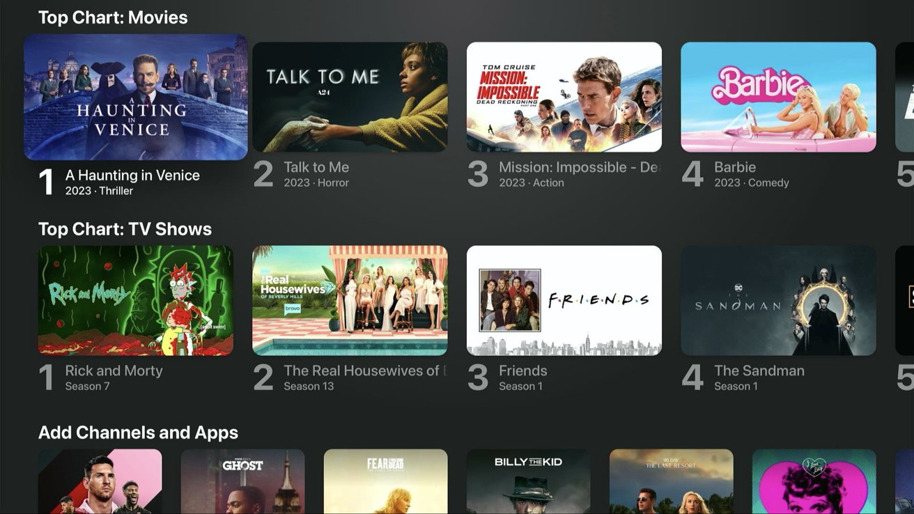
Watch Now is still a collection of any content enabled to populate the Apple TV app. The old circle icon Channels section is now "My TV" with square icons, which also merged with the apps section.
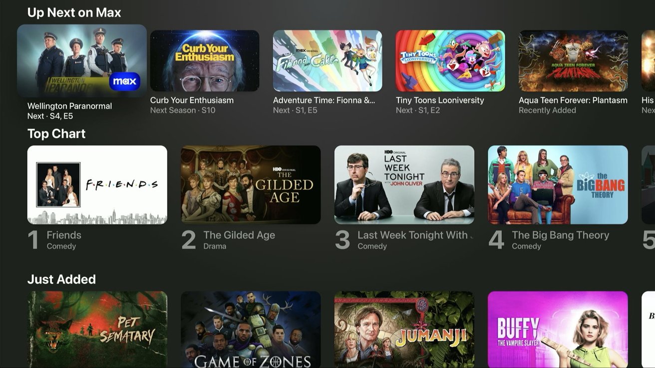
Select a Channel or app from My TV or the sidebar to jump to a dedicated page containing content just from that service. Channels have always had dedicated Up Next queues, but now so do apps.
There were so few premium Channels built into the Apple TV app that users likely never interacted with them outside of Paramount+. Now, apps like Disney+ and Max feel like they are part of the TV app in a way they never did before.
Netflix still isn't part of the Apple TV app or Up Next, and playing a video belonging to an app still launches the dedicated app to play it. However, the improved navigation of the sidebar and My TV sections makes everything much easier to navigate.
As long as you're inside a dedicated Channel or app section, all the content presented is part of that service, with few exceptions. Apps like Amazon Prime will still fool you into believing a piece of content is available within the Amazon Prime app but then ask for a digital purchase.
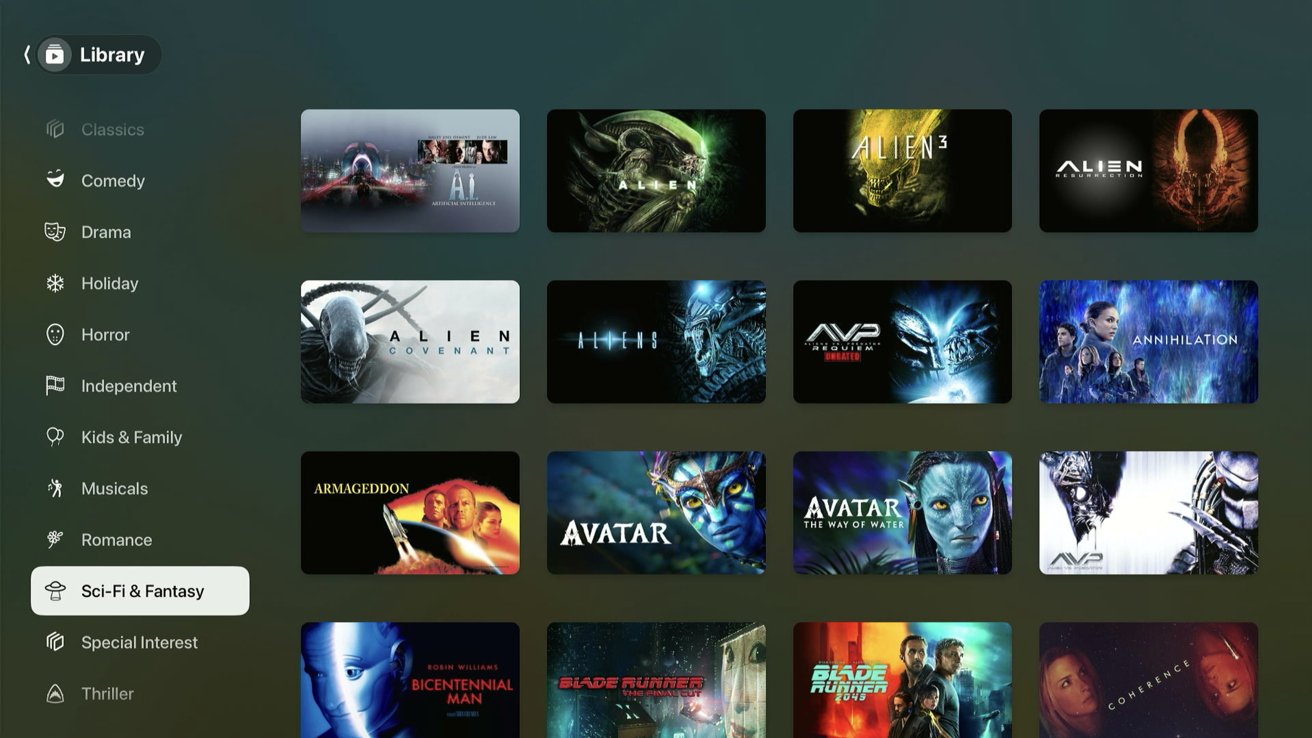
The Library tab contains everything purchased from iTunes. The sorting between movies, TV, 4K titles, and genres is still available, but there's a new set of glyphs depicting each genre.
The iTunes Store is still part of the Apple TV app but has combined the movie and TV sections. This streamlined experience is expected to replace the dedicated Movies and TV Shows apps on Apple TV, but they are still in tvOS 17.2.
The combined storefront still needs some work. It's mostly the movies view from before, but a few TV series options are intermixed.
The updated Apple TV app interface might take some getting used to, but we expect it will be a big win for ease of use. It also acts as an excellent showcase for Apple to convince more apps to join Apple TV Channels so users don't need to launch a separate app.
While the Apple TV app isn't perfect, the latest redesign is a step in the right direction. We're not sure Apple will ever convince companies like Disney to join Channels, so this is the next best thing — treating Channels and apps like equal services within the TV app.
