Following the news that the New Mac mini has its power button on the underside, fans with 3D printers have been proposing how to make it more accessible.
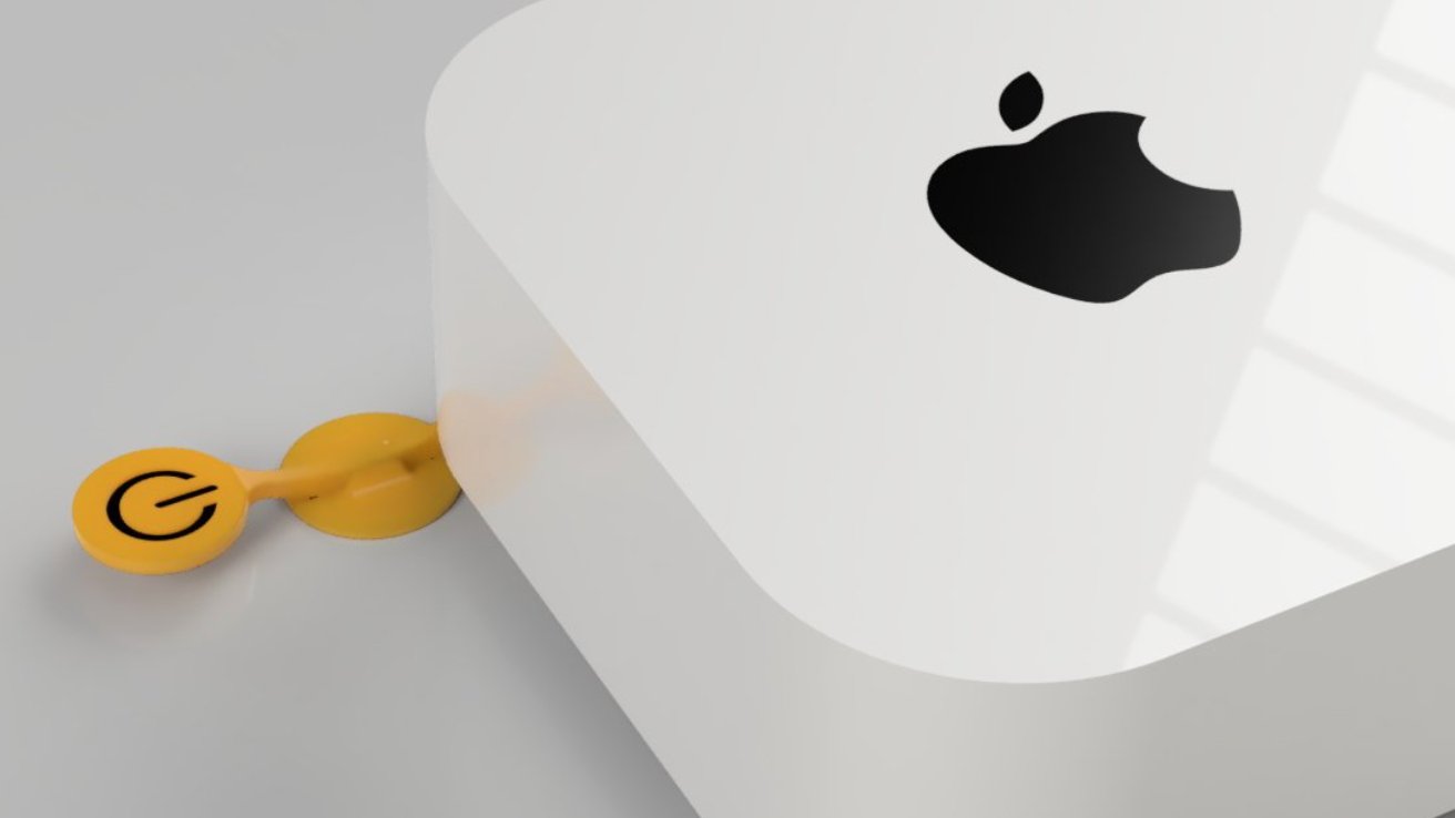
The first of what just might become a wave of Mac minipower button tools have begun to spread across social media, but maybe the archetype of them all is from engineer Ivan Kuleshov. He previously redesigned the Magic Mouse so that it got a charging port on the front.
Believe it will work pic.twitter.com/dZkYFAPDik
— Ivan Kuleshov (@Merocle) October 30, 2024
Kuleshov's idea is a clever fulcrum where pressing on one end causes the other to rise, and therefore press the comparatively inaccessible power button. He's even 3D printed it with an Apple-style power icon on the end.
There is of course the small problem that Kuleshov does not have a new Mac mini. They're available for pre-order now, but won't ship until November 8, 2024.
Consequently, Kuleshov says he "modeled the Mac mini based on available photos and dimensions," and that believes his lever will work. But he notes that ultimately it will depend on "the Mac mini weight and the force required to press the button."
But then there is a further snag that isn't going to be fixed by Kuleshov's lever design. His lever has to extend out from one side of the new Mac mini, meaning that despite its small size, it takes up a larger footprint on a desk.
If you're the sort who leaves their Mac on all the time, then you won't be concerned about the power button. And you're also not concerned about the planet.
Macs can restart themselves after a power outage, so there are use cases where that inconvenient power button might only be pressed once. In that case, it can pressed as you first put the Mac mini down on your desk.
But whenever you do need to press that button, you have to pull up the Mac to reach it. Depending on the space you have, and depending on how many cables you have connected, that could be a pain.
It does, though, hark back to the days of Steve Jobs who famously did not like having power buttons at all.
That didn't stop Apple putting one on every Mac mini, starting right back with the original in 2005. From then until now, the power button was on the back — so it could have been more accessible even then.


