Don't expect to fit the new M4 Mac mini into too tight a space because you're going to have to tip it to reach underneath every time you need to switch it on.
If the position of the charging port on the Magic Mouse isn't the questionable design choice it's been called, the New Mac mini power button might be. As pointedly not shown by Apple in its launch video or new ad — the Mac mini power button is underneath the device.
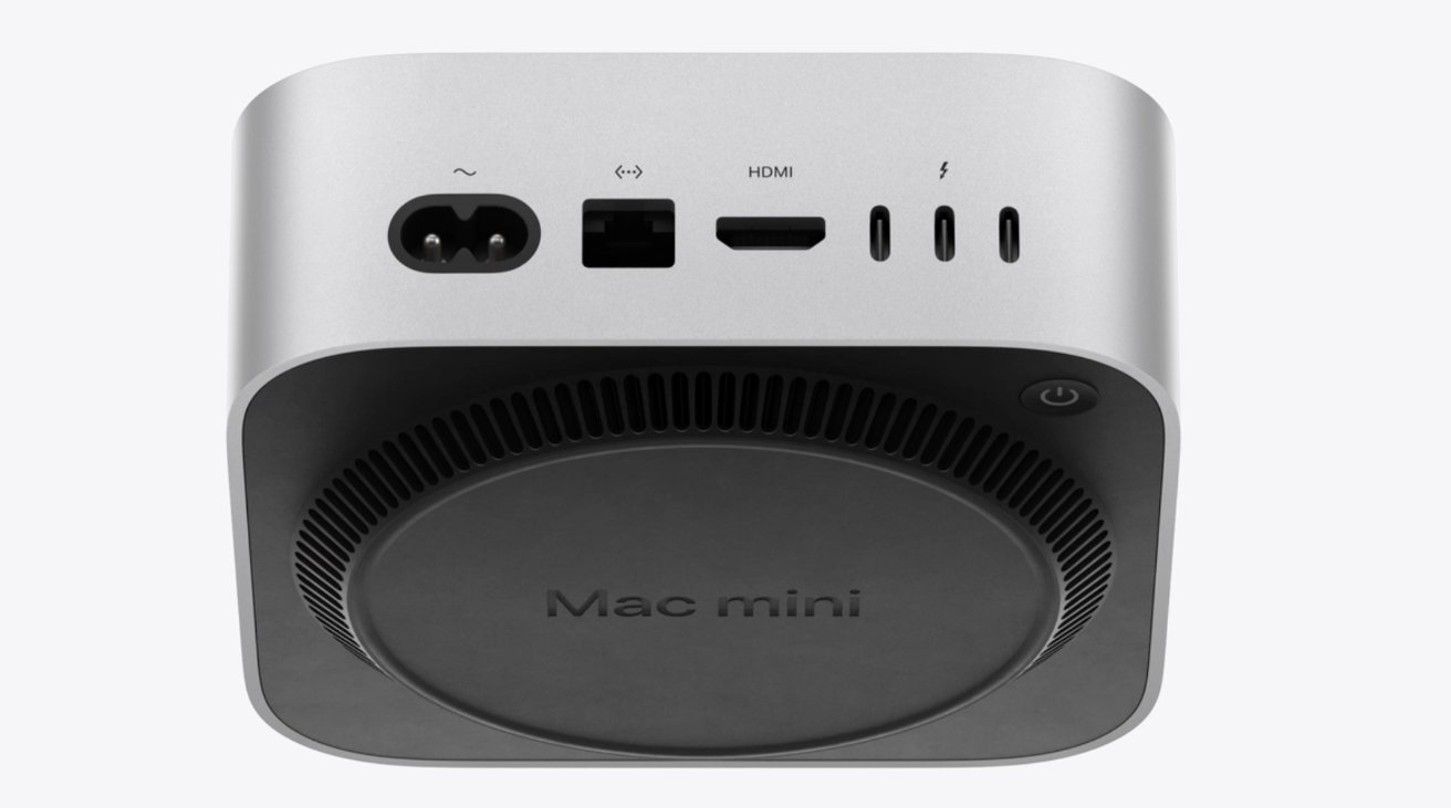
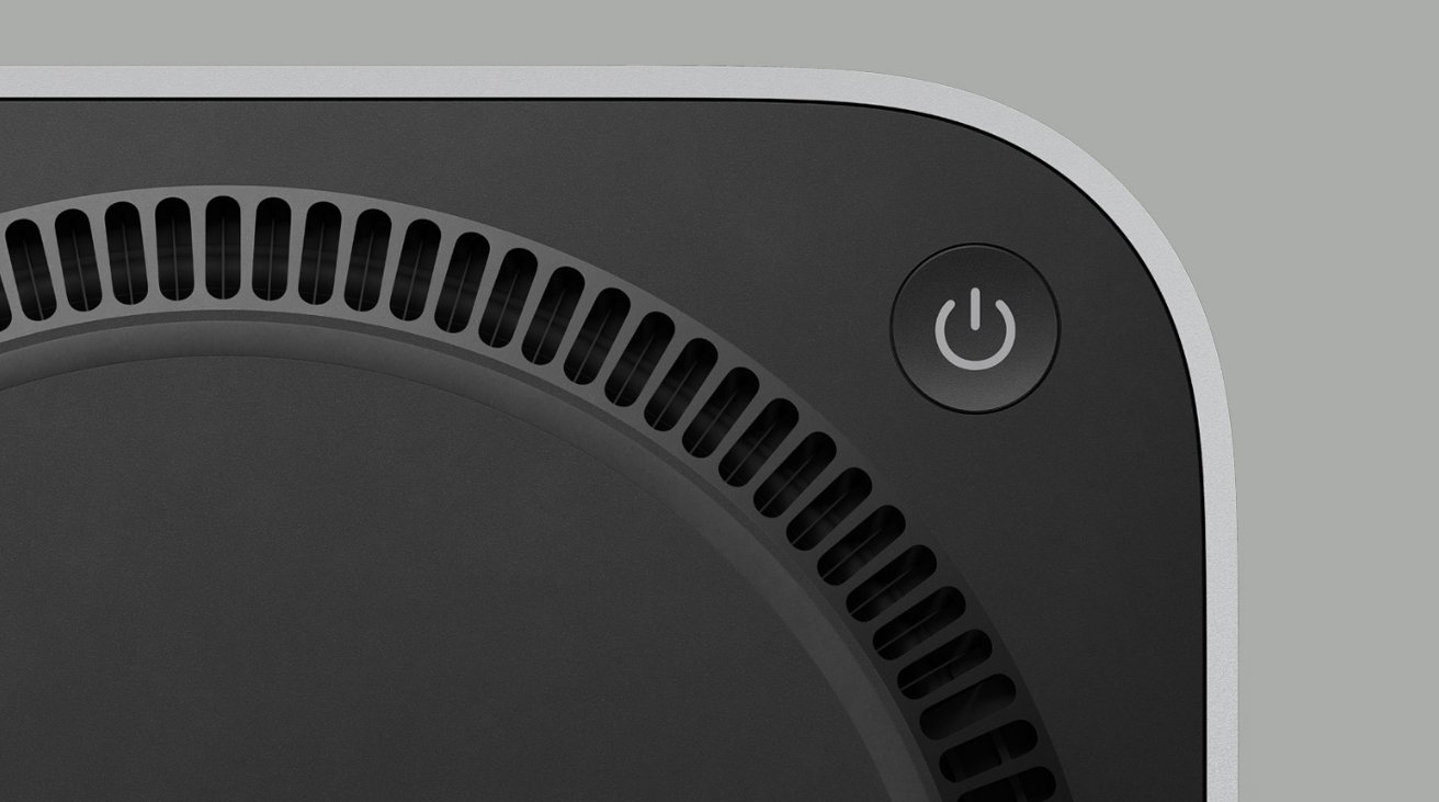
As can be seen on the online store's page for the new M4 Mac mini, the button is not on the very base of the model. It is, though, underneath it, raised off the ground only by the cooling vent.
It's positioned toward the left rear of the device, as seen from the front. To turn the Mac mini on, then, or to force a restart if it locks up, users will at least need to reach underneath the device.
Given the clearance between the main part of the Mac mini and the slight lift that the vents give it, it's most likely that users will have to tip or lift the device to reach the button.
Previously, the power button was on the right rear of the device, again when facing the M2 Mac mini from the front. It meant having to reach behind the device, but since that's also where power and other cables connect, pressing it did not require moving the unit.
We await the accessories and docks that will result.


