Apple's decision to place the power button of the M4 Mac mini underneath has been questioned by users. In some cases, they've come up with their own "solutions" to the problem.
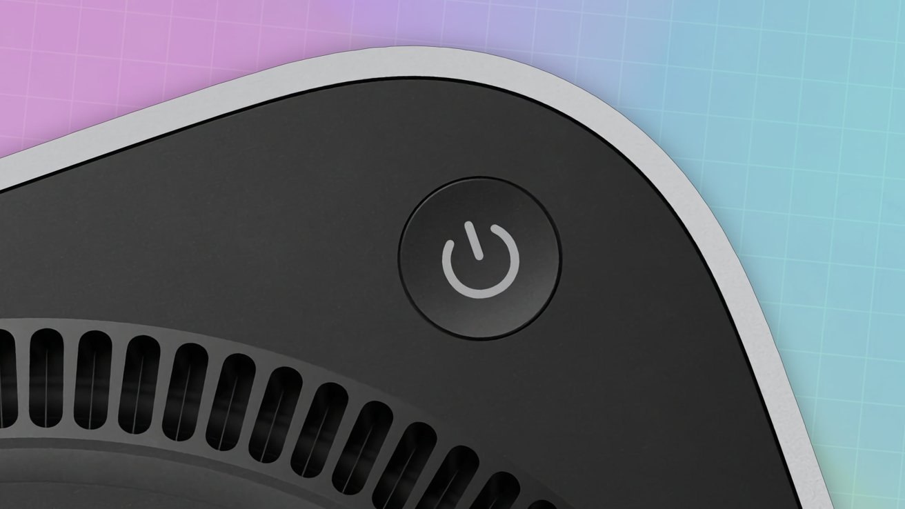
The introduction of the M4 Mac mini was welcomed by critics, with the already small Mac made to be even smaller. Getting to that size meant there had to be a compromise, and that took the form of an awkward power button placement.
Rather than at the rear, the button is instead underneath the corner of the Mac mini's enclosure. It's in a position that you have to lift or tilt the Mac mini to access it, which can be awkward for people with larger digits.
This isn't seen as a problem to Apple. In one interview, SVP of Worldwide Marketing Greg Joswiak and SVP of Hardware Engineering John Ternus believed that access was still easy.
Even so, it's still a non-problem to them. "Honestly, most people almost never use the power button on a Mac," they commented.
While true, with most users habitually putting the Mac mini to sleep rather than shutting it off, there are still times that the button must be pressed.
Homebrew fixes
The issue of a badly placed button has led to ingenious Mac users to come up with alternative ways to press the pushable control. Ideally without needing to pick up the Mac mini in the first place.
One early example of a fix that AppleInsider previously covered was by Ivan Kuleshov. A 3D-printed see-saw was created, translating a downward press on a pad next to the Mac mini into an upward press by the tool.
Kuleshov didn't stop there, as a second more elaborate design was proposed. Shared on X, the idea was to create a large plate with soft pads that the Mac mini sits on.
One more thing.
— Ivan Kuleshov (@Merocle) October 30, 2024
A solution for turning on your Mac mini simply by clicking on it.
The soft pads will have to be selected based on the Mac mini weight and the force required to press the button. pic.twitter.com/HQcEXu05L4
Key to the design is a small nodule off to one side, designed to line up with the power button. The idea is that rather than pressing the button, the user presses down on the Mac mini itself, which in turn presses the nodule with the button.
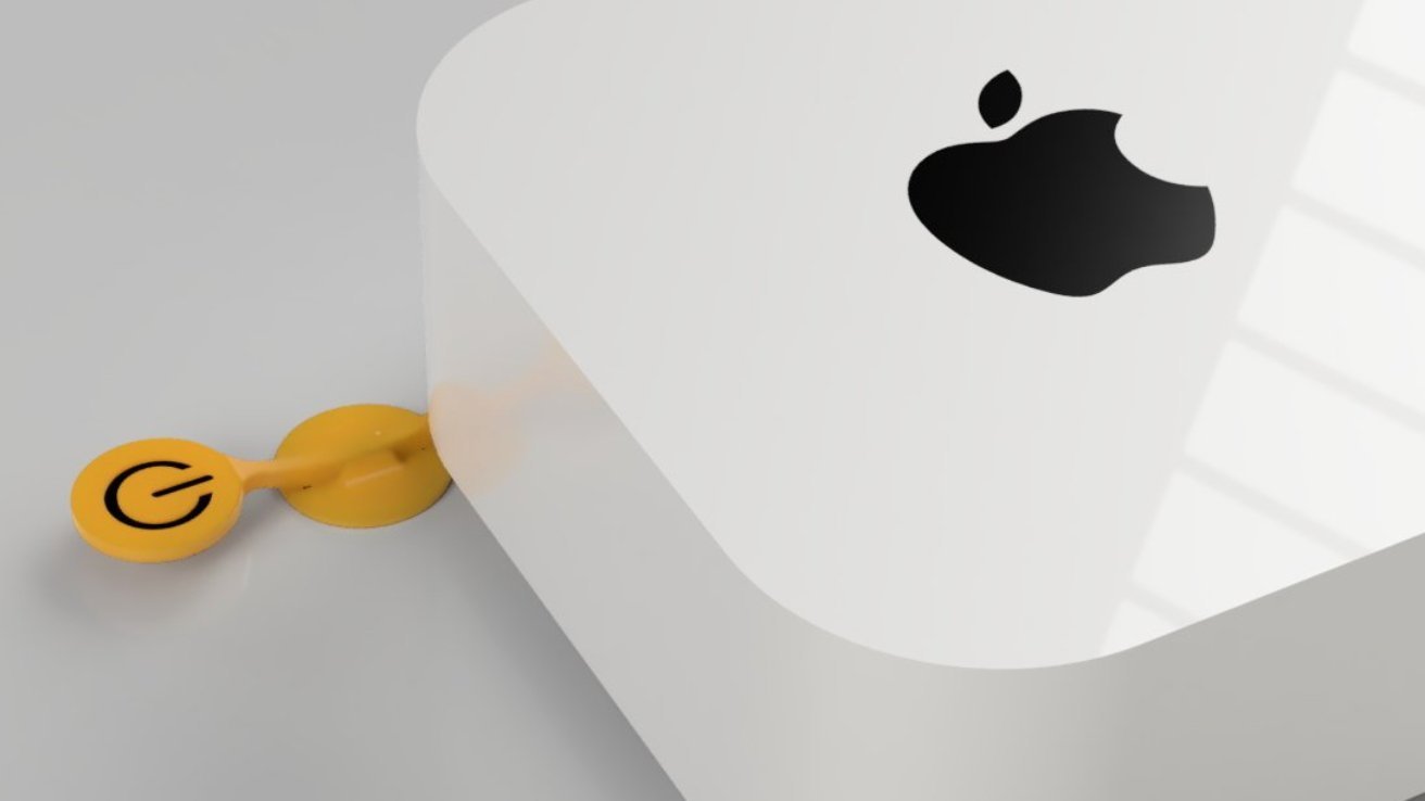
Another X user, @Shapoco, came up with another see-saw design, but with a distinct difference. Rather than being below the Mac mini and to the side, it is instead intended to be placed on top of the Mac mini.
TL Mac mini pic.twitter.com/cy5OH8VjBU
— (@shapoco) November 9, 2024
A dangling section on the other end of the see-saw covers the button on the underside of the Mac mini. When pressed, the dangling element is raised and presses the button.
Thingiverse user "gismans" added their design for the whole-Mac-mini-button concept, with a 3D-printable base. Taking the form of an X, the Mac mini sits on top, with one arm pressing the power button when you press down on the Mac mini itself.
Meanwhile, over on Makerworld, "danielha2058" offers another see-saw design, but all enclosed this time. The button on the top presses down on a covered rod onto a teeter-totter that presses the button.
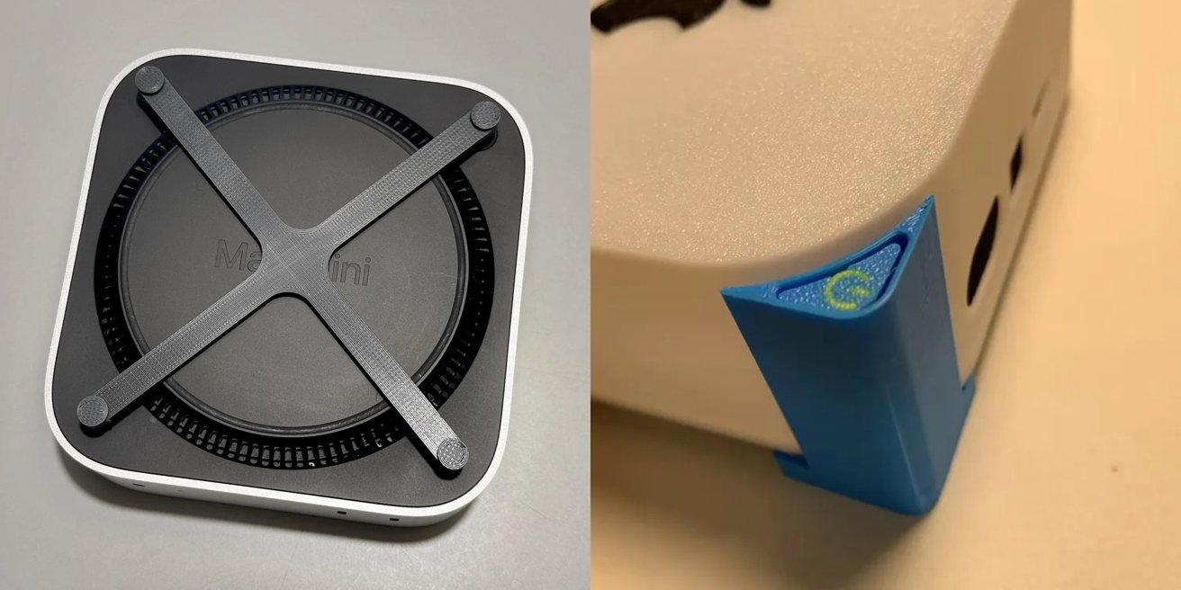
One 3D print design from gismans [left], and another from danielha2058 [right] - Image credit: Thingiverse, Makerworld
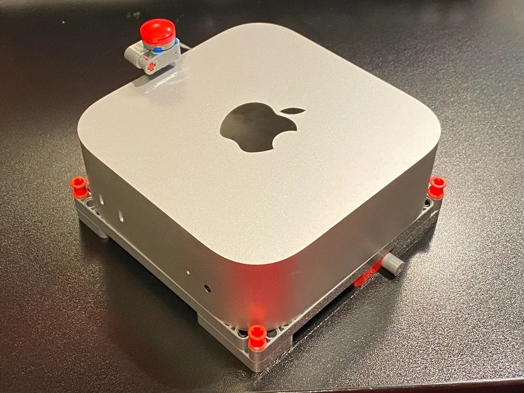
Of course, you don't have to go down the route of 3D printing something to fix it. You could always use Lego.
Reddit user "u/Warvanov" posted images of a Lego Technic contraption, consisting of a stand and a red button above the Mac mini. Pressing the button moves an element within the plinth, which presses the button.
While infuriating to some, the power button drama has at least allowed some well-intentioned people to come up with neat solutions to a problem that is being blown way out of proportion. It also shows that there are many ways to solve the problem.
Of course, a well-placed and sized piece of Blu-Tack or a pebble under the button could work just as well if you're willing to slightly tilt the Mac mini to press the button. But it's more fun to come up with a more creative solution.
