An Introductory Mac OS X Leopard Review: Meet Your New Desktop
 Prince McLean
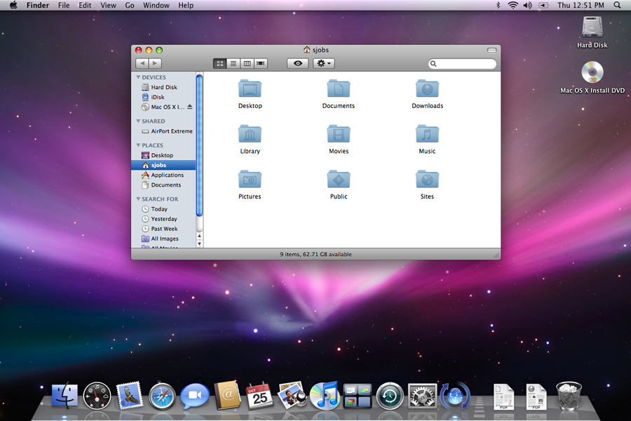
Mac OS X 10.5 Leopard has two audiences: those who already own a Mac and are interested in upgrading their experience, and new buyers investigating a Mac purchase. This review series is designed primarily toward Mac users looking to upgrade but includes notes of interest to new Mac buyers as well. This segment provides a 2-page introduction to Leopard's overall features and an introduction of the desktop, with real world usage notes about its peculiarities so you can decide if Leopard (and the Mac) is right for you.
Is Leopard Ready Yet?
Back in 2005, Apple released Mac OS X 10.4 Tiger with a few rough edges, many of which were patched a couple weeks later in the 10.4.1 update. Since then, the company has churned out nine other free updates at regular intervals that progressively added features and fixed problems. However, this time around, the company left its new OS in gestation for a full sixteen months since its debut at the 2005 World Wide Developers Conference, compared to just ten months of Tiger development following its initial showing. It has been a full two and a half years since Tiger, and all that extra development time has helped to polish the release of Leopard significantly.
Rather than feeling like a "1.0" software release, Leopard claws against the conventional way to release operating systems ("ship it early and then fix with follow up service packs") and instead feels a lot more like Apple's other products, from the iPod to the iPhone to the company's software applications. There's no doubt that a project this complex won't have some niggling issues to iron out, but Apple has directed a lot of attention to ensuring that the Leopard launch will go as smoothly as its transition to Intel last year, or its iPhone launch a few months ago.
In an age when shoving out incomplete, commercial software products as "beta releases" has become standard practice, the fit and finish detail work that has gone into Leopard is really impressive. If you're worried about Leopard not being complete, you can set aside you concerns. However, if you currently use applications that are critical to your work, you should contact the vendor to make sure they're ready for the Leopard launch. You might also decide to wait a week to gauge user feedback on the specific applications you use.
For more casual users, I can point out that I've been using Leopard as my main system now for several months and am extremely happy with its stability and features. The "Golden Master" version Apple is now selling, labeled build 9A581, further improves on previous builds that were already solid. I'd rate Leopard equal in comparison to the current release of Tiger, and slightly more complete than the latest iPhone 1.1.1 release, which seems to hit glitches occasionally.
What To Expect
Apple's product boxes keep shrinking, which is a good thing. Leopard now ships in a small DVD folder distinguished by a holographic X on a star-field background, but the real product is the work that went into developing the software. That work is being sold in the same DRM free packaging Apple has been advocating for music sales in iTunes.
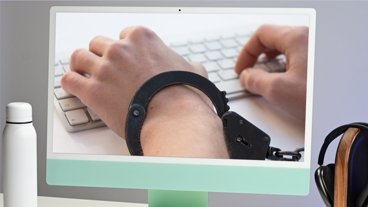
There's no Product Activation system to prevent you from stealing Apple's software; the company trusts that you'll appreciate its product enough to support its efforts to continue development on Mac OS X. That's another welcomed change in the industry, particularly in comparison to Microsoft's Windows Vista, which not only requires a product activation, but also resets activation if you install certain drivers and goes into a "Reduced Functionality Mode" until you are cleared of your suspected crimes.
If you are now running Mac OS X 10.3 or later (Panther or Tiger on either a PowerPC or Intel Mac), Tiger will perform an in-place update, preserving all your settings. If you have an earlier system or a Developer Preview, Leopard needs to do either a clean install or an "Archive and Install," which sets aside your existing software, installs the new system fresh, and will then optionally import your user accounts and files afterward.
Leopard requires at least an 867 MHz G4 PowerMac, or any G5 or Intel model, and 9 GB of free hard drive space. Apple also lists "512 MB of memory," but anyone running any version of Mac OS X should have 1 GB, and ideally 2 GB or more of installed RAM. There are also some other specific requirements that apply to certain power features, including video effects in iChat. These are listed on Apple's site: Mac OS X Leopard - Technical Specs.
Overall Impressions
There's five main themes that have jumped out at me as permeating Leopard's key features and its overall value in using the system:
General Performance
In my testing of Leopard on both a 2005 1.25 GHz G4 PowerBook with 1 GB RAM, and a more modern, year old Core Duo MacBook Pro with 3 GB of RAM installed, I found the system's general performance to be excellent on both machines. The general interface speed of Leopard, despite its fancier bells and whistles, is at least slightly faster overall than Tiger in general and in some cases dramatically snappier and more responsive, even while offering more both in features and in flourish.
That's largely because many of the fancy features of Leopard are delegated to the video card, which is usually sitting idle. If your system lacks the hardware required for certain effects, Leopard doesn't struggle to do them anyway, it often just trims things down to do what it can. Of course, Leopard doesn't magically speed up your slow hard drive or double your installed RAM, but it does take full advantage of your system's resources. At the same time, Leopard can still run on machines that are now a half decade old.
Pervasively Parallel
Another noticeable reason for everything being slightly faster is Leopard is that a lot of secondary tasks are delegated to their own thread, allowing more to be done in parallel rather than having the interface held up until a task is completed. One example is network servers in the Finder. If you've ever disconnected the network before ejecting a file share, you've no doubt felt the pain of having your entire Finder grind to a halt while the system sends out a search party looking for the missing disk. Normality doesn't resume until all hope is lost, and the rescuers don't seem to give up easy, even though they never have any chance in finding anything.
All that's gone in Leopard. Disconnect a file share, and the Finder remains responsive while it tries in vain to reconnect in a separate thread. It then simply pops up a disconnect notice. If you have your Mac on a network, that's reason to buy Leopard in itself. The new Mail similarly benefits from multicore optimization.
Another example of parallel operations occur when you boot; the system starts up very rapidly, because it's designed to kick off everything in parallel.Along the same lines, putting a Leopard machine to sleep and waking it up is nearly instantaneous, just as with Tiger. On Windows, be prepared for a frustrating delay every time you wake your laptop. For mobile users, waking from sleep is a common reason to switch to the Mac.
User Feedback
One of the most frustrating things about software can be waiting for a result without any indication of what's going on. Apple's User Interface Guidelines recognized the importance of informing the user of status information back in the 80s, using thermometer progress indicators and other means of letting the user know why the system was busy.
Leopard provides lots of good examples of this. When you plug in a hard drive, for example, Spotlight begins indexing the files on that drive so you can rapidly search its contents. As with Tiger, the Spotlight icon in the upper right gets a a dot notification to indicate Spotlight is busy. However, when you perform a search, the Spotlight menu now provides a progress indicator to show you how much longer the job will take, and lets you cancel the action.
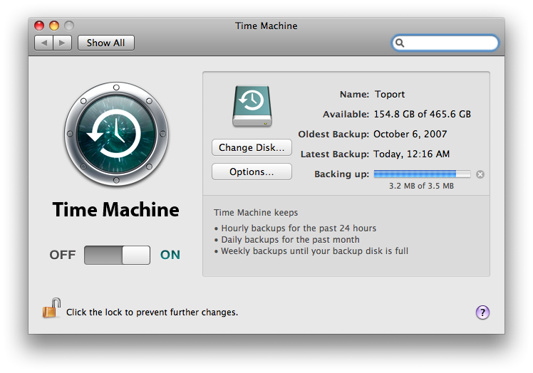
Mail has a similar Mail Activity region that can be displayed to indicate what tasks are underway. This helps the user realize why things may have slowed down, and makes it easier to cope with delays or work around them by pausing intensive activities. For example, when Time Machine hits a scheduled backup time, it presents a progress indicator within System Preferences, which can be used to stop the back and automatically reschedule it for later.
Minimal Clicking, Maximally Intuitive
One fair indicator of how well designed an interface might be is how many clicks it takes to get what you wanted. New features like Stacks trim a few clicks away from finding files, and the revised Spotlight makes it easy to do everything from launching an app, to looking up a word's definition, to doing a quick calculation. And of course, it can also find your files.
Spring-loaded Dock icons — which pop open when you drag an icon on them and hit the spacebar — are also a quick shortcut that strips off a few intermediary clicks when navigating. The best part of these features is that they are all completely natural, and don't require learning keystrokes to invoke complex actions; they simply make sense.
Spaces lets you just drag windows around between Spaces, as it "should." In reality of course, all of that intuitive simplicity was the result of a lot of work to make things behave naturally, because left to their own devices, all software interfaces are horrifically artificial and clumsy.
A Thoughtful Interface
Leopard has a lot of the feel of the iPhone, as one might expect of an Apple product. Recall that the reason people camped out overnight to get the iPhone wasn't because early buyers were excitable fans ready to buy anything, but because they appreciated the work Apple spends in crafting its designs, both in hardware and in the software interface.
The new system also brings together the different window styles that had cropped up, with every application now adopting the unified, clean window style pioneered by iTunes. Aside from third party hacks, there is no provision for theming the interface in Leopard; windows aren't designed to amuse, they are there to provide an elegant but utilitarian framework for your documents. Windows also increasingly get out of the way. The big thick windows of the Finder are now gone, replaced by minimal framing of file views. Safari, iCal, iChat and Address Book all reflect the same design. Contrast this with Vista, which is intentionally designed to be showy and ornamental, as advertised in Microsoft's "Wow" ad campaign.
Those foundational principles provide an overall glimpse of the strengths the new Leopard offers. Of course, there's also room for improvement, some occasional irritations, and elements you might not like in the system. Here's a more specific look at what I've discovered within Leopard's significant features and applications getting started with the desktop.
Installation
One application everyone will jump to use first is the installer. As with other Mac OS X installer DVDs, you can restart from within your existing system or simply boot from the DVD. It also includes a PDF booklet with easy to follow installation help, written in the style of an iPod guide. Apple is finally marketing Macs to regular people; imagine how many they'll sell now.
Leopard is set to install nearly everything by default — as had always been the case in Mac OS X upgrades — including Cherokee fonts, lots of language localizations, and several GB of printer drivers. The instructions outline how to do a custom install, and it isn't difficult, but it is odd that the default behavior is to dump lots of obscure foreign fonts on your hard drive. We know Steve Jobs is a fan of "beautiful fonts," but how about some restraint here?
The installation progress takes about an hour, including a lengthy check of the DVD. As with previous Mac OS X installers, it seems to reach the finish line and then hang out with "a minute to go" for some time. Apple advises you to go get a coffee and come back. In any case, that example of frustratingly scanty user feedback is, fortunately, a rare problem once the install has completed. A secondary installer can be used to load developer tools, including Xcode, DashCode, and WebObjects.
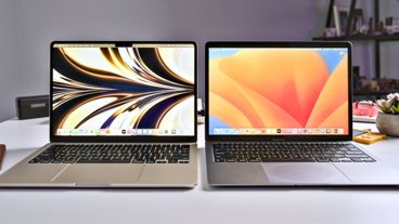
The New Desktop
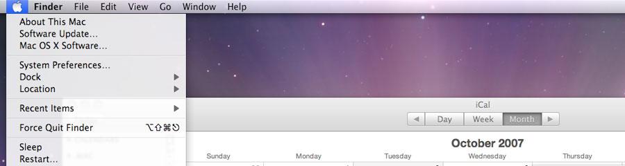
The default desktop is the now familiar view of space, which also shows up in the standard "Welcome to Mac OS X" entry movie that plays on launch. It sets up your account, and then offers to register your system. With that complete, you're left with the purple desktop, which is also used as the new desktop icon in the Finder. The other two new elements visible at launch are the reflective, dimensional looking Dock and the translucent new Menu Bar.
The Menu Bar is really only mildly translucent. I didn't notice any impact in readability, but if you find it objectionable you can use a dark desktop pattern (or go out of your way to change things in the system). Whichever desktop pattern you use will be infused into the Menu Bar's look, which subtly presents your desktop photo even when the desktop is obscured. The stronger and brighter the desktop you choose, the more noticeable the effect is.

The Menu Bar also has a flatter, subtler appearance compared to the Tiger version, which looked like glossy plastic and featured a bright blue Apple icon. The icon is now black with a grey swash across the lower half that makes it appear to be a black metallic logo with a mirror polish (above). Clicking on the Apple Menu makes it white. Drop down menus now have rounded corners and stronger drop shadows that give the system a classy look overall, and the translucency effect of menus now uses a blur to enhance readability over the background below (below).
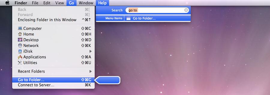
Also integrated into the Menu Bar is the new Help system. As you type in search terms, it suggests Menu Items. If you point the mouse at suggested items offered in the Help menu, a floating chalk pointer pops up, pulls down the menu, and points out where the item is. If you click on the menu bar item in the Help list, it will simply activate that item (below, in this case it would open a Go to Folder window: again, fewer clicks). If your search in Help matches terms in that application's Help pages, it will also display those in the menu.
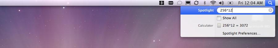
The other end of the Menu Bar offers the smarter new Spotlight. Open it up with Command+Spacebar. As you type, it first tries to find a matching application and offers to quickly launch it with a tap of the spacebar. If no apps match, it assumes you're looking for a definition of a word in Dictionary, or with numbers, looking for an answer from the Calculator (below). Spotlight is now useful for more than just finding files, and brings up smarter results that are now both instantaneous and easier to use. Additional notes on Dashboard, Spotlight and the Desktop were presented in Road to Mac OS X Leopard: Dashboard, Spotlight and the Desktop.
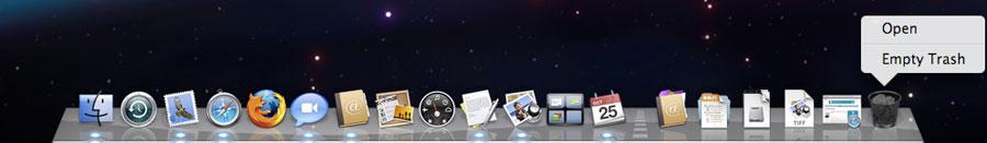
The Dock also picks up the background image, both through its translucency and by way of reflections. It also reflects nearby open windows. I thought this would be more busy and annoying than I later decided it was in actual use. The highway stripe separates applications from Stacks, docked windows and files, and the Trash. Docklet menus also get the new rounded corner look.
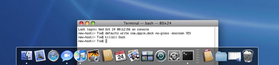
Again, if you find it too distracting you can also tone things down with a simpler desktop image, or by setting the Dock to the right or left side, where it uses the simpler strip look rather than the glass shelf appearance. You can also manually set the Dock to assume the plain strip appearance (below) along the bottom of the screen via the command line:
Additional notes on the Dock, including an extensive look at the new Stacks, were presented in Road to Mac OS X Leopard: Dock 1.6.
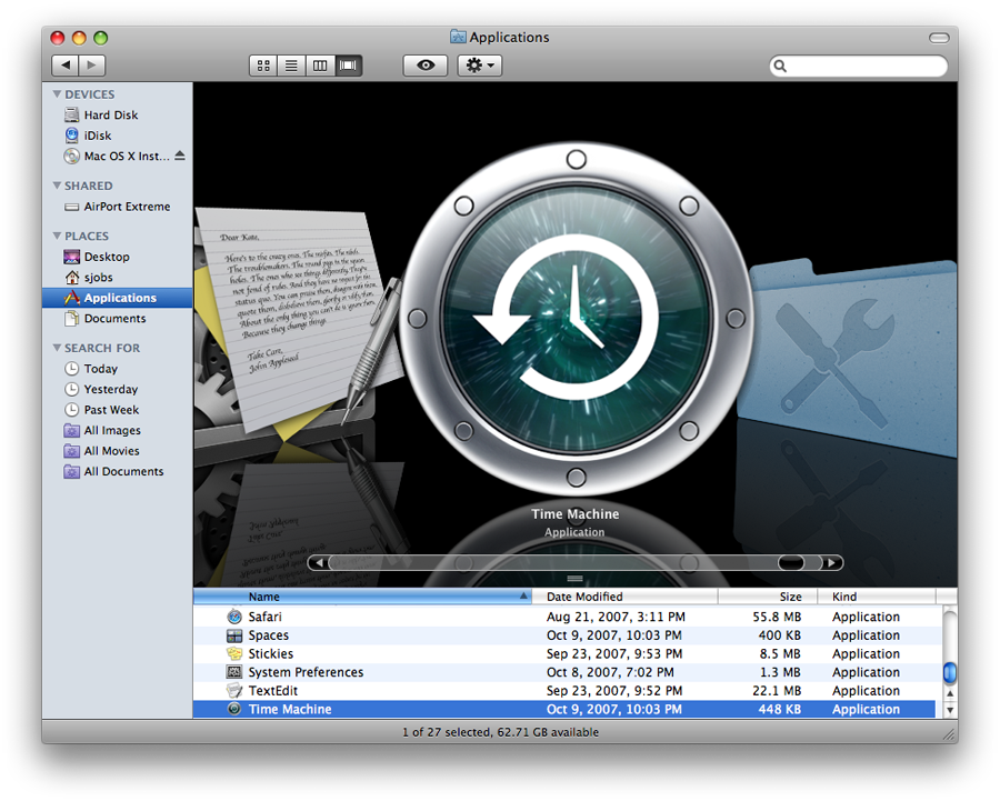
The Finder is now iTunes. It was inevitable. They both catalog your stuff, search it, show it, group it, start it, categorize it, label it, date it, and share it over the network. The new Leopard Finder uses an iTunes-style window, offers a Cover Flow view that debuted in iTunes a year ago, and now presents more items in your sidebar, iTunes style:
- Devices lists your attached drives, .Mac folder, network shares, and optical discs.
- Shared lists all of the machines on your local network, via Bonjour, as well as Back to My Mac, a feature of the new Wide Area Bonjour offed through .Mac, and any manually connected file servers. Clicking on shared systems shows you the sharepoints on that system, offers to login as a user or browse as a guest, and for configured Leopard peers, allows you to initiate a screen sharing session. Once you mount shares, an Eject button displays on that item so you can easily unmount the server.
- Places is your old Finder sidebar, with any folders you want to list.
- Search For are smart folders, which are essentially stored search queries.
The new Finder also gets a Path Bar for showing the folder hierarchy of the folder you're looking at. While the Finder could always display a Path Menu from the proxy icon centered in a windows' title bar when Command clicking, the new Leopard also lets you pull that up by right clicking, which is a bit more natural when using a two button mouse of a two finger clickable trackpad.
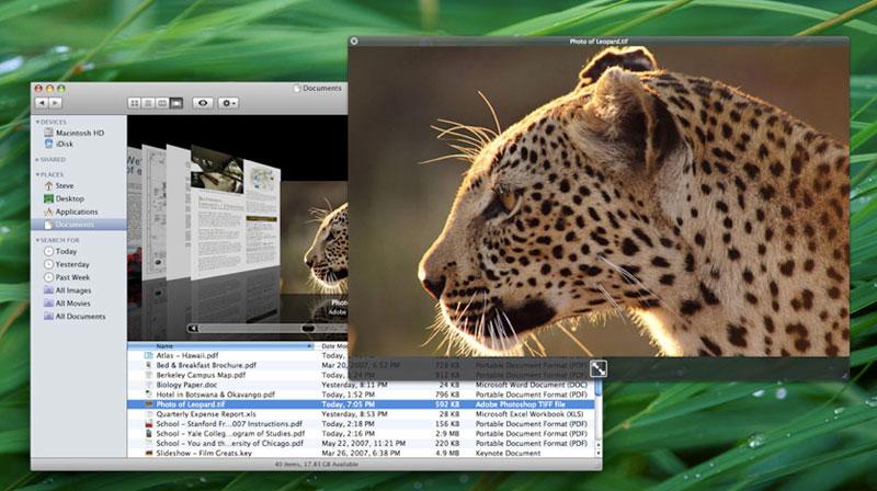
The new Cover Flow view shows off the beautifully rendered new high resolution icons (above, check out TextEdit's icon), as well as the dynamic previews of files. Even better, you can play movies inline within Cover Flow, or from the file Preview in Column view. Hit the spacebar to bring the file up in Quick Look, the system-wide file viewer for a variety of known file types; it's also extendable by developers. There are additional notes on the Finder in Road to Mac OS X Leopard: Finder 10.5.
If the new Finder is too complicated for you, you can try out the "At Ease" Simple Finder, designed for kids and available under Parental Controls. In the world of Simple Folder, everything launches when you click it, you aren't expected to drag anything around, and you can't do much but surf the web, exchange emails with you set list of people, and create lot of files that can only go in your own folders, which are presented in a set panel window. It's pretty much a lot like working for a big corporation running Windows, although you still get the shiny new Dock. Additional notes on Parental Controls appeared in Road to Mac OS X Leopard: Parental Controls and Directory Services.
Coming soon from AppleInsider: an introduction to Leopard's desktop applications.


 Malcolm Owen
 Chip Loder

 William Gallagher
 Christine McKee
 Michael Stroup
 William Gallagher and Mike Wuerthele