Apple on Tuesday was awarded a patent for a method which allows smartphone users to quickly switch between multiple open apps, a feature many iOS device owners have come to find indispensable.
The U.S. Patent and Trademark Office granted Apple U.S. Patent No. 8,291,344 for a "Device, method, and graphical user interface for managing concurrently open software applications," otherwise known as multitasking.
While switching between apps running in the background has become part of the iOS experience, and possibly taken for granted for those new to the operating system, the feature wasn't available until version 4.0 of what was then called the iPhone OS.
Apple's first steps into multitasking actually came with app switching on the iPad in early 2010, though at the time, the system still limited third party apps to run in the background. It was only until iPhone OS 4.0 that true multitasking was allowed for apps made by outside developers.
Apple was well aware of the constraints seen in iPhone OS, especially as titles in the App Store grew exponentially, and in September of 2010 filed a patent application outlining its solution to bring multitasking to its mobile platform.
From the '344 patent's background:
For portable electronic devices, existing methods for managing concurrently open applications are cumbersome and inefficient. For example, portable devices with small screens (e.g., smart phones and other pocket-sized devices) typically display a single application at a time, even though multiple applications may be running on the device. With such devices, a user may have difficulty seeing and managing the currently open applications. This situation creates a significant cognitive burden on a user. In addition, existing methods for managing currently open applications take longer than necessary, thereby wasting energy. This latter consideration is particularly important in battery-operated devices.
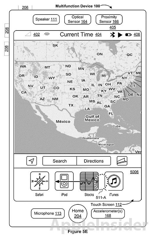
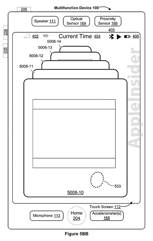
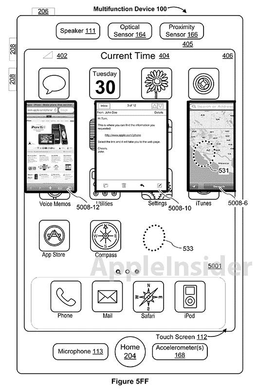
The comprehensive patent goes on to describe a number of embodiments, each focusing on a device first displaying an open application, which is then replaced by a second open app that takes the place of the first. A slew of user interface options are described, including a number of solutions resembling Apple's Time Machine "three-dimensional stack" GUI, except with representations of open apps.
In another embodiment, the app windows are downsized and represented as a linear strip that can be scrolled through, much like mobile Safari's multi-pane GUI.
Ultimately, the patent describes the system iOS users have come to know, which is the double tapping of an iDevice's home button, which brings up a row of icons on the bottom of the screen. Each icon in the multitasking bar represents a recently opened app, and can be scrolled through and selected as wanted by the user.
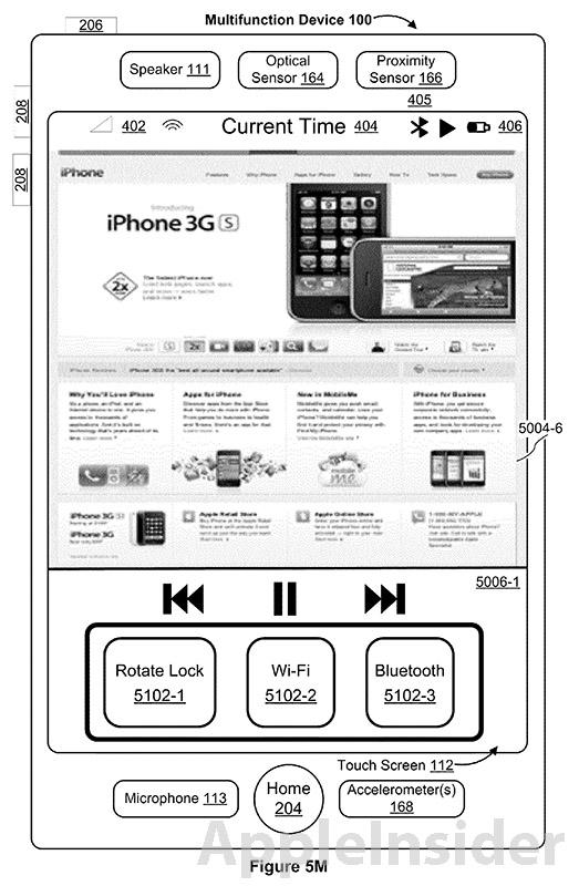
The '344 patent also accommodates gesture-driven multitasking, as is seen on the iPad when a four-finger swipe up reveals the multitasking bar. Basically every instance and embodiment seen in modern iOS iterations, meaning iOS 4 or later, are covered in the invention, including the multitasking bar's orientation rotation lock and music player controls.
It should be noted that the Exposé-like iOS multitasking bar does not technically represent a list of running apps, but instead shows those programs that were recently opened by the user. Background tasks are still managed by the OS itself, and usually have a max time limit in which to complete a task. For example, a podcast downloader may be run in the background while a user is browsing the web, but if the selected media does not download in the specified amount of time, iOS will suspend the app's CPU access. There are instances when this time limit does not apply, such as when music player apps or first-party software are functioning.
 Mikey Campbell




 William Gallagher

 Christine McKee
 AppleInsider Staff

 Chip Loder
 Malcolm Owen






14 Comments
I wish they'd have a three finger swipe for the iPhone and touch to bring up the multitasking bar (like the iPads 4 finger swipe). I hate pushing my home button so much.
I too wish, they'd have the toggles for not only screen lock but wifi and bluetooth and a few other power toggles just as they show in the picture. Once they add that I would no longer have to jailbreak the iPhone I'd own to get sbsettings on it and iOS would be absolutely perfect in my opinion. Hopefully by the time I get rid of Android phone they will have that in iOS.
I never liked the multitasking bar as it is way too small. From a UX perspective, why only show one row and force the user to scroll through? Not smart. I really like the swiping on the IPAD to switch between apps and wish they would enable it on the iPhone/iPod Touch too. I would also add the settings in the multitasking bar too. Hope someone from Apple is reading this:)
[quote name="Jivanile" url="/t/153407/apple-granted-patent-for-ios-multitasking-user-interface#post_2212403"]I too wish, they'd have the toggles for not only screen lock but wifi and bluetooth and a few other power toggles just as they show in the picture. Once they add that I would no longer have to jailbreak the iPhone I'd own to get sbsettings on it and iOS would be absolutely perfect in my opinion. Hopefully by the time I get rid of Android phone they will have that in iOS.[/quote] That's a nice thing android does have- from notification bar you can have Bluetooth, wifi, and GPS to turn on or off. Now- when I'm done with maps, I have to double click the home button, hold down maps, hit the - button, then the home button again. Whew... And it still shows GPS as on for a good 5 mins
I'm starting to feel a little envious when I see Android commercials and Windows 8 videos with true multifunction features. The split screen feature seems really cool. Also the ability to watch a video on one half and read your email on the other is pretty cool too. On the other hand, I suppose this is a big drain on battery life and may not be an often used feature, especially on a phone. But it could be useful on a tablet. Speaking of battery life, wouldn't it be cool, if one day Apple didn't make the next iOS device smaller/slimmer with the same battery life and instead kept the size the same, but added 25% longer battery life? All of a sudden, 10 hours becomes 12.5 hours. This would really be a differential feature between other mobile devices.