Tuesday's iOS 10 launch cleans up older iOS features, and introduces a number of new ones, including a new Home app for HomeKit, stock app hiding, voice mail transcription, and much more.
Messages
Apple says that Messages is by far the heaviest used app on iOS. The new version includes emoji-related enhancements, dynamic text bubbles, and rich links with images automatically integrated into chats.
More importantly for the app, though, is the addition of a SDK and app store for Messages. The SDK and app store allows "iMessage Apps" to hook into the main app, allowing users to extend the Messages functionality, and add graphic embellishments, such as the recently launched "Super Mario Run" Stickers to chat at little or no cost.
iOS 10 will also introduce full-screen effects into Messages. In an example given at the 2016 WWDC, fireworks were shown in the background behind user-input text bubbles.
Siri enhancements
Like Messages, Siri has been opened up to developers in iOS 10, allowing discrete app control through Apple's digital assistant.
Notable third-party Apps with Siri controls baked in at launch time are Pinterest, LinkedIn, Square Cash, LookLive, Uber, and Lyft.
Additionally, Apple has swapped out some other technologies with a deep neural network, for enhanced voice interpretation, and better Siri responses.
Home app for HomeKit
Apple is introducing a dedicated Home app inside iOS 10, that will give people a central location to manage and control HomeKit accessories, and even allow control outside the house.
Prior to the Home app, full HomeKit functionality has required third-party apps, generally produced by individual hardware makers. While some of the vendor-specific apps can control devices made by other vendors, most can't.
Home will work on iPhones, iPads, and the Apple Watch. Starting with iOS 10 iPads can serve as a hub for remote control while outside the range of a local network, something previously restricted to Apple TVs.
Control Center
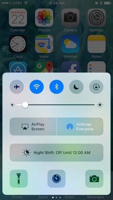
An integral feature in iOS, the Control Center look and feel has been refreshed, with some features moved around. The Wi-Fi, Bluetooth, Do Not Disturb, orientation lock, flashlight, and brightness controls are kept on the main Control Center screen.
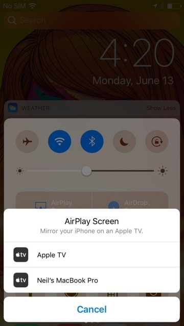
AirPlay has been modified, and is now called "AirPlay Screen." Audio AirPlay features have been moved to the new Music control pane.
Night Shift controls are now front-and-center, with a much larger button for activation on the Control Center.
Music controls have been removed from the main panel, and invoked by a swipe to the left. A second swipe to the left brings up the HomeKit Control Center, with one-stop access to all of a user's accessories displayed.
Apple pre-installed app hiding
In response to user complaints over many years, iOS 10 will finally let people partially remove apps native to the operating system.
Apps that can be partially removed, but not utterly stricken, are Calculator, Calendar, Compass, Contacts, FaceTime, Find My Friends, Home, iBooks, iCloud Drive, iTunes Store, Mail, Maps, Music, News, Notes, Podcasts, Reminders, Stock, Tips, Videos, Voice Memos, Watch, and Weather.
The apps aren't totally purged, and are re-installed through the App Store. Apple notes that deleting everything will only free up 150MB, however, the removal of 21 icons from the phone may be worth more to users than the freed space.
Improved notifications and lock screen
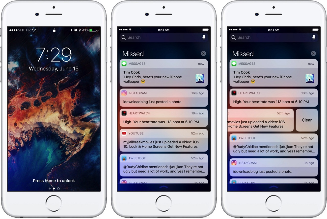
The new lock screen and home screen in iOS 10 will give users quick access to time sensitive information with less interaction than before.
Notifications have been redesigned, with clearer bubbles containing time stamps and the source of the notification. In conjunction with raise to wake, a user need only pick up the phone to see a notification, rather than press a button to activate the phone.
Voicemail transcription
Apple's new iOS 10 transcription function will try to interpret what a caller says in text form. These transcriptions can appear in iOS 10's improved notifications, presenting information without the user needing to unlock the phone.
Coupled with the feature are developer hooks, allowing third-party apps like WhatsApp to display incoming calls on the lock screen, including standard "Remind Me" and "Message" options.
Apple Music renovation
Music selection and discovery for Apple Music subscribers have been given a big boost in iOS 10.
A new library menu gives more graphical and intuitive options for users, and is customizable by the user.
"For You" has been redesigned, and a playlist called the "My New Music Mix" is automatically presented according to a user's taste, with weekly updates made to the suggested tracks.
Alongside My New Music Mix, Apple rolled out an accompanying playlist called "My Favorites Mix," which appears to surface previously played songs mixed in with related tracks. My Favorites Mix updates every Wednesday.
In iOS 10 beta, users can choose to subscribe to both My New Music Mix and My Favorites Mix with an option to automatically download new tracks when they become available.
Other key changes
- Fast camera app launch
- RAW photo support, with capture of RAW images in iPhone 6s and above
- Maps improvements
- Automatic storage optimization
- Flashlight intensity adjustment
- Copy and paste between iOS 10 and macOS Sierra
- Apple Pay on the web
- Revamped news app
... but it's not for everybody
The iOS 10 has left some hardware behind, only running on the iPod touch sixth generation, iPhone 5, iPad Mini 2, and iPad fourth generation and newer.
AppleInsider recommends that users on the low-end of the device list hold off before upgrading, as there is no Apple-sanctioned way to downgrade if the experience isn't positive for the user. We will be testing speed over the first few days on an assortment of the bottom of the list of iOS 10-supported gear in coming days.
 Mike Wuerthele






-m.jpg)


 Andrew Orr
 Amber Neely
 Marko Zivkovic
 William Gallagher and Mike Wuerthele





9 Comments
I wonder how the raise to wake feature works on the privacy front, it seems like something the privacy czars would have shutdown in one minute
Loving the update overall, but not seeing the value in the new tiles design on pop-up notifications versus full-width panels used in iOS 9. The space on the sides of each tile seems unnecessary and distracting. Less simplistic, IMO. Very nitpicky, I know, but I'm a UI designer and I can't help but stare endlessly at details like such.
The music storage optimization feature that allows you to set a MINIMUM amount of downloaded music to keep on your device while automatically removing least recently played files to free space for other files seems like a great solution for those of us who are always running up against the storage limits on the largest capacity device but still want a decent sized collection on the device for dealing with loss of connectivity scenarios. However, after having set it up on both an iPad and iPhone I still cannot figure out exactly what it does! At least this is the case when you have a combination of CD ripped content, Apple Music, and iTunes Match. I was down to less than 5 GB on my devices but when I activated the "optimize" feature iTunes started showing very large amounts of "free" storage, like 32 GB. This lead me to believe that music files that hadn't been played in a long time were marked as free for deletion when needed and thus would increase the free pool. Two days later while taking photos I received the dreaded "not enough storage" message. Hmmm?
Perhaps someone could write an article explaining exactly what the music storage optimizer is supposed to do and how it should handle the phantom storage capacity scenario I encountered.
I also encounterd a situation during shuffle playback where the music player cycled endlessly through song titles but never stopped on a title and played the song. So far this release has been much smoother than the first iOS release that rolled out Apple Music. But obviously there are still a few bugs lurking in the new features that need to be squashed.
I fucking hate it. Feature bloat plain and simple. They've ruined a simple OS with overkill