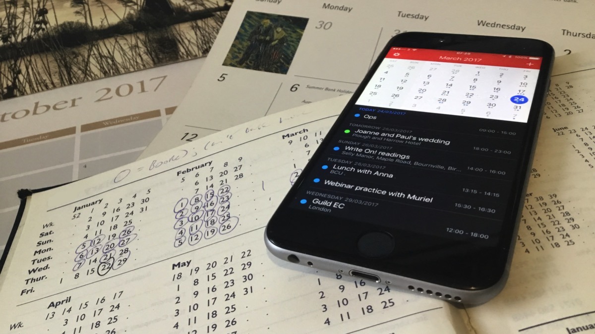
After two months spent examining the calendar app heavy-hitters available for iPhone and macOS, AppleInsider helps you narrow down the choices.
The winner of the best calendar app for every user of macOS and iOS is...not included in this showdown. It's not that we're on a peculiar quest to determine which is the second best, though. Instead, it's because the best app for most people is Apple's own Calendar.
If you're an AppleInsider reader, you're just not most people.
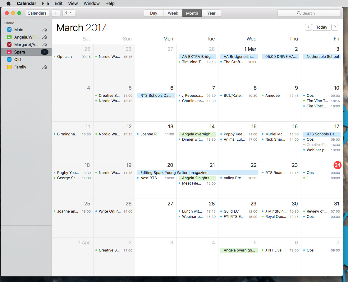
The calendar that comes free with your Mac, iPhone or iPad is robust, easy to use and you know that any event you enter on one device is immediately on the others.
Plus, of all the calendars we tested, Apple's own has the best travel time alerts — the feature that pops up a notification saying you'd better leave for your next appointment now because traffic is heavy. We've swapped entirely to an alternative app but we still rely on Apple's travel time alerts.
Whether you just use your calendar every few weeks to check who's birthday is coming up or you're in it a few times a week, try Apple Calendar and you may very well end up happily sticking with it. If you use your calendar every day and especially if you use it many times a day, though, then there are alternatives that have each have great strengths.
Calendar apps by other companies all aim to do better than Apple's in broadly two ways. The most useful is how they each attempt to make it quick to enter a new event or look up an existing one. Not all succeed but those that do are startlingly fast.
The other broad description you assign to calendar alternatives is that they want to be better designed than Apple's. They want to look clearer, to show you different views of your calendar in more attractive and useful ways.
They also want you to pay.
Each of the recommended apps here range from around five to fifty bucks and we've just about completely ignored the price in every case. You're more likely to drop five dollars to try something out than you are fifty. However, if the $50 one is perfect for you and the $5 isn't, it's not any savings going for the cheaper option, it's just wasting your money.
Plus, the more expensive calendar apps all have trial versions, at least for the Mac, so you can have a good look at what you'd be getting.
All of the apps here, Mac and iOS, actually use Apple's own behind-the-scenes calendar engine. That means you can download, say, Fantastical and immediately be using it with all of your existing events. Try it out and if you don't like it, you could go to BusyCal and immediately be using that — with all your events including any new ones you added in Fantastical.
The fact that they use the same Apple engine meant we could try them all separately, together, in combinations and most of all in anger. We put these apps through real-world testing, living our working and home lives by each of these calendars except the terrible ones we'll tell you about in a minute.
None are so perfect that we recommend you and everyone you know ditches Apple Calendar for them. However, there is one that comes close and there are several that could be the best for you.
If there's no one real winner, though, there are losers. Two of them.
Worst in class
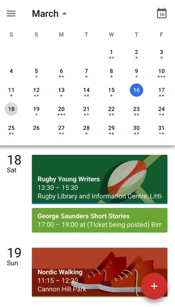
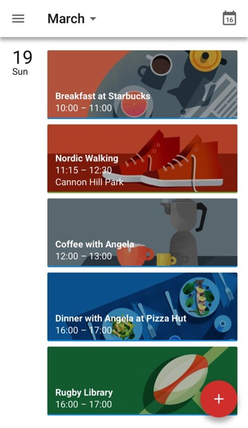
Google Calendar for iOS. The Google Calendar service is powerful, if fiddly, but the free app for iPhone and iPad is a mess.
That's not because we're thinking of security and how Google automatically reads everything to see how it can advertise to you best. In fact, that actually gives Google Calendar at least one feature the others can't match: it can automatically schedule a certain type of event it calls Goals into your week.
It's not because we agree with Tim Cook's opinion that if the service is free then "you're not the customer... you're the product" — although we do.
Rather, we just out and out recommend that you skip Google Calendar for iOS because the app is bad. The kindest thing you can say about it is that at least it's better than the official Google Calendar app for Mac - because there isn't one.
If you use and like the Google Calendar service, your best bet is still to stay with Apple's own Calendar app. That plugs into Google Calendar on both Mac and iOS. It's not ideal — it doesn't support all of Google Calendar's power features — but it works.
The second-place worst app is the calendar in Microsoft Outlook for iOS. Again, just tell Apple Calendar that you have a Microsoft Exchange account and never look at Outlook for iOS again. We examined it so you don't have to.
Envelope not provided by PriceWaterhouse Coopers...
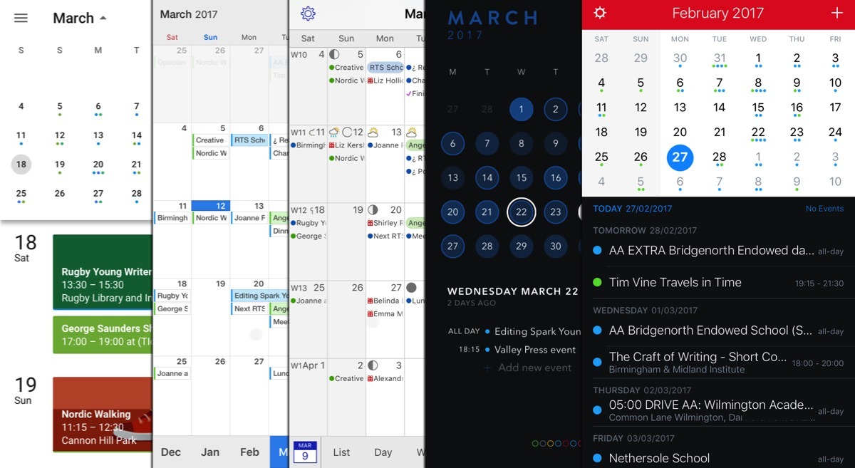
With those out of the way, this is what we've got. The best calendar apps on the Mac and iOS are Fantastical, BusyCal, Calendars 5 and Timepage. Special mention to Informant 5: it's an app for handling a busy schedule and so includes a calendar. The calendar isn't its sole or primary purpose though, and we're looking at apps that concentrate on this.
Most of the apps we've ended up with also include a basic To Do or Reminders kind of feature. If your work or life needs more than Apple Calendar, then it also needs a fully implemented To Do manager. Go look at OmniFocus or Todoist.
Timepage by Moleskine
Timepage by Moleskine belongs in contention here solely because of how great it looks. Don't ever knock the importance of attractive design when it's for an app that you're going to spend a lot of time using.
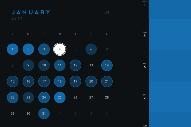
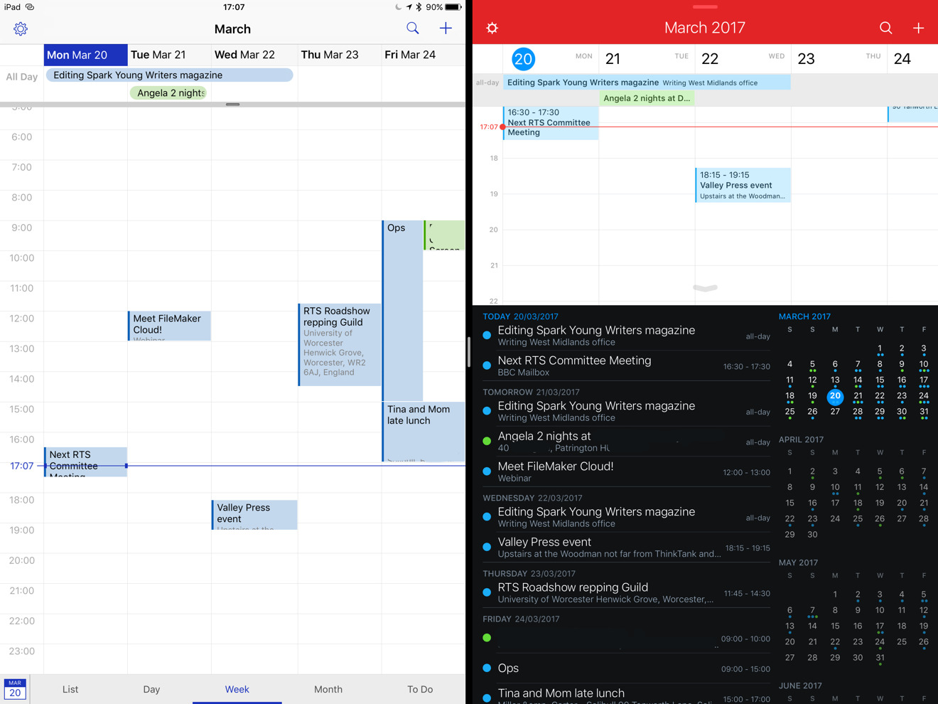
As well as simply looking great, the attractive design means that Timepage is maybe the best for quickly showing you one thing. With a single glance at Timepage, you immediately get how busy your schedule is. You immediately see when you've got a day that can take a new event and you can immediately see when you haven't.
It's a heat map of your month and though we've chosen a soft blue color, Timepage lets you pick your palette the first time you start it. The colors are all the same as Moleskine uses on its paper notebooks and they're all shown off rather tastefully throughout the app.
Timepage, however, works best when you have only one calendar. If you separate your events and appointments into, for example, a Work and a Home calendar, Timepage will show you both — but not at the same time.
It's fast for you to look at this heat map, everything else on Timepage is a little slow. Only a little, but if you're using the app a lot, you notice. The way you add new events is different to Apple's but doesn't save you any time. Starting the app feels slow enough that you don't turn to it to check where you're going next.
Still, that heat map is gorgeous and Timepage is on Mac, iOS and Apple Watch. Timepage 2.0.1 for iPhone requires iOS 9.2 or higher and costs $4.99 on the App Store. The separate Timepage 1.1.1 for iPad requires iOS 9.2 or higher and costs $6.99 on the App Store.
Calendars 5
Calendars 5 from Readdle is not on Mac or Apple Watch, it is exclusive to iPhone and iPad. If you work entirely or mainly from those devices, you'll never even notice. If you're split between iOS and Mac, it's not exactly a burden, however.
It's better to have the same calendar app on all the devices you use but it isn't essential. It's not even that big of a pain because anything you enter or change on Calendars 5 on your iPhone is immediately entered or changed on whatever Mac calendar you use.
Calendars 5 has some clear advantages over Apple's Calendar on iOS. Chief among them is the week view on iPhone which is particularly well designed.
If you look at it in landscape then you get a regular week view with a column for each day and each event gets a box that blocks out that part of your day. Turn it to portrait, though, and you get a unique take on the same information.
Now each day is a row. Instead of a day being a long blank section divided into hours and with these event boxes at the appropriate times, you get this:
Each event gets its own box and has the title and time in it but they aren't spaced out to represent when they are in the day, they are next to each other. It's specifically so that you can see with a glance both what your next event is today — and how visually spot how busy any given day is.
Every calendar app — except Apple's on iPhone — has a week view but none presents it to you in this way.
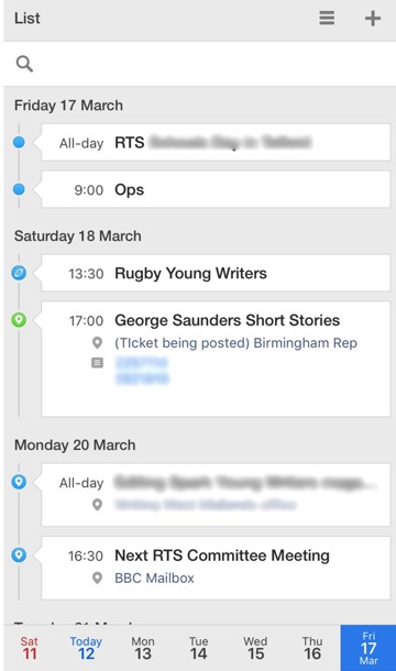
Every calendar app also offers you a list view that simply lists every event you've got coming up, in order. Calendars 5 does it clearly and also gives you a quick way to leap on to list just events from tomorrow, next week and so on.
Entering new appointments is done very well too and it's also fast. It's not the fastest or the best, but it is very good because it uses natural language. Rather than having to schlep through a series of questions such as when the event starts, when it finishes, where it is, you just type. Simply type into Calendars 5 the same way you would tell a friend where you're going: "Lunch with Bert next Tuesday at noon at Starbucks" is enough.
Apple Calendar now uses this natural language too, though, so while it's great to have it, the feature isn't strong enough in Calendars 5 to make the difference on its own. What sells Calendars 5 is this natural language entry plus how quickly you can find what's on your schedule.
Calendars 5 5.10.3 requires iOS 8.0 or higher and costs $6.99 on the App Store.
BusyCal
BusyCal also has you enter new events using this natural language where you just type what you want. It edges out Calendars 5, though, in that it understands words like 'lunch' so rather than your having to say "lunch at noon" it gets it on the first word.
That's still not the best version of natural language that you can get and it's not why BusyCal shines.
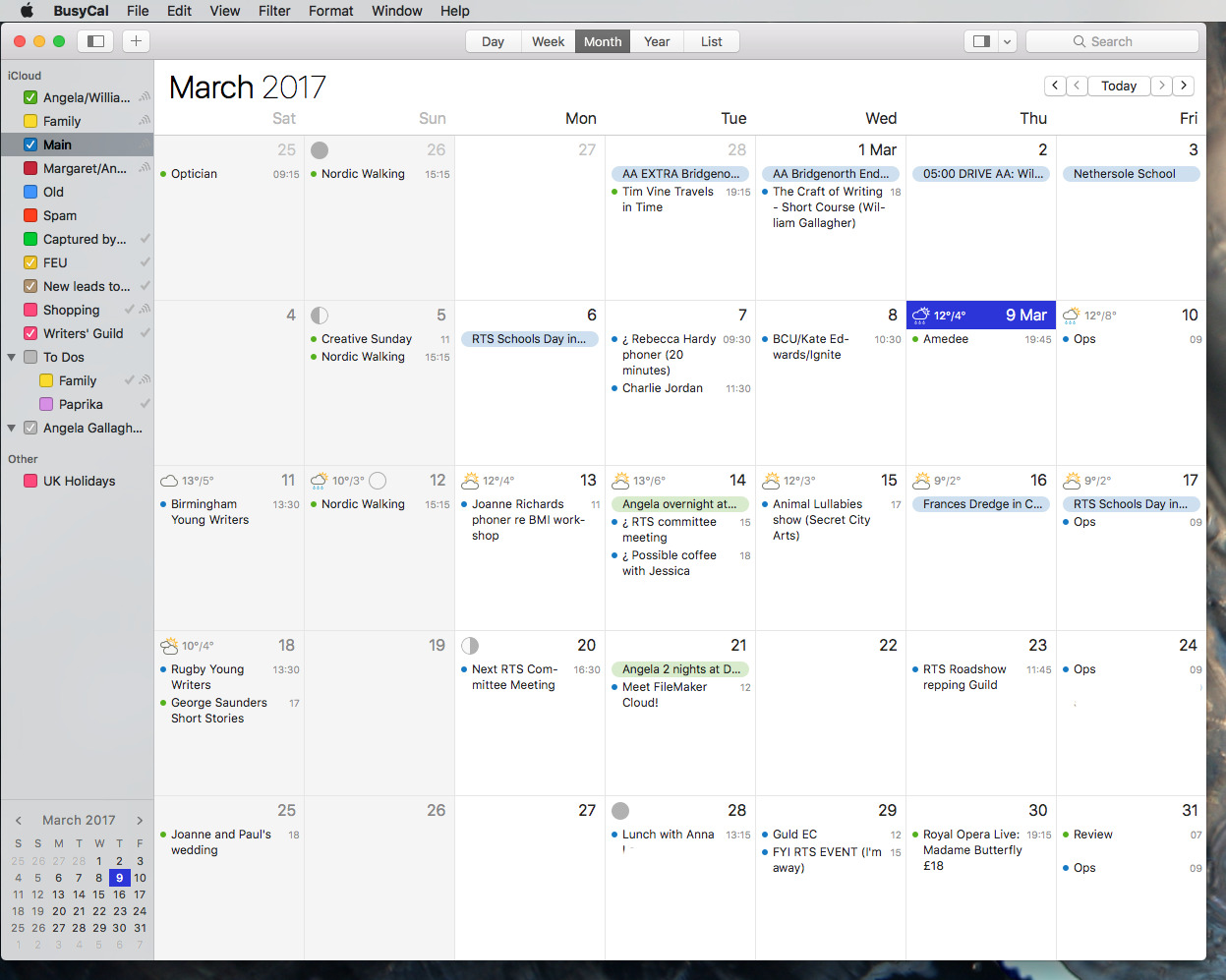
Instead, BusyCal is up there as one of only two best-in-class calendar apps because it is replete with powerful features on both Macs and iOS. It does lack an Apple Watch app, though.
Uniquely, it has its own alarm notifications across Mac and iOS instead of relying on Apple's. That's actually a slight snag as it means cancelling an alarm that pops up on your iPhone won't cancel it on your Mac. Otherwise, though, it's a boon because BusyCal gives you choices right in the notification about how long to snooze the alarm.
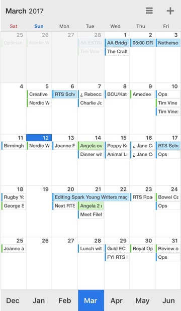
Behind the scenes, BusyCal is particularly strong on working with Microsoft Exchange and in front of the scenes, right in your face, it gives you the weather. If you choose, BusyCal will put a weather forecast in every day of the month view. It will put phases of the moon in there too, if you like.
If you do like that, if it helps you, then BusyCal is your only choice and it is a fine one.
It just feels a little old and that's partly because it is — the people who make it have been doing calendar software for decades, although not this version — and partly because of design. The weather and moon information is displayed more elegantly than we seem to remember from previous versions, but BusyCal can look, well, busy.
You just can't knock how fast it is to enter appointments, you can't knock how well thought out the whole calendar app is.
It also has a version of a feature that after testing so many apps over a couple of months, we've come to find indispensable. From now on, if a calendar app doesn't have this feature, we're not interested. It just won't sound that special: it's simply an extra menubar app in the Mac version.
We keep saying that natural language entry is great because you just type the way you'd tell a friend. Imagine, though, that this friend or colleague is on the phone to you right now and needs to know if you're free for a meeting next Monday at 9 a.m. With almost every other calendar app on the Mac, you have to launch the application, find the day and look.
That's quite quick if the day you're looking at is in the current month so it's right in front of you. It's very quick if the calendar app is already open.
Yet compare that to what BusyCal can give you. Whatever you're doing on your Mac, whatever you're working in, when you get a call like this, you tap a key and BusyCal's menubar app pops down. From that app, you can see what you've already got on your plate with a view of your month marking out busy days. You can see the detail of what's coming up with a scrollable list of your events underneath that.
So you can add that colleague's meeting right there — using natural language again — without switching to BusyCal itself.
Use that for a couple of days and you're never going back. However, you might go forward: as great as this is, the same feature is done better in Fantastical.
BusyCal 3.1.5 requires OS X 10.11 or higher costs $49.99 if you buy it on its own. You can get it from the Mac App Store But you're better off buying it direct from the developer as that will get you update deals in the future and a discount deal on BusyContacts right now. BusyCal and BusyContacts for Mac are each $49.99 but you can buy them together in a bundle, just like the old Now Up-To-Date and Contact, for $79.98.
There's no bundle on iOS because unfortunately there is no iPhone or iPad version of BusyContacts as yet. Instead there is solely BusyCal 3.1.2 which requires iOS 9.0 or higher and costs $4.99 on the App Store.
Fantastical
If there were one winner here, if there were one app that is the closest to perfect for users who need more than what Apple's Calendar offers, then this would be it: Fantastical for Mac, iOS and Apple Watch.
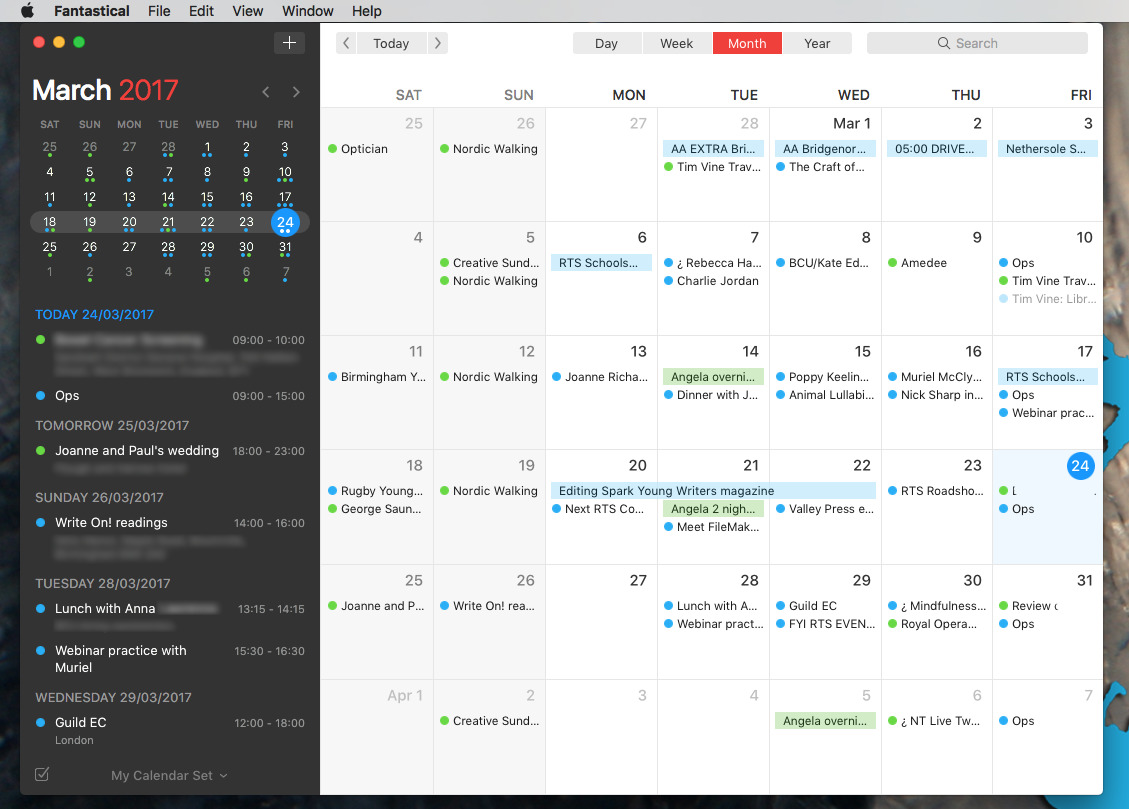
Take that menubar app, for instance. As good as BusyCal's version is, Fantastical's is better because it's not an addition, not an adjunct to the main app. Fantastical in the menubar is a full application — because that's originally all that Fantastical was.
Now that it has a fuller Mac version, it's still got all its features in the menubar and that means you can do everything there. As well as seeing what's on your plate for the next few days or month, you can easily search across every event you've got. BusyCal doesn't let you search at all.
You can also choose to show or hide your Work and Home calendars so you can see everything or concentrate on one.
Then when you do want to add a new event, you've got Fantastical's natural language feature right in the menubar — and it is the best implementation of this.
Other apps are catching up, including Apple's own, but what makes Fantastical stand out is both that it understands what you're typing and how it shows you it does.
As you type in Apple Calendar, for instance, that app shows you what it thinks you mean by writing underneath where you're entering your text. So if you type Lunch in the Quick Entry box, immediately underneath it you'll see the word Lunch repeated and the words "Today 12:00 to 13:00". Type "Lunch Tuesday" instead and Apple Calendar writes next Tuesday's date instead of "Today".
BusyCal, on the other hand, does the same thing more in a way that is more like filling out a form for you. Where all calendar apps used to have this thing of asking for the date, the start time, the end time and all that, BusyCal lets you type a sentence and it figures out which bits is the date or start time or venue and pops that information into the right boxes.
What Fantastical does that is so much better is that it visually shows your event. On Mac and iOS, the moment you start writing a new appointment, Fantastical pops a box into your month view right in front of you. When you type "Lunch Tuesday", it moves that box over to Tuesday. When you say "Lunch Tuesday at 1pm" it shunts the box from noon to 13:00.
The fact that you can see it doing this as you type means it's so much more clear when something's wrong, when the event's not on the day you meant. The fact that there is this fact means that you know you'll catch any problem so you end up trusting your calendar more.
It's not perfect, though. Swapping between the month, week and other views on iOS is a matter of swiping in the right direction and it makes absolute sense once you're used to it. We just seem to spend most of our time in one view so when do want to swap, there's a moment's confusion over how.
Also on the iOS version, you have to know to pull down on the calendar to get to a search box. That's not some poor Fantastical exclusive, it's more an iOS 10 feature that you can see in other apps such as OmniFocus. The fact that it's reasonably common doesn't make it any better, though.
On all versions we'd like to see the list of events somehow mark out what days are empty as well as those that are full. That's the one thing where we find Fantastical's design unhelpful: rather than leaping out at us as clearly as we'd want, we have to remember to look closely to get the information we want.
Fantastical 2.8.3 requires iOS 10.0 or higher or macOS 10.11.5 or higher. It costs $4.99 on the iPhone and $9.99 on the iPad.
The Mac version of Fantastical 2.3.3 costs $49.99 on the Mac App Store.
A choice that is no choice
We said that there's no one winner and then we went on about Fantastical as if there were. It's just that we think it has the edge because of its superb design, and in particular, how much you can do with that menubar app on the Mac. We've worn out that keyboard shortcut since we first tried it.
It is still the case that even if you are a power user of calendars then you should stick with Apple Calendar until you find it lacking. Even with all the words we've written about calendars, the choice is still an intensely personal one, and this series has been written with our particular needs and ecosystem choices in mind.
When you hit the wall with Apple's Calendar, you should look at all of these apps, but get the trial versions of BusyCal and Fantastical for Mac.
These are the two heavyweight calendar apps for Apple users. Get the free trials for their Mac versions first, then splash out five or six bucks on their iOS versions.
We're being pretty fast and loose with your cash here, but it's worth it. We thought we were heavy users of our Apple Calendar, yet over the last eight or nine weeks of studying these, we've found our scheduling precision has gone up.
Somehow, because alternatives are so fast to add new appointments and to look up existing ones, we found we were adding more. We slotted in more meetings which might be a good or a bad thing, but we also made more time for healthy pursuits as a result.
Once we had taken this time to see what alternative calendars could do, we found they did a lot and it ultimately changed how we work.
 Mike Wuerthele




-m.jpg)




 Amber Neely
 Malcolm Owen
 Christine McKee
 Chip Loder
 Marko Zivkovic
 Wesley Hilliard


22 Comments
I used to be an Apple Calendar user, and for me it had its heyday when it had crisp, good contrast items and the to-do list on the side in week view (the only view I use). But then the to-do list went away to become a separate app and the contrast was removed. It made it a useless blur for me, so I went out and tried other calendar apps. Busycal came out on top and I've been using that ever since. Unfortunately, Busycal has gone along with Apple in lowering contrast, but luckily they didn't take it as far as Apple did, so I can live with it. The combo with Busy Contacts is perfect for me.
BTW, I don't use BusyCal on iOS. WeekCal is my choice there because of its high contrast and dark mode.
I've used Moleskine's Timepage since buying my first iPhone three months ago (used Moleskine's notebooks and sketchbooks for about 20 years too) and love the app... and the phone (my first portable)... and the physical note/sketchbooks.
My one make or break feature: A bunch of completely flexible reminders. And I've found exactly one app that does it, Awesome Calendar. Ugly as f*** but does the job that no one else does. For that reason, I use TimePage solely to flip through coming weeks.
And a feature that I'd like (although reminder apps may do the job) is a reverse calendar reminder. Something where I schedule an appointment and I get daily reminders. What I want is something unified where when I schedule a deadline or due date, I can schedule daily reminders from a given date up to the due date -- remind me every day from now to then.