What is Apple's True Tone technology on the 2018 MacBook Pro, and why does it matter?
 Malcolm Owen
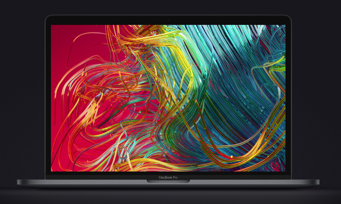
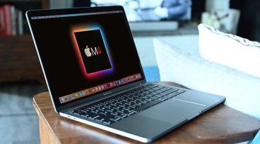
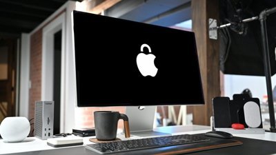
Apple's MacBook Pro refresh on Thursday revealed Apple has incorporated True Tone technology into a Mac's display for the first time. AppleInsider sheds some light on the color management system that aims to keep the image the same for the user, wherever they are situated.
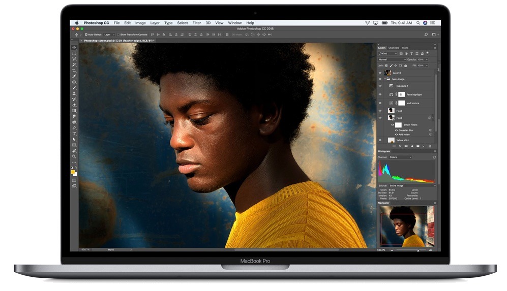
The announcement of the 2018 MacBook Pro line included a number of changes to the notebook lineup, with the main changes including support for up to 32GB of memory, 8th-generation Intel Core processors, and up to 4TB of SSD storage. Other important changes include a new quieter keyboard, the use of the Apple T2 chip for enhanced security, and the addition of "Hey Siri" support.
As part of the updates, the display also received some attention. Alongside the 500 nits of brightness and P3 wide color gamut support, the display also uses Apple's True Tone technology, marking its first appearance in an iMac or MacBook display.
What is True Tone?
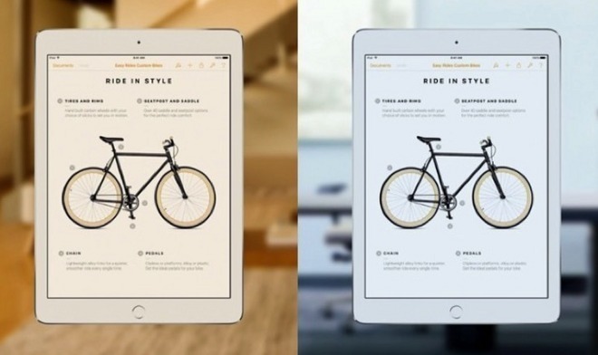
First introduced in the Apple ecosystem with the 9.7-inch iPad Pro, True Tone is Apple's system for keeping the white balance of the display the same in appearance to the user, regardless of the ambient light around the screen. When the device is moved from one environment to another, the screen is perceived by the user to be the "same" at all times.
Normally when the ambient light in an environment changes, the screen's white balance and general coloring appears to change, such as becoming more blue or orange, even if the display's settings are kept the same. This is actually a problem caused by the user's own vision, due to observing the change in the rest of the environment's lighting conditions and adapting to that, while also noting the "changed" display.
True Tone combats the issue by using four-channel sensors to detect the ambient light that can affect the perception of the display. If a change is detected, such as the user moving an iPad Pro from a room lit with cool blue-ish lightbulbs to the more-yellow light outside on a sunny day, the screen automatically alters what it displays to match, in turn keeping the screen comparably similar despite the differing light situations.
Why use True Tone?
For the most part, True Tone is meant to make the experience of using the device more comfortable for the user. Matching the environment's light scheme can help prevent any strain or discomfort to the user viewing a suddenly more blue or orange screen, one that also constantly changes if they are moving around.
Another reason is to minimize the amount of blue-colored light a user could be subjected to during their working day. It is believed overexposure to blue-toned light can interrupt a user's sleep patterns.
The color-matching also helps create a situation where the user's perception of a color on the screen is the same regardless of their surroundings. Apple called this a "paper-like" viewing experience, as it is a similar effect to seeing a drawing on a piece of white paper, and how it appears under different lighting situations.
Will it affect users in creative professions?
There may be some concern for users in industries where visual appearance is important, such as video editing, illustrating, and photography. These creative professions already have to deal with issues in color, such as making sure different screens display the same image with identical colors.
On Apple systems, this has largely been managed by the color management tool ColorSync, which helped keep color representation accurate between desktops. This only solved part of the problem, as while the colors displayed on connected screens could be accurate, the problem of human perception comes back, as it doesn't take into account the environment and may appear "wrong" to the user.
As True Tone handles the environmental lighting problem, this should make it easier for user to see their work in different conditions and perceive it in the same way. As a technology specifically affecting the display, it also does not interact directly with apps or files in any way, since it only changes what the screen eventually shows to the user.
This also potentially allows creative users to work under a variety of lighting conditions, without vastly affecting color-related tasks. For example, when applying color to an illustration, the same "red" color perceived in one environment will still appear to be the same "red" if the user opens the file up under different conditions.
Can I try it out?
Depending on your investment into the Apple ecosystem, you may be able to try out True Tone for yourself, before shelling out for the 218 MacBook Pro. It has been available for some time in the 9.7-inch iPad Pro, as well as the 10.5-inch iPad Pro and the 2017 12.9-inch iPad Pro.
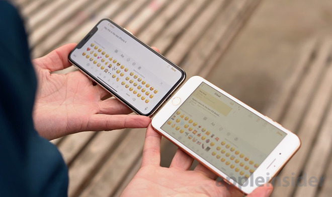
You can also try it out if you or someone you know owns one of Apple's current-generation iPhones. The iPhone X, iPhone 8, and iPhone 8 Plus all use True Tone in their displays, which can be enabled and disabled from the Settings menu.
Considering its appearance in the 2018 MacBook Pro, as well as rumors and speculation, it's possible that Apple will incorporate the technology in other Pro-grade product displays in the future, like the forthcoming Apple Pro displays.
 Chip Loder
 Andrew Orr
 Marko Zivkovic
 David Schloss
 William Gallagher