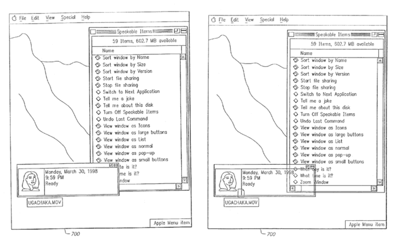
In the 16-page filing made this March, the Mac maker explains that when operating system windows overlap one another, they tend to hide valuable information such as other windows or icons.
"What results is that the particular information the user wants to obtain may be hidden behind several layers of windows and may be difficult to access; when an icon is hidden by another window it is temporarily not accessible," the company says. "This has been referred to in the industry as the 'window overlap' problem. There are several instances where window overlap problems routinely arise in the usage of conventional user interfaces."
For the purpose of the particular filing, Apple chose to focus on floating windows that provide feedback information to a user regarding a particular operation, which are often "a useful, yet sometimes annoying phenomenon." As such, it proposes to overcome this problem by providing such floating windows with varying visual and manipulative qualities.
"For example, a floating window that has not been updated with new information within a predetermined time period will become translucent so that the underlying window or windows are then visible to the user," the company said. "Other actions or omissions may also serve as a trigger for graduated translucency of windows [...] Moreover, as the floating window becomes translucent, the user can click-through to the underlying window(s) to interact with its contents. When information on the floating window is updated, it can return to being opaque until the predetermined time period has elapsed again without new information being presented."
More specifically, Apple explained that a floating window could become translucent via a series of steps. For example, the floating window may initially be displayed as completely opaque and then, after the predetermined time period expires, have its opacity reduced in steps of, for example, twenty-five percent.
The floating window could also have a lower limit of translucency as well. Each of those parameters could be set by the application which generates the floating window or be set by the system or the user.
"By applying graduated visual translucency, as well as manipulative translucency, a user is able to receive the benefits of an information-bearing floating window without having to move the floating window to reach underlying content," Apple added. "Moreover, the change in visual translucency provides a focus mechanism to the user who will readily associate a return to opacity with new information being presented on the floating window."
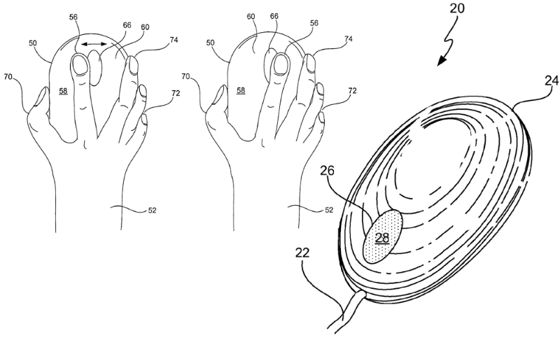
Separately, Apple also continues to strive for a patent on a version of its Mighty Mouse that would shed the traditional scroll ball for a completely optical scroll sensor build into the device's housing.
Apple originally filed for the patent back in December of 2006 and later followed it up with another filing that described a Mighty Mouse with an enclosure capable of sensing and distinguishing between multi-touch like gestures.
