While Lion continues a trend toward user interface simplicity, it's still getting powerful new features. Among the improvements to the Finder are new search suggestions for refining queries, as well as ways to view items the file system.
The new features add functionality without additional complexity, allowing users for the first time to merge the organized groupings of items in list view with the easy to visualize icon view or the rapidly navigable column view that Macs inherited from NeXTSTEP.
Finder smart search
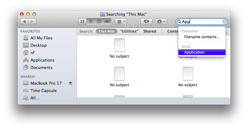
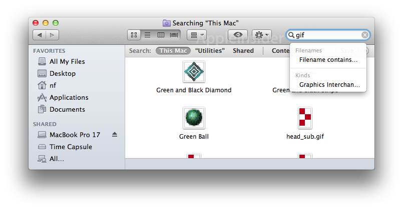
The Finder's integrated Spotlight search is getting smarter are more helpful, with queries providing related suggestions for narrowing a search. Search for "app" or "gif" and the Finder offers to show you just files of that type.
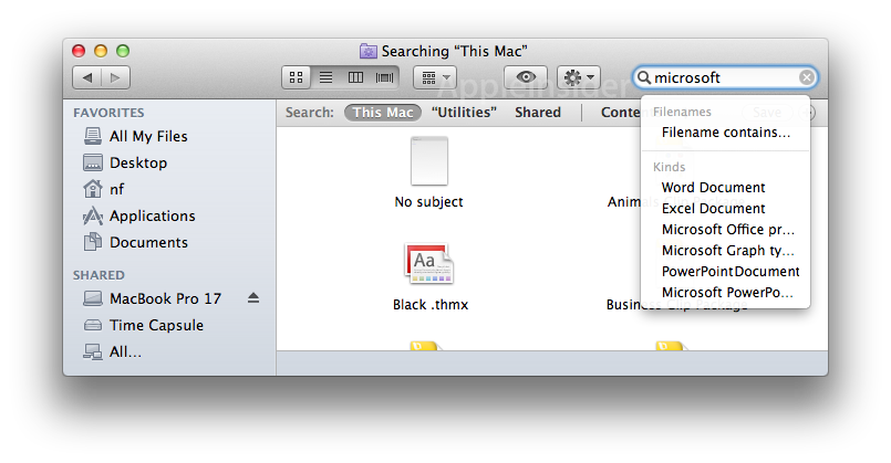
Search for "Microsoft" and it will offer to narrow your results down to specific Office file formats.
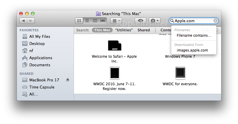
Search by a domain, such as "Apple.com," and you'll get the option to search for downloads from that site.
On page 2 of 2: Finder view organization.
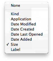
A new "item arrangement" view control in the Finder can group items by their file type kind, their primary application (default app that opens them), their modification or creation date or the date they were last opened or added, their file size, or their user assigned Finder label.
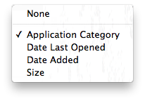
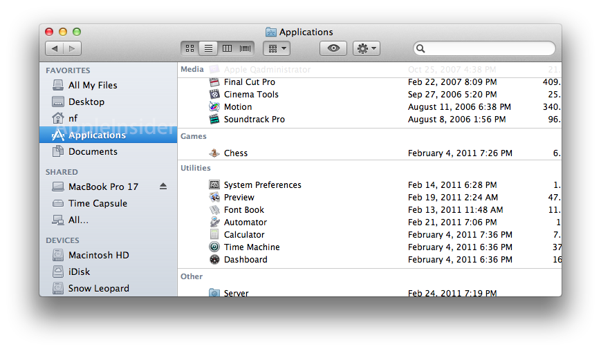
Within certain types of files, the selection changes to fit; when viewing applications, for example, the Finder presents an "Application Category" option, which groups apps by their Mac App Store category (such as Games, Internet, Media, Productivity, Utilities, or Other for unknown apps).
These organizations serve to integrate the traditional list view (which presents items with sortable columns of metadata) with either the classical Mac icon views (presenting boundaries between items' kinds, size, dates and labels), the NeXT-originated column view (similarly grouping items into related categories as selected by the user), the list view itself (creating a fixed grouping of items with the rest of their metadata also visible), and even Cover Flow, which merges the list view with a graphical representation.
Item arrangement popup menus
The popup control, adjacent to the view settings, changes depending on the files being arranged. On the left, general file arrangement options; on the right, arrangement options specific to viewing apps.
Item arrangement within icon view
When in icon view, the item arrangement control separates icons into rows of Cover Flow navigated items. Below are icon views arranged by file size, creation date, and app icons arranged by category.
On page 3 of 3: More Finder view organization: list, column and Cover Flow views.
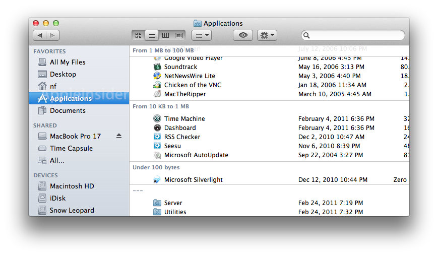
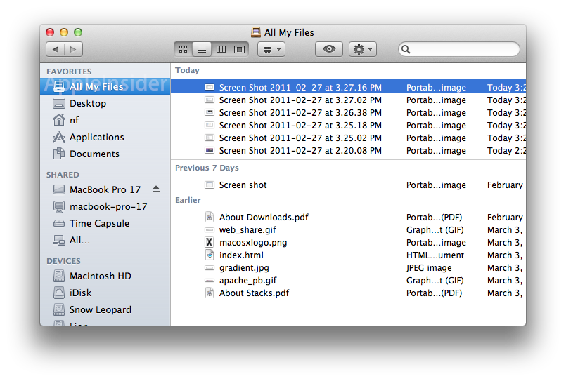
In list view, item arrangement locks items into bucket groupings without column search, but still shows the normal metadata for the items. Below are list views arranged by file size, creation date, and app icons arranged by category.
Item arrangement within column view
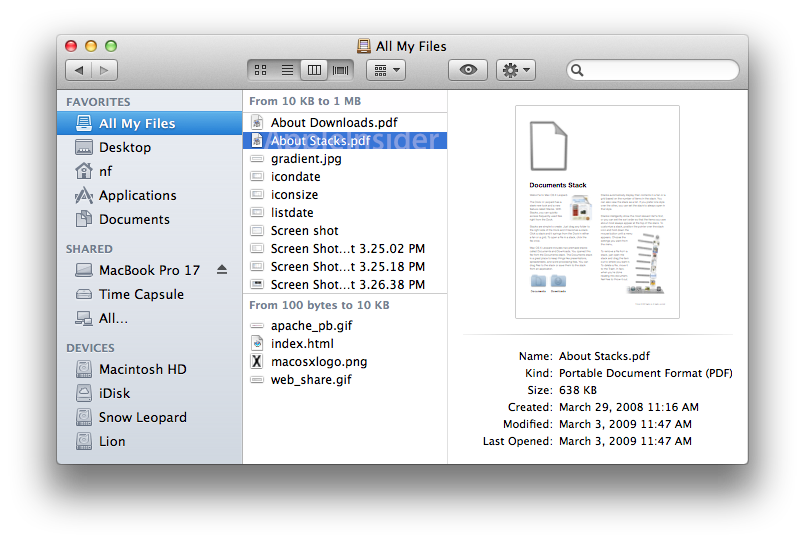
In column view, item arrangement segments each column into groupings, with multiple columns each grouped as desired. A prominent preview is displayed in the final column. Below is a column views arranged by file size.
Item arrangement within Cover Flow view
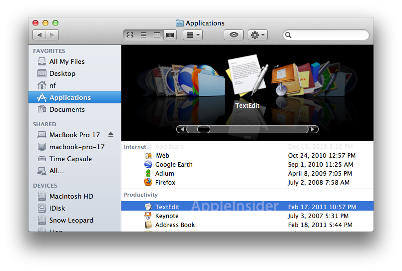
In Cover Flow view, item arrangement segments each listing into the desired grouping, just like the normal list view, with a Cover Flow depiction on top. Below is a Cover Flow view of apps arranged by their category.
