Inside OS X 10.8 Mountain Lion: Dashboard gets iOS-style widget organization
 AppleInsider Staff
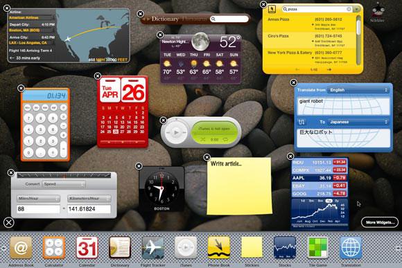
Last updated
Dashboard, first introduced in OS X 10.4 Tiger, originally presented widgets in a drop down layer that appeared to float above the desktop. Additional widgets could be selected from a Dock-like perforated steel plate interface that appeared from the bottom of the screen.
While a wild divergence from standard window behaviors, Tiger's Dashboard layer kept widgets (essentially self contained, simple web applets built using JavaScript, CSS and HTML) isolated in their own environment so they wouldn't consume resources when idle, yet could still be quickly accessed and dismissed similar to Desk Accessories on the original Macintosh in the 1980s.
In OS X 10.5 Leopard, Apple introduced Spaces, a virtual desktop feature for managing multiple screens each containing its own environment of active apps and their windows.
In last year's OS X 10.7 Lion, Apple made Dashboard into a Space by default. Instead of depicting Dashboard as a special mode that whisks in above the desktop as a visual overlay, the widget layer is simply a panel that slides in from the left (evoking the left-most strip of audio playback and screen orientation lock controls accessible from the iOS multitasking bar).
Combined with Mission Control and Full Screen Apps, this intended to make Dashboard easier to conceptually work with, and easy to invoke with a four fingered swipe to the right. However, Dashboard retained its oddball widget picker, something that initially seemed to be visually related to the iOS Home page and Mac Dock, but which behaved unlike either.
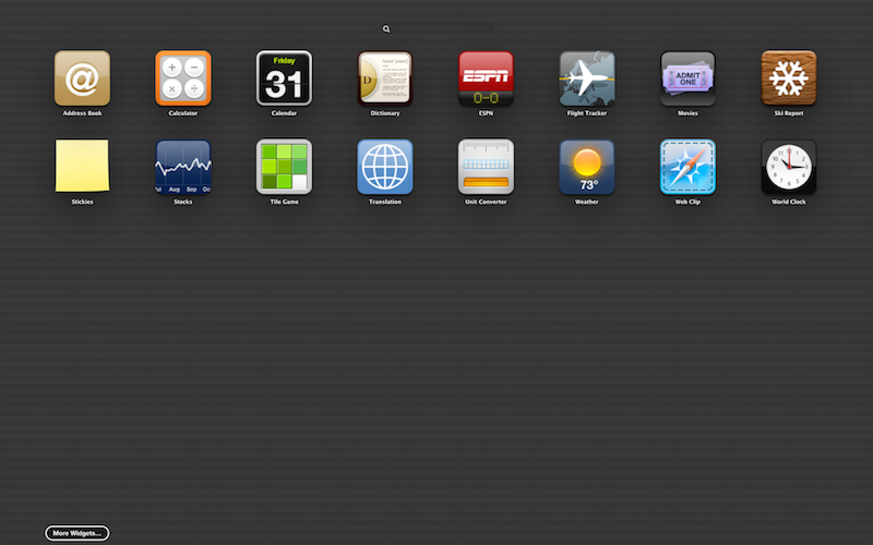
In OS X 10.8 Mountain Lion, Dashboard get iOS-like widget management parallel to OS X 10.7 Lion's Launchpad manager for Mac apps. Rather than a single "plus" icon for bringing up a widget picker strip, Mountain Lion presents the Dashboard Space with a plus and minus icon.
Clicking on the Plus icon brings up the Launchpad-like Dashboard widget screen. Just like Launchpad (or the iOS Home screen), you can now drag icons on top of each other to create organizing Folders. Rather than dealing with a "widget manager," you can directly search for widgets from a field at the top of the widget page.
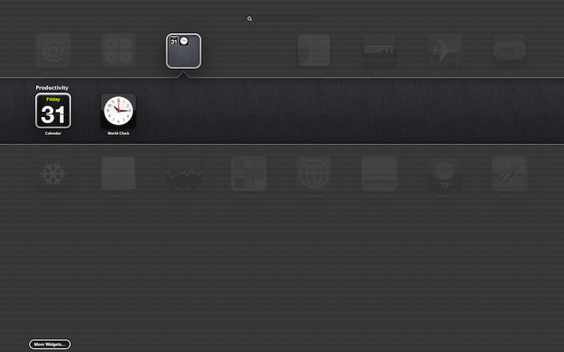
Dragging World Clock onto the Calendar icon automatically creates a "Productivity" Folder, which works and looks just like Launchpad and iOS.
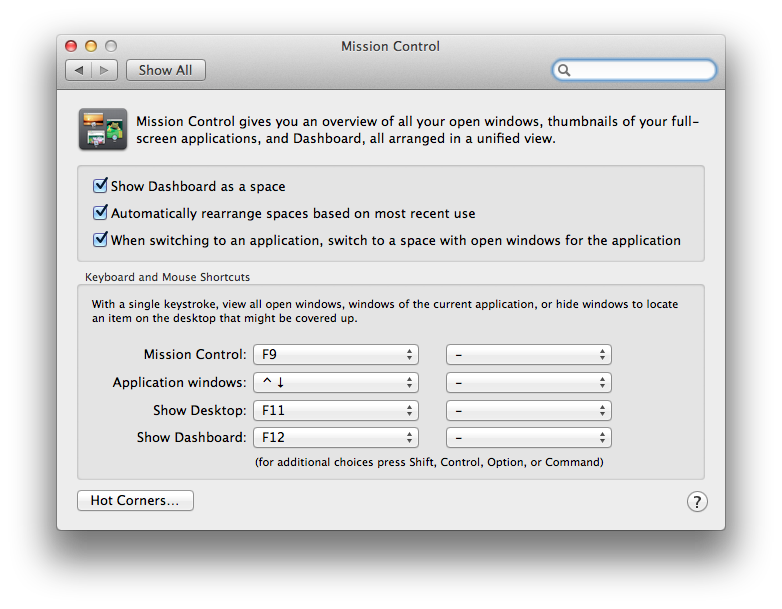
There's still the option, in the Mission Control panel of System Preferences, to not "show Dashboard as a space." When you select this option, Dashboard appears as a translucent overlay as it did in Tiger.
Dashboard can be invoked by a keyboard shortcut or by launching it from its Dock icon or via Spotlight. The only thing really missing from Dashboard is a featured connection to the App Store; to get more widgets, Apple simply links to its Dashboard website.
It wouldn't be a stretch to see Apple add Dashboard widgets support to a coming version of iOS, adding both a store to sell widgets to both iOS and Mac users and iCloud support to sync your widgets installations between all your devices.


 Amber Neely
 Thomas Sibilly
 William Gallagher
 Malcolm Owen
 Christine McKee


39 Comments
I have no use for Launchpad as a way to find apps — don't suspect many longtime or "power" users do — but this addition to Widgets is nice. Much better than the previous setup and exactly what this UI within a UI needed. Now if only they would invest in some updated Widget APIs and refine the rest of Dashboard while they're at it.
Ah, nice. I'll repost this here because it's relevant.
Every update.
Every update since 10.4.5, I have complained to Apple about Dashboard.
Every single time a point release comes out, I install it and test the Dashboard's weather widget.
Every single time, from 10.4.5 to 10.8 Developer Preview 1, it has remained broken.
I drag my widgets where I want them to be. Exactly where I want them to be. And then the next time Dashboard reloads, they move. They always move. They always move down. It's always down. NONE of the other widgets that come preloaded or which I have ever installed have done this. They stay right where I leave them. Weather always moves. Always moves.
They don't care about Dashboard at all.
Looks like the artificial dividing line between widgets and what we all simply call "apps" now, is simply disappearing.
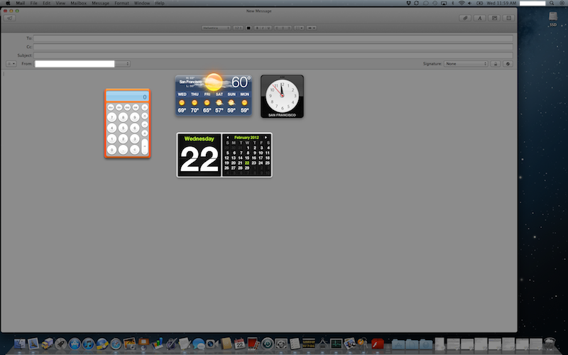
Am I the only one in thinking that it would be nice if these widgets could be used on top of the existing UI? If I need quick access to say a calculator then I should be able to press the hot key to bring that up while still being able to use all the documents on hand. Maybe that's why I don't use them. It takes an extra minute to launch the widget then to get back to what I am doing, then to maybe use the widget again. In that time I could just launch the Calculator app and it will stay open till I am done with it.
I do like how the Stocks widget is redesigned to be like how the Stocks app in iPhone OS has been since 2007, but it should definitely support swiping the bottom section instead of clicking on those tiny arrows.