Affiliate Disclosure
If you buy through our links, we may get a commission. Read our ethics policy.

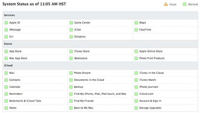
Apple's refreshed system status page tracks services, stores and iCloud

Apple's new system status page. | Source: Apple

Last updated

Apple on Thursday rolled out an update to the iCloud status webpage, which now covers 32 online services and a graphical representation of outages as they occur on a sliding timeline.


Unlike the service's previous iteration, Apple's revamped system status page offers a comprehensive look at most of its critical online assets, including Messages, iTunes and everything iCloud. As noted by the webpage's title, the system tracks "Apple Services, Stores, and iCloud."

Also added is a new interactive timeline at the bottom of the page that allows users to scroll through past few days to see when problems were recorded and for how long. Currently the timeline only goes as far back as Dec. 11, likely the date on which data collection began.

Timeline

Overall, the update is a huge improvement to its predecessor, which only gave brief descriptions of outages as they occured without an easy way to track performance over time.

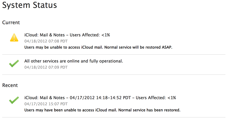
Apple's previous iCloud status webpage lacked information and was slow to update.

While the newly redesigned page is a welcome improvement in keeping users up to date, a more pressing issue is the recent series of outages suffered by Apple's cloud-based services. The latest downtime came in November when an issue hit U.S. iMessage and FaceTime users. It was the fourth such outage in the three months, coming after an incident in September and two in October (1, 2) that affected both iOS and OS X Messages users.

10 Comments

tallest skil 15 Years · 43086 comments

Quite nice. I rather like this. And a timeline of past down-ness? Really good. Not many companies would show that.


Recently I've come to like hatching in UI design, and I like how the hatching looks here. It's subtle, but it's well done.

SpamSandwich 20 Years · 32917 comments

But is there an app for this? A link within another app? How can this be used easily by customers? Just a bookmark in Safari? That seems a bit retrograde.

philboogie 16 Years · 7669 comments

Looks very slick indeed, I agree. Recently I installed Little Snitch, and it shows that a lot of Apple Services, like these, are run on Microsoft Azure and .Net technology. I wonder what else they use. I know there'r some Sun servers used, but is that it? Or are there more suppliers, even if it's just to balance the risk of possible outages?

gazoobee 16 Years · 3753 comments

It looks great, but still doesn't mean much in that even a small fraction of a percent of downtime to any of those services is still a huge number of inconvenienced people in absolute numbers. For instance the email sometimes goes down and if previously you could find any mention of it at all, it would say something like "less than 1% of users affected," but that can still mean (and often does) that whole countries, states, or provinces are without email for the day. They would do better to indicate the conditions locally instead of globally. Do I really care if 99.5% of users are okay if the entire city that I'm in can't currently use the service? Users in even more far flung locations than I could be without *any* service for days before it even showed up as the tiniest blip on this graph.

tallest skil 15 Years · 43086 comments

Originally Posted by Gazoobee 
…even a small fraction of a percent of downtime to any of those services is still a huge number of inconvenienced people in absolute numbers.


That's true for any service from any company. What, do you expect them to have a webpage up like,


Adam A. Aadamson

David P. Barnes

Julia M. Baughmann

Ted D. Bedford

Marjorie E. Oliver

Jonathan E. Zilz


Your [service name here] is down. Sorry, peeps.