The company behind the Pebble Kickstarter project showed off a number of prototype and final versions of its smart watch product at CES this week, with consumer units shipping out to backers on Jan. 23.
Disclosure: The reporter is a Kickstarter backer of the Pebble project.
It was announced on Wednesday that Pebble will start shipments on Jan. 23, and we had a chance to look at the unit up close as the company invited backers attending CES to join them in their suites at the Venetian Hotel to see the long-awaited timepiece.
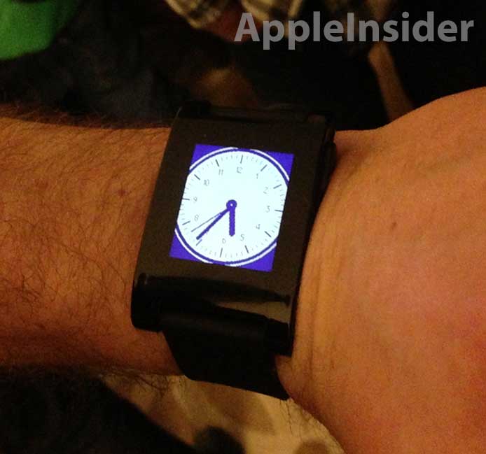
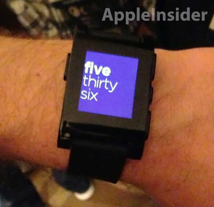
Looking at the Pebble's hardware, the side control buttons were responsive and the screen looked crisp, with an evenly-diffused backlight that turns on with a tap of the bezel.
Pebble's menu back button and charging port are located to the left of the watch face.Users can control the e-paper screen with two scroll buttons and one selection button on the right of the watch, while a single larger button on the left is used as a "back button" for the watch's UI. Pebble's polycarbonate shell houses an accelerometer used to operate the backlight, which is activated by tapping on the bezel.
The selection and function buttons are located to the right of the watch face.Sample text messages and emails pushed from phone to watch quickly and without fault. The watchband wasn’t overly stiff (as some rubber watch bands can be) and the company is offering a longer length band to backers for $3 if the one provided is not suitable.
After a brief amount of wrist time, I can say that handling the watch was a rare moment when a product feels like it’s worth more than what you paid for it. The UI is responsive, the text is clear and the materials are of top quality.
While the software selection is currently sparse, and the SDK doesn’t allow for much more than creating new watch faces, Pebble still holds a lot of promise. The company said it will be rolling out new software versions every few weeks, including an update for IFTTT support that will hit soon after launch.
Other future developments aim to take advantage of the built-in sensors, like a compass and the aforementioned accelerometer. An example would be turn-by-turn directions based on data taken from Pebble's compass rather than the phone's sensor.
 Victor Marks



-m.jpg)


 Charles Martin
 Christine McKee
 Wesley Hilliard
 Malcolm Owen
 Andrew Orr
 William Gallagher
 Sponsored Content




44 Comments
I prefer my 6th generation iPod nano watch. Better looking clock. The only limitation is no speaker.
I like what they are trying to do but there is nothing about the current design I would consider buying. It's too limited, too thick, and simply looks cheap.
Looks really ugly. Sorry, but in today's world of smartphones, the only purpose a watch serves is as a fashion statement. This makes a little bit of a fashion statement because of the coolness factor, but the extreme ugliness just ruins it. The iPod Nano makes as much of a "geeky cool" fashion statement, and is pretty good looking to boot.
Looks really ugly.
Sorry, but in today's world of smartphones, the only purpose a watch serves is as a fashion statement. This makes a little bit of a fashion statement because of the coolness factor, but the extreme ugliness just ruins it.
The iPod Nano makes as much of a "geeky cool" fashion statement, and is pretty good looking to boot.
Not a sports-type, are you?
I like what they are trying to do but there is nothing about the current design I would consider buying. It's too limited, too thick, and simply looks cheap.
Sadly, I entirely share that statement. In a world where this dream exists: http://www.kickstarter.com/projects/1655017763/cst-01-the-worlds-thinnest-watch ... competition is heavy.