Developers viewing their applications on Apple's official site on Tuesday were surprised to find that their icons are now being displayed with square edges, rather than the usual rounded corners.
The changes, pointed out to AppleInsider by numerous developers, have been interpreted by some as a sign of the anticipated iOS 7 user interface overhaul for iPhone and iPad Apple is expected to unveil at next week's Worldwide Developers Conference.
Developers have always been asked to upload their application icons as a square with "sharp corners," but Apple's system would then automatically apply an effect that would create rounded corners. Application icons then appear the same way when they are uploaded to the App Store, or are downloaded and installed to a user's device.
But as of Tuesday, those rounded corners no longer appear on applications when viewed in Apple's official developer portal website. It appears whatever filter was in place before has been dropped, with less than a week to go before Apple's scheduled WWDC keynote.
The changes may not necessarily mean that Apple is planning to adopt square icons for iOS 7. Instead, the company could simply be replacing or tweaking the filter that was previously automatically applied to icons once they were uploaded by developers.
The square icons also come just a day after Apple launched its official WWDC 2013 application for iOS. Some have interpreted the design of the new software as a potential sign of changes to come in iOS 7.
Specifically, in contrasting the new WWDC 2013 app with previous years' applications, the design is decidedly "flatter," as can be seen below:
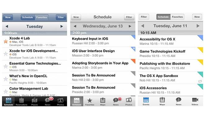
The recently released WWDC 2013 app for iOS appears to sport the same flat design aesthetic that is said to be forthcoming in the next version of iOS. Twitter user @yuize recently posted an image that shows the evolution of the WWDC app's design from 2011 to 2013.
Whereas the 2011 version sports a number of gradients and elements that make the interface options "pop," the 2013 version is much more subdued, with much of the "gloss" of the app having gone. The look is generally in keeping with the aesthetic seen in what is thought to be an early screenshot of iOS 7, which shows all of the stock Apple icons having lost that same faux-3D effect.
The flat look is said to grow out of the preferences of Apple's hardware and interface design chief, Jony Ive, whom Apple CEO Tim Cook has described as having "the best taste of anyone in the world." Ive took the reins of interface design after the ouster of Scott Forstall, who had a penchant for skeuomorphism, the design aesthetic seen in the faux stitched leather of the Calendar app or the felt green table in Game Center.
Apple has signaled it plans to show off both iOS 7 and OS X 10.9 at next week's WWDC keynote, scheduled to take place next Monday, June 10, at Moscone West in San Francisco, Calif.