Apple's upcoming iOS 7 introduces a bright, clean new visual appearance that strips away much of the shadowing and gloss that Apple introduced into the computing mainstream with iPhone six years ago, particularly evident in its new social sharing app icons.
Apple's design overhaul of iOS, orchestrated by its famed lead hardware designer Jonathan Ive, focuses on functional design expressed with the same clarity and precision that's been a driving force in developing the company's hardware.
It's an obvious departure from from the richly ornamented original appearance of the 2007 iPhone, which flaunted its industry leading support for sophisticated, hardware accelerated 2D graphics composition with layers of gloss above design element and layers of shadow below them.
The iPhone's appearance was derived from earlier work on OS X, which debuted in 2001 with similarly inspired layers in its translucent Aqua interface. The Mac's richly detailed icons grew increasingly nuanced to the point where the utilitarian System Preferences icon was represented by machined aluminum gears housed in a nonsensical contraption behind glass.
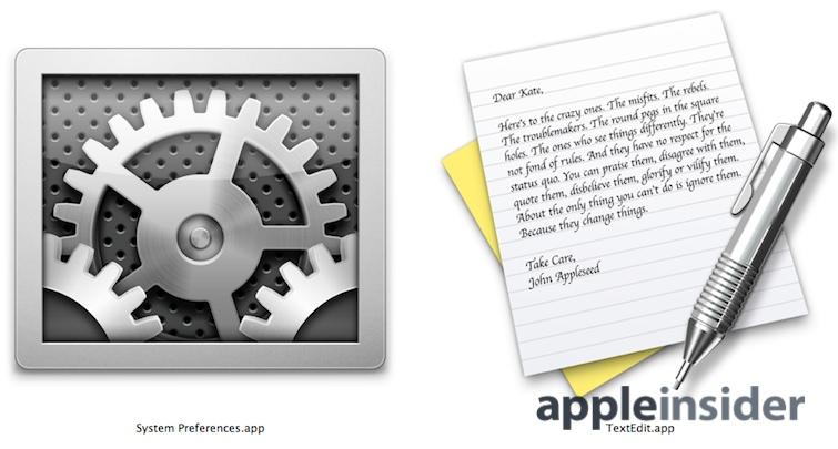
The icon for TextEdit.app actually portrays a studio-lit mechanical pencil casting a drop shadow on a written note that includes the text of Apple's "here's to the crazy ones" manifesto featured in its 1997 Think Different campaign.
After a decade of fully exploiting iconic decadence to the point of exhausting it of its novelty, Apple is now pursuing a new direction where app icons return to being the expertly distilled, abstract representations of functionality they originated as on the first Macintosh, the designers of whom which coined the term "icon" as an allusion to representational images used in religious veneration.
"A better, more delightful experience overall"
Many elements of Apple's iOS 7 design deconstruction have generated controversy, with several critics expressing particular disapproval with the company's new first party app icons and even the concept of Ive's underlying grid system (below) and a "precise color palette."
Your browser does not support the video tag.
At the same time, several industry observers, including Instapaper developer Marco Arment, have also noted that iOS 7 will provide third party developers with a rare opportunity to stand out from the App Store crowd by adopting the refreshed design cues Apple employs.
It appears that designers from top social sharing networks are already onboard to move away from the glossy detail apparent in iOS 6 and embrace the refined new appearance of iOS 7.
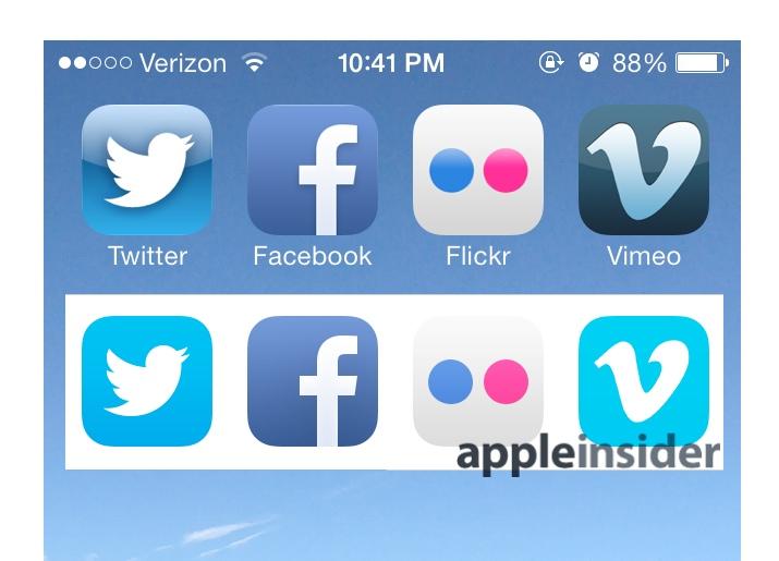
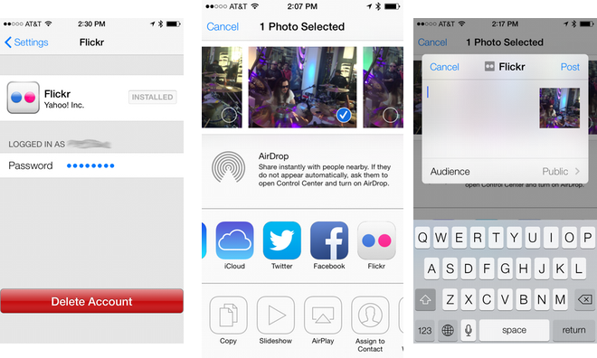
iOS 7's support for social sharing expands beyond Twitter and Facebook to add support for Vimeo video uploads and Flickr photos. Each service is now being represented by new, gloss-free icons within Setting's sharing configuration pages, even though the services haven't updated the appearance of their existing app icons yet (before and after, above).
A platform for developers vs Windows Everywhere
While often compared to the "flat" appearance of Microsoft's Windows Phone, iOS 7's isn't aiming at being flat.
Its new sharing interface, for example (below), is unique in that it contrasts color differentiated, branded web service icons, including the company's own iCloud, with utilitarian system tasks such as copying, printing, AirPlay or assigning a contact photo. The latter are assigned a monochromatic, generically abstract outline. The former are brands.
On Windows Phone, everything is apparently designed to look like an integrated part of the operating system, almost working more like component services rather than apps. Apple once tried selling developers on the idea of components with OpenDoc, an initiative that failed miserably in the mid 90s.
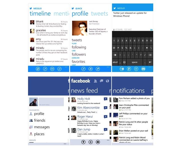
The Windows Phone versions of Facebook and Twitter apps, for example, look like strict implementations of Microsoft's Metro appearance, not like products independently designed by Facebook and Twitter with a focus on functionality.
Source: Windows Phone Super Fanboy
Additionally, Microsoft portrays its Windows Phones as having an interface dominated by a a single overall color and presenting most third party apps (even its own Internet Explorer, Xbox and Outlook brands) as simple white icons, focusing attention on the OS as a product rather than apps.

Discount hardware not popular without support for apps
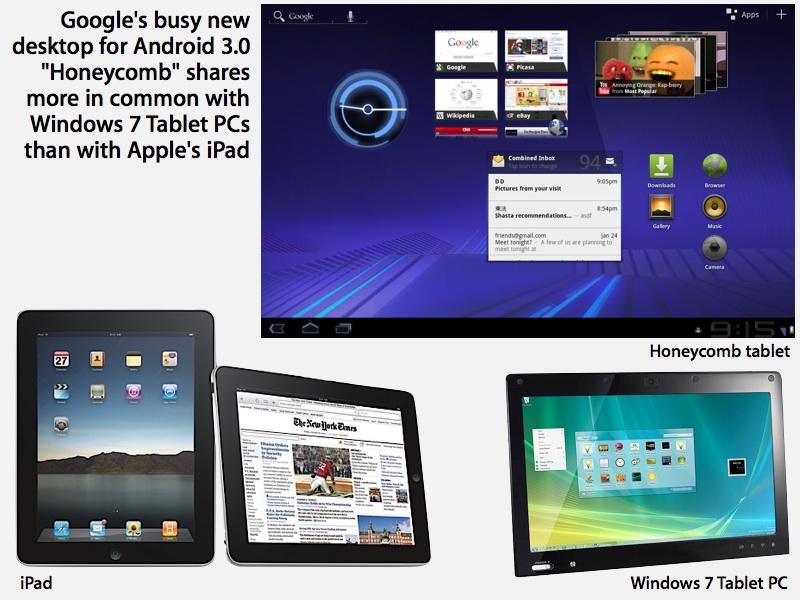
Similarly, Google's Android 3.0 Honeycomb attempted to rein in its open source platform under a strict, cohesively uniform Holo UI implemented as an appearance skin, but both third party software and (particularly) hardware developers have resisted efforts to conform with undifferentiated support for "pure" Android as defined by Google.
Like Microsoft, Google has focused on Android's operating system, highlighting its Holo 3D shadow effects and gadgets that direct users to the company's own YouTube, Gmail, Picassa and Google Web Search services (below).
Apple's iOS has always focused attention on third party apps, encouraging developers to create rich and novel experiences with distinctive, professionally designed visuals and icons in order to stand out as individual accomplishments users want to buy.
The core value of apps was particularly highlighted at the release of iPad, which serves largely as a canvas for third party apps. Critics initially dismissed the new tablet as "just a big iPod touch," apparently unaware of the fact that the iPod touch was itself incredibly successful in expanding Apple's iOS app platform, particularly in the field of video games.
Google's own efforts to deploy iPad-like tablets using Android, first with 2011's Honeycomb, then with 2012's Nexus 7 reboot plagued with hardware and software issues and most recently with a refreshed version finally equipped with functional solid state storage management technology, have focused on PC-style specifications and, more recently, low prices.
However, asTime observed last week, "Compared to iPad, Tablet Apps Are Still Android’s Weak Point."