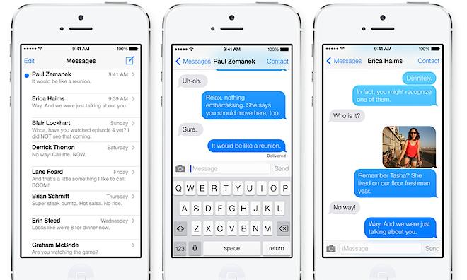
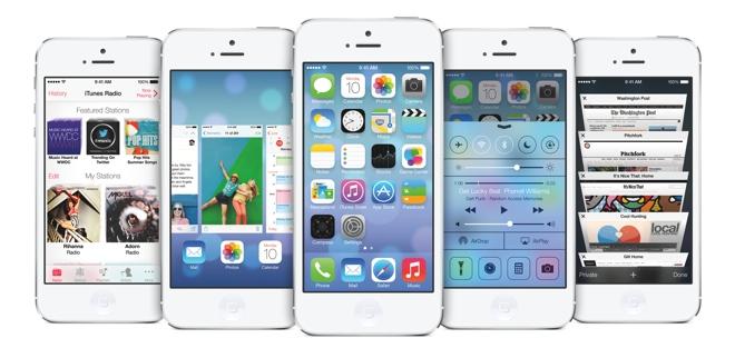
Apple's new iOS 7, which the company unveiled last week at its Worldwide Developer Conference, says a lot about the future of mobile devices because Apple owns the future of mobile devices.
Apple owns the future of mobile devices, not because it has erected a near monopoly market position protected by major barriers to entry like IBM in 1970s or Microsoft's DOS and Windows in the 80s and 90s or Google's search and Adobe's Flash in the 2000s; Apple sells its products within a very diverse and openly competitive market and maintains minority unit market share in smartphones.
It just happens that Apple is making the vast majority of all the profits in mobile hardware, software, media and services. And the mobile segment happens to have much brighter prospects than the rest of the consumer technology market, particularly WinTel PCs.
WinTel goes down the drain
There's a fact that can't be overemphasized: the history of technology has been directed by those who sold the products generating the greatest overall profits and successfully reinvested those profits into innovation. They get to chart out the future, at least until something that's even better at making money comes along.
Intel's x86 CPUs and Microsoft's DOS/Windows didn't rule the WinTel PC era because they debuted with or were first to implement the most exceptional technologies. They didn't, and weren't.
Both started with dated, weak contenders that managed keep themselves ahead of superior chip architectures and far more sophisticated operating system software because the WinTel PC efficiently generated billions of dollars in revenue that was funneled right back into development at Intel and Microsoft. Between 1995 and 2005, WinTel did little more than plug up the pipes of technology, holding everyone back while collecting incredible revenues but delivering only the most minor dribble of updates.
It wasn't PowerPC, Alpha or ARM, or Solaris, Linux or OS X that ended the WinTel era. The WinTel partners erected substantial barriers to entry that ensured nobody else could directly compete in PCs. This arrangement only ended when the complacency and lack of competitive advancement by Intel and Microsoft reached a point where both parties failed to recognize and actively address the emergence of mobile computing.
By the point Apple was busy earning billions on iPods in 2005, it was simply too late for a me-too Zune strategy from Microsoft. And by the time Apple had three years of iPhones and the iPad on sale in 2010, it was too late for Intel to begin pushing its low power x86 Atom chips, or for Microsoft to begin work porting Windows to ARM, or its failed Zune strategy to Windows Phone.
At this point, the WinTel partnership is now more like a ball of greasy hair saturated in Drano, eating it self up as it sucks itself down the sewer pipes and out of relevance. And really, good riddance. Between 1995 and 2005, WinTel did little more than plug up the pipes of technology, holding everyone back while collecting incredible revenues but delivering only the most minor dribble of updates.
Going forward, there will be millions more PCs sold every month, but that market increasingly fails to matter because the money is increasingly in mobile devices, not PCs. Intel and Microsoft know that, which is why both companies are looking for other things they can do as their sink-clogging business plan goes down the tube.
The best kept secret in technology sector
What comes after WinTel? Well if you quiz most industry analysts and journalists, you'll hear lots of excitement around Android, largely because Google's platform is really easy to compare to WinTel, the last model that worked so well at collecting all the industry's profits over the past 30 years.
Never mind that, relative to all mobile revenues, Google's Android isn't making anywhere near what Microsoft had been making in OEM Windows licensing. The fact is that Microsoft continues to make more money licensing its patents to Android licensees than Google does selling ad views and apps on its own platform.
The bigger problem for Android is that it does nothing to solve the very issues that kept Microsoft from delivering the kind of mobile devices people wanted to buy over the past decade. From Windows CE to Tablet PC and Windows Mobile, Microsoft's offerings were just not very compelling, and for good reason.
Unlike the simplistic PC, today's ultra personal, tiny, battery-sipping mobile devices need much more focused, vertical integration than a "white box" of slapped together components and a general purpose OS required to boot it up to a familiar looking desktop. To replace WinTel, Android would need to offer a better mobile solution, not worse.
Google's Android is actually much worse at integration than the old WinTel, because Google is following an ideological "open software plus adware licensing" fantasy that simply does not erect any barriers to entry and does not syphon off the industry's profits.
To replace WinTel, Android would need to offer a better mobile solution, not worse. Microsoft didn't oust IBM by copying IBM's mainframe and mini business, poorly. It sidelined IBM by sapping its core business with a cheaper, more accessible alternative: the PC.
Incidentally, the fact that the old IBM valiantly but ineffectually tried to regain its former monopoly position by belatedly following WinTel, first with PS/2 hardware in 1987, then then with OS/2 software that lasted into 2001, then with its PowerPC chip initiative that breathed its last gasp of PC air in 2005, also offers a bleak prognosis for anyone who assumes the old winners have some special foot in the door to reemerge years after their incredible revenue collecting monopoly collapses.
At the same time, there is absolutely no improvement or efficiency in mobile devices moving from Microsoft's poorly integrated Windows Mobile licensing model to Google's even less strictly integrated mobile licensing model. What the consumer technology industry really needs is tightly integrated mobile products that leverage the same tremendous economies of scale that propelled WinTel into popularity and profitability.
If only somebody could come up with mobile devices with the kind of fit and finish you see in modern automobiles, televisions or SLR cameras. It would be a business just like Apple.
Oops I let it slip.
Yes, what if one company was making highly integrated products with its own hardware and software platform technology. And what if it had already proven, over the course of a decade, that nobody could compete with the iPod. And then, over the next five years, proved that nobody could rival the iPhone unless they were rampantly stealing every bit of its design, right down to the marketing and box. And then what if Apple kept ruling the iPad market through year after year of failed Android and Windows tablets.
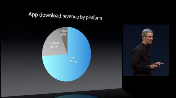
Now imagine this hypothetical "Apple," after twelve years of this sort of thing, is now collecting 73 percent of the industry's hardware profits and the same proportion of mobile software revenues.
At this point, the media's continued enrapturement with Android sounds as insane as if, back in 1998, we had been told on a daily basis that the leading PC platform was Linux, simply because "who knows how many copies of it are floating around the Internet out there!"
Start attaching dollar signs to the facts in the consumer technology sector, and they all begin pointing to Apple running the show, not some version of Android from 2010 or some distro of Linux from 1998.
While the last Google IO conference pointed to big numbers of Android device activations and app downloads, it neither referenced Android's conspicuous lack of revenue nor even unveiled Google's vision for the future of the platform. And in technology, no news really is bad news.
Apple's WWDC not only threw out some gigantic numbers with dollar signs (including $10 billion in developer payments, not just 50 billion app downloads) but also introduced the direction Apple was targeting for the future of mobile devices: iOS 7.
What do you do with iOS 6?
With iOS 7, Apple is doing something nearly unthinkable: it's fixing something that isn't broken. When Apple leaped from the Classic Mac OS to OS X, it was addressing a decade-old affliction of very outdated technology. When Microsoft moved to Windows Vista, it was attempting to breathe innovation back into a staid, boring desktop. Neither had much of a choice.
While iOS 6 has been contemptuously targeted as "boring," it remains the leading mobile platform in generating revenue, and it attracts, by far, the most attention from developers.
It remains the most used, and overwhelmingly the most satisfying, mobile experience.
Google and Microsoft, and their Android and Windows Phone licensees, are working really hard to attract the kind of attention iOS 6 has in spades. Samsung is working so hard to flatter Apple with its imitations that its becoming hard to differentiate a Galaxy from an iOS device.
And that's the primary problem facing iOS 6: the rest of the industry's technology has sufficiently advanced to the point where Apple's magic is indistinguishable. Apple needed to venture a little way past the limits of the possible into the impossible.
A dangerous journey into the impossible
When the open source community started cloning Microsoft's Office and the Windows desktop, Microsoft attempted to ditch them with arbitrary changes to the toolbar resulting in the Ribbon UI and Windows Vista overhaul, controversial moves that were not exactly successful.
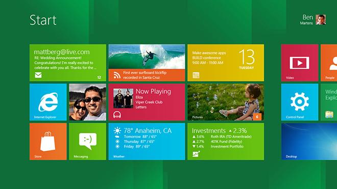
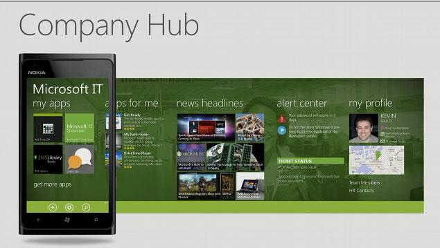
After dialing back the disruption with a more familiar Windows 7, it then applied the even less successful Metro Zune interface on Windows 8 (below), providing an even more convincing data to show that Apple can't similarly ditch its existing mobile users and developers by making wild, jarring changes to the user interface of iOS 6.
On the other hand, were Apple to only reskin iOS 6 with new "flatter" icons and gestures, as many designers had imagined before the release of iOS 7, it would be a comfortable, uncontroversial way to safely cling to its past performance.
It would also be really easy to copy, and would demonstrate that Tim Cook's Apple plans to meekly ride iOS 6 out into the sunset.
Apple needed to boldly rethink iOS 6 the same way car manufacturers rethink their designs every few years to carry forward the things that are popular and replace the things that aren't essential (and which identify them with the past) in order to keep their products new, fresh and interesting.
Apple, the creator and destroyer
Apple is well known as a destroyer of the status quo. It boldly dropped legacy ports from the iMac in 1998, forcing the industry to finally begin supporting USB. It discontinued the iPod mini at the height of its popularity to introduce something it was convinced would sell even better.
When it recognized that the enterprise didn't want its server products, it simply canceled them. And when it realized its MobileMe online services were not compelling, it radically rethought its entire cloud services strategy with iCloud, ditching several products and features (including iWeb, iDisk and iWorks.com) rather than limping along with half baked updates to unpopular offerings.
With iOS 7, Apple refocuses on the things it thinks are important to its mobile platform. In a word: apps. The iPhone debuted as a simple Home screen that could launch engaging experiences, from mobile internet to the iPod. When it opened this up to third party development, it was blown away with opportunity knocking.
iOS 7: light, depth, movement and clarity
Rather than trying to deeply integrate the popular apps people use into its mobile operating system (as Microsoft and Palm did with Facebook, as Facebook itself tried to do with Android Home, and as Google is trying to do with its own services in Android), Apple is focusing on doing the things developers don't really want to do.
Apple's iOS interacts with social networks like Facebook or Twitter to share photos and post comments, but if you want to use these services you need to launch those company's third party apps. It also links to stock and weather news in its own first party apps, but when you follow the links you're taken to the original web content in Safari, rather than an embedded view or lock screen news feed.
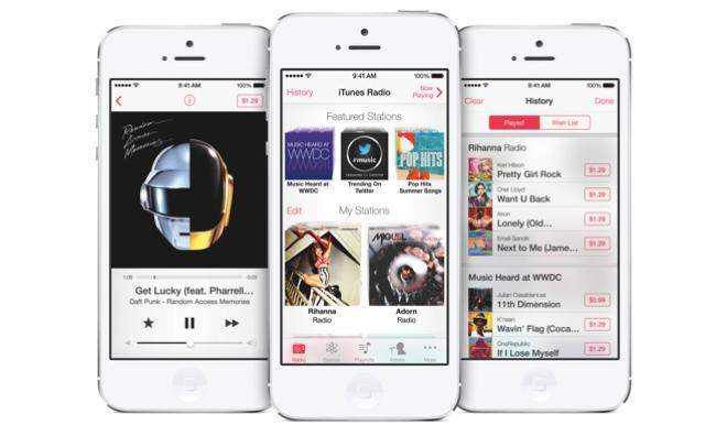
From iTunes Radio (above) to the App Store to new frameworks like Sprite Kit and updated services like Game Center, Apple is doing the platform work in iOS 7 to support and direct attention to new third party apps and content.
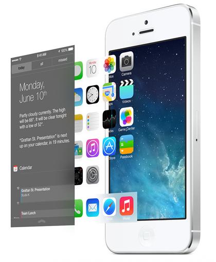
The showcase of this third party content, the very stuff that keeps iOS alive and adds value, is Apple's "boring" Home screen, which has been livened up with new animations and parallax effects that give vitality to a utilitarian app picker.
Notably, apps on the iOS Home screen haven't been replaced with Windows Phone's "live tiles" or Android's "widgets," two things that supplant valuable third party branding and refocus a platform away from apps and onto busy gadgets.
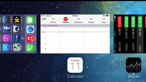
There's also a lot of curious things from earlier editions of iOS that have been stripped, refined and simplified, from the popup app switching bar to the hidden-away controls for accessing music playback and screen lock. Apps now switch in a full screen presentation (below), and Control Center puts not just audio playback, but a dozen other controls one swipe away.
A variety of other iconic things that have defined iOS since 2007 are also getting stripped away in one massive housecleaning. The strong borders of buttons, the heavy bevels, gloss effects, dark shadows and the earthly colors of leather and felt are all being retired like last season's fashions.
In its place, Apple has put together a luminous, clarified and light user experience where actions are highlighted with distinctive color. Anyone copying iOS 7 will not be able to do so with subtly. iOS 7 looks different. It does not, however, really work differently in ways that are difficult to learn and discover. Apple didn't hide the Start menu.
iOS 7 is not just an effort to ditch copycats and set itself apart from other mobile platforms that can now also browse the web and access Facebook. It's also an effort to freshen up the App Store with a new design language that will shine attention on active developers and leave static old apps in the iOS 6 shadows.
iOS 7 leverages modern hardware
Finally, iOS 7 leverages a series of technologies that are now ubiquitous across all supported iPhones: a Retina Display, a 6-axis gyroscope and at least an A4 chip. iOS 7 leverages a series of technologies that are now ubiquitous across all supported iPhones: a Retina Display, a 6-axis gyroscope and at least an A4 chip.
Trying to introduce a leap incorporating such iconic use translucency and smoothly animated live motion effects (and supporting those effects across its product line) has simply never before been possible on iOS.
There are still features in iOS 7 that don't work on every iPhone: iPhone 4 still can't render 3D Flyover in Maps and still doesn't support Siri. But the iconic light, depth, movement and clarity of the new appearance is supported across the product line.
iOS 7 provokes an eruption of rage
Apple's new iOS 7 has generated a lot of comment, much of which comes from people who just like to chatter about whatever's hot. Lots of designers have taken issue with facets of its icon design, for example, the very same way that people used to endlessly critique the images and branding in every new version of Windows. Actually I'm just kidding; nobody was ever concerned about the appearance of anything in Windows.
The most interesting thing to me, however, are the embittered insinuations that Apple is so devoid of original ideas that it is now copying Android and Windows Phone.
As if, were this inarguably true, it would change the direction of the industry. Remember when the WinTel partnership picked up every potential competing concept and rolled with it like a giant snowball eating up everything in its path?
When Intel embraced RISC principles or ARM's 64-bit architecture in its x86 chips, or when Microsoft copied the Mac's graphical desktop, NeXT's object orientation and then the entire architecture VMS, not only were there no allegations that the WinTel partners were visionless copycats that had to steal ideas to remain relevant, but it also did nothing but increase their grasp on the industry. And it was celebrated, not demonized by the mainstream tech media.
Hey, you can't steal from Microsoft!
On a high level, companies are foolish not to follow successful ideas. After Coke began selling Tab, it was pretty important for Pepsi Light to appear. And after demand for Pepsi's Mountain Dew was established, it's not surprising that Coke released its own Mello Yello.
If Apple didn't release high level features for iOS that matched the best ideas of other platforms, it would simply be stupid; the company would deserve to lose its customers.
iOS 7, however, has been greeted by intense criticism for supposedly being a full "rip off" of, depending on the author of the attacks, either Microsoft's Windows Phone design or Google's Android design. This is curious because nobody says WP8 and Android look very similar. Apparently it's just iOS 7 that manages to look like both of them, at the same time.
Another curious point: when webOS appeared in early 2009, nobody felt the need to point out that it looked just like Apple's iOS 2.0. What they did focus on was the new stuff it did: it switched between apps just like Apple's Cover Flow from 2006, depicted apps as "cards and stacks' just like Apple's HyperCard from 1987, and delivered incoming notifications just like the Mac's Growl. It was even praised for trying to sync to iTunes just like an iPhone. Unfortunately, it didn't sell like the iPhone, in part because most of its hardware and software features were immediately eclipsed by the next iPhone.
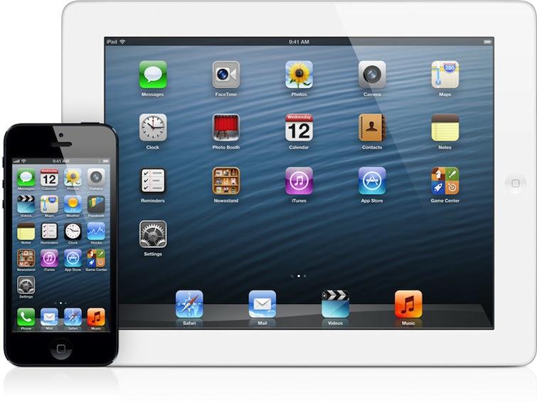
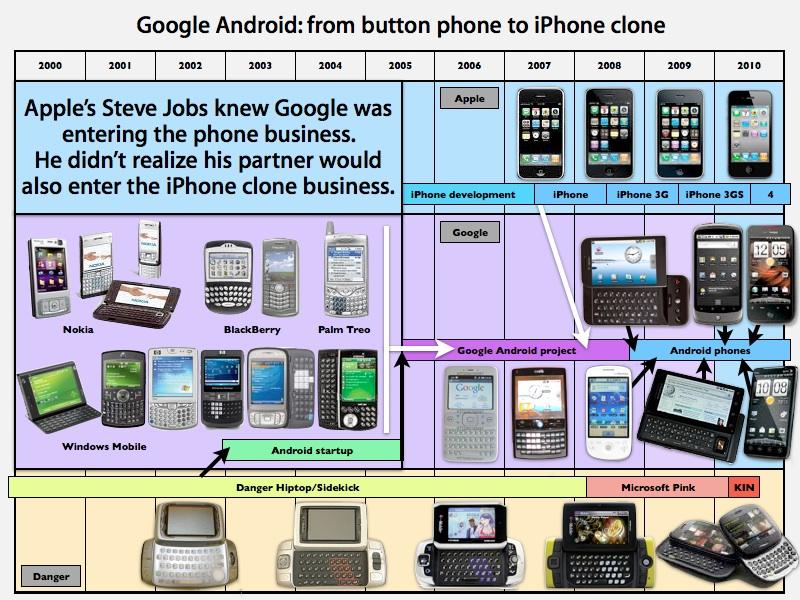
In parallel, when Google's Android rapidly shifted from being a BlackBerry clone to looking just like an iPhone (below), the media also preferred to focus on its unique elements, such as slide out keyboards, trackball navigation and other differentiating features that have since been shed in an effort to look exactly like what Apple was doing.
When Windows Phone was introduced in late 2010, there wasn't so much comment about how Microsoft had abandoned every last vestige uniquely identifying Windows Mobile in a desperate reach to be more attractive to the iPhone's audience. Instead, there was a focus on Microsoft's use of sideways navigation and solid colors broken into dynamically updating tiles.
When Microsoft added iPhone-like copy and paste, there wasn't any outcry of "copying," as Android fans did when Apple had introduced its own copy and paste features, despite the fact that Microsoft's implementation came years late and was actually worse rather than much better.
Given Apple's market position and its history of embarrassing all of the phone industry incumbents that were caught flatfooted by the iPhone, it makes sense that fans of Android and Windows Phone would bitterly poke at iOS 7 with disrespect and derision. But is there any element of truth in what they are claiming?
Does iOS 7 look anything like WP8?
One chief media proponent of WP8, Farhad Manjoo of Slate, immediately complained just hours after it was released, "iOS 7 borrows many ideas from other companies’ touchscreen designs, especially Microsoft." I scoured his piece looking for examples of this but there weren't exactly "many."
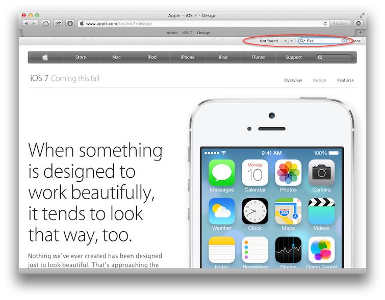
"If you want to sum up iOS 7 in a word, it would be 'flat,'" he noted. Apple's own lead designer Jonathan Ive never summed up iOS 7 as an effort to achieve "flat."
Instead, Apple says iOS 7 "creates a sense of dimension," adding that "distinct and functional layers help create depth and establish hierarchy and order." On stage, Ive demonstrated iOS 7's depth with graphic representations. Apple's iOS 7 website doesn't even mention the word "flat" in passing.
And despite all the clamor of how Apple needed to kill "skeumorphism" and deliver an experience that was as "flat" as a Macromedia Flash animation from 1998, iOS 7 still uses real world textures wherever it chooses to, such as the subtle paper background used in Notes.
The most distinctive elements of iOS 7 are its use of translucency, icon gradients, a vivid and nearly Day-Glo color palette, parallax and other dynamic animations of background elements, static presentation of information and iconic branding and white backgrounds contrasting with a borderless buttons highlighted with color accents.
Whether you like these things or not, none of them are identifiable with Windows Phone. WP8 uses solid swaths of an opaque, primary color; moving widget-like information tiles and boxy buttons that are generally monochrome.
Manjoo does give one example of "places iOS 7’s design is a straight rip-off of things that have come before." He notes: "When switching between open apps, for instance, you now see flip-through cards showing you screenshots of each app. That’s pretty much the same interface that’s in Windows Phone, which in turn borrowed heavily from Palm’s webOS."
Back in 2011, Manjoo noted that the latest update of WP7 "now has copy and paste, and it has adopted Apple’s half-loaf version of multitasking, allowing some apps to stay active while you’re not actively using them." So he's not now saying iOS multitasking was taken from WP8, only that the concept of showing full screen proxies of your running apps in the task switcher was borrowed from elsewhere.
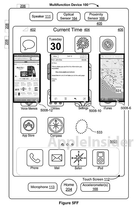
However, if you do a patent search, you'll find Apple was documenting its own multitasking user interface ideas depicting a stack of app windows in 2004; Microsoft's own 2008 patents on the subject were related to Windows Vista's app preview popups on the Start bar, not a Cover Flow carousel of app thumbnails like webOS, WP8 or iOS 7.
Apple's subsequent patents explored both full app previews and the icon bar task switcher design that first appeared in iOS 4 (below).
And lest anyone wonder where Palm got its engineers who put together the webOS task switching cards interface: they came from Apple's iPhone team, and were led by Jon Rubinstein, Apple's former iPod executive. While Rubinstein reportedly never saw the iPhone in development at Apple, he was certainly aware of all the multitasking, Cover Flow and Exposé UI work Apple was doing on OS X, as was the rest of the industry.
First to implement, or best implementation with monetization?
So if Apple developed these concepts in 2004, why did it wait until 2013 to add them to iOS 7? Rather than claiming that Apple waited three years to copy Microsoft's 2010 copy of 2009's webOS, it makes more sense to recognize that Palm's webOS, in 2009, beat Apple to delivering the concepts Apple had already patented in 2004 because Palm simply reentered the mobile market with the luxury of a fresh start in hardware that leapfrogged the performance of the installed user base of the last two years of iPhones that Apple's iOS chose to continue to support.
Similarly, 2010's Windows Phone 7 simply ditched compatibility with Microsoft's entire existing Windows Mobile 6.x installed base, starting afresh with a new hardware platform sporting iPhone 4 A4-class, 1GHz ARMv7 CPUs to deliver its own version of the iOS App Store running on a windowless, touchscreen smartphone. 2010's Windows Phone 7 simply ditched compatibility with Microsoft's entire existing Windows Mobile 6.x installed base.
If you're going to start running a marathon from the halfway point, you can't really be mad that runners who started from the beginning are able to catch up and surpass you. You didn't earn your lead, and you're not a victim of being unfairly passed up by better runners. And nobody on the sidelines has any business stoking contempt for your faster opponents.
Apple didn't have the luxury of only targeting modern iPhone hardware with its own user interface redesign until iOS 7, because unlike Palm and Microsoft, Apple's platform wasn't so desperately behind that it was will willing to abandon the customers who had just bought its smartphones over the previous two years, just to roll out a visual feature that demanded modern CPU power.
It's also useful to point out that Apple's iOS apps are substantial, native software packages, not merely mini web pages being rendered by a "multitasking" browser as webOS essentially was. The new iOS 7 delivers a live, Exposé like window preview of running apps when you pull up the app switcher.
Rather than being a case of slavish copying by a company devoid of original ideas, Manjoo's singular example of how Apple iOS 7’s "is a straight rip-off of things that have come before" is simply a misunderstanding of how Apple manages its platform and supports its users. Apple chose not to abandon its entire installed base of recent customers when the time came to revamp its operating system's user interface, a strategy it clearly did not copy from Microsoft or Palm.
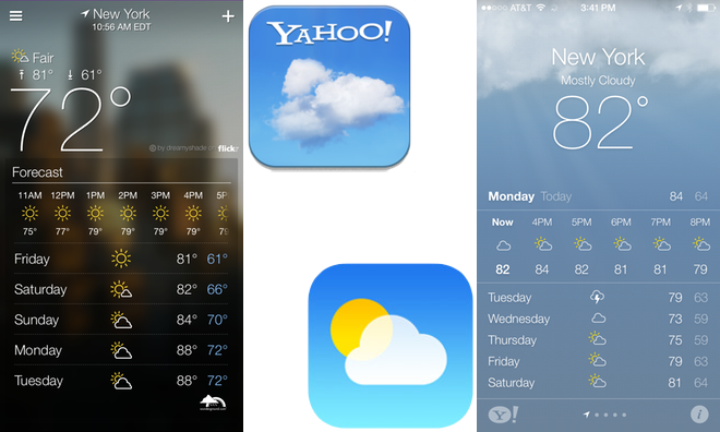
Manjoo has also drawn attention to Apple's new Weather app in iOS 7, which is virtually identical to the one in Windows Phone and very similar to Yahoo's own Weather app. Apple pulls its data from the Weather Channel and Yahoo, which is also a search partner with Microsoft. Apple also partners with Microsoft's Bing, and has even made Bing the default search engine for Siri in iOS 7.
Left: Yahoo Weather, redesigned in April. Right: Apple's new Yahoo-powered Weather app in iOS 7.
Without any special, proprietary insight into all of the various links and IP sharing agreements between Apple, Microsoft and Yahoo, I'd say trying to insist on crediting Microsoft's WP8 with the design of Apple's latest Yahoo-based weather app is a bit of a desperate reach. I would also recommend that Microsoft's WP9 team take notes on iOS 7's Weather app, which arranges more relevant and important information better than WP8 does.
Hey, you can't steal from an open source project!
More puzzling than the accusations that Apple's iOS 7 steals back its own patented concepts from WP8 via webOS are the charges that iOS 7 lifts its new overall appearance directly from Android, an open source project that exists entirely to lift the iPhone's overall appearance and style of functionality.
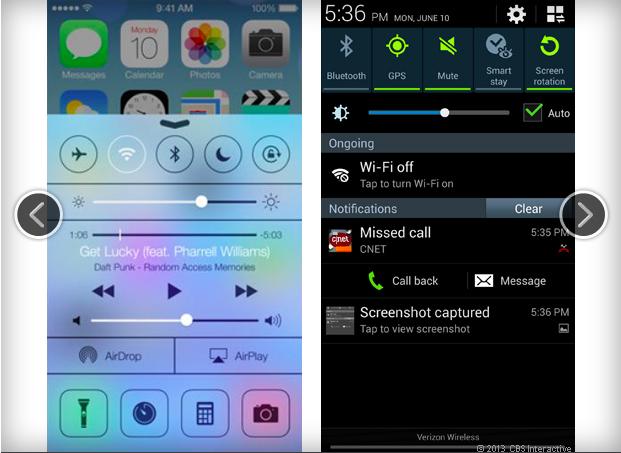
In a slideshow of comparisons to Android and WP8, CNET asks, "is Apple's iOS 7 really all that new-looking?"
Perhaps the most blatant example of Apple lifting a feature concept from the Android relates to Control Center (above), which shares the same quick access to settings that Google has packed into its notifications panel.
There are four settings that both screens have in common. Apple adds eleven features this particular Android screen lacks, and it in turn packs in six feature controls that aren't in Apple's Control Center, but hey, there are similarities, if not in actual appearance or the overall implementation.
This is not a case of infringing patents or stealing original, novel features or their presentation from a company that built said features into differentiating, hallmark characteristics of its product. If fact, if you look at the series of features that Google itself says identify Android as being distinct from iOS, none of them are borrowed in iOS 7.
Swiss swing and a miss
And really, if you look closely at what critics are identifying as similar in iOS 7 and Android or WP8, it all pretty much boils down to the fact that Apple is now using Helvetica Neue as the primary system font.
And we know that the first company to put Helvetica on the screens of personal computers was, well, actually it was Apple. But many years after that, Microsoft licensed a cheaper knock off font named Arial.
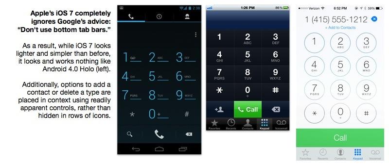
And decades later, Google made its own knockoff Helvetica for Android 4.0's Holo appearance, which it calls Roboto. But if Apple wants to continue to use Helvetica, some angry critics demand it must grovel before Google with a domo arigato.
Windows Phone now uses Segoe UI, which only sort of looks like Helvetica. Which again makes Apple as much of a copycat here as when it added its own invention for switching between apps after a series of competitors implemented it themselves.
If this all sounds familiar, perhaps it reminds you of Bill Gates' famous retort to Steve Jobs that he didn't steal the Macintosh, but rather, "I think its more like we both had this rich neighbor named Xerox and I broke into his house to steal the television and found out that you had already stolen it."
The difference being, of course, that Xerox profited from its investment of a million dollars into Apple for assistance to productize its inventions. Microsoft Word came directly from Xerox without any sort of remuneration.
And of course, Apple actually licensed the Helvetica font family, too. It's a pity that so many in the "unbiased world of objective journalism" are desperately trying to subvert reality with a fiction that Apple doesn't really ever do anything new and steals everything from smarter, more creative people.
Where iOS 7 is taking mobile devices
It may be that these critics are just desperately afraid of a future where Apple continues to lead the state of the art. Perhaps they're afraid that, with Apple at the helm, they'll have to constantly keep up to date on new technologies that people actually use, which Apple rolls out on an annual basis.
It was much easier to keep up with the three to six year cycle of new releases of Windows, where there was always a comfortable, two year delay period between initial innovations and Microsoft's own promised future implementation.
With Android, Google is doing something similar. It releases new editions of its operating system nearly as often as Apple, but only a few early adopters get to beta test these new releases. The rest of the market waits for years for new versions of Android to trickle out into the mainstream through the nearly nonporous screen of hardware OEMs and carriers.When they stop complaining, it will be a sign Apple isn't innovating.
Additionally Apple keeps rolling out new services that are difficult for dinosaurs to understand. Where's the file system? Why isn't iCloud exactly like DropBox? Where is the support for NFC tapping in Passbook, so I can write a story about technologies nobody is using? And why is Apple convincing the public to buy mobile devices to play games when I prefer to play Xbox 360 titles?
As long as Apple keeps pushing technology forward, there will be no end of pundits, bloggers and company shills to vilify and denigrate its efforts. When they stop complaining, it will be a sign Apple isn't innovating. And when they start to voice similar complaints about Android and Windows Phone, rather than lavishing them with praise, it may be a sign that Apple actually has some real competition in its mission to lead mobile computing.
