There's intense interest blooming around reports that Apple plans to revamp the look of iOS 7 with a flatter appearance. But there's more reason to believe that Apple is - or should be - focusing on features, not a radical new appearance.
Is iOS 6 boring?
Pundits like to say that iOS 6 is "boring," pointing out that little has changed in the iPhone's general appearance since it arrived in 2007. This is essentially true; iOS on both the iPhone and iPad continues to serve as a rather plain springboard for apps, rather than lots of chrome that attracts undue attention to itself.
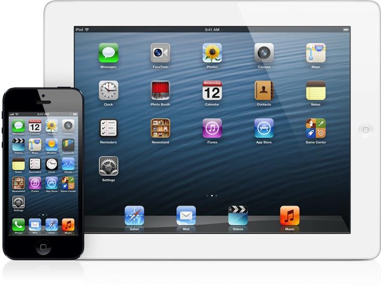
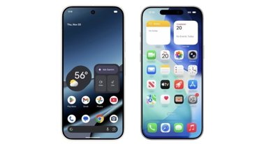
Apple's main image depicting iOS 6 (above), apart from sporting new apps and running on new hardware, is nearly identical to the original appearance of Apple's mobile OS from 2007.
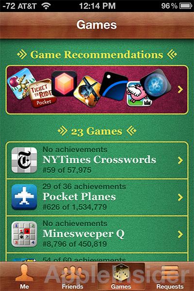
This tends to make any adornment at all (such as the use of leather accents, ragged paper skeumorphism and Game Center's craps table background) a subject of attention, even though these accents are simply a minor graphic embellishment, not a radical shift in the user experience.
Over the past six years, Apple has added a series of UI-extending features which helped to define each annual release via functionality without significantly altering the overall appearance of iOS, from 2.0's App Store to 3.0's fast app-switching "multitasking" to 4.0's Spotlight search and tethering to 5.0's Notification Center and Siri and 6.0's Passbook, Maps and social integration for Facebook and Twitter.
Makeup your mindshare
In contrast, Apple's competitors have all focused on completely revamping their mobile user interfaces, in large measure because iOS so clearly leaped ahead of the market at its launch.
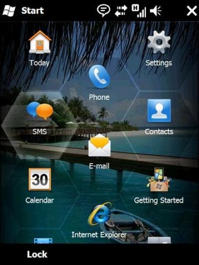
Since 2007, Microsoft radically reinvented its entire user experience of Windows Mobile multiple times, first using Vista as a template (WiMo 6.5, below) and then with the Zune's tile based interface, resulting in Windows Phone, quite disastrously. Microsoft went from having 12 percent of the smartphone market to its current single digit fraction.
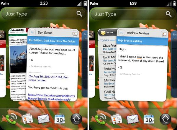
In 2009, Palm created the webOS, fully rethinking its dated, classic Palm OS. It did not recover.
Photo via Engadget.
Nokia tried to rebuild Symbian before abandoning it, and Blackberry revamped its OS with a new appearance a couple of times as it continued to hemorrhage market relevance.
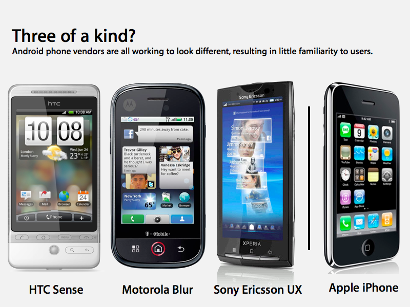
In 2009, Google's Android was so diverse that phones from different vendors didn't offer much clue of being the same platform (as noted at the time, below).
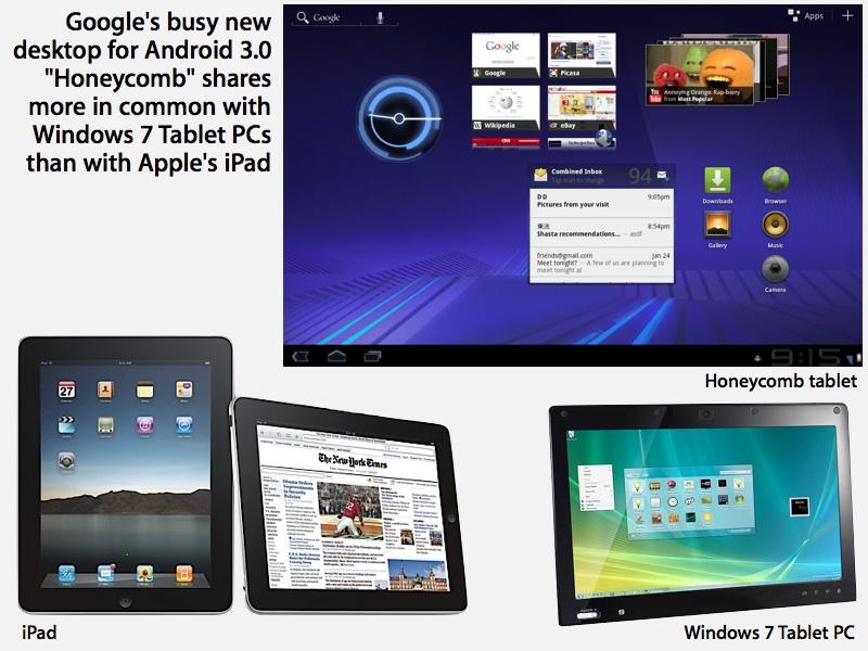
In 2011, Google tried to give Android a fresh 3D appearance called Holo (shown below), first targeting a new crop of tablets with it in Android Honeycomb 3.0.
The embarrassing boondoggle of Honeycomb tablets ended up getting toned down for the smartphone-centric release of Android 4.0, but even today, more than two years later, the majority of all Android devices still run outdated software that predates the entire Holo experiment. In fact, even among the Android devices that regularly buy from Google Play, 44 percent still run a version of the software prior to Android 3.0.
On top of this, much of the installed base of the Android "platform" not only looks disparate, but in many cases it is intentionally differentiated, such as is the case with Amazon's Kindle Fire and low end phones targeting China and developing countries, which don't use Play at all.
These Android devices often have as much appearance and functionality in common with Apple via borrowing from the WebKit project as they do with Google for incorporating code from Android, which is to say: very little at all.These Android devices often have as much appearance and functionality in common with Apple via borrowing from the WebKit project as they do with Google for incorporating code from Android, which is to say: very little at all.
It's as if Apple entered a beauty pageant during the talent competition and all the other contestants freaked out and responded by layering on gaudy makeup the way Paula Deen uses Crisco. And the judges are now so bored with Apple winning every year that they now have to play the Emperor's New Clothes in describing the series of wildly new and unfamiliar user interfaces as "fresh" and "exciting," the way Car and Driver never describes the wildly new placement of a car's steering wheel and gas pedal because car makers don't ever experiment with such things just to get attention for their failing products that aren't selling or are struggling to compete solely on price.
In any event, given the side effects of these mobile makeovers, which ranged from disastrously terrible to simply irrelevant, it doesn't seem like Apple's boring success over the past six years is really all that bad of a thing.
This all happened before
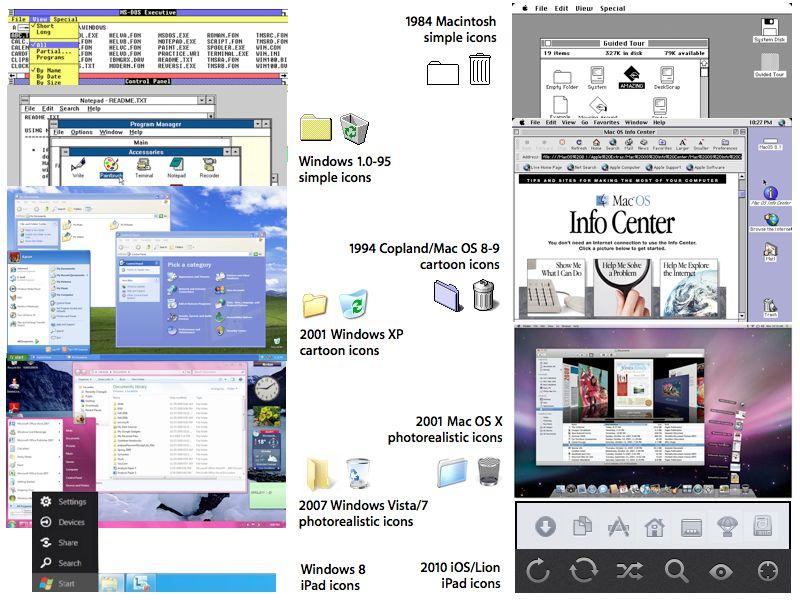
Consider too the history of the desktop user environment. The overall appearance of Apple's original Macintosh didn't really make any substantial changes between 1984 and 1991. Even at that point, Apple's new System 7 was mainly made to support new color capabilities rather than radically rethink the Mac's graphical computing environment.
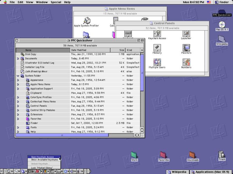
The Mac platform then continued onward with few changes for another decade through Mac OS 9 (above) before Apple launched its first real revamping of the user interface with Mac OS X 10.0. And again, that was again spurred by advancing technology; in Aqua's case, it was a new graphics compositing engine that supported features such as real time translucency and shadows.
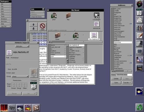
But rather than being a whole new exciting UI, Aqua was really a Macintoshification of NeXT, Steve Jobs' computing platform that grew up in the shadow of Apple in the late 80s (below). The new Mac OS X was really a different underlying operating system that had been modified from its original appearance to look more like the Mac, rather than being an unfamiliar, radical rethinking of the Mac platform.
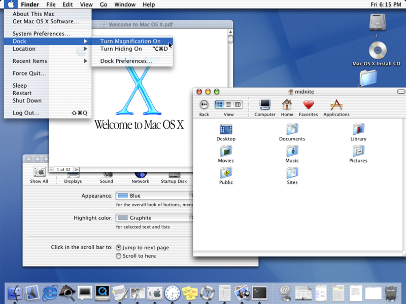
Over the next decade, Apple essentially toned down the original Aqua interface in each new release (shown below), rather than trying to radically revamp it over and over again. And in hindsight, this conservative maintenance of familiarity has worked in Apple's favor.
Now compare that to Microsoft, which after launching Windows 95 also successfully kept things reliably boring for the next ten years. Just like Apple (and largely patterned after the Macintosh, as shown below), Microsoft only added relatively minor changes in how Windows looked and worked until 2006's Windows Vista, which suddenly made far more significant changes in both appearance and behavior.
Vista had multiple reasons for failing to be successful, but its radically new and unfamiliar appearance sure didn't seem to help. Microsoft then recovered somewhat by dialing back the gloss of Vista in Windows 7, only to layer on an even more disruptive layer of unfamiliar user experience with Windows 8.
At this point, it's hard to argue that the appearance-centric strategy behind Windows 8 was anything but a huge failure.
This makes it curious why anyone might wonder out loud why Apple hasn't completely revamped the user interface of iOS over the past few years.
Update looks, but work on features
Rather than it being critically important for Apple to remake iOS into something that impresses the reviewers of products, it's really only necessary for the company to clean things up a bit, a continuation of the efforts it has made on both iOS and Mac OS X over the past decade.
Apple has in particular unified the look of Mac and iOS devices, sharing features between them and clearing out concepts that never really took off or are now dated looking or obsolete (like the Brushed Metal appearance on OS X).
We'll very likely see a refreshed overall appearance for OS X and iOS at Apple's Worldwide Developer Conference next month, but don't expect a radical rethinking of the user interface and behaviors.
That's because Apple now has more in common with Microsoft in 2000; it has more customers to lose with confusing shifts like Vista than it has to potentially gain by trying to attract fad-seeking smartphone reviewers who were entertained by webOS and titillated by learning from scratch to use a Windows Phone.
Instead of a radical user interface shift, Apple appears more likely to simply excise the more egregious bits of fluff that characterized Scott Forstall's management of iOS (the pinnacle, perhaps, being Game Center, below) and replace these with the more subtle lines favored by the company's head of industrial design, Jonathan Ive.
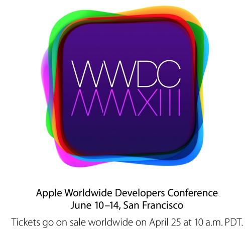
Blogger Joshua Merrill has suggested that Apple's new WWDC logo (below) likely represents a stack of colored app icons, where each color represents a particular app. Apple already uses colors to denote function, coding information apps (like Safari, Mail and iWork apps) in blue, telephony and messaging apps in green and utilitarian apps like Settings in grey, a practice that originated on the Mac OS. At WWDC, this concept may be carried ahead even further.
But beyond a focused face lift, what iOS really needs is exclusive features that make the iPhone and iPad more useful everyday. In large part, Apple has left this task to third party app developers, but Apple has some core apps that it needs to shore up with modern functionally.
iOS apps that need attention
Apple has been incrementally adding innovative "enabling technologies" that are used throughout iOS' core apps, ranging from facial recognition and HDR in the Camera app (and iPhoto) to geolocation and gyroscope features that show up all over the place.
Oddly enough however, Apple has yet added any sort of Optical Character Recognition features for digitally reading and importing text seen by the camera or sensed on a web page or within other graphics.Why can't an Internet-connected app look up zip or postal code information for you?
This is why Contacts can't import data from a business card via the camera. In fact, of all the iOS apps, Contacts is particularly barren in functionality. Why can't an Internet-connected app look up zip or postal code information for you? And particularly grievous: why hasn't Apple wrung more value out of one of the very few patents its has gotten any real traction out of, Apple Data Detectors?
Manually copying and pasting address information, names, photos and other information from a web page or email into Contacts should be unnecessary. And given that iOS' copy/paste loves to copy an entire region from a web page, Contacts should be smart enough to import a rough selection and offer to magically break it all up into address, phone and other Contact fields.
Like Contacts, Notes also got basic iCloud integration. But the app remains an incredibly bare bones text affair. Certainly 2013's iOS 7 should be able to support a real Notes app that imports photos, allows users to doodle, insert videos or maps, and then keep all these scrapbook bits synched across devices with iCloud.
Notes could also serve as a simple way to compose and then share thoughts and images with social networks, from Facebook and Instagram to Twitter and Flickr.
Another example of an app that's been incrementally enhanced but could use a lot more basic functionality is Messages. Given that Apple controls the experience of SMS, iMessage, FaceTime, Phone voicemails and Mail it would make sense to integrate these better so you could rapidly peruse all the various messages a particular contact has sent your way.
Apple could also expand support for automatically configuring Facebook messaging, given that it is based on the same open XMPP technology as the old iChat. And of course, Apple could also add stronger social network integration with other services, including those it supports on OS X such as Vimeo and Flickr.
There's also strong potential for Apple to create new app features without interfering too much with third parties. While iMovie lets you edit actual movies, Apple could release a scaled down social sharing app for making sharable videos along the lines of Vine, perhaps even integrating this into Photos.
Offer the same sort of Faces and Places tagging, and support basic editing features to make easy to create, easy to share video experiences you could iMessage to your friends, complete with view-expiring features like Snapchat. And stop leaving user experience dead-ends in iOS, such as where you can see your photos within Camera, but to do anything with them you need to exit and enter the Photos app. This is ridiculous.
Another core feature Apple is (more) likely to add to iOS is support for ad-hoc sharing, similar to AirDrop on the Mac desktop. Being able to send photos, locations, messages, and documents like provisioning profiles between devices or to a desktop via iCloud (if necessary) without emailing them would be handy.
Of course, Apple has to take care not to steamroll its third party developers. There's a delicate balance between first and third party development, complicated by the fact that many of the things Apple is working toward are also identified independently by third parties as commercial opportunities.
However, whenever Apple has spearheaded its own software development it has delivered important stickiness for its platforms, which can be observed well back into the 1980s from Lisa Office to AppleWorks and in the modern era with iTunes, iWorks, iLife and Pro Apps.
In 1979, John Couch was in charge of all software at Apple Computer. He commissioned this poster to emphasize the importance of software in selling hardware.
And conversely, whenever Apple has relied entirely upon third parties to add value to its platforms, it's gotten the treatment of Microsoft, Adobe and Google.
So if anyone needs something to worry about with the future of iOS, it's not its "boring" appearance but rather the scope and quality of the features and functionality it offers that its competitors currently don't (or already do).
