Apple updates retail store webpage with iOS 7-inspired design
 AppleInsider Staff
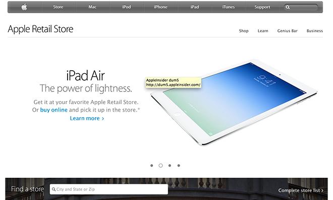
Apple.com's new retail store page. | Source: Apple
Last updated
Apple on Monday refreshed the "Apple Retail Store" section of its website with a clean aesthetic inspired by iOS 7, complete with "flat" graphics and copious white space.
With the new look, Apple has brought the informational retail section more in line with the rest of the website, which has moved from skeuomorphic graphics to a "flatter" design representative of iOS 7. The tweaked page was first spotted by ifo Apple Store.
While the Online Apple Store and dedicated product pages switched to a white, open look shortly after the launch of iOS 7, the retail location landing page was stuck with a layout from the days of iOS 6.
With a hefty serving of negative space, the retail pages now take on a "flat" look devoid of drop shadows, "depressible" blue buttons and gray background. Instead of being segregated into separate "boxes" as seen below, text and images are now merged into a continuous flow of content.
For example, the top carousel, which currently rotates through promotional images and text for the iPad, iPhone and MacBook Pro, abuts an edge-to-edge image of the Amsterdam Apple Store.
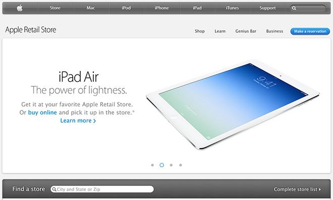
Retail store webpage prior to Monday's redesign.
Previously, second-tier retail pages like "Shop," "Learn" and "Genius Bar" had their own divisional boxes. The three categories — with the same pictures and corresponding text — are still there, but instead of being segregated, they share a common row of negative space outlined by thin gray lines.
Ancillary retail pages have received the same treatment, including the Apple Store locations list.
The update is representative of Apple.com's continual evolution, which usually takes graphical cues from the company's operating systems.


 Amber Neely
 Thomas Sibilly

 William Gallagher
 Malcolm Owen
 Christine McKee


35 Comments
I don't notice any changes to other parts of the website, was it only the homepage? And please update apple insider to ios 7 with the keyboard.
I like it, especially the really nice photos of iconic stores. But once again makes that horrible navigation bar look even more out of place. How difficult could it be to update that to the rest of Apple's new design language? Edit: 9to5Mac has screen shots of old and new pages. Makes the nav bar look even more out of place. :no: http://************/2014/02/24/retail-section-of-apple-com-updated-with-new-design-inspired-by-ios-7/comment-page-1/
It'd be nice if AI would follow suit and remove the top carousel as well as creating empty, white space to the left and right of the homepage.
Could this change have waited a while so they could fix the security problem in OSX?
Sure, different department. But I am sure a lot of people are thinking this.
[quote name="Bergermeister" url="/t/162178/apple-updates-retail-store-webpage-with-ios-7-inspired-design#post_2477242"]Could this change have waited a while so they could fix the security problem in OSX? Sure, different department. But I am sure a lot of people are thinking this. [/quote] Indeed, different dept. I wouldn't want to have any security fixes coming from a web designer. Besides, how long have we had this SSL/TLS bug? All the time no one knew about it it wasn't a problem, now it is as we all read about it.