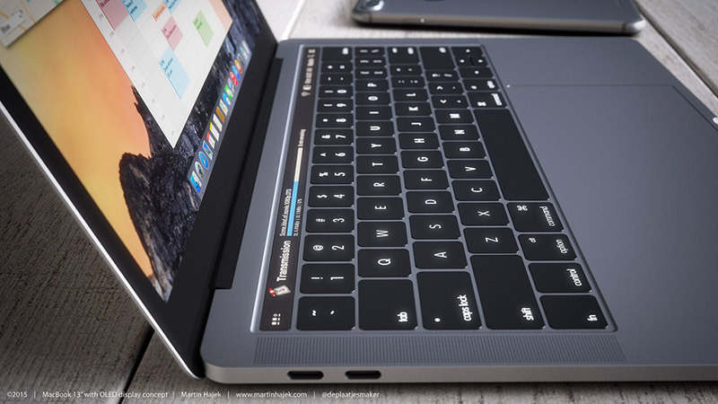
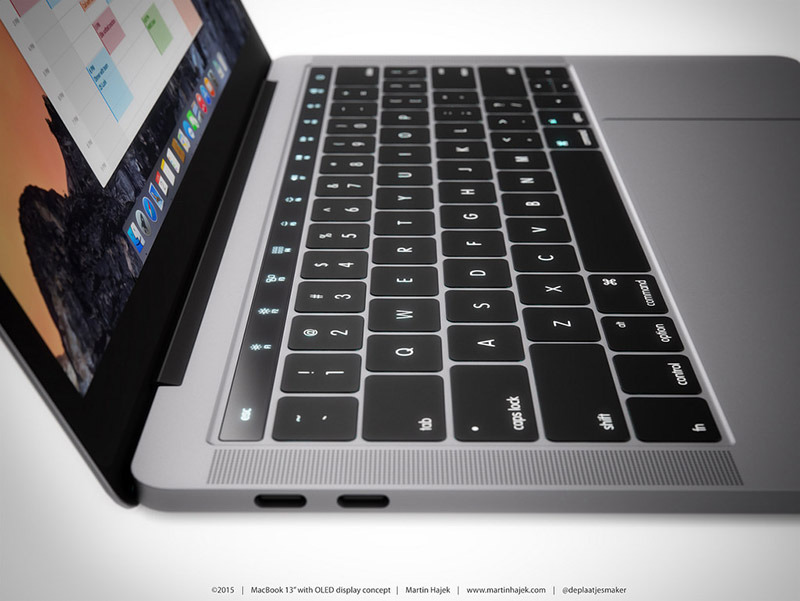
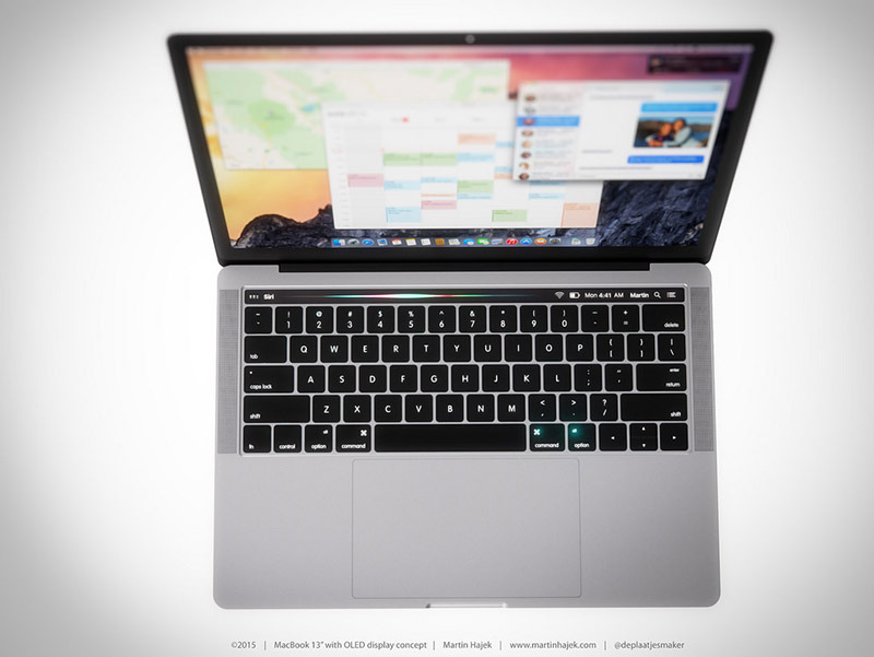
Building on a foundation of recent rumor and speculation, designer Martin Hajek mocked up computer graphics renders exploring the utility of incorporating an OLED touchbar into Apple's rumored next-generation MacBook Pro, a device anticipated for release later this year.
Posted to Hajek's blog on Thursday, the concept rendering integrates a sleek, high-resolution OLED touchbar into a modified MacBook Pro chassis modeled after a supposedly leaked part shown off in photographs last month. The result is nothing short of stunning.
In May, well-connected KGI analyst Ming-Chi Kuo issued a note airing Apple's potential plans for its aging MacBook Pro lineup. Along with a thinner, lightweight design, Kuo said Apple will nix the top row of function keys in favor of a single OLED touch panel. As the company is unlikely to remove existing keyboard functionality, some speculate the display will double as a customizable touch input capable of reconfiguring itself on the fly.
Hajek offers a few examples of how Apple might handle contextual reconfiguration. A few concepts show a representation of MacBook's traditional top row keys with the usual secondary functions like volume control, screen brightness and OS X system shortcuts. Other renders imagine the OLED display mirroring Mac's menu bar icons with app-specific graphics, an interesting idea that plays well Apple's push toward fullscreen app views. Siri's telltale equalizer graphic can be seen in another concept.
Not present is a MacBook version of Touch ID. Kuo predicts the next-generation MacBook Pro will be the first non-iOS device to integrate Apple's fingerprint recognition system. As Touch ID is embedded into iPhone and iPad home buttons, some speculate MacBook Pro's power button, or its OLED facsimile, as a logical installation site.
Kuo's note estimated Apple to announce a revamped MacBook Pro in the fourth quarter, but more recent rumblings suggest a June unveiling ahead of wide availability in August.
 Mikey Campbell




 William Gallagher
 Malcolm Owen
 Christine McKee
 Wesley Hilliard
 Thomas Sibilly
 Marko Zivkovic
 Andrew O'Hara

 Amber Neely

30 Comments
I love the idea of this OLED supplanting the menubar (at least in part) to maximize screen real estate. I tried the show/hide option in System Prefs, but I missed having the time, battery life, Bluetooth, WiFi and other info readable at a glance.
Granted I'm not an engineer, but assuming it's practical, if rather see Touch ID in the track pad.
I wish these mock ups would take it one step further when thinking about the design.
They end up making good ideas look pointless by just copying existing status quo.
I mean:-
-Handbrake Progress bar is a waste of touch screen. It's not like a can touch the bar and make it progress faster.
-If UI can change why do I need 4 brightness controls. have just one then pop up options.
- Same with volume, media player controls, mission control all could pop-up all the UI they need it.
- touchID at one end handles power, siri/search.
That would leave say 10 uninterrupted function keys for apps to use without needing an "fn" key.
Indeed why have the "fn" key at all with this system or is that for TouchID