Apple's Wide Color screen on the iPhone 7 will lead to more faithful color reproduction
 Mike Wuerthele
Last updated
Apple has implemented many different changes to graphics presentation over the years, but none may be more dramatic and have a more lasting impact than the ongoing shift from older technologies to the new Wide Color standard as found in the iPhone 7 family.
Wide Color, as found most recently on the iPhone 7 family, is Apple's name for the DCI-P3 color space. DCI-P3 was designed as a standard for digital movie projection for American film industry.
Most displays use the older "standard RGB" (sRGB) with a narrower color space — all of the iPhones prior to the iPhone 7 use sRGB.
Many still cameras have been storing the wider color range possible with DCI-P3, and have just not been displaying all the information possible on conventional displays.
Bringing Wide Color to iOS involved creating new software support for advanced color management in iOS, while implementing backward compatibility at the same time to ensure older apps still function. Additionally, on top of all that, new frameworks needed to be implemented for developers to be able to use the new Wide Color standard.
The above image was developed by Apple's WebKit team and utilizes the DCI-P3 Wide Color Gamut. Users on conventional displays, including all non P3 Macs, see an orange square. For users on a monitor or display that supports the DCI-P3 Wide Color Gamut, a circular logo is visible.
First seen in the iMac 5k, Apple implemented Wide Color in the 9.7-inch iPad Pro with the True Tone display, and now with both models of the iPhone 7. While the iPhone 7 screen is a Wide Color display, it is not a True Tone display with automatic white point alteration in response to the ambient lighting situation.
How much better is Wide Color than sRBG?
This is difficult to demonstrate on most monitors that don't support Wide Color. However, a standard representation exists depicting the limits of human vision, and the subset of color reproducible on a display can be outlined on that.
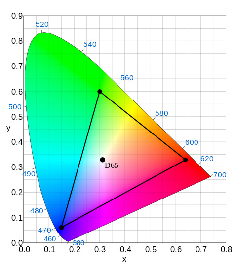
In the above image, the colored region represents the outer limits of perception in a human's color vision. The black triangle represents sRGB's limits of presentation.
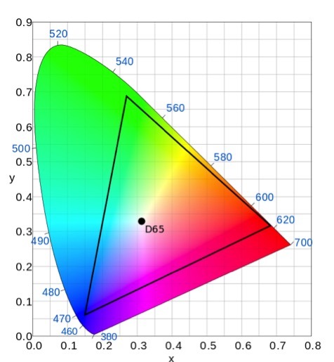
In contrast, the DCI-P3 standard, and the Wide Color implementation, has a larger area underneath the triangle, representing the greater array of displayable color possible.
Practically, this means that a fall foliage photo will be more uniform, with less color banding and other digital approximation artifacts introduced into the picture when captured on devices all capable of the DCI-P3 color range.
When 4k video is more common, a Wide Color display will be able to faithfully display it. The 4K ultra-HD specification requires devices to display at least 90 percent of the DCI-P3 color range.


 Amber Neely
 Thomas Sibilly
 AppleInsider Staff
 William Gallagher
 Malcolm Owen
 Christine McKee


27 Comments
"Users on conventional displays, including all non P3 Macs, see an orange square. For users on a monitor or display that supports the DCI-P3 Wide Color Gamut, a circular logo is visible."
I'm seeing the logo on a mid-2010 iMac. Buh?
Strange here, too. I'm using a Mid-2014 15" Retina MacBook Pro. In System Preferences/Displays/Color, if I select Color LCD (the default), I see just a red/orange square, but if I select ACES CG Linear or Adobe RGB (1998), I clearly see the logo. Even stranger, if I try out all the color options and then go back to ACES CG Linear or Adobe RGB (1998), I no longer see the logo. Quitting System Preferences and then going back to System Preferences/Displays/Colors, I can once again see the logo if I select ACES CG Linear or Adobe RGB (1998).
My 2014 iMac 21 (non retina) shows the red box only. As expected. feeling conned for having an inferior monitor to the RMPB ;)
Im seeing orange boxes in real life now.
Interesting. From an area perspective you just can show about half the colors a human eye can discern. I thought it was more. Did I miss it until now? Not consciously. Will it be something like a once-you tried-you'll-net-look-back things lile Retina display? Hmmm