The more technically-minded you are, and the less dependent on paper, the more you'll love Ulysses, the comprehensive writing tool for both Mac and iOS.
The trouble with Microsoft Word, Apple's Pages and apps like Final Draft is that they were built in a time when you printed everything out. Ulysses 12.3 for Mac and iOS is a text editor for today when you aren't sure where your printer is and you definitely can't remember when it last worked. It's for writers whose work is going to go online.
It's a writing environment and also wants to be where you go whenever you want to write anything.
If it suits you then Ulysses is a true marvel. Instead of thinking in terms of documents, you have one single Ulysses library and everything you ever write goes into the same place. Individual pieces of writing are called sheets and maybe you decide that these 50 sheets are a book while that 1 sheet is your shopping list.
Ulysses comes in versions for the Mac and iOS and the two are remarkably similar. You could swap between the two all day and forget which one you are using, the experience is that similar. Then, too, you could swap around and also know that everything you write on one platform is instantly on the other.
The syncing via iCloud is fast and it all contributes to this idea that you stop thinking about where your writing is. Just reach for the nearest device and carry on working.
You find that you very rapidly grow a huge library of material. There's no way to count but we've certainly accrued in excess of a thousand sheets' and see no ill effects like slower launches or syncing.
Dragging sheets around to collect into folders or to reorganize a book is instantaneous too.
Then so is picking and collating some, many or all of your sheets to send them to someone else. If you are writing for online then you can send your work directly from Ulysses to blogging platforms like Medium and WordPress.
For any other service you can either email text into them, if they support that, or just copy-and-paste like an animal. If you copy and paste from Word, you bring along all sorts of formatting gubbins that online doesn't understand but if you do it from Ulysses, you get exactly what you need.
If you are writing for print then a magazine will probably want the same kind of plain text that online does so you could again email directly from within Ulysses. They may prefer Word, though, and book publishers always do, so if you want it to, Ulysses will convert your selected sheets into a Microsoft Word document.
In the same way you can also prepare a PDF or an ebook in Ulysses. Whatever you want it to end up as, you write your sheets, choose which ones you want, pick the order and Ulysses will format your writing in the way you need. It's not the best ebook-making app: it won't compare to the design options of, say, Vellum. Yet this ability to always write in the same way in the same app yet later choose how to send your text out is a boon.
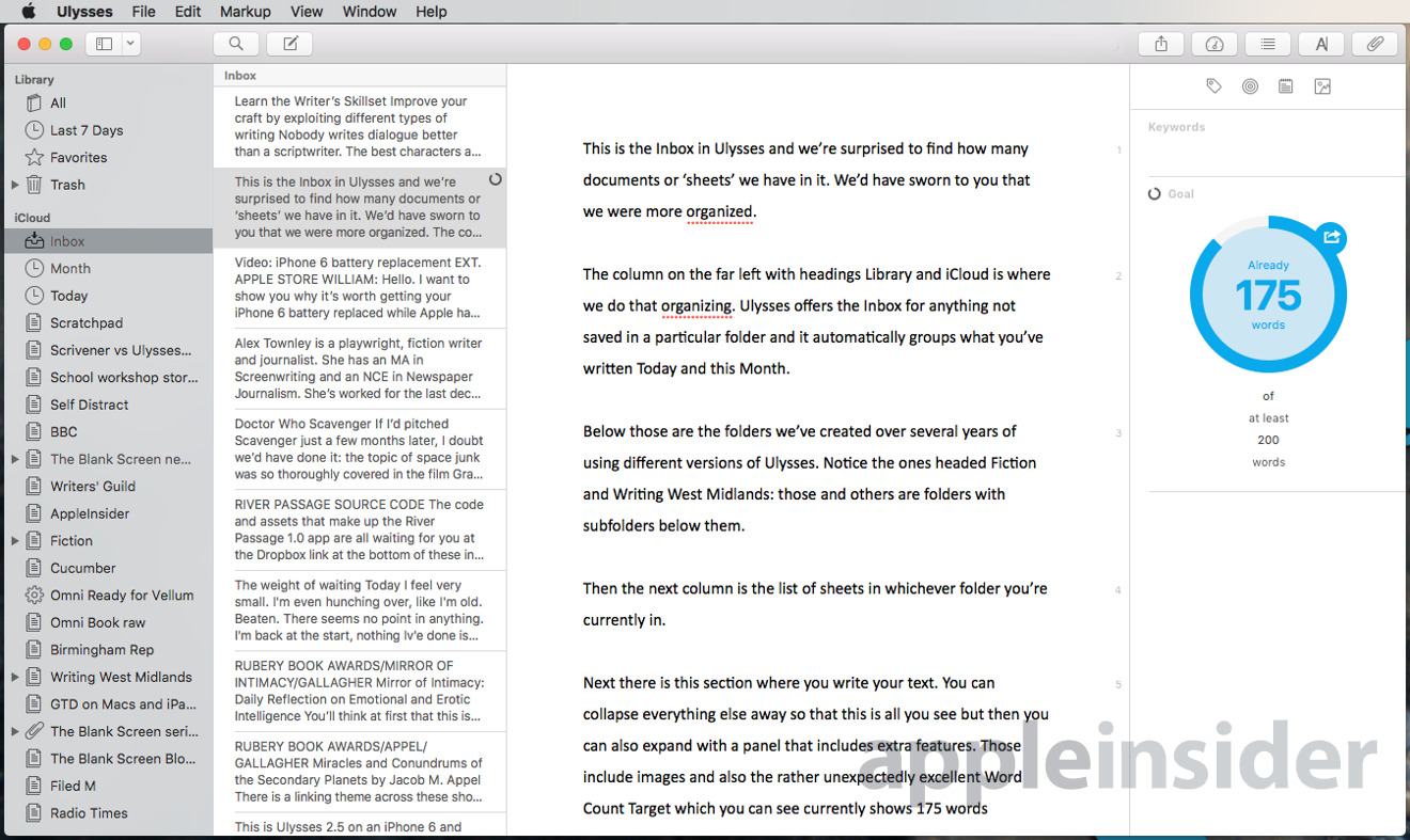
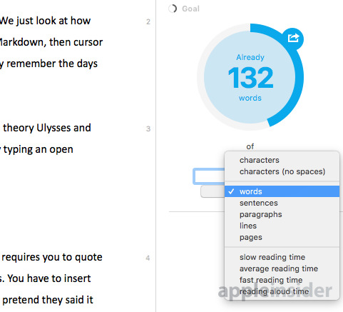
It does remain a reasonably basic writing experience, though: it won't do automatic cross-referencing, for instance, and it won't build you an index. What it can do is get you writing the text, bashing the keys, doing the work. For it optionally contains what proves to be a preposterously addictive goal feature. Tell it that you want to write 2,000 words today and as you type, it counts.
It counts the words and also displays a growing blue circle as you go. As you reach your target, it turns green. When you're writing for a magazine and are on a tight word count, it is ridiculously satisfying to turn that circle green and know you're done.
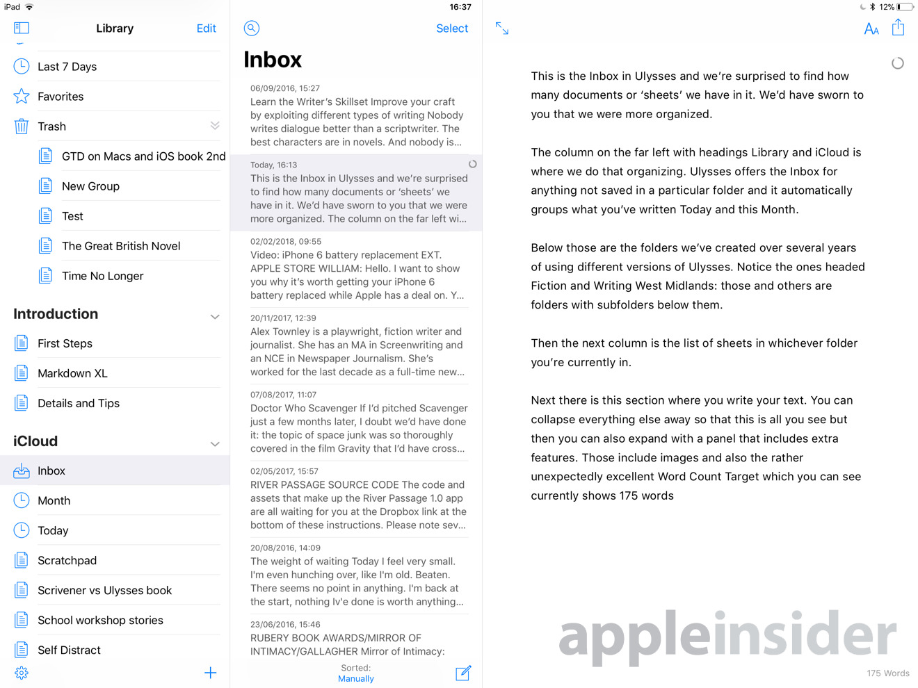
Spot the difference, if you can: this is the iPad version. The target word count circle is reduced to a small icon instead of a large one but otherwise there's no difference in writing on either platform. If you tap on the main text and start writing, you lose the Library columns and regain the large word count circle.
Last August, Ulysses moved to a subscription model, saying that this was necessary to ensure the app's development continued. Since then there have been some eight updates which chiefly refine features and fix bugs.
On the iPad and iPhone the releases have steadily added more and more iOS 11 features so that you can now drag and drop. Plus there have been improvements to searching but the key change has been in how you can now see a preview of any image you put into your text.
This, though, is a litmus test of whether Ulysses will suit you or not. Until the new version 12, you could include an image in your text on the Mac by the kind of series of steps that only a techie person would love. Very briefly, you'd write a tag that told the app to embed the image. If you understood that, if you can spot the steps we missed or if you know some mistake in our description then knock yourself out: Ulysses is definitely for you.
For anyone else, let us refer you to how you include an image in Scrivener, Word, Pages or absolutely anything else: you drag it in and that's it.
Things have improved in the new version for macOS but it's not exactly intuitive. We struggled with this, dragging images into the text, dragging them to a note attached to the sheet and so on. At first, we could load up an image into that note but nothing would make it appear in the text. Now without being able to find any information on the Ulysses help pages and without doing anything differently that we can see, we can suddenly drag an image in and it's fine.
Prior to this new version, you could attach an image but not actually see it until you exported your text to send to someone else in some other format like PDF or Word. Now you can see the image in your text and that's great. However, the makers say that Ulysses will preview any image in black and white so that it doesn't distract you from your writing.
That feels a bit spurious but it's also a bit wrong: drag a color image in and it will show in color - for a while. Then at some point soon it changes to black and white.
This is all the kind of thing that makes Ulysses feel less for writers and more for programmers. It does what it says and it offers you a great deal, but if you're an author coming from Word or Scrivener, it's sometimes bewildering.
The logic is that Ulysses wants to be a minimalist writing environment so that you can get on with your writing instead of fiddling. You don't think about images, you don't think about headers or footers, you focus on only the text that matters to you.
You can do that and we have written these thousand sheets, we've enjoyed writing them. We've especially enjoyed having our entire writing library with us on every device we own.
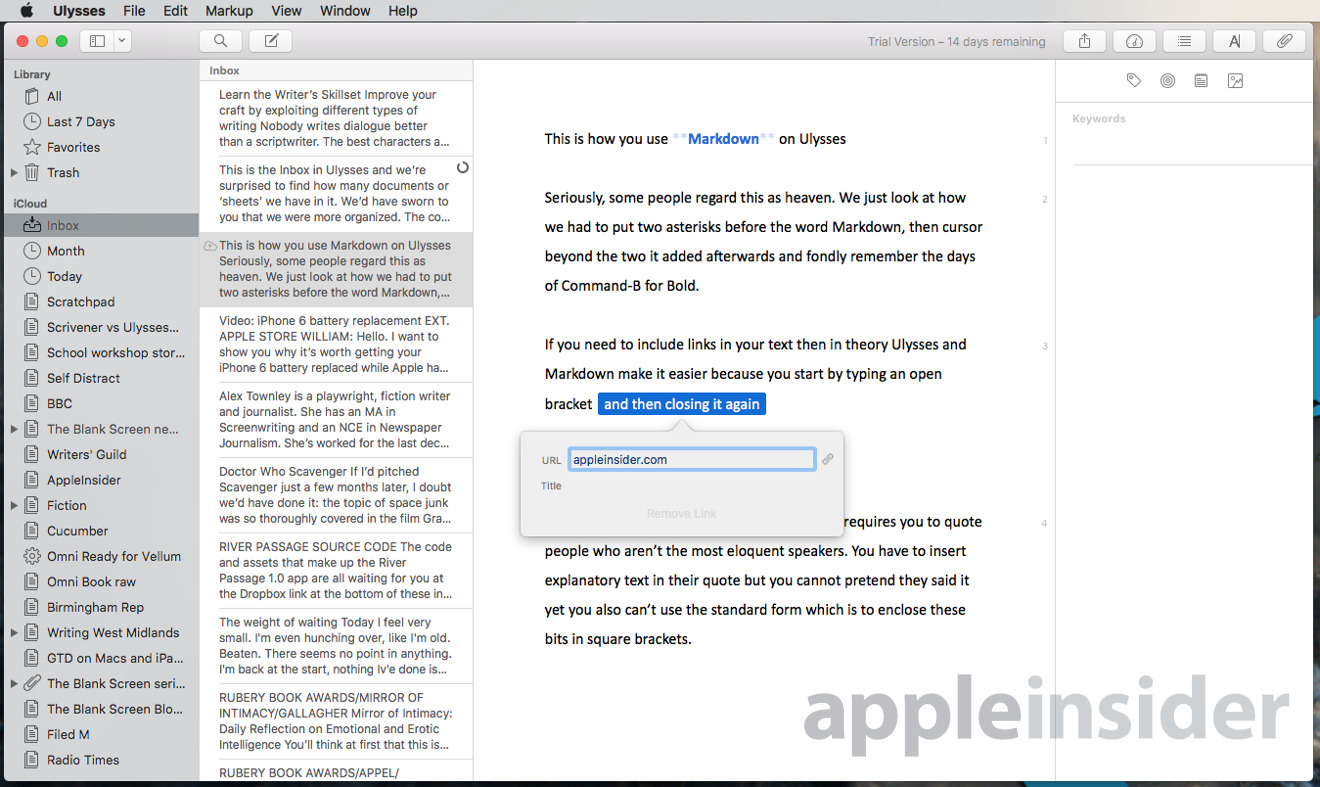
Yet for a writing app that wants you to focus on your writing, Ulysses at least likes it if you also know what's called Markdown. This is a tool, a language, that is meant to make it easy for you to add bold, italic, headings and so on into your work. So to mark some text as bold you would begin and end it with ** two asterisks, for instance.
That's definitely better than how you would write it in HTML to go on a webpage but it doesn't seem all that much better if you're a writer used to pressing Command-B.
Then say you're a journalist with a quote from someone that's absolutely perfect except they way they've said it, it's not clear whether they're talking about the defendant or the bishop. You can't misquote someone so what you do is take, say, "he admits he bought the truffles" and write "he [the bishop] admits he bought the truffles".
Try doing that in Ulysses, though and it interprets the square brackets as the Markdown code that means you want to insert a link to a website. You can stop it doing that, you can stop Ulysses interpreting Markdown yet it's another unnecessary fiddle when all of this is meant to be helping you get on with your writing.
We've just gone from enthusing about Ulysses to making it sound like you have to be a geek to use it and that's not what we really mean. If you are a geek, you'll get more from Ulysses and you will deeply love it. However, if you're a writer genuinely only concerned with the text you're writing, then Ulysses is schizophrenic: half the time it's brilliant and half the time it gets in your way.
We really, really like writing in Ulysses on the Mac and the iPad. We like having all sheets together so much that we don't stop saying it. Then the ability to write text in Ulysses and just copy it straight over to a website's Content Management System is first class.
We just don't quite like it enough to be sure that its subscription is worth the price to us. This is preposterously subjective but then all software is and we don't quite enjoy Ulysses as much as we wanted or even expected to.
Fortunately, there is a 14-day trial version on the Mac and iOS App Stores. If you're either looking for a minimalist writing tool or you are already a fan of Markdown, try Ulysses for two weeks and see how it fits with your work.
If you decide to buy then you get use of Mac, iPhone and iPad versions via a subscription which is either $4.99/month or $39.99/year though an in-app payment.
 Mike Wuerthele and William Gallagher






 Charles Martin
 Amber Neely


 Sponsored Content
 AppleInsider Staff
 Malcolm Owen
 Oliver Haslam



14 Comments
I used to be a big fan of Ulysses, buying Mac and iOS licenses for years — until the subscription model was implemented. Simply put, Ulysses is a very good text editor, but that’s it. In no way is it worth the price the developers are asking. IA Writer and Bear to essentially the same thing for less, and IA Writer has more features and is available on Mac, iOS, Android, and Windows (in the future). The subscription price would possibly be worth it if there was some sort of service offered along with the software (along the lines of Omni’s or Panic’s sync server). But there are no such services, just a developer with an inflated sense of worth. Sad to say, because, as I mentioned, I used to really love Ulysses.
It uses iCloud and still is based on subscription.
There, stopped reading.
Evernote still does the job.
Great review. I’ll stick to Scrivener.