The Eve Button joins a growing field of attempts to solve a basic problem of smarthomes: controlling accessories when you don't have a phone, tablet, or smartspeaker nearby, or you simply don't want to make a fuss.
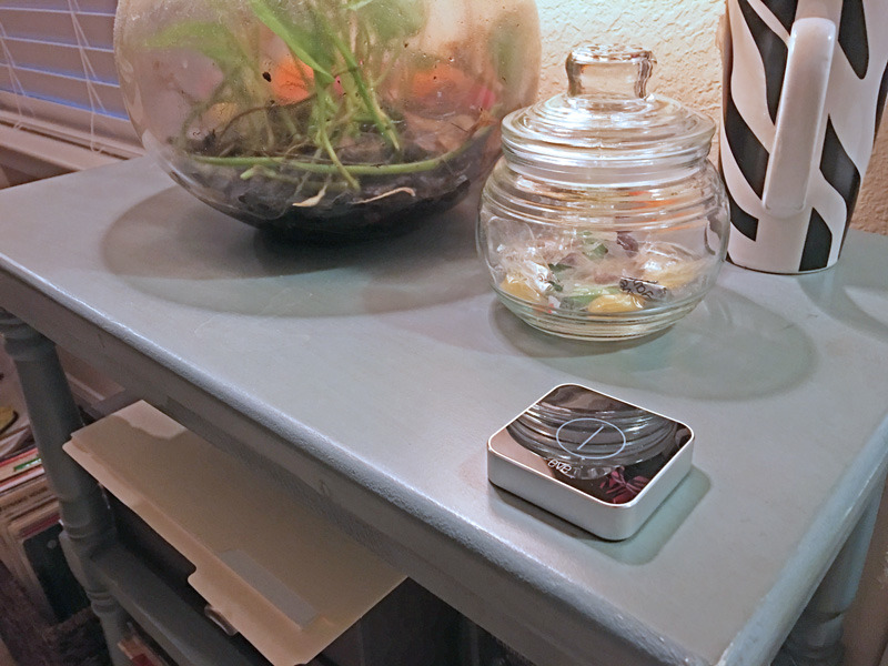
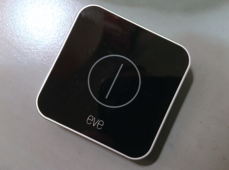
Fundamentally, the Button is extremely simple. As its name implies there's just one button, which triggers different commands based on whether you do a single, double, or long press.
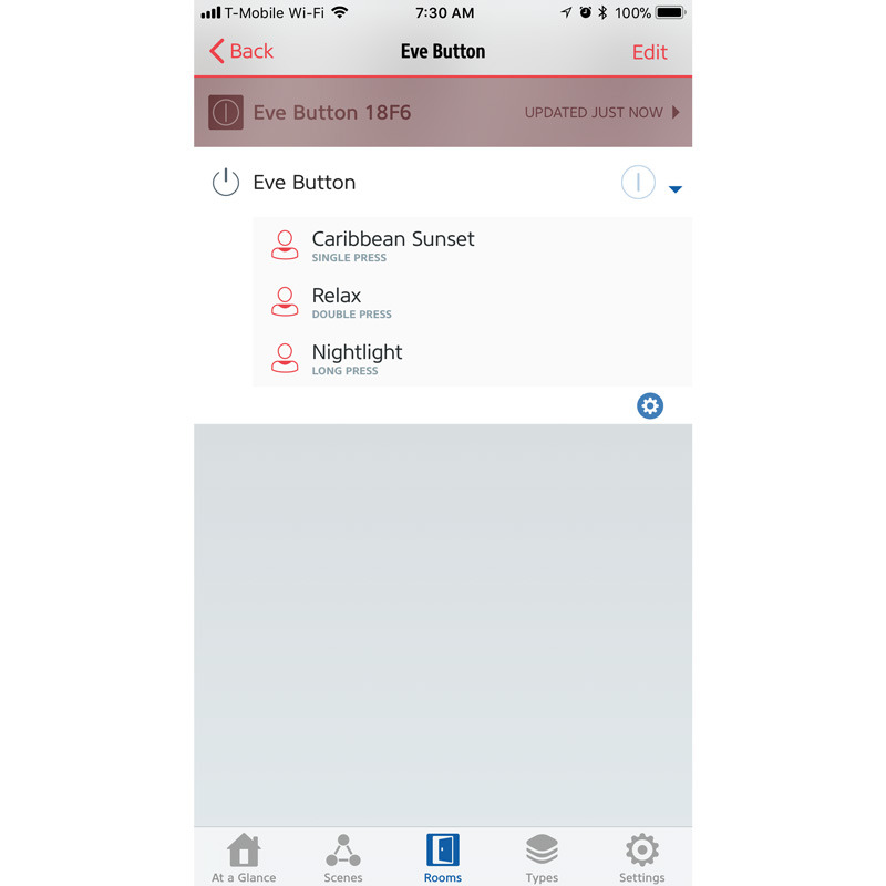
Using the Elgato Eve app — or Apple's own Home software — you can assign HomeKit scenes to each kind of press. The most common use is liable to be lighting, for instance letting you set a bright scene with a single tap, switch to "mood" lighting with a double-press, or shut off lights entirely by holding the button down. There's no reason however why you can't include things like fans, blinds, locks, or thermostats.
Interestingly, the Eve app lets you assign multiple scenes to a single button. We need to test this to see how well it works in practice, but conceivably it could let you control many different parts of a home without having to create new scenes.
It should be noted that the Button is meant to be treated like a remote, rather than wall-mounted, so people looking to replace a wall switch should probably search elsewhere. And like the rest of the Eve line the product uses Bluetooth, not Wi-Fi, so you'll need an Apple TV or iPad to serve as a HomeKit hub.
The Eve Button costs about $49.95. AppleInsider will continue to test the device, and will publish a full review in the coming weeks.
 Roger Fingas






 Marko Zivkovic
 Malcolm Owen

 Andrew Orr


 Christine McKee
 Andrew O'Hara





4 Comments
So, I spend a bunch of money on smart home tech that moves past physical wall switches and lets me use my voice or my phone to turn my lights on and off.
Why would I need to buy a $49.95 device so I can go back to using a physical switch?
😂😂
PS - this is tongue-in-cheek people. Just goofing around, so save the nasty replies. 😉
I have a big issue with the single/double/long press thing on a device that is meant to be SIMPLE. In other words, something that ANYONE should be able to use and behaves consistently. I use the Logitech Pop, which provides very similar features, and it's been a nightmare to get non-tech savvy house guests to use it, because they always end up pressing the wrong way, triggering the wrong thing. Considering the size of the thing, it would be so much better if it had three or four buttons, and even better if it had a clear plastic cover so you could place a customizable insert underneath. This way, you could clearly identify the function of the button, such as "watch TV," "Play radio in all rooms", "Leave house". And there would be no need to have those silly long and double presses, which I have no problem with but everybody else in my house did.
A little pricey for my taste. It's a maybe for me at $39.95, but would be a solid Buy! at $29.95. There are other similar products but I'm not familiar with their features.
It's not very attractive, but the more HomeKit compatible kit, the happier I am.