Dark Sky's excellent data is now clearer, becoming slightly odder later. AppleInsider checks out the forecast.
Maybe everyone can make a weather app because there are certainly enough of them in the App Store — but there aren't many very good ones. There are yet fewer exceptional ones and even before this revamp, Dark Sky 6.0.7 was one of them.
Most weather apps aim to have their own distinctive feature and there aren't that many possibilities but Dark Sky has a genuine one.
From the start, back in 2012, Dark Sky has centered on telling you about rain. If it's raining now, it'll tell you how bad it's going to get and when the sun will come out again. If it isn't raining, Dark Sky will tell you if a shower is due soon.
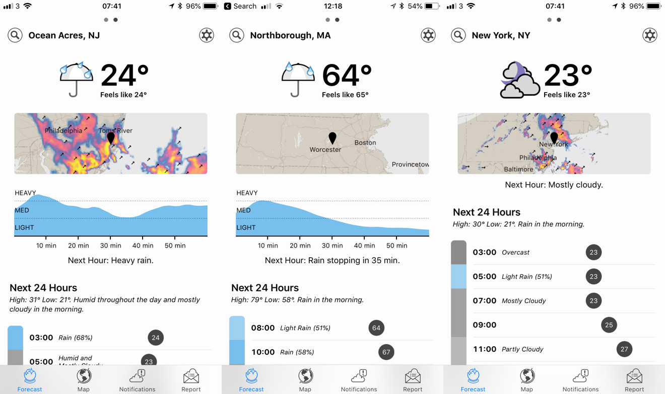
The information has always been displayed particularly plainly, too. The app will tell you directly that, for instance, the situation is: "Next Hour: rain starting in 2 min., stopping 12 min. later."
It's a nice touch including the period after the abbreviation "min" but it would be better if it correctly identified plurals.
Still, with detail as specific as this, you've either got to be bluffing or to be extremely accurate.
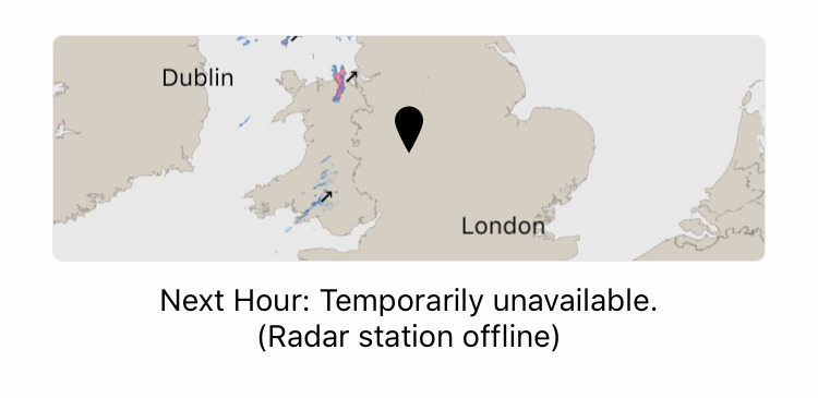
Dark Sky is a tiny bit of both. When you're in continental USA, you can put money on it being right to the minute. Elsewhere in the world, it's not as accurate. That's hardly surprising as it can only be as precise as the data it's given but it only rarely warns you of that.
This new update does help a little more: if the information is not available then the rain forecast section is simply removed from the screen.
The main screen
That's to do with how the new design attempts to show you as much relevant information in one go as it can. Previously you had the main screen with the rain and some forecast details but you had to swipe to a second and third page to get more.
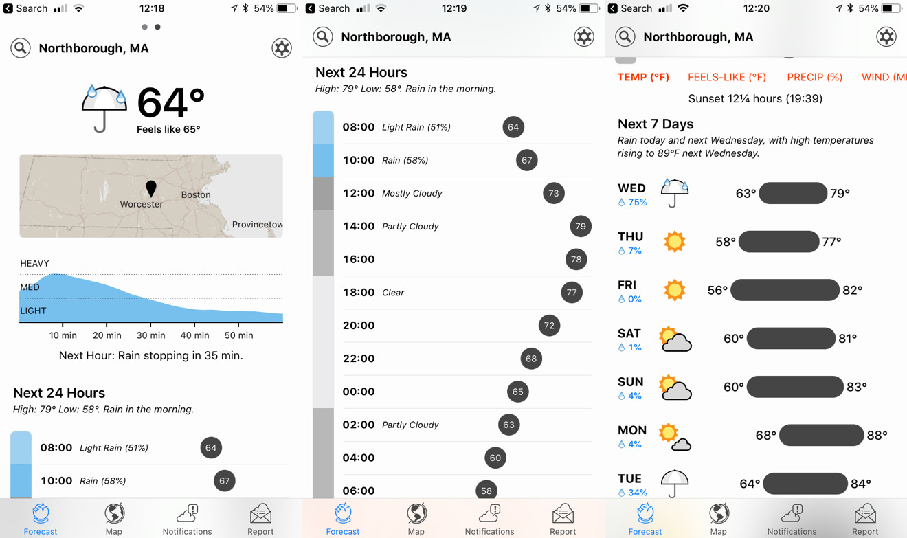
Now you can't swipe or at least you can't swipe left and right. There are still four pages, which you get to through buttons at the foot of the screen, but all the major detail is on the front page. So you can and you do swipe up and down.
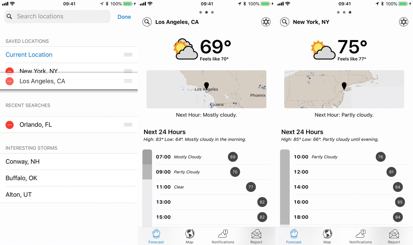
Above the rain forecast, you now also get a small map extract. This is to get around a disadvantage of the weather reporting being so local. Previously Dark Sky might correctly tell you that there is only light rain in the area but then you drive down the road and you're in a tornado.
This map extract puts your position and the local weather in context.
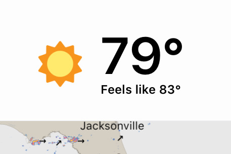
As well as this, the rain and the overall temperature — both the correct one and a very useful "Feels Like" figure — Dark Sky presents an timeline of the day.
It's a vertical timeline divided into hours and alongside each hour there can be a brief description. There's also a temperature in a circle and, particularly nicely, that circle will be at a different position on the line depending on how hot or cold it's going to be.
So with a glance you can see that the temperature is rising or falling over the next hour.
Week forecast
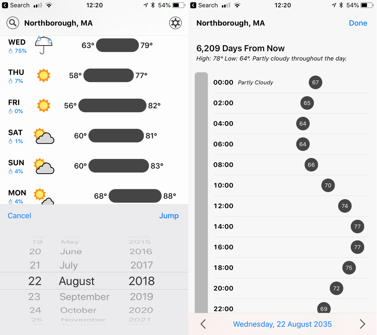
There's a similar visual clue in the Next 7 Days section which, again, you get to just by scrolling down. This lists the next week with an percentage chance of rain and an icon indicating a small range of possibilities from sunny through cloudy.
Then there's a bar showing you the forecast maximum and minimum temperatures for each day. Just as with today's temperatures, this bar is positioned so that hotter days are toward the right, cooler toward the left.
Weak forecast
There are three more screens in Dark Sky and each has its uses but this main front one concludes with a peculiar feature called Time Machine.
The idea is that you can look forward or backwards to see how the weather will be or was across a range of time. It's the range that's peculiar.
Tap on Time Machine and then choose a date from the picker. This will surely, surely be fixed in an update some time but at this moment you can choose a date up to December 31 in the year 10,000.
You can be quite sure that this is just because the developer has missed putting an end date and of course there isn't really any weather prediction for then.
Except there is a seasonal average prediction for every day up to — currently at least — Monday January 18, 2038. New York City will be partly cloudy throughout the day, with a high of 37 degrees Fahrenheit and a low of 28.
Where are you now?
Dark Sky defaults to your present location but you can specify others. Not only can you search for places but it also prompts you to look at three spots on the Earth that are facing particularly interesting weather conditions.
The trouble is that this is a search rather than a setting. You can say that you want to know the weather in Los Angeles — spoiler: it's sunny — but it's confusing how you save that as a regular location.
First you look for a place, then Dark Sky saves that as a recent search. You can leave Los Angeles right there but there is also a grab handle next to the name. You can grab it and drag upwards from Recent Searches into Saved Locations.
Now you can swipe left and right: once you have two or more locations, this is how you move between them.
Only, if you swipe to one and then tap on the Map button at the bottom of the screen, you're taken to a globe that is centered on your current location instead.
Back on that front page, you can tap on the little map extract to go to the globe with the correct view, though.
The map is fascinating, though. The globe shows you a time-lapse of the last four and the next five days from today with rainfall or temperature. We found the temperature took many seconds to start but once it does, both it and the rainfall version are quite mesmerising.
Notifications
So you can glance at the front page of Dark Sky or you can choose to get absorbed in its Map. There is, though, a third screen which is all about sending you alerts.
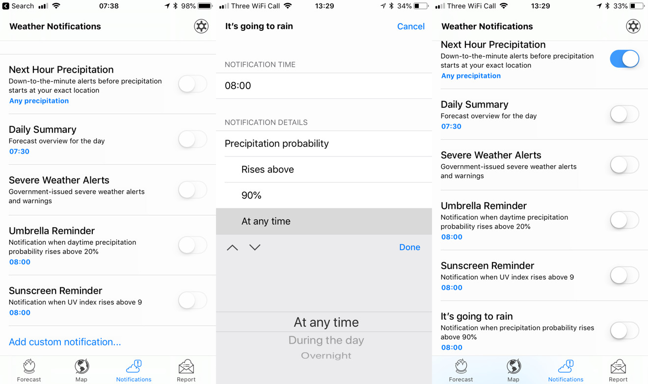
By default, Dark Sky comes with five standard notifications that you can choose to switch on. They include options such as displaying a banner when there's going to be rain in the next hour or just giving you a daily summary.
Dark Sky has always provided custom notifications where you can specify whether and how you want to be notified about what. This has got an overhaul in the new version 6.0.1 to make it a matter of choosing from various options.
You do have to remember to tap Done when you've chosen a setting. If you want an alert any time that it's going to rain a lot, you can't tap to say 90 percent probability of rain and then immediately tap on the "At any time" setting. You have to choose the temperature or whatever, then tap Done, then move to the next thing.
Similarly, you can set this up but you have to remember to then switch it on. A new custom notification gets added to the list of Dark Sky's regular ones and each has its own on/off toggle.
One more thing
Dark Sky is able to forecast extremely accurately because it collates information from so many sources — and that can include you.
The last section of Dark Sky 6.0.7 is a reporting screen where you can tell the developer what the weather is like where you are.
That's through a well done series of quick taps but you can also give Dark Sky permission to use your iPhone's pressure sensor to anonymously provide barometric readings.
Dark Sky may be one of myriad weather apps but it's also one that many of those others rely on. Its data is available to anyone, for a fee, and it's mark of the service's accuracy that the likes of Microsoft and Yelp use it. So does iStat Menus with its gorgeous Mac weather display.
Dark Sky 6.0.7 costs $3.99 on the App Store and you can judge the accuracy of its data for where you are by using the official website.
