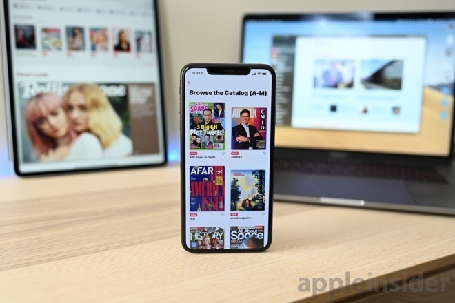
Apple News+ is apparently experiencing growing pains, as a handful of smaller publications speak out about problems with the month-old service including access to platform-specific design templates and poor communication from Apple.
Citing five publications taking part in Apple News+, Digiday reports Apple is giving unequal aid to participants of the subscription news and magazine service, with much of the company's assistance seemingly focused on larger publishers.
Perhaps most detrimental to Apple's next-generation news hub is a reported lack of support for adapting publications, both physical and digital, into the custom Apple News+ format.
According to sources, Apple in pitches leading up to the release of News+ presented a customized version of soccer magazine Eight by Eight, suggesting all publishers would be furnished with their own specialized design assets and templates.
"They basically said, We will help you out by providing templates,'" a source told Digiday.
That has not been the case.
Beyond giving input on in-house templates designed by larger outlets, Apple has not provided its own solution for publications to insert into their respective workflows. Instead, the tech giant is outsourcing template design work to outside vendors, a strategy that has yielded mixed results, the report said.
Publishers of physical magazines who opted out of custom templates, or simply could not afford to roll their own tools, are left to rely on "buggy" conversion software that scans and converts article PDFs into a format digestible by Apple News+. Apple's provided tools are reportedly not up to snuff, leaving magazines no choice but to commit resources toward re-editing the copy and design of each issue.
Further, the tools are standardized, meaning output is largely homogenous. For publishers looking to stand out in a crowded industry, and have done so with successful print design, Apple's answer to digital adaptation is sub-optimal.
The result is a disparity in design that sees some magazines displayed with custom article templates, interactive graphics and special animated cover art, while others are simple PDF scans. Publishers are reportedly vexed by the uneven user experience.
"You think of Apple, and they're so design-conscious," a second source said. "This doesn't feel like that at all."
Apple does maintain a team of designers tasked with fielding pitches for design help, but the initiative is not applied evenly to all publishers. Headed up by former Wired editor Jason Tanz, the group accepts requests for assistance on specific articles or story packages. While Apple handed out a global email address to all participating publications, a smaller group was afforded access to a private Slack channel.
Apple's preferential treatment did not sit well with some publishers.
"They're basically playing favorites," said a source at a participating Apple News+ publication. "It always seems to be good for the big guys, but not for the rest of us."
Publishers also complain about Apple's indifference to confusion as to whether Apple News+ interferes or cannibalizes digital sponsorships of print edition packages.
Apple debuted Apple News+ at a special event in March and launched the service as part of iOS 12.2. A report in early April claims some 200,000 people signed up for a trial subscription to the service in its first 48 hours of availability.
