It's the first thing you see when you switch on your Mac — but then you might not look at it again for the rest of the day. Yet if you take some time to see what the Finder can do for you just in its regular windows and it'll become a tool instead of simply where you keep that pretty wallpaper.
Every one of us uses the Finder on the Mac, but also every one of us has a different way of doing it. There's nothing wrong with that, but we do tend to get so unthinkingly locked into how we have the Finder set up that we can be missing out. That became especially true with macOS Mojave introduced new features that were only available in certain views, but it's always been the case that there's more to Finder than meets the eye.
Start with those views. Maybe you're an icon fan or maybe you prefer lists. Today we have four subtly different views on our documents, though, and sometimes just switching to another one is useful.
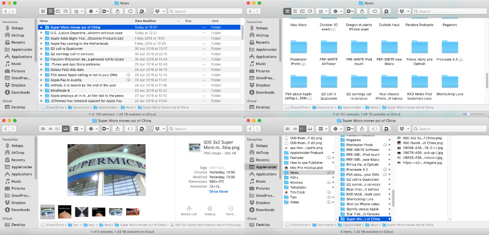
Top left: list view. Top right: Icon view. Bottom left: Gallery. Bottom right: Columns.
The list view at top left shows the most number of items in the current folder, but then the icon view at top right makes it much clearer what's what.
That's not just because everything's bigger, either. Notice the folders with little iCloud download icons in their name as this view is also the clearest about whether an item is physically on your Mac or has been copied off to iCloud.
Those icons are present in all the views, but they're most the visible in the icon one.
Whereas macOS Mojave's new Quick Actions are most visible in the Gallery one at bottom left. That shows you an icon view of the current folder, but the emphasis is on the currently-selected file — and you can have a pane that shows you more details about it. Plus that pane includes these Quick Actions that let you do work on a file without even opening it.
Then none of the views give you a better idea of where your documents are on your Mac than the Column one. Click on that and the current folder becomes just the right-most pane in a series of columns. As you look to the left, each pane you see is showing the files from one level up.
Scroll to the left and you keep on going for as many columns as you were folders deep into your drive. You can't quite go all the way up to the top level of your Mac, you can only go up to iCloud drive or to the highest level of the current drive.
Where you are
You can also scroll to the top level of the current drive or iCloud Drive by right-clicking on the icon in the window's title bar.
In this case you have to scroll up, but it's immensely handy. Say you've searched for a file and while Spotlight has found it, you now realise you need some other files to do with this one. Just right-click and go up one level to the enclosing folder and you'll see what else is related.
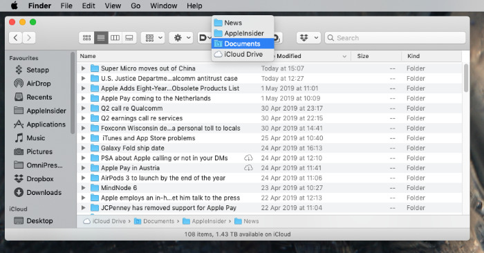
Right click on the title bar and you get the path to this folder.
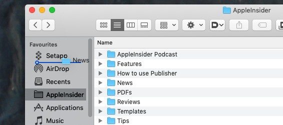
When you're not happy with where something is, you can change it from the same title bar, too. Just click and hold on the icon and drag. It is specifically the icon in the title bar, not the text title, but it doesn't matter whether that icon is of a document, folder or application.
In any case, you can drag that icon to somewhere else on your Mac and the app, folder or file will move there.
The one exception, and it's a very useful one, is when you drag the item to the sidebar in the Finder window. In that case, the item stays right where it was, but you get a shortcut to it in the window's sidebar. And in every window's sidebar until you drag it out again.
You can drag just about anything into that sidebar, whether it's from the title bar of a window or anywhere on your Mac. And you can drag it back out again to get rid of it.
Where you want to be
This sidebar is one of the best parts of the Finder but it is also one that causes confusion for new users and isn't perfect for experienced ones, either.
The problem for new users is that they tend to think that their folders and so on are actually in that sidebar, that it's not a shortcut to somewhere else. So we've had people think they were backing up their Mac because they dragged one Finder window somewhere.
You not only wouldn't do that, you're struggling to work out how any one could. We're with you. But as long-time Mac users, we may understand what's going on in the sidebar yet that doesn't completely make it better.
You can drag just about anything into the sidebar for quick access later. And you can drag most things out again.
The problem with the Finder's sidebar is how it handles tags. Tagging is reasonably recent to the Mac, or at least it feels as if it's only recently that Apple paid it any attention — and then forgot about it again.
For right now, the Finder's sidebar will display a list of your tags and in theory that is fantastic. You can click on any to see a list of any file on your Mac that you've given that tag to. It's extremely useful.
Except you either tend to ignore tagging completely or you're so into them that you have many, many tags. In which case that sidebar list is just a long mess.
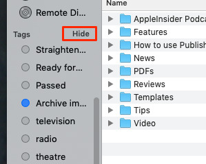
The Hide button is usually hidden. Of course it is.
Instead of taking up all that space or giving up on tags, though, you can hover your mouse cursor over the window and just next to the title Tags.
If you do that, you will get the word Hide and you can guess what happens when you click that.
Why Apple chooses to hide the Hide button is a mystery, but this same function is there for every section in the sidebar. You can hide or show any or all of the different sections and really customize this for what you need.
Customizing
Speaking of customizing, though, you may have noticed that the Finder windows in these illustrations is not quite the standard one.
Everything we've said still applies, everything the Finder can do is still the same, but each of these images looks slightly different because we use Default Folder X.
This is one of those third-party apps that should be part of macOS and never will be. It solves problems you don't appreciate until you've been using the Mac a lot, for one thing, and as easy as you will find it to use, it does add an extra layer of complexity that isn't necessary.
Or it isn't necessary until you've used it, then it's mandatory. Then it's something you will add to every Mac you ever touch, because it's so useful.
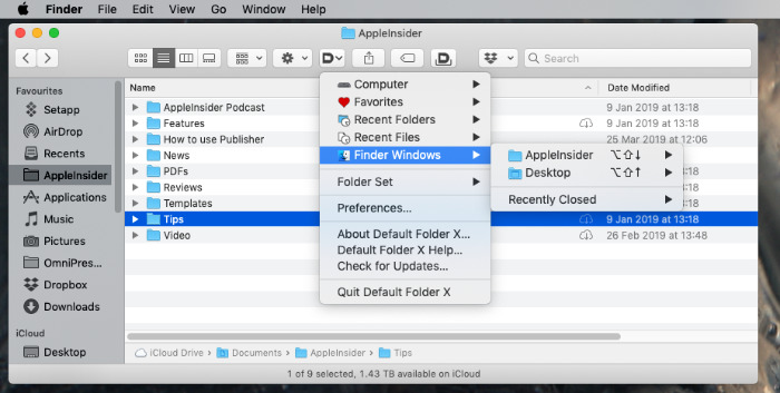
Default Folder X. A Finder navigation app that Apple should bundle with all Macs.
Right in the Finder window, any Finder window, you can click on its icon to get a list of recent files or folders and go straight to them. You can create favorite destinations you regularly save files to. And clicking a separate icon, you can give each window a shelf onto which you save often-used items.
Default Folder X is so much more use when you're actually in an app, because it changes the standard Open and Save dialogs into much more powerful ones. So much more powerful that we went for months loving the app and not even realising it did all this with the Finder too.
That's the case with everything to do with the poor, forgotten Finder. That app adds more features that we rely on, but the regular out-of-the-box Finder contains so many more power features than we appreciate.
Next time you start up your Mac, take a moment before you go into your apps for the day and see how much more use you can get out of this macOS staple.
Keep up with AppleInsider by downloading the AppleInsider app for iOS, and follow us on YouTube, Twitter @appleinsider and Facebook for live, late-breaking coverage. You can also check out our official Instagram account for exclusive photos.