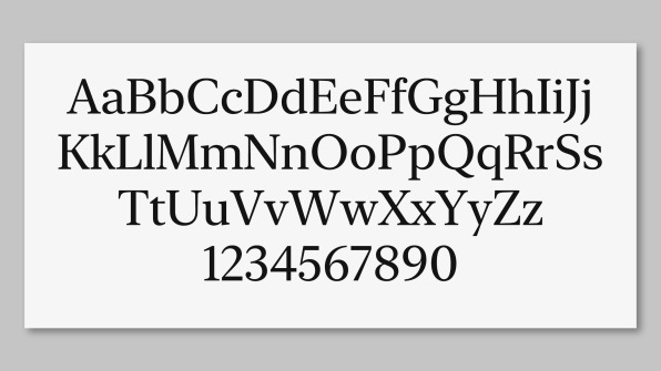
Apple has quietly released a free, revamped version of its "New York" font, intimately familiar to anyone who used the first-generation Macintosh and many of its successors.
Apple is introducing ever higher resolution displays but it has always been focused on typography, right from the days of the very first Mac. Consequently New York may have become a nostalgic favorite, but it was originally a very carefully designed font that was intended for maximum clarity and readability.
Apple says that this new version does exactly the same job, just for today's monitors.
"This all-new, Apple-designed serif typeface is based on essential aspects of historical type styles," says Apple on an updated developers' page, "and is designed to work on its own as well as alongside San Francisco."
In the beginning
Neither San Francisco nor New York were the original fonts intended for the Mac. Back during the machine's earliest developments alongside the Lisa in the early 1980s, the Cream 12 font face was used. However, Cream was a font used by Xerox and Apple decided to create several of its own to make the best use of its screen technology.
While the first Mac had a limited bitmapped screen, designer Susan Kare — best known for creating the original Mac's icons — says it was a pleasure to work on. "It was especially enjoyable because the Macintosh was able to display proportional typefaces," she wrote on Folklore.org, "leaving behind the tyranny of monospace alphabets with their narrow m's and wide i's."
Kare had named her fonts after cities she and Mac designer Andy Hertzfeld knew in Philadelphia. Steve Jobs approved of the idea of using cities, but not these ones. "They ought to be world class cities!" he said.
San Francisco
The company's default font across Macs, iPhones, and iPads is a custom sans serif font called San Francisco, based on Helvetica Neue, Fast Company noted. Sans serifs can scale across multiple resolutions and remain readable.
Helvetica was not originally designed for screens at all, so Apple's development and refinement of its own font faces is part of what makes text look so good on Macs.
While New York and also two versions of San Francisco are now available to download for your Mac, Apple is presumably making the New York revamp public because of iOS 13. Coming this fall, that release will be the first version of iOS permitting system-wide font changes and brings "desktop class" font capabilities to Apple's Mail on iPhones and iPads.
Windows
These new fonts also work on Windows — if you can extract them from the DMG file. Steve Jobs once famously said that without the Mac, no computers would have fonts. During his 2005 commencement speech at Stanford, he talked about dropping out and attending whatever courses he happened to like — which included a typography one.
"If I had never dropped in on that singe course in college, the Mac would never have had multiple typefaces proportionally-spaced fonts," he said. "And since Windows just copied the Mac, it's likely that no personal computer would have them."
Apple's licensing terms do limit use of the font to mockups of user interfaces for iOS, macOS, tvOS, or watchOS.