Apple has rewritten its basic Reminders app for iOS 13, iPadOS 13 and for macOS Catalina when it releases. No longer quite so simple, it could be all the To Do app you need, but it does suffer from being a first version.
The Reminders app that Apple has now revamped used to be an odd mix of the particularly basic and the quite brilliant. Overall, it was a simple To Do app, a task manager that was deliberately easy to use. Yet it was also typical of Apple at its best in that it introduced a feature no one had ever thought of, but which was so obviously good and right that everyone copied it instantly.
That was location reminders, this ability for your iPhone to remind you of a task not at a certain time or on a certain day, but instead just whenever you happened to get to the place where you could do it.
This alone was a reason to use Apple Reminders, but if you have a lot to do, you soon found that it wasn't up to the job. Everything else about it was just intentionally underpowered to make it quick to learn and fast to use.
Now with this totally rewritten new Reminders app, Apple is trying to make something that is much more powerful and yet keeps its simplicity.
The new better
The one feature this revision of Reminders adds that is again typical of Apple, and again will surely be copied in every To Do app, is Messages. If you tag a task with a person from your contacts list, then when you next message them, you'll get a reminder popup with the task name.
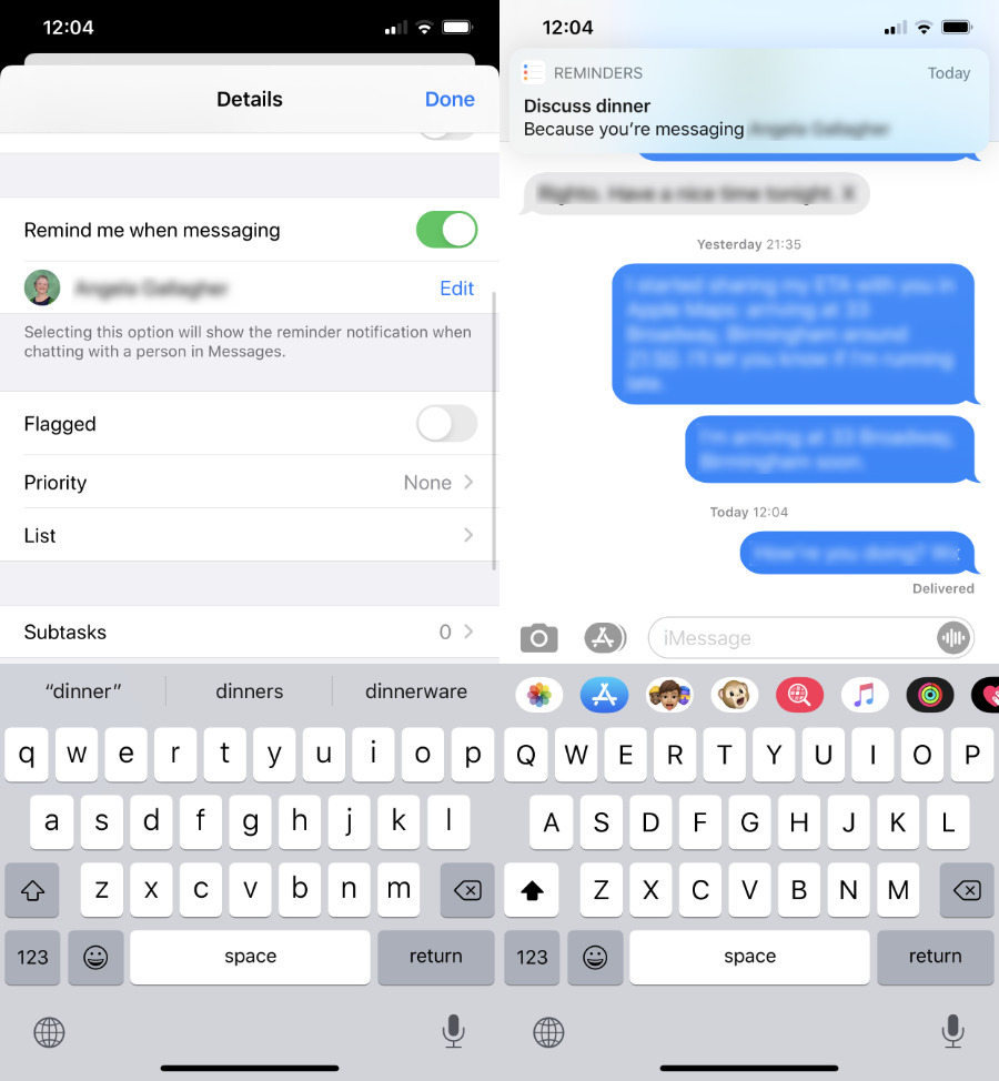 This is so good. Start a Messages conversation with someone, and Reminders will notify you right there if you had planned a task you need to talk to them about.
It'll appear after the first message you send this person, rather than just when you go into Messages and choose their name. So it might be handier to have it appear right away, but it's still great that it's there doing your message conversation.
Apple is also very keen on its new natural language parsing.
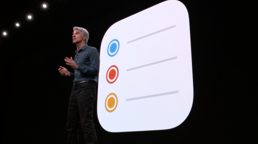
"Just type what you want and Reminders will understand when and where to notify you," said Craig Federighi when he introduced the new app at WWDC 2019.
This is superb, and yet also a bit inconsistent.
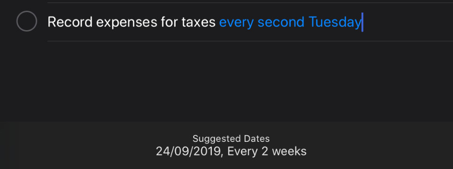
If you write a task such as "Check finances daily" then Reminders will see that last word and offer to create a task dated today, which repeats every day. You can also say "every week" or "every two weeks," and it works. It's the same with "every Second Tuesday," too.
Only, it doesn't work when you want to write "last day of the month," or "fortnightly." It won't interpret "Book holiday on the 15th," but it will "...on October 15th."
There are the usual issues to do with, say, you're for some reason reminding yourself to phone the New York Daily Post where it picks up the word daily. We also found sometimes it would pick up a key word in a task such as "book Christmas dinner" and suggest December 25, but then other times it wouldn't.
Whether it's correct or not, you only set that date or that repeating task by tapping on the button that offers it to you. If you just keep typing and hit Return, the task is set for today.
If you then tap the i button to get all the details of your task, you can change that date and when the task should repeat. This is half excellent — the way you can tap to say you want it to repeat on these days in the month is among the simplest and clearest we've seen.
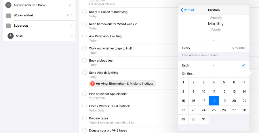 It's very easy to set up repeating tasks, but we're not sure what happens when a month doesn't have 31 days in it.
However, if you want to do something on the last day of every month, you've got a problem. Apple Reminders assumes every month has 31 days in it.
Organizing
Other than this, the new features are all to do with addressing the same concerns that every To Do app has to handle. They all need a way for you to get new tasks into them quickly, to find out fast what you need to do next, and help you organize yourself.
Reminders lets you create different lists for what other To Do apps might call projects. That vacation you're planning, that could be a list to which you add tasks like "Buy plane ticket," for instance.
The idea is that you need to make a note of that and it's something you've got to do, but you don't need to know about it while you're at work today. While you're at work, you might need to note down some tasks to do with Friday's AGM, or with your Acme client.
In which case, you would make an AGM list, and an Acme one. But you can now group them together under one title you call "Work."
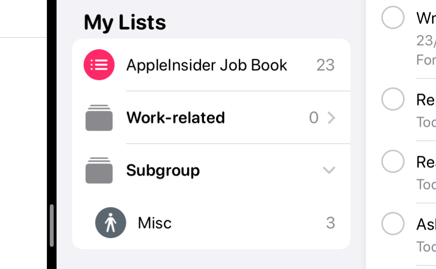
Groups are what other To Do apps would call folders. You can't have subgroups or subfolders, though, so your list of lists or lists of groups can still get pretty long.
They're all shown under the heading My Lists on the front screen of Reminders, but above that is a set of four buttons. They're all shortcuts to some subset of your tasks, such as those you've said are for Today, those that you've Flagged as important.
There's also Scheduled which lists every task you've entered that has a date on it. And there's All, which is for when you need to see everything in one go.
This all means that when you open your Reminders app, you have one-tap access to Today's tasks, or any project you're working on.
When you do open the Reminders app, you are shown the last page you were looking at, too, so you don't always have to tap through to Today, for instance.
Plus, very nicely, you can use iPadOS 13's multiple windows feature to have two Reminders views showing different lists.
What a task can contain
As you'd expect, Apple's new Reminders app has the same location reminder feature that it did, and it's done very well. You have to tap on an i button to get all the details of your task, but then there's a particularly straightforward menu to let you specify that you want to be reminded when you get to your office, when you get to your mom's, or wherever.
Similarly, it's easy to attach a photograph to a task through these same menus.
When you look at your list of tasks, you get a preview of the photo you've added, or an icon and name of the person you want to message. Or you get a map arrow and a destination name for your location reminders.
It would be handier if you could elect to see them, or if they were consistent. As it is, they can take up quite a bit of room on your list, and some are more use than others.
You can tap on an attached photograph to see it in full, for instance, but you can't tap on either a map icon or a messages contact name. It would be great if the former opened Apple Maps and the latter took you straight to Messages, but they don't do anything.
Inconsistencies
Another key feature that lifts Apple's new Reminders up from being very basic is the addition of child or subtasks. This is how, for instance, you might have a single task called "Packing", and then underneath that list all the things you have to bring on a trip.
No one wants to forget their iPhone charger, but nobody needs to see "change of clothes" in their list until they start to pack.
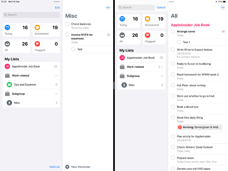
 Left: the Today view where there is no way to tell you've go subtasks. Right: a project List view where it's clear.
The trouble is that if "Packing" is due today, you will see that in your Today list — but you will not see the subtasks. You can't tap to reveal them, you cannot tell that there even are any subtasks.
Go into a regular list, one you've created for the "Vacation," for instance, and now you see "Packing" followed by all the subtasks right there.
Light, medium and heavy users
If Apple's old Reminders app was all you needed, then you will be very pleased with the new one, because it is that and more.
If you've been right on the cusp of needing something more powerful, it's probably also a good idea to stick with the new Apple Reminders. It does a lot more and, inconsistencies aside, it does them well.
When you're someone juggling a lot of work, though, it's still not there.
Entering new tasks is fast enough, but the app expects you to do those tasks today, so we miss being able to just dump an idea into there and worry about it later. We have to worry about it now, at least enough to think about which project or List to put it in.
Then you can select more than one task to move around to a different list, but you can't select multiple tasks and change all their due dates at the same time.
We also just generally have to think about all of our tasks in Reminders more than we'd want. There's nothing like the Review feature in OmniFocus that makes you periodically step through your tasks so that you're up to date, yet not overloaded.
What the new Reminders does well, though, it does so well that we hope it gets picked up by all other apps. That Messages reminder is hard to walk away from, it's so useful.
Keep up with AppleInsider by downloading the AppleInsider app for iOS, and follow us on YouTube, Twitter @appleinsider and Facebook for live, late-breaking coverage. You can also check out our official Instagram account for exclusive photos.
 William Gallagher



-m.jpg)


 Wesley Hilliard
 Malcolm Owen
 Amber Neely
 Christine McKee
 Andrew Orr

 Mike Wuerthele and Malcolm Owen




28 Comments
Most of this doesn't even matter because it is still a god awful bug ridden mess. They can't even get Complete status to sync properly between devices. Recurring Reminders are still plagued by inconsistent behavior: duplicates, appearing on days they aren't scheduled for, on and on.
Maybe you should mention that if you upgrade to this new version on your iOS device, you won't be pleased that your desktop version will no longer be synced since it requires Catalina (which hasn't been released). And yes you can use the iCloud website, but the Reminders there are a truncated version.
Seeing the above (I’ve not “upgraded” yet), is informative and exasperating. Did all the well-educated GUI and user experience experts leave Apple when Jony Ive put the print marketing department in charge of re-skinning the UI?
I’m another person constantly suffering the WONT SYNCH nonsense of iCloud’s “it just works”. My devices don’t respond anymore to changes on other devices. It used to be awesome and now it’s extremely irritating. Universal Clipboard hasn’t worked in many months, and reminders won’t sync until I actively EDIT one on one device (and that may or may not propagate to the other devices). My Macs are constantly showing me, when I log in, notifications for long passed events I’ve since cleared (and deleted) weeks prior.
Also, trying to show off “natural language parsing” when “...
I hold Apple to a higher standard. Do you know why? Because the Apple of 2007-2012 actually cared about that standard.