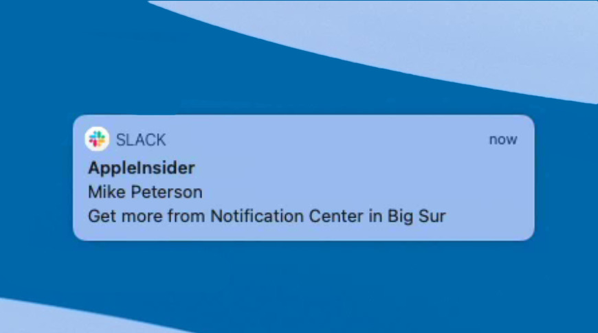
The new-style Notification Center in macOS Big Sur come with many hidden options that make using your Mac quicker, and more convenient.
Next time you open Notification Center on your Mac, ignore all the useful widgets. Even though they are the most visibly improved part, there's a reason the feature is called Notification Center.
You still get the regular notifications that you've always had of new mail messages, or alerts from other apps, and so on. But macOS Big Sur has introduced new, extra options to most notifications. You just have to find them.
Gaining and losing functionality in Big Sur
Not all of these Big Sur notifications improvements are great, though. Previously in macOS Catalina, if you got a notification of a new mail message, you could click a button to delete it. So with a glance, you'd see what it was, and if you decided you didn't want it, the delete button was right there.
Since macOS Big Sur came out, you instead get a button marked Options. It isn't truly a button, either, as it's really a drop down menu that you have to select before you can find the option to delete the message.
However, most of the time, the new features let you rapidly get more information, make decisions, and alter notifications if you're starting to get weary of them all.
What you can do with a single notification
- Open Notification Center
- Scroll to any one notification and hover your mouse over it
- You will get an X icon to delete that notification
- Click on the notification instead and you'll see either the new Options drop down, or a Show button
Opening Notification Center isn't always as obvious as it seems. You know that it's a swipe gesture from the side, but it isn't from the side of the screen. It's not that you have to move the cursor to the right hand side and then swipe in.
Rather, it's a two-finger swipe from the right edge of your trackpad. It used to be that there was an ellipses icon of three dots in the top right of the menubar and you could click on that.
This has now been removed in macOS Big Sur, but it is still possible to click to open Notification Center. It's just that now you have to click on the date and time in the menubar instead.
At least the three dots were a clue. We're used to menu items ending in an ellipses if that item opens a dialog box for more options. Good luck glancing at the menubar's date and time and figuring that's also where you open Notification Center.
Using the Options menu and Show button in a notification
Whether you get shown the Options menu or a Show button, depends on the type of notification you've been sent. Then the options that are presented to you depend on the application that has sent the notification.

L-R: a notification, then notification with options dropdown, lastly a typical list of these options
Oddly, the Show button does not always show you anything at all. Developers have to choose what happens when you click on that button, and some either don't, or just haven't yet.
At the moment, that seems to happen when the notification is an error message. You would hope that the Show button would take you to more details about the specific error, but quite typically it doesn't even open the notifying app.
The Options dropdown menu, on the other hand, does always give you choices that it then does something about.
If the notification is from any kind of messaging service, you can be sure that there will be a Reply button, for instance. A To Do app like OmniFocus may notify you of a task that's due, and if it does, the Options will include your being able to say you've completed it.
Developers get a wide range of possibilities for this Options menu, but so far it seems that it's really only Apple who has exploited it. The Mail app puts Reply, Mark as Read, and Delete in this drop down.
That's only three options, but then Mail gives you many more through another button that other apps have yet to exploit. Once you click on the notification and the Options button appears, so does a forward-arrow icon at top right.
Click on that and Mail will first expand the preview of the new message. Then it will show you the entire message.
It's presented in the same width as the notification, you are still in Notification Center instead of launching the Mail app. It's very much like having your iPhone's version of Mail up in the corner of your Mac.
Mail lets you read the full message, including font changes, and now presents the Reply, Mark as Read, and Delete options as buttons at the bottom of its window.
That's still not quite all, however. There can be — and Apple expects developers to provide this — yet more options to do with notifications from this app. Apple describes this as being where you can change an app's notifications settings.
How to change settings from within a notification
When you click on a notification and you see the forward-facing arrow, you click on that arrow. And then you may or may not get an ellipses More button.
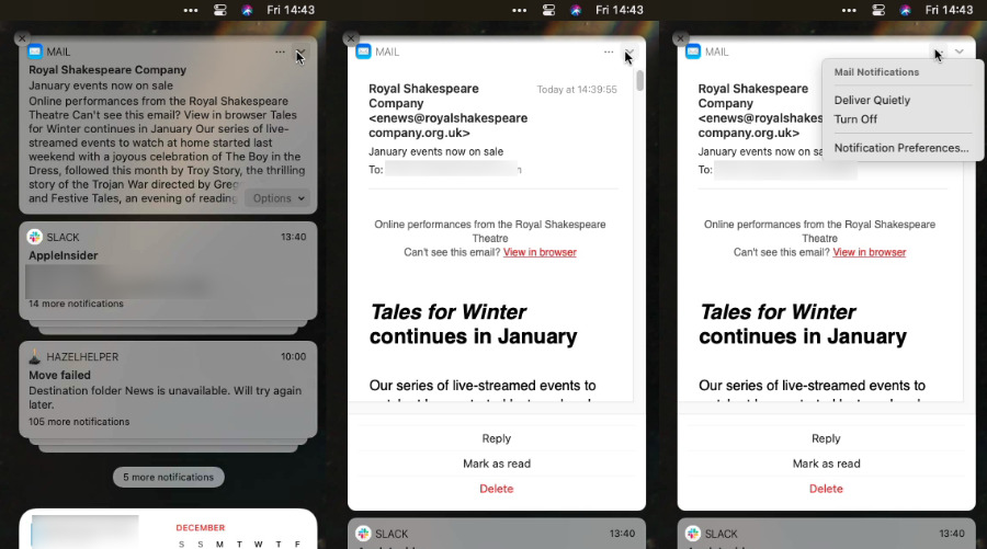
L-R click the arrow to first see a larger preview, then in-line Mail message, lastly notification options
If you get it, that button appears to the left of the forward-facing arrow. So you click to go forward, and the new option appears behind you.
Clicking it gives you quick access to the same notification settings you can get through System Preferences. There are always options to Deliver Quietly, Deliver Prominently, Turn Off, or go to Notification Preferences.
If you choose Deliver Quietly, then you'll get notifications, but solely in Notification Center. You won't hear a bleep and you won't see a notification on screen, you will have to choose to go into Notification Center to see if there are any notifications.
Deliver Prominently is the opposite, and Turn Off is the one that gives you quick relief when you've been hounded by message after message.
One thing you can't do here is pause notifications. To do that, you need to either click on Notification Preferences and do it in there, or separately turn on Do Not Disturb.
How to handle multiple notifications
All of this also applies when you've received two, ten or many notifications from an app. When you open Notification Center, you see the latest notification, and it has whichever of these controls the app developer has decided.
It also has an stack-like image where this notification appears to sit above and slightly in front of other ones. Now when you click on the one notification, the stack springs out and you see all of them.
You also get a new button called Show Less, which is how you collapse the stack back to just one. Plus there is now a large X icon, which usually means Close, but here turns to a Clear All button.
Notification Center is a boon
It might be inconsistent. It might be impossible to guess how you can do certain things unless someone tells you.
But overall, macOS Big Sur has turned the Notification Center into an active, useful tool that will speed up how you use your Mac. And that's not even counting all the new widgets that have been introduced to it.
Keep up with AppleInsider by downloading the AppleInsider app for iOS, and follow us on YouTube, Twitter @appleinsider and Facebook for live, late-breaking coverage. You can also check out our official Instagram account for exclusive photos.
