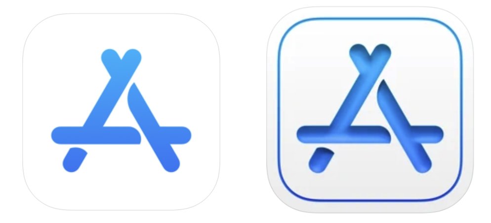
Apple has updated its App Store Connect, and Apple Music for Artists, apps to use icons resembling macOS design choices, potentially signifying that "iOS 15" will adopt the look of Big Sur.
Although all that's known of Apple's next major iPhone software release is that it will be called "iOS 15," two new icon redesigns do hint at its look and feel.
The Apple Music for Artists app is the most recent of the two, being updated on April 5. Alongside assorted bug fixes and unspecified improvements, the update to the app's version 1.3 comes with a new icon.
Previously, this app's icon resembled the regular Apple Music app's red background being blended into the blue of the usual Apple Developer app. Now it is inset within a red border, and the music note image has a slight 3D depth to it.
The new styling might not have been noticed, if it weren't that a similar design ethos has already been applied to another of Apple's apps. The App Store Connect app was updated to the same format on January 26, 2021.
Again, it is adds the inset border, this time in blue. And again, the major part of the icon is in 3D. Apple says only that this version 1.5.1 update contains stability improvements and bug fixes.
It's possible that the new look is simply the work of the same designer, although that doesn't account for why a change has been made at all. The fact that both app icons are from Apple and yet have stepped away from Apple's familiar flat design, could be more of a hint of other changes to come.
Apple is expected to unveil "iOS 15" at its WWDC 2021 event on June 7. Typically, it will then shortly enter a developer beta phase, followed by a public beta one, before a final release later in the year.
Stay on top of all Apple news right from your HomePod. Say, "Hey, Siri, play AppleInsider," and you'll get latest AppleInsider Podcast. Or ask your HomePod mini for "AppleInsider Daily" instead and you'll hear a fast update direct from our news team. And, if you're interested in Apple-centric home automation, say "Hey, Siri, play HomeKit Insider," and you'll be listening to our newest specialized podcast in moments.
