Apple has evolved its remote control over time, with each iteration introducing physical improvements and better features. After launching the second-generation Siri Remote, has Apple created its best controller?
As part of its "Spring Loaded" special event, Apple updated the Apple TV 4K with some new specifications, but the biggest news about it wasn't the Apple TV itself, but its controller. Apple refined the design of the Siri Remote, updating it to answer numerous complaints it had about the first generation.
The introduction of the new remote also only Apple's fourth real attempt to craft the ideal remote control for its users in 16 years. With so few examples of remote controls, it's worth taking a moment to see where Apple started with its original Apple Remote to truly understand where Apple has gone with the latest iteration.
Remote design is (apparently) hard
You may think that four remote controls in 16 years is a tiny number for a company that brings out so many new devices every year. To a point, you would be right, but Apple has quite a few reasons not to be concerned about redesigning it every year.
The main thing to bear in mind is that it's supposed to be the main point of interaction for a set-top box-style experience. Whether watching movie trailers on Front Row at a distance from a MacBook in the early years or controlling the latest Apple TV in the living room, it all centers around that one remote control.
To create the design, Apple has to consider so many factors, including what it is, how it is intended to be used, and how experienced with technology its intended audience is at the time. Since it's also a controller used by people who aren't technology-inclined, they also have to be made to be as easily understood as possible.
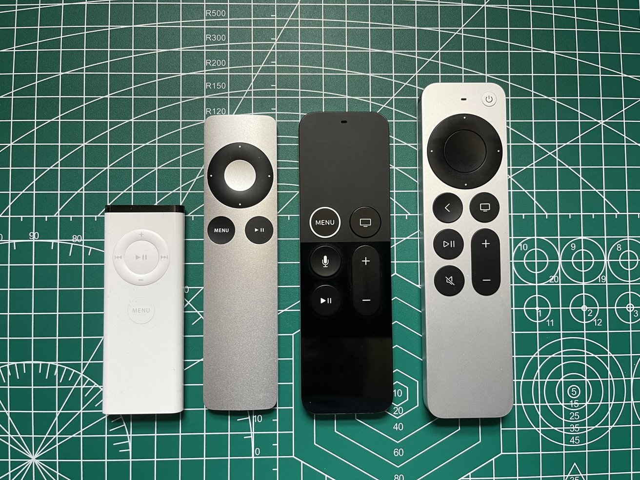
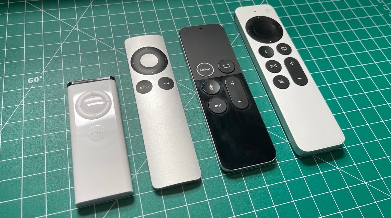
The first Apple Remote (First from the left), the second Apple Remote, the refreshed first-generation Siri Remote, the second-generation Siri Remote.)
Furthermore, Apple also tries to make the controller as simple in its design as it can. Unlike the remote you use with your TV, Apple errs to using as few buttons as possible for a relatively uncluttered appearance.
Balancing those factors, especially in combining features and functionality with simplicity, is tough to pull off, yet Apple tries.
We're also talking about a remote control designed to be used by millions of people worldwide. Releasing many different designs in quick succession could confuse even existing Apple users if they visit someone else's house and see a different controller design.
This is the same experience you would find if you visited a friend or colleague's home and discover they use the same cable or satellite TV service as you do. The remote control is almost certainly going to be identical, and therefore it will be familiar to you.
Add in that people are more likely to keep their set-top boxes for far longer periods of time than some other technologies, and it makes more sense for Apple to avoid changing the design too quickly.
There's simply no need for it to do so at a rapid pace.
2005 - First-generation Apple Remote
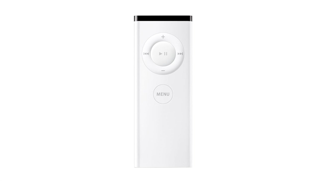
The earliest remote Apple produced was the Apple Remote, a simple rectangular white plastic controller with a black edge at the top. It was a cheap and highly compact remote that did the job, allowing you to control media on a nearby Mac that had a built-in infrared sensor and attach it to the side of that iMac with an integrated magnet.
Long-time Apple users would have used it to control music playback or a movie, and it was a familiar tool back in the day when Apple typically included optical drives in its hardware. A few years after release, if you were lucky enough to have an iPod and a dock with an infrared sensor, you could even control your iPod's music from a few feet away.
For business users, it also had the more utilitarian purpose of being used to control presentations.
The design will also be very familiar to those same Apple users who bought iPods, as it had many of the design cues of the iPod Shuffle, with its rounded edges and tubular construction. The buttons from the front used the same design as early Shuffle models and even shared the same core functionality.
Though you had only six buttons, there was still a lot of functionality available, as many buttons had multiple uses. For example, a circle of buttons could handle volume and navigation through media and handle directional navigation in menus. Meanwhile, the central play and pause button could be used for confirming a selection.
The remote differed in its layout from the iPod Shuffle by having an extra round Menu button, an addition that would hang around Apple's remotes for a few more versions.
Naturally, for a remote control of the time, Apple allowed users to change the CR2032 button-cell battery, which slid out of the base on a tray after being poked by a paper clip.
2009 - Second-generation Apple Remote
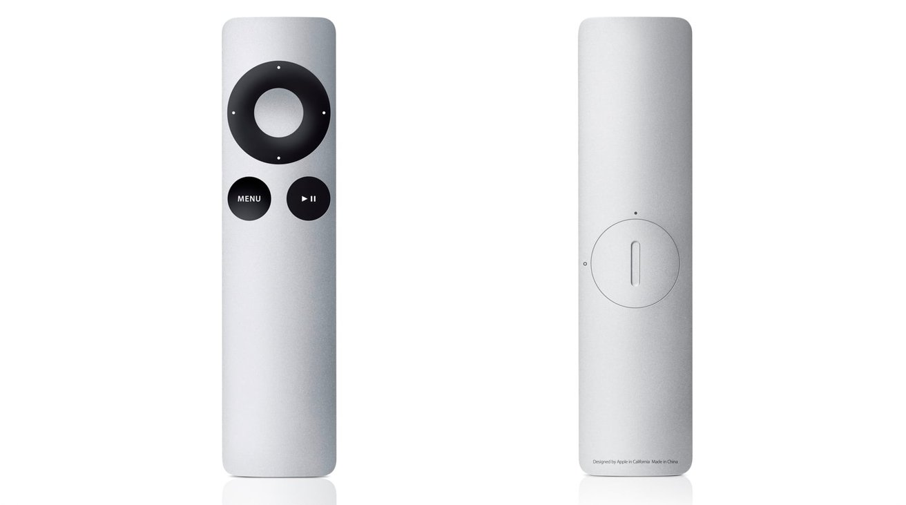
For Apple's second stab at a remote, it decided to make a remote that was more remote-like to go with the living room nature of the Apple TV. Gone was the white plastic, in favor of a longer aluminum controller that borrowed from Apple's anodized metal design aesthetic.
Like the first version, it offered users a circular main control that responded in the four cardinal directions, though they were labeled with dots rather than with icons detailing exactly what they did. It was likely Apple thought users could easily intuit that it could be used to navigate and perform media control functions simply from the location on the circle.
While the circular element had a central button, Apple, in fact, moved the Play/Pause button over to its own dedicated button, next to the returning Menu button.
Outside of some cosmetic changes and button alterations, the remote acted pretty much like the first. An infrared transmitter on the top, this time hidden within a recess instead of using a black translucent bar, beamed instructions off to the Apple TV and other compatible devices it was pointed at.
Not all changes to the Apple Remote were necessarily positive. While the first remote used a pop-out tray for the battery to be replaced, Apple instead had a circular door on the rear accessible using a coin for CR2032 battery changes.
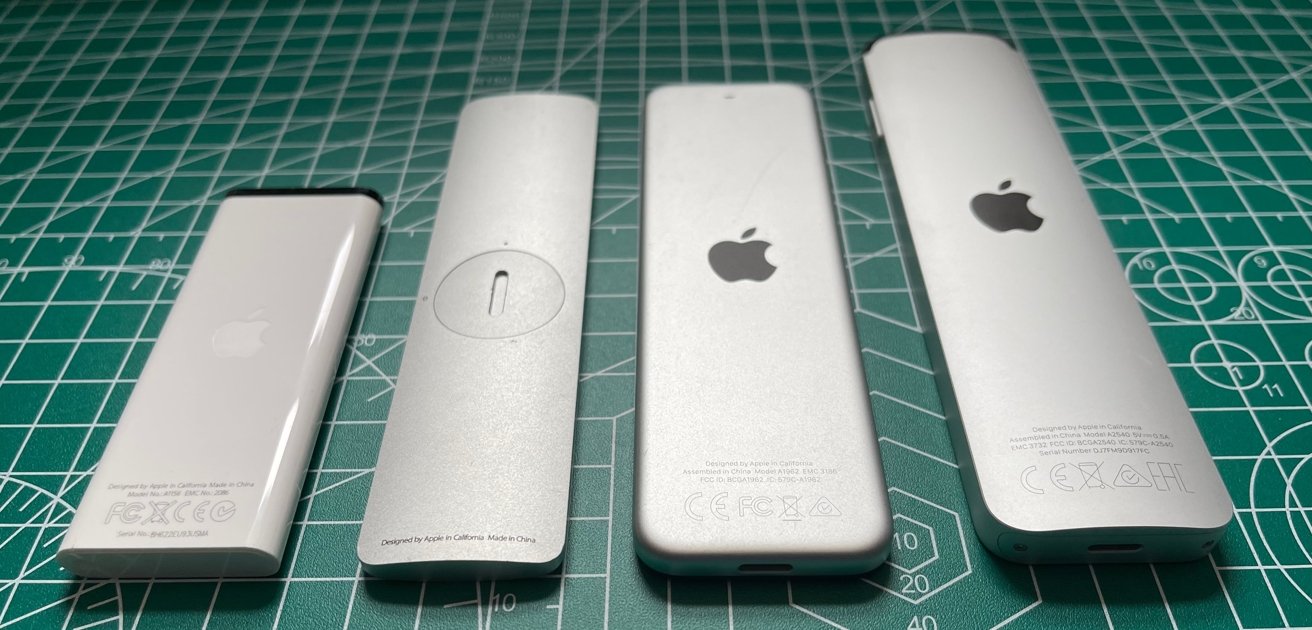
The first Apple Remote had a pop-out battery tray in the base. The second had a coin-unlockable door for the battery. Both Siri Remotes have fixed batteries recharged via Lightning.
This alteration may have disturbed the sleek and minimal appearance of the new Apple Remote, but it was only a minor flaw in the controller.
The remote remained usable with the Apple TV up to the third generation of the device, but for the fourth-generation models and the introduction of tvOS, Apple wanted to go down a different direction.
2015 - First-generation Siri Remote
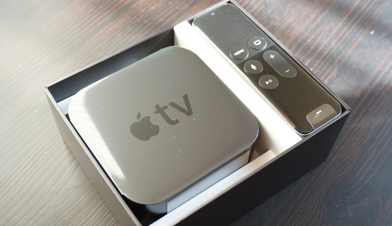
With the switch to a more app-centric fourth-generation Apple TV, Apple took the opportunity to overhaul the remote control. The result is its third remote design, the first to use the name "Siri Remote."
For the third iteration, Apple decided to bring touch-based interactions to the Apple TV. It does this by doing away with the circular button collection in favor of a touch-sensitive glass surface near the top.
Sensitive to swipes and taps, the touch control provided far more freedom of directional control than in previous versions. This included swipes to scroll through lists or menu options, a press-click to select, and a long hold down for certain functions, like repositioning app icons on the home screen.
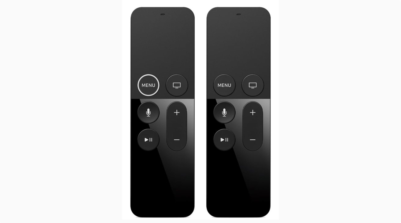
While a touch-centric experience, Apple still retained a total of six distinct buttons on the remote, excluding the touch surface click. These buttons include the Menu, a dual-purpose Apple TV App and Home button, a volume rocker, Play/Pause, and a Siri button.
The Siri button enabled users to speak into the remote control, which is then transmitted to the Apple TV. As well as enabling users to ask Siri queries, such as to trigger HomeKit functions. It also allowed users to search quickly without spending long periods typing in search terms using the touch surface.
The remote was able to do this because of two other design changes, with the inclusion of a microphone at the top of the remote itself.
The other element was its communication to the Apple TV itself. While earlier remote versions relied on infrared, the Siri Remote had support for both IR and Bluetooth 4.0, with the latter able to handle audio for Siri queries.
This offers multiple benefits, including using the remote without actually pointing it at the Apple TV. The IR system also enabled the remote to control the volume of a TV by transmitting the same volume-up and volume-down commands as the TV's own remote.
There were also motion controls built into the remote, intended for some gaming apps, though developers didn't really use it. By the release of tvOS 10, Apple didn't require Apple TV games to directly support the remote and instead could use compatible game controllers.
All of these feature changes were accompanied by a major overhaul of its visuals. Somewhat matching the physical design of some iPad and iPhone models, Apple elected for a thin and flat controller, with an aluminum enclosure capped off with a black top surface.
This resulted in an extremely thin device, at a mere 0.25 inches thick, which also forced Apple into another design change relating to power. Unlike previous models, the Siri Remote includes a non-removable battery, rechargeable using the Lightning port on the base.
And, it was not well received, if for no other reason than it not being able to tell which way was "up" in the dark easily given the symmetry of the device. Apple would make a minor change shortly after release to "fix" that problem with the remote.
2017 - First-generation Siri Remote, take two
Two years after its release, coinciding with the launch of the Apple TV 4K, Apple made some tweaks to the first-generation Siri remote. While technically it's a new remote, its design alterations make it more of a refinement than the previous version, rather than a whole new generation of device.
Apple's changes were small but improved the user experience of the Siri Remote.
Firstly, the Menu button gained a bold white ring that extended above the button's surface. Quite simply, this was a visual and tactile way for users to know that they were holding the remote the right way.
The only other change with the remote was Apple adding more motion control support to it, allowing the remote to be more easily used with some games produced for the Apple TV. While motion was a small part of the user experience in the first iteration, Apple seemingly wanted to give developers more opportunities to use the functionality.
2021 - Second-generation Siri Remote
With the update to the Apple TV in April, Apple took the chance to update the Siri Remote once again, shaking up the design of a peripheral that had been the subject of complaints from users for various elements.
Unlike the 2017 refresh, Apple's alterations to the Siri Remote are much more substantial in its second generation. You could say that the design is a mash-up of the aesthetic of the second-generation Apple Remote and the capabilities of the first-generation Siri Remote.
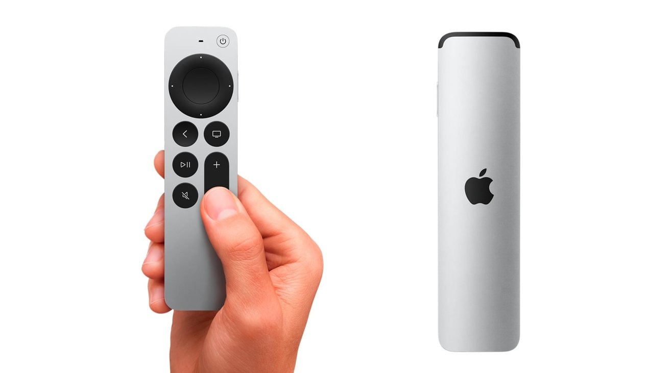
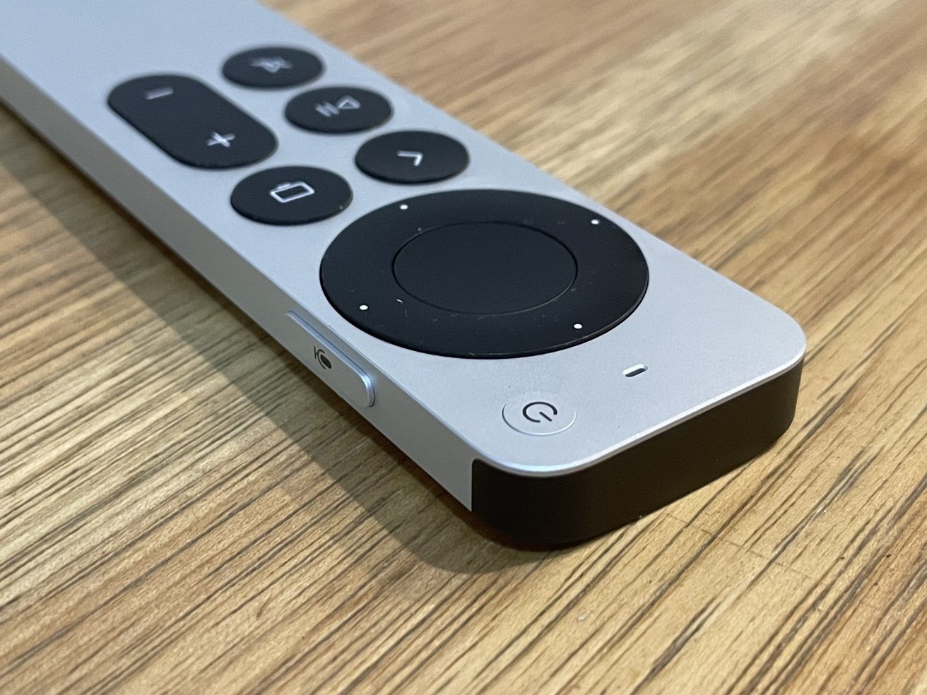
For a start, Apple has gone for an all-aluminum enclosure, with greater contrast for the buttons and surfaces. At the top, the square touch surface has been replaced by a revival of the circular clickpad, which this time includes touch sensitivity for swipes and other fine-grain actions.
You can even use a circular gesture on the outer ring, which Apple suggests could be used for searching through video for the correct scene.
Below the clickpad are six buttons, but with a difference. The TV/Home button, Play/Pause, and volume rockers return but are accompanied by dedicated Mute and Back buttons. The front panel has one extra button at the top for power.
Though not on the front, there's still a button for summoning Siri, but this time it's on the right-hand side. This arrangement mimics how iPhone users can summon Siri by holding the side button on their mobile devices.
Like the previous model, it has both IR and Bluetooth, this time upgraded to Bluetooth 5.0.
Continuing from the first-generation model, the Siri Remote still uses a built-in battery and relies on a Lightning port for recharging.
Not all changes are additions for this remote. This time around, Apple has seemingly given up on game developers using the Siri Remote for gaming and has left out any and all forms of accelerometer or gyroscope components, eliminating its use for gameplay.
Given the ample support for third-party controllers in tvOS, as well as scant support for the remote in games anyway, it seems like a logical removal for Apple to perform.
Is it worth the upgrade?
Owners of the fourth-generation Apple TV and the Apple TV 4K will be pleased to hear that the newest Siri Remote is backward compatible and will work with those models without issue. This does raise the question of whether it is worth shelling out for a new remote control.
Generally speaking, it's probably not worth the move for existing users, and it comes down to cost. If you buy the updated Apple TV, you get the new remote with it automatically, but you could also buy the new Siri Remote on its own for $59.
There are certainly new features that will be welcomed, such as the mute button, the potentially easier-to-use clickwheel touchpad, and the potential remote-finding functionality. Some may even find the mere certainty of knowing which way around to hold the remote is a massive pain point to be removed from their user experience.
The overall design is certainly better in terms of accessibility, considering the move to a clickwheel and the button changes. For everyone else, it's just tough to justify paying out nigh on $60 for a few relatively minor quality of life changes, especially considering that your iPhone has the best remote functionality for the Apple TV over all of these presented here.
If you have an Apple TV HD, don't bother buying the new Siri Remote outright. You're far better off putting the $59 towards the cost of a new Apple TV 4K that also has the remote, as that will put you a third of the way to a bigger overall upgrade.
