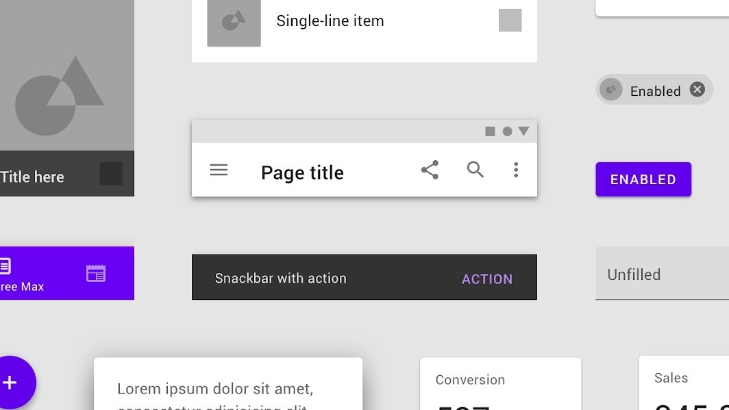
Google will begin phasing out its Material Design for iOS apps in favor of Apple's own proprietary UIKit, a change that could result in apps that feel more like they belong on iPhone.
Jeff Verkoeyen, Google's iOS design chief, announced the change on Twitter Tuesday, stating that his team began a deep dive into "what it means to build a hallmark Google experience on Apple platforms" — namely, Google apps on the App Store. The Verge first spotted the news.
This year my team shifted the open source Material components libraries for iOS into maintenance mode. Why?
— Jeff Verkoeyen (@featherless) October 7, 2021
A ...
"The time we're saving not building custom code is now invested in the long tail of UX details that really make products feel great on Apple platforms," Verkoeyen wrote.
In addition to less work for Google's iOS design team, the switch in direction will likely also mean that Google apps feel more "native" on Apple devices like the iPhone or iPad. An example of how the change could play out practically could include the swapping of Android-esque buttons in Google apps in favor of more iOS-based elements.
Overall, Verkoeyen said that the change will "result in much tighter integrations with the OS than what we can reasonably achieve via custom solutions."
First unveiled in 2014, Material Design is a set of in-house design principles and conventions that were aimed at unifying how Google apps look and feel across various platforms.
Over time, Verkoeyen said Google's iOS design components have been" slowly drifting further and further from Apple platform fundamentals because those fundaments were also evolving year over year."
 Mike Peterson





 Wesley Hilliard
 Malcolm Owen

 Andrew Orr
 William Gallagher
 Sponsored Content
 Christine McKee

 Thomas Sibilly





13 Comments
"Apple's own proprietary UIKit" Interesting how you snuck that in. It's still a UIKit that's available to every developer to develop apps on iOS devices so why the dig?
I know Google has always wanted to take over every hardware platform it can get on, change everything to look the way they want it to look, but this is Apple's platform and they are graciously allowing developers to write software for it. As a longtime customer, I welcome UI standards. That way I am able to figure out how to use an app because it follows the way every other app works. Make it difficult to figure out and I delete it. I'm sure there are others who do the same thing.
Well, halleleujah. Google sucks at UI design, but this should help.
Google is finally following proper etiquette and conforming to the user experience defined by the host platform. When Apple puts an app on Android or Windows they should follow the same common courtesy and conform to the UX precedents on those platforms. None of this should come as a surprise. It's not about trying to one-up a rival or push what you may claim is a "universal" standard down someone else's throat. It's about not surprising, or shocking, the users of the platform. No matter how much you think your UX is better than the host platform's UX, if it doesn't conform it will be seen as a wart.