Ikea is gearing up to launch a new smart indoor air quality monitor that works with the company's Matter-enabled, Homekit-compatible smart hub.
In an effort to combat indoor air pollutants, Ikea has just announced its upcoming smart indoor air quality monitor, that is is calling "Vindstyrka." As shipped, the monitor can be used with other Ikea products to improve indoor air quality.
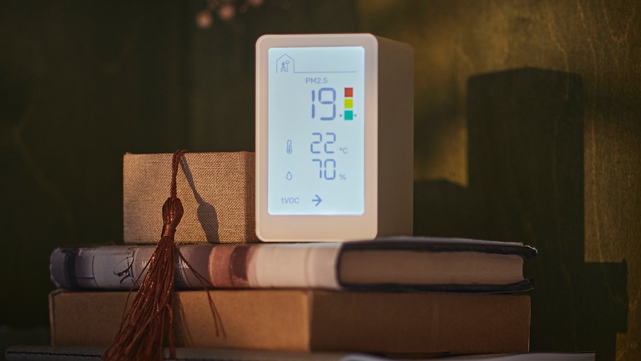
Vindstyrka boasts a large, backlit display. It can monitor PM2.5 levels, humidity, temperature, and total volatile organic (TVOC) levels.
The monitor also color codes the indoor air quality as green, yellow, or red, enabling users to glean the information they need at a glance.
Vindstyrka can also be connected to Ikea's Dirigera Matter-enabled smart hub. When paired together, users can use Vindstyrka to trigger other smart devices.
Ikea notes that, for example, Vindstyrka can be used to automatically adjust the fan speed of the company's smart air purifier, Starkvind.
The company has yet to price for Vindstyrka, but says it will launch online and in stores in April.
The Dirigera hub is Matter-enabled and can work with HomeKit and other smart home platforms. The Dirigera hub is currently available from Ikea for $69.99.
 Amber Neely






 Malcolm Owen
 William Gallagher
 Andrew Orr
 Wesley Hilliard




-m.jpg)

2 Comments
Looks interesting. Unfortunately, I have found that Ikea has about the worst customer service I've ever experienced when it comes to technical products. Really hope they can get their act together.