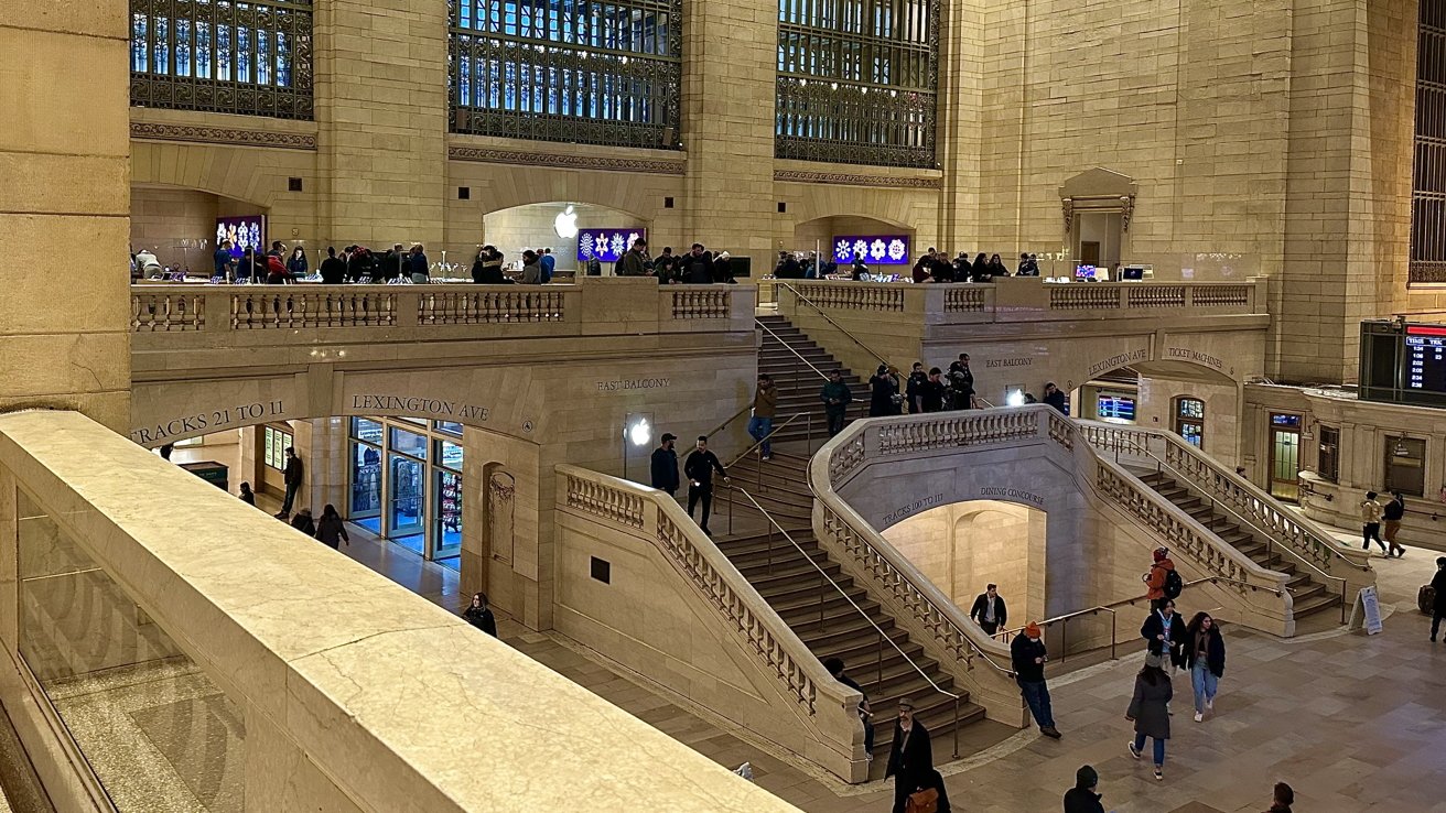
If you're either getting off your train or running to it through Grand Central Terminal, you will most likely see Apple Grand Central. AppleInsider checks it out.
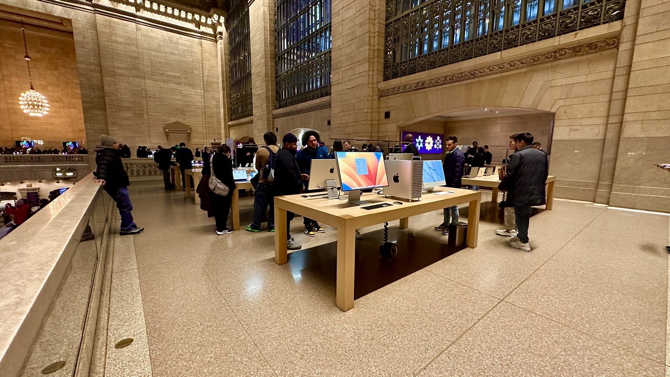
Unlike Apple's traditional white-chromatic environment you would usually see when visiting one of their stores, Apple Grand Central blends in with the setting around it by continuing with the brushed-brass colored finish from the walls to the floors.
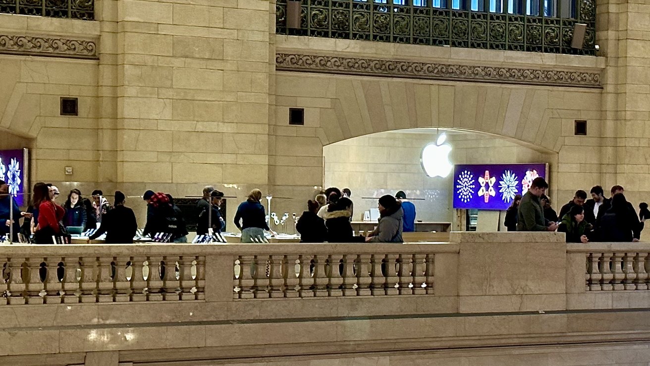
While the main areas are located on balconies that oversee the Grain Central Terminal, there is a maze of rooms behind door frames that expand the Apple Store deeper into the space and further display Apple's long list of products.
The history of the Apple Grand Central retail store
Back when it was announced in 2011, Apple Grand Central was the largest retail store Apple had built, and also the first one to be designed around a balcony-like design.
When it was first revealed that Apple would build a retail store in Grand Central Terminal, many people feared that Apple would disrupt the design of the area by overtaking a section of it and fusing it with Apple's white-and-silver design.
However, instead of just designing the retail space like an ordinary Apple Store, Apple took pains to make this store blend in with the architectural design while still incorporating the core Apple Store experience for people visiting it.
The Metropolitan Transportation Authority (MTA) — who owns the space — estimated that adding an Apple Store to the terminal would increase traffic for other retail stores too. Later, while it said it couldn't ascribe overall revenue increase solely to Apple, the MTA reported a 6.5% rise in gross sales for stores that were open during the first quarter of both 2011 and 2012.
Though while the store's incorporation into the space was seen as a positive to the MTA, public opinion was not so favorable. Many thought that the MTA gave Apple an unfair advantage by creating a bidding strategy that made it nearly impossible for anyone to be awarded the retail space, other than Apple.
Based on a state audit from May 2012 by Thomas DiNapoli, the state's Comptroller, it was revealed that Apple had been in private talks with the MTA for more than two years leading up to the bidding process for the retail space. Apple even allegedly tried to get reimbursed by taxpayers for the initial $2 million it has paid Metrazur — the restaurant that previously owned the space — to vacay the balcony space.
Apple and Metrazur reached a $5 million lease buyout agreement, which came after the restaurant approached Apple with the proposal in July of 2009.
All these claims were denied and blasted by MTA officials who called the report "overt bias against the MTA and Apple."
When the store officially opened on December 9, 2011, 2,500 people waited in line to be the first to visit. That count went up to 4,000 people who came and went before noon that same day.
Apple paid $1.1 million in rent its first year at Grand Central Terminal, which is four times more than the previous business paid for the same space.
Inside the Apple Grand Central retail store
When walking into Grand Central Terminal, you'll notice that there are no doors to go through when entering the Apple Store - you just walk up three flights of stairs and the Apple experience begins.
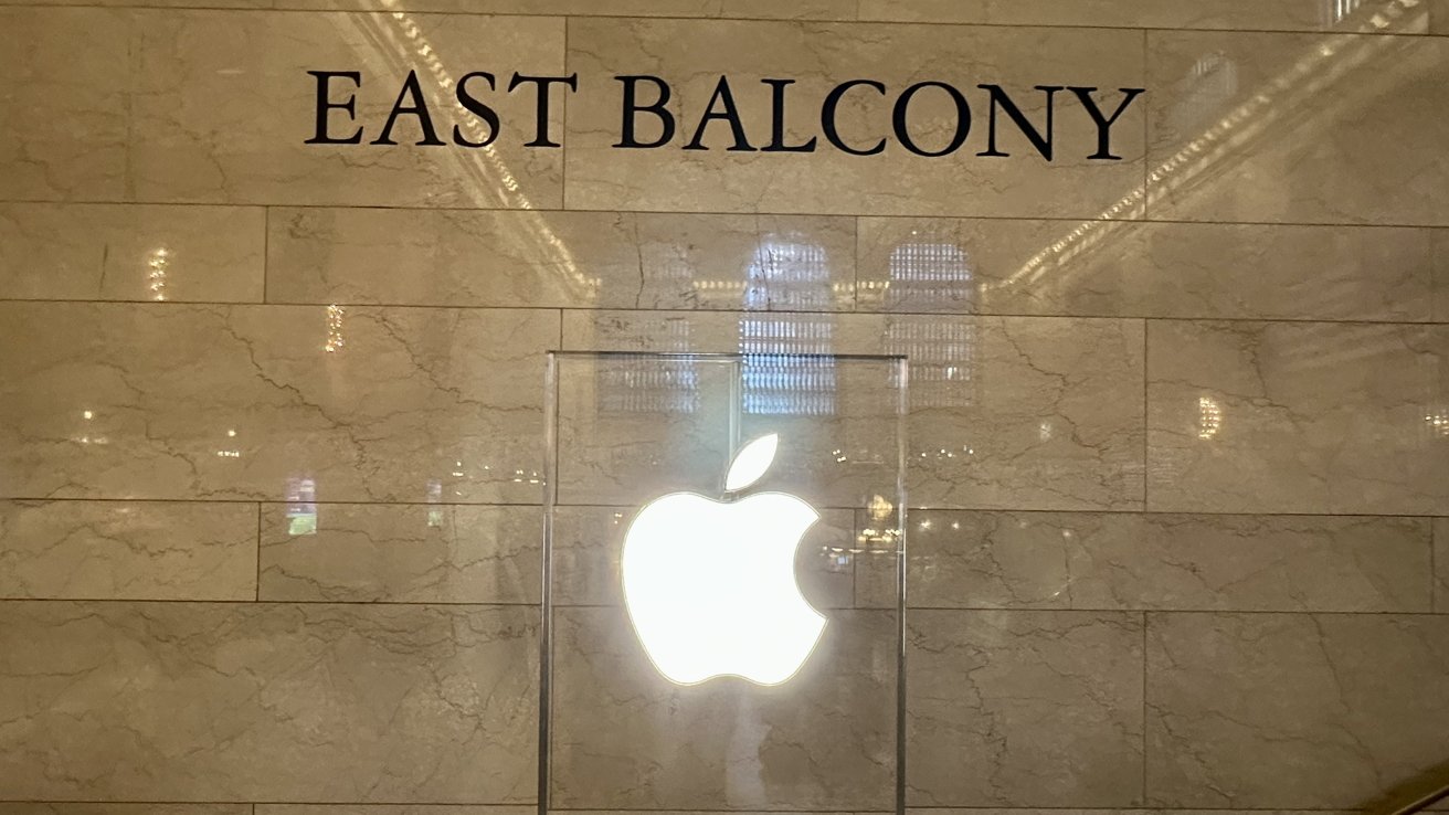
The stairs color-match the exterior around them from the flooring to the walls, and on each level, an Apple logo greets you with the words "East Balcony" printed behind it to assure you that you are going in the right direction.
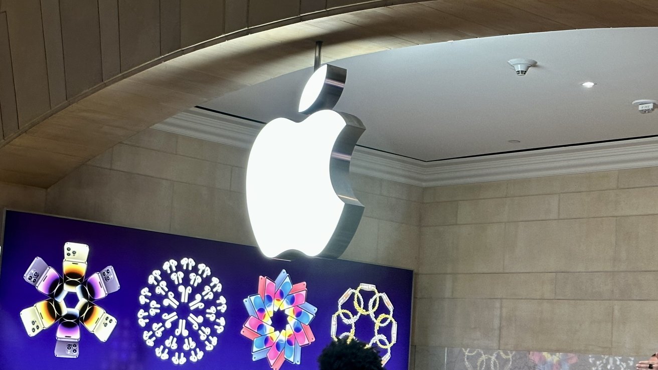
When you finally make it to the top of the stairs, you will be greeted by the main Apple logo glowing above you and an Apple employee standing in front waiting to greet you.
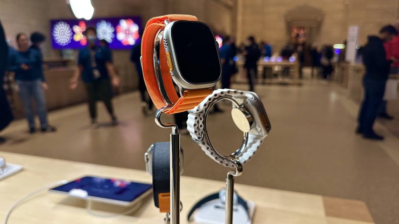
To your left are Apple Watches on display, and to your right are iPhones doing the same thing. You will see other Apple products the further you walk into the space.
Carved out of the back of the store are three little dens that show accessories, more products, and is a station for people to pick up online orders.
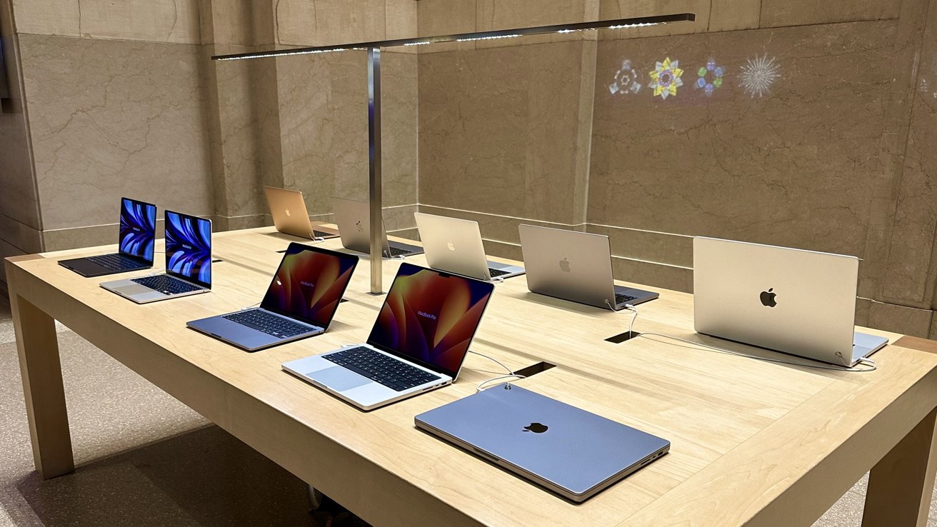
Due to the dim-lit nature of Grand Central Terminal, overhead lamps are looming over most Apple products so you can examine and see them better in brighter lighting.
The trick within this store is that it has multiple rooms hidden behind the huge walls in Grand Central Terminal. It is like a maze to figure out how to get to one side of the store, and which doorways you have to go through to get there.
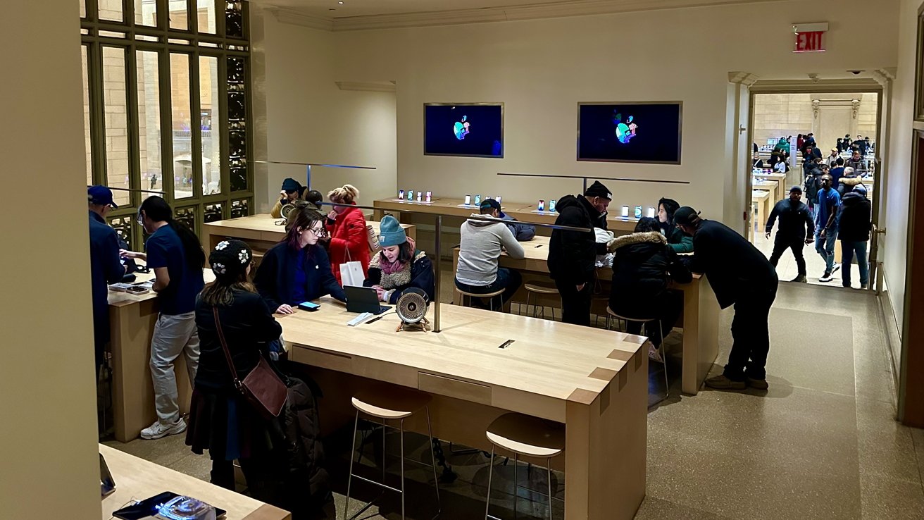
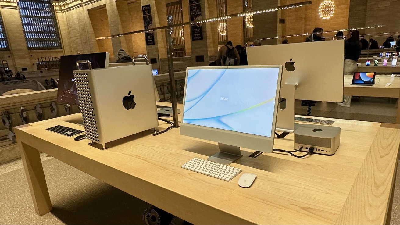
Walking through the doorway on your right will bring you to a room filled with the signature Apple wooden tables, where Apple employees can help you with any questions you may have. Each side of the room is aligned with iPads and iPhones to show off. The room is dimly lit, which gives a calming feeling and aura to it.
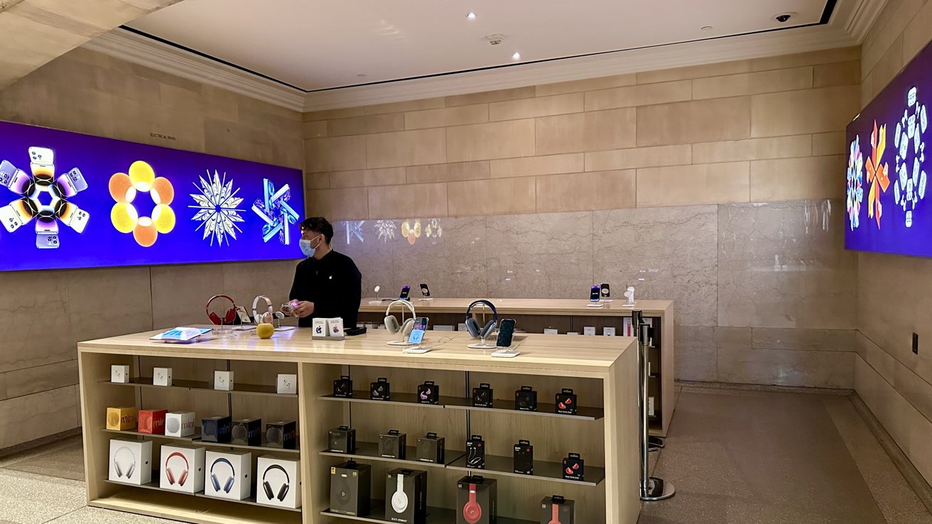
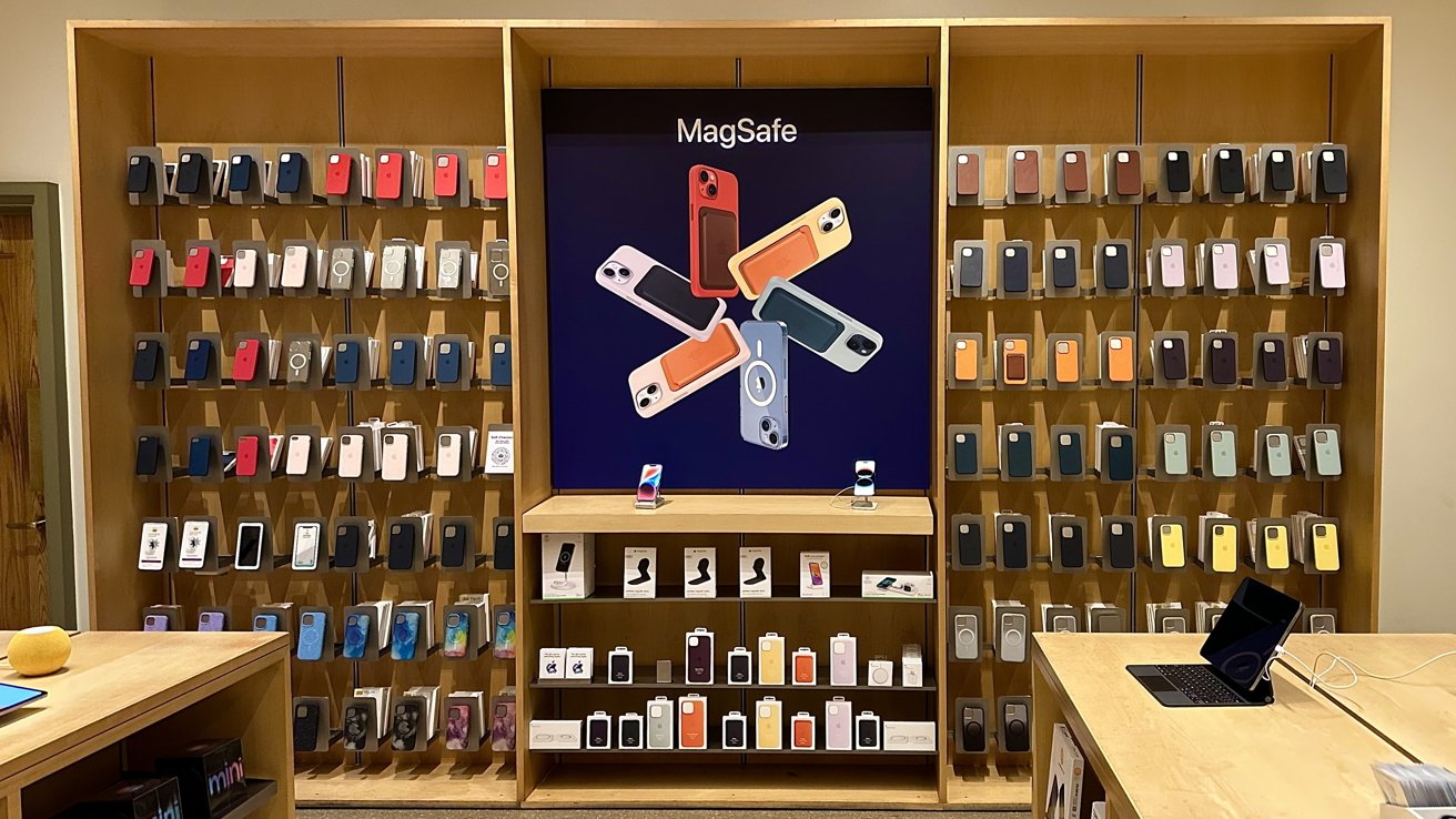
Walking into the next room will bring you into the area where Apple keeps all of its accessories — such as AirPods, Apple Watch bands, iPhone cases, and AirTags — and promotes its services.
Each room continues the design of Grand Central Terminal, by bleeding in the marbled floor and darker muted colored walls surrounding the area.
On the other side of the store, located within another balcony area, is the Genius Bar and more wooden tables. The area is very open and easy to walk through, and just like on the showcase tables, there is a huge overhead lamp that sits above the tables, allowing more light for anyone sitting underneath it.
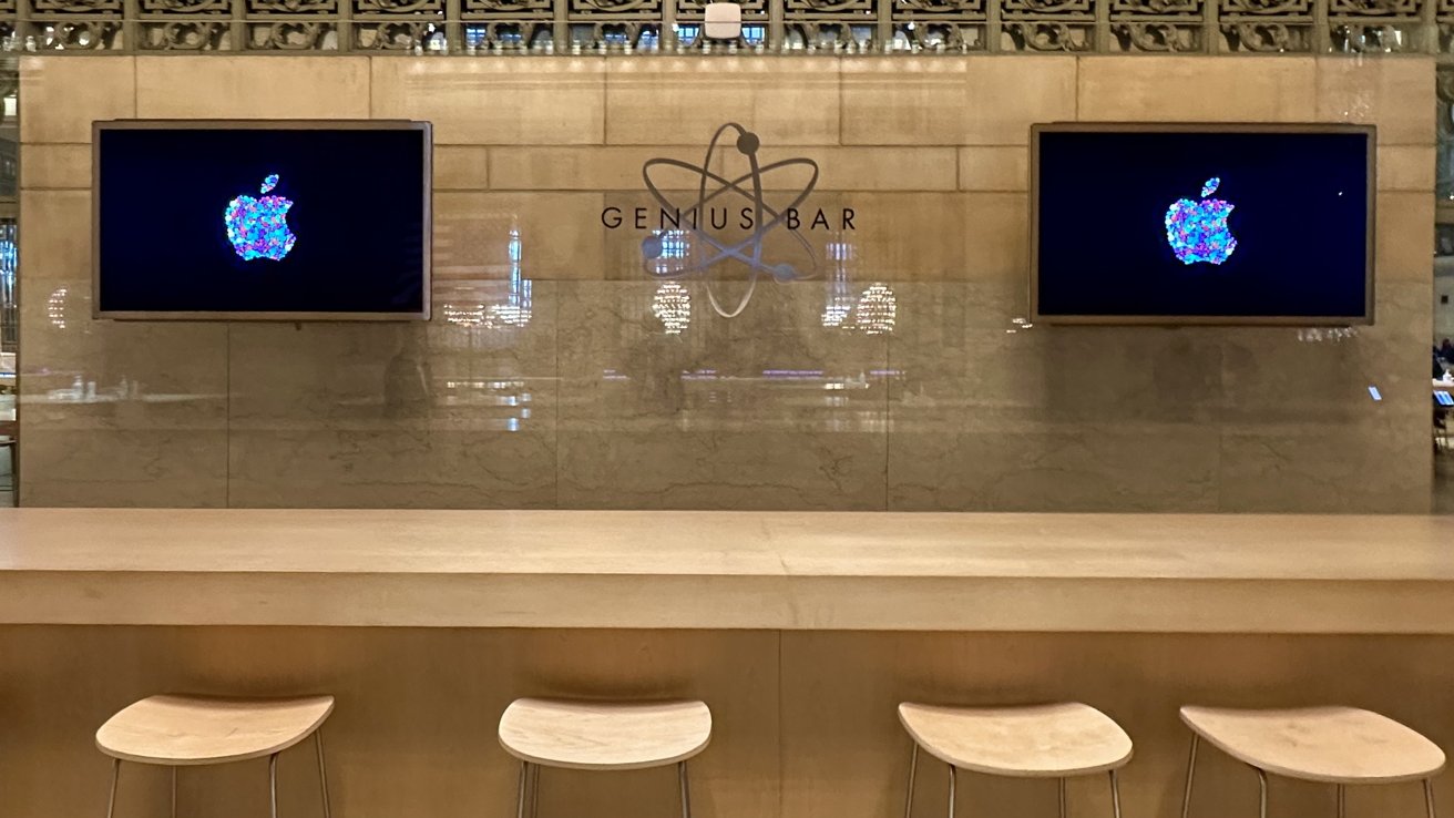
The Genius Bar is set up like a traditional bar, with high seats and a bar-like table where the top hangs over on one side and is flush on the other. Two televisions hang on the wall behind it with the title "Genius Bar" written in the middle.
When you are done visiting the store, you can descend the staircase you came up when entering the store, and then you'll find yourself in the middle of Grand Central Terminal.
Towering over Grand Central Terminal
Apple Grand Central is unlike any other Apple Store you have been to. Instead of opening a door to enter the experience, you just walk up the stairs and are in it before you know it.
While the store usually closes at around 8 PM EST, it makes you wonder how they keep the products secure while being in such an open area. Unlike the products in back rooms, Apple's most noteworthy products sit on tables on open balconies.
With multiple people coming through the terminal either to get to their trains or from them, many seemed to have stopped at Apple Grand Central to check out the current products Apple has to offer — even if it was early January.
Some back rooms may feel small — due to the limitation of space they have — but the balconies feel open and wide, with no experience of bumping into people being in the same area as you are.
Apple Grand Central takes the historic and well-known design of Grand Central Terminal and incorporates itself into it, and becomes part of it, while still offering the core Apple Store experience. While it may look completely different from a traditional Apple Store on the outside, the feeling and experience are still attached to the core on the inside.
For more examples ofd Apple Stores that preserve and incorporate historical architecture into their store design, check out Apple Birmingham located in the UK and Apple World Trade Center located in New York City.
