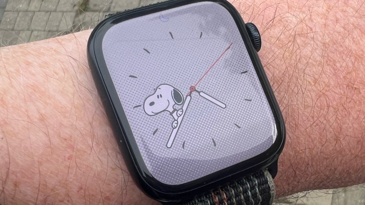
The new Snoopy face was reason enough for people to join the Apple Watch beta test, but now everyone can get it — and see the results of unbelievable attention to detail.
Apple Watch launched in 2015 with faces including a Mickey Mouse one, but that was simple compared to the effort that has gone into the new Snoopy and Woodstock face for watchOS 10.
In them, Snoopy may hang off the hour hand, or throw something that bounces along the minute hand before hitting him back on the head. And when users turn their wrists and the Watch face dims, Snoopy goes to sleep atop his famous red kennel.
Speaking to Britain's GQ magazine, the team behind the Watch face reveal an astonishing degree of detail and effort behind the delightful series of faces.
"When you design an analogue watch with Snoopy, he's a static character right?" Paige Braddock, chief creative officer at Charles M Schulz Creative Associates, told the publication. "So all you're really focusing on is the hands and the arms."
"You wouldn't believe the minutiae we go into to make them work at every angle," continued Braddock, "but going into this first meeting with Apple I was going 'I don't even know if I'm smart enough to wear this watch.'"
It began with a meeting with the Apple Watch team at the Charles M Schulz Museum in Santa Rosa, California. Ultimately became 12 minutes of animation work, with 148 distinct animations.
"I'm typically a very organised person," Gary Butcher, human interface designer at Apple, said. "So I felt, We've got a limited amount of time together and there might be some uneasiness, so I'll print out 148 pieces of blank paper and we need to leave the room having filled out every one of those pages.'"
"By the end of the day," continued Butcher, "we'd not touched the wall of A3 paper, but had tons of sketches littering the table."
"In the initial brainstorm, the team had started with sort of generic sketches where he's walking in the rain with an umbrella or whatever," continues Braddock. "But there are some very specific Snoopy things that that no other comic character does, like he holds up his ear and blocks the rain for Woodstock."
And then there was Snoopy himself. Over the 70 years since his creation, Snoopy has gone through radical changes both in character and appearance. The version of Snoopy on the Watch is instantly recognizable, but is actually a compromise, showing a shorter nose than he had in the 1970s, and a straighter one than in the 1990s.
Even then, it wasn't just a case of drawing the animations and having the Watch show them randomly. There were considerations over such issues as how often the set repeats. Also, some are more suited to certain times of day than others.
Consequently, and possibly unbelievably, this Apple Watch face comes with a Snoopy decision engine. It choose the best face for the current time, and avoids repetition without making it so that you have to sit there for hours trying to see a particular one.
The Snoopy face is available in watchOS 10, which has now been officially released by Apple.


