Apple's Freeform productivity app has been made easier to navigate and to understand, thanks to some changes in iOS 18, iPadOS 18, and macOS Sequoia.
Introduced in late 2022, Freeform was launched as tool for creation. Enabling collaborative brainstorming by letting multiple people work on the same infinite whiteboard document.
While it certainly helped some users develop new ideas, there were still some areas that needed fixing. In its updates to iOS 18, iPadOS 18, and macOS Sequoia, the app is getting quite a few quality of life improvements.
Many of these were previously covered by AppleInsider before Apple's introduction of the changes.
This is what Apple has implemented to make Freeform a much better creative productivity tool in the betas.
Freeform Scenes in iOS 18 and macOS Sequoia
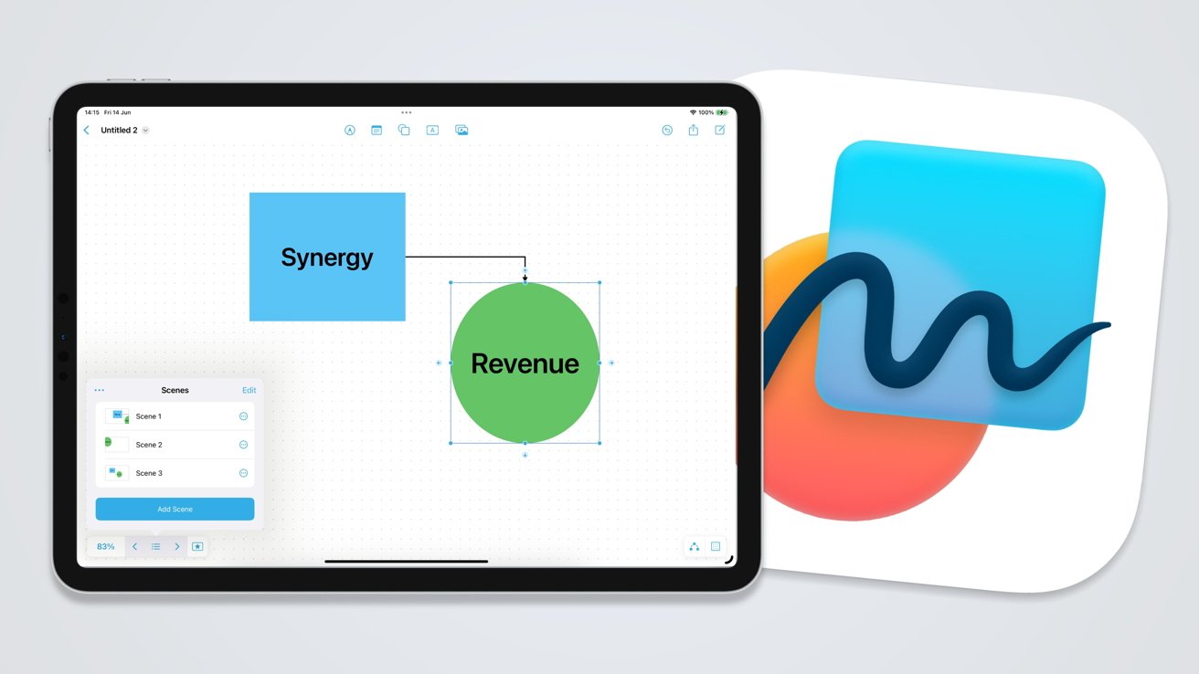
The most important change in Freeform is one that makes it a lot easier to navigate. Scenes is Apple's way to instantly take users to different parts of the digital whiteboard space.
Taking the form of a small button in the bottom-left corner resembling a star in a box, clicking it summons three new buttons.
The middle list button shows the main controls for Scenes. This includes options to select existing scenes, create new scenes, editing controls for the scenes and the list as a whole, and the ability to print or export scenes to a PDF.
The left and right buttons takes users between scenes on the list. In a way, this could be used as a highly interactive presentation system using the buttons.
To create a scene, users must frame the viewpoint they want within the document, then tap Add Scene in the Scenes controls. This adds a new scene based on the view to the bottom of the scenes list.
Each of the scenes in the list view have a preview image. They can also be renamed to be more appropriate to what they depict.
This is, by far, a better way to take new users through a detailed project, by giving them a tour to important locations in the file. It's a considerably better navigation system than before, which required memorizing locations as well as manual scrolling and zooming.
Snap to Grid
To help users more easily organize shapes and text in a document, there's now a Snap to Grid option. Users can enable it, and a dot grid, by selecting a button in the bottom right corner of the screen.
With a dot grid covering the document, items can be moved around the space, with it automatically snapping in place when aligned with one of the dots. This will let users who are concerned about keeping the document presentable more easily line up multiple items in a row or column.
The snapping action also applies to items within items. For example, you can drag a text box inside a shape, and see guiding bars when it's close to the center, snapping the text to the middle of the shape.
Connectors
Next to the dot grid button in the bottom right is a Connections button. This enables and disables a mode to more easily make connections between on-screen elements.
For example, if a shape is selected and Connections is enabled, users will be presented by small arrows on each side. Users can select the arrow to generate a connector, which can be dragged to another shape.
Users can draw their own lines, of course, but these connecting lines are useful for future reorganization. If two shapes are connected in this way, Freeform will maintain the connected line regardless of where you move each shape in the document.
Like other lines that can be drawn, users can select the line and apply various types of formatting to it. Arrows can also be added if you want it to act like a flowchart.
Spacebar Panning
Rather than using scrollbars to move around the screen, Mac users have an extra method to pan, inspired by art programs.
By holding down the spacebar, the cursor turns into a hand. Using the hand by keeping the spacebar pressed and dragging the document, the user can quickly pan to nearby sections.
The interface returns to normal once the spacebar is released.


