In iOS 18 and macOS 15, Apple's Freeform app will receive an entirely new navigation feature called Scenes, as well as new options for object alignment. Here's what to expect.
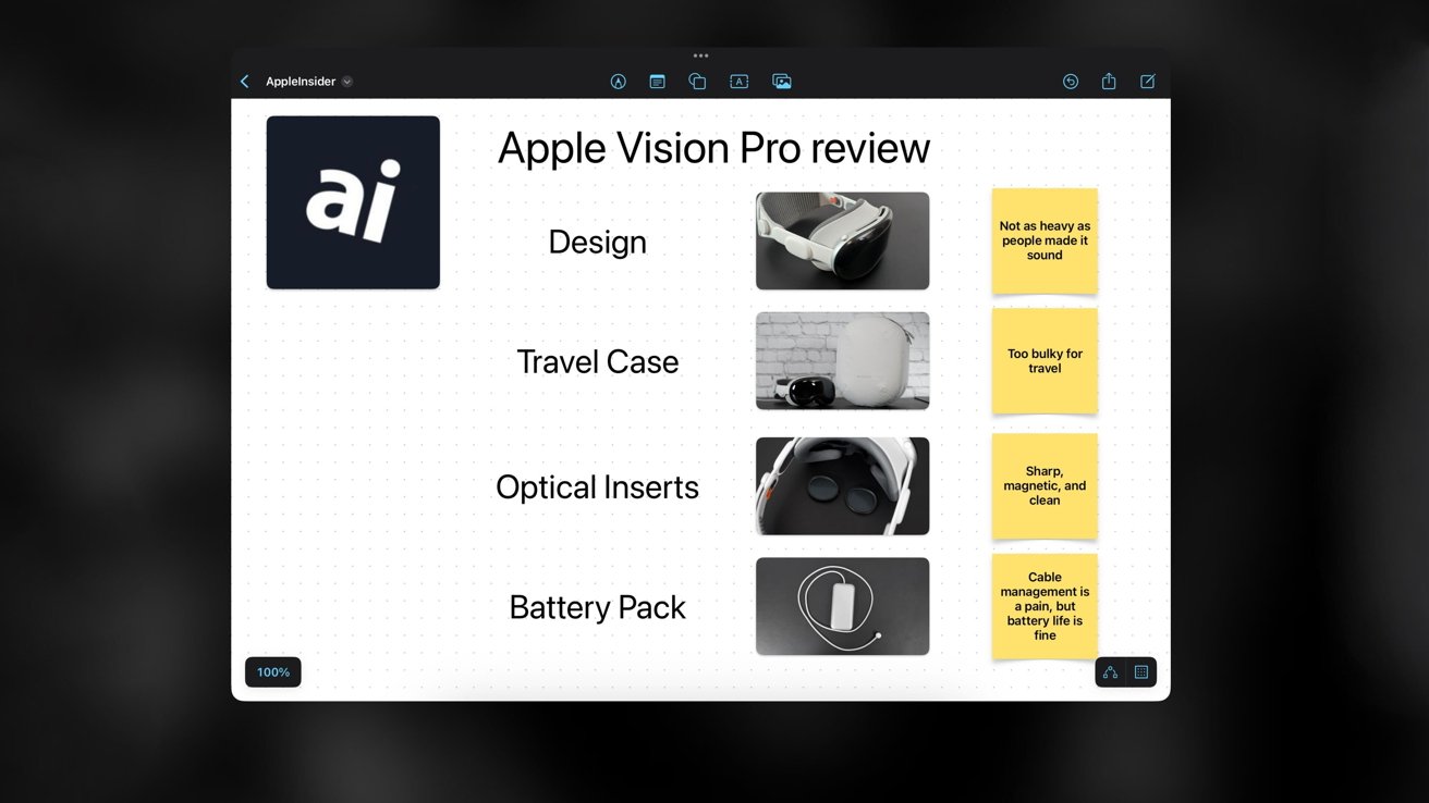
Freeform is Apple's version of a collaborative infinite canvas application, which gives users a way of creating virtual whiteboards with images, links, and text. Introduced in 2022, the app is available on iOS, iPadOS, macOS 15, as well as visionOS.
With Freeform's new "Scenes" feature, it will be possible to more easily move between individual sections of a board. These sections, or Scenes, can be edited, saved, exported as PDF files, or printed directly from the in-app user interface.
Users will also have the option to collaborate or present Scenes to others, as the feature will be compatible with iCloud. People familiar with the feature have revealed specific details about its design, allowing us to create detailed mockups of the in-app user interface and illustrate the feature's functionality.
Freeform Scenes will make it significantly easier to manage complex projects and large boards by allowing for quick navigation between specific areas. Simplifying the navigation process would lead to an improved creative flow, while minimizing distractions and disruptions, allowing users to preserve their chain of thought.
The feature will prove particularly useful for planning and creating detailed concepts, or layouts. Users in the business or education sector could present and explain their ideas or projects to others, or fix mistakes with just a few clicks - as opposed to the endless scrolling required in the current version of Freeform.
Users will also be able to work together and fine-tune specific Scenes, as the feature fosters collaboration through its compatibility with iCloud. This means that designers, artists, marketers, educators, and other business professionals would have the ability to work on the same area of a board, enabling changes on the fly.
What will the user interface for Freeform Scenes look like?
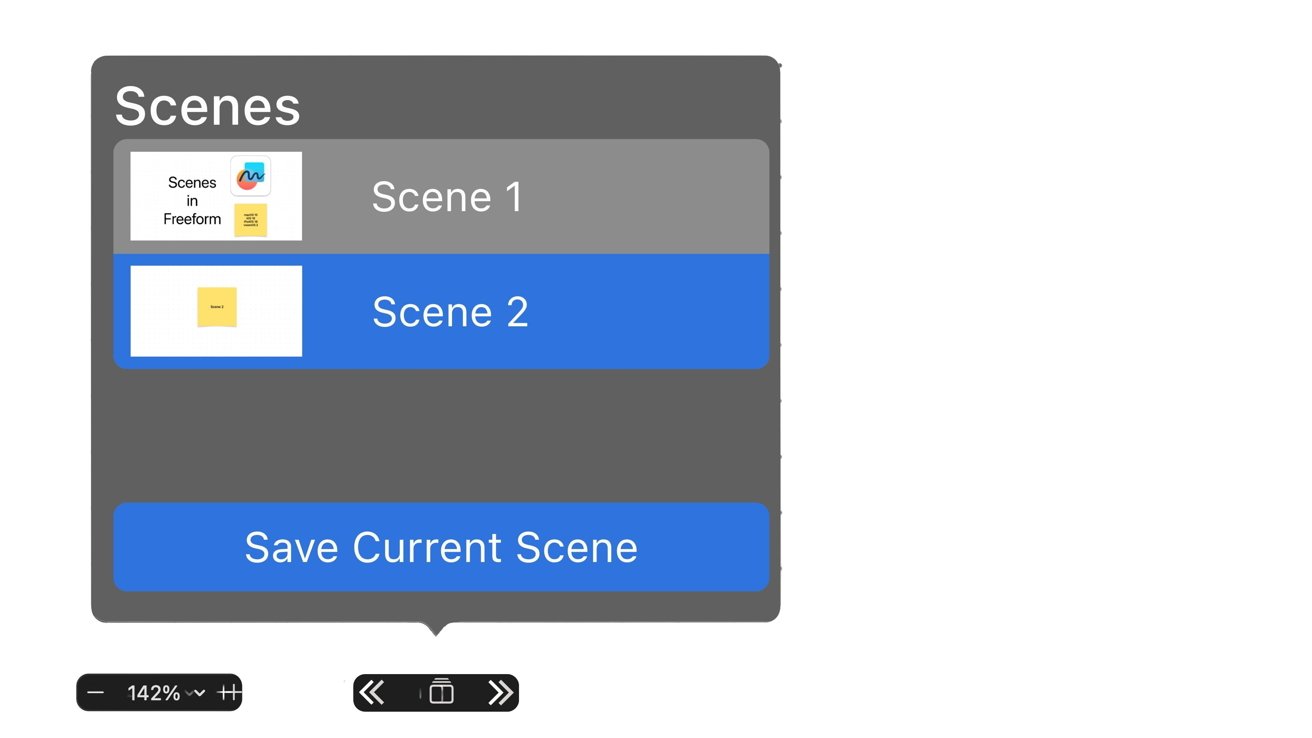
In pre-release versions of Apple's operating systems, the user interface for Freeform Scenes is located towards the bottom left area of the application window, right next to the zoom controls.
As revealed in an earlier report, the new UI can be toggled by tapping or clicking the new sandwich bar icon. This will present the user with basic navigation controls in the form of two arrows, with a square icon between them.
Tapping the square icon reveals additional options for saving, exporting, and navigating between Scenes. When opened for the first time, the new UI element will display a brief description of the Scenes feature, as a way of explaining its overall purpose and functionality.
From the same user interface element, users will find a dedicated button to save the current area of their board. Whenever a new Scene is saved, it will populate a list within the app.
This means that it will be possible to navigate between scenes in multiple ways - either by using the two arrow icons mentioned earlier, by scrolling through the list of saved Scenes, by using the menu bar, or through keyboard shortcuts on macOS 15.
Freeform's Snap To Grid feature will make precise object alignment possible
On Mac, it will be possible to access Scenes via the menu bar. Users will find navigation options for Scenes under the View section in macOS 15, alongside another feature called "Snap To Grid."
This feature will regulate the placement and alignment of objects in relation to the existing board grid. When activated, users will be able to precisely align objects and elements so that they match up with the board nodes.
Snap To Grid is an option that's widely available across different design-related applications. Products such as Adobe Photoshop, Microsoft Excel and Archicad all contain the feature in one form or another.
With the Snap To Grid feature, users will be able to precisely align various elements, such as images, text boxes and shapes within a board. This would be ideal for complex concepts and projects that require meticulous attention to detail, such as design projects or precise diagrams.
Other upgrades in store for Freeform
Internally, Apple has also developed integration between Freeform and an app called "Generative Playground." As explained in one of our earlier reports, Generative Playground is an image generation and editing tool related to the company's Greymatter AI project.
This means that Apple could upgrade Freeform with generative AI, allowing users to add AI-generated images to their boards. It remains to be seen, however, if this feature will become available to end users, or if it will make it to release.
People familiar with the matter have told AppleInsider that Freeform will receive support for vertical text box alignment.
Vertical text box alignment would be especially useful for detailed projects with numerous elements. The feature would give users more options for labeling different processes within a structured business plan, or for labeling roads within a simplified representation of a city, for instance.
Also coming is a mysterious feature dubbed "Magic Lists." At the time of writing, It is not entirely clear exactly what Magic Lists will actually do, though.
Not all software features in early testing make it to the final release versions of Apple's operating systems. The company has been known to delay new options and enhancements to subsequent OS releases or cancel them entirely, so there is always a chance we may not get to see these features at WWDC — or at all — for one reason or another.
The updated Freeform application is expected to make its debut at WWDC alongside Apple's new GreyParrot Calculator, updated Calendar, Music, Notes, Photos, System Settings and Voice Memos applications.
The company is scheduled to announce its next generation of operating systems on June 10, which is when we will see the first developer betas of iOS 18, iPadOS 18, and macOS 15 - all of which are said to have a heavy focus on AI.
