First there was Spaces, then Stage Manager, now there's Window Tiling. All try solving the issue of Mac window management — yet all are hidden. Here's where they are and what they do on macOS Sequoia.
It's possible that you've never had to think about window management on a Mac. It's more likely that you have faced multiple apps and open documents, that you've struggled to find the one you want, but you had no reason to know there's even a term for this.
As well as the term window management, though, there are three distinctly different systems for making it simpler to find what you need, and to concentrate on your work. That's three systems from Apple — there are many third-party apps too.
Those third-party apps, most famously such as Moom, all concentrated on giving you quick ways to arrange windows on screen. With a click or a keystroke, a given window could take up the left half, the right third, or any possible position you determine.
Apple's latest Window Tiling in macOS Sequoia targets precisely this method. It's going to Sherlock some apps, but it might also promote them as all third-party rivals do more than Apple's new version.
Only, once Apple highlighted each of its window management tools at WWDC, it then hardly mentions them again. If you are a new Mac user, it is entirely possible that you would never realise these tools exist.
And right now, that's especially true with the new Window Tiling because it can be controlled by keystrokes — but by default, only if your Mac keyboard is a small one with a function or globe button. Hopefully that will change during the rest of the beta process.
Window Tiling
You could even wonder if Apple wants to hide these features, because as well as limiting the keystrokes, it's put a constraint on just dragging windows around.
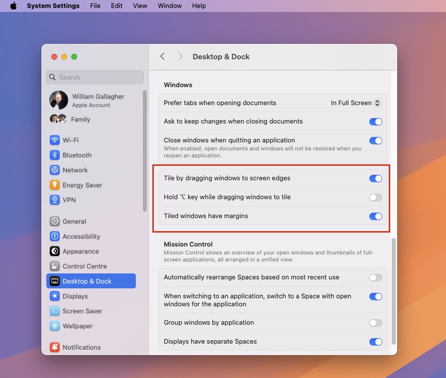
The demonstration showed that simply dragging a window to the side of the screen can now make it tile. But in reality — at least in the beta — this won't work unless you hold down the option key.
Fortunately, that is just the default option. To have it so that a window will tile to a side of the screen, go to System Settings, Desktop & Dock, and turn off the option under Windows.
Now you can drag a window to one side and know that it will snap to, for instance, the left, or the top right, and so on.
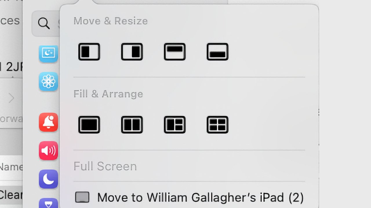
You do also have the same options under the green traffic light at the top left of every Mac window. It's easy to click there and take the window full screen, but if you instead hover the cursor over the green light, you see options to either Move & Resize, or Fill & Arrange.
The former moves a window to the left, right, top, or bottom of the screen. The latter, Fill & Arrange, gives you options including full screen, half screen, and a quarter screen
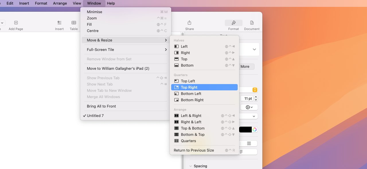
Plus under the Window menu of every app, there is now a Move & Resize section, which is subtly different. Choosing this option gets you four sets of controls for your window positions:
- Halves (left, right, top, bottom)
- Quarters (top left, top right, bottom left, bottom right)
- Arrange (left & right, right & left, top & bottom, bottom & top, quarters)
- Return to Previous Size
That last option is also what happens if you drag a window back from a tiled position. So if you change your mind or are just done with having the window there, you can quickly revert to having it wherever it was.
One thing. Each of these options under the Window, Move & Resize menu, is specifically a menu option — and that should mean you can add a keystroke.
So rather than having to use a keyboard with a function or globe key, you could go to Settings, Keyboard, and click on Keyboard Shortcuts... to set new keystrokes. At present, that doesn't appear to be working.
When it does, though, or when you have a globe key, or when you use the menus, the new macOS Sequoia's window tiling is excellent. The thing it lacks is the ability to say that you want a window to be in a more precise position and precise size than solely tiled into an existing grid.
For that, you need apps such as Moom, or Keyboard Maestro.
Stage Manager gets better
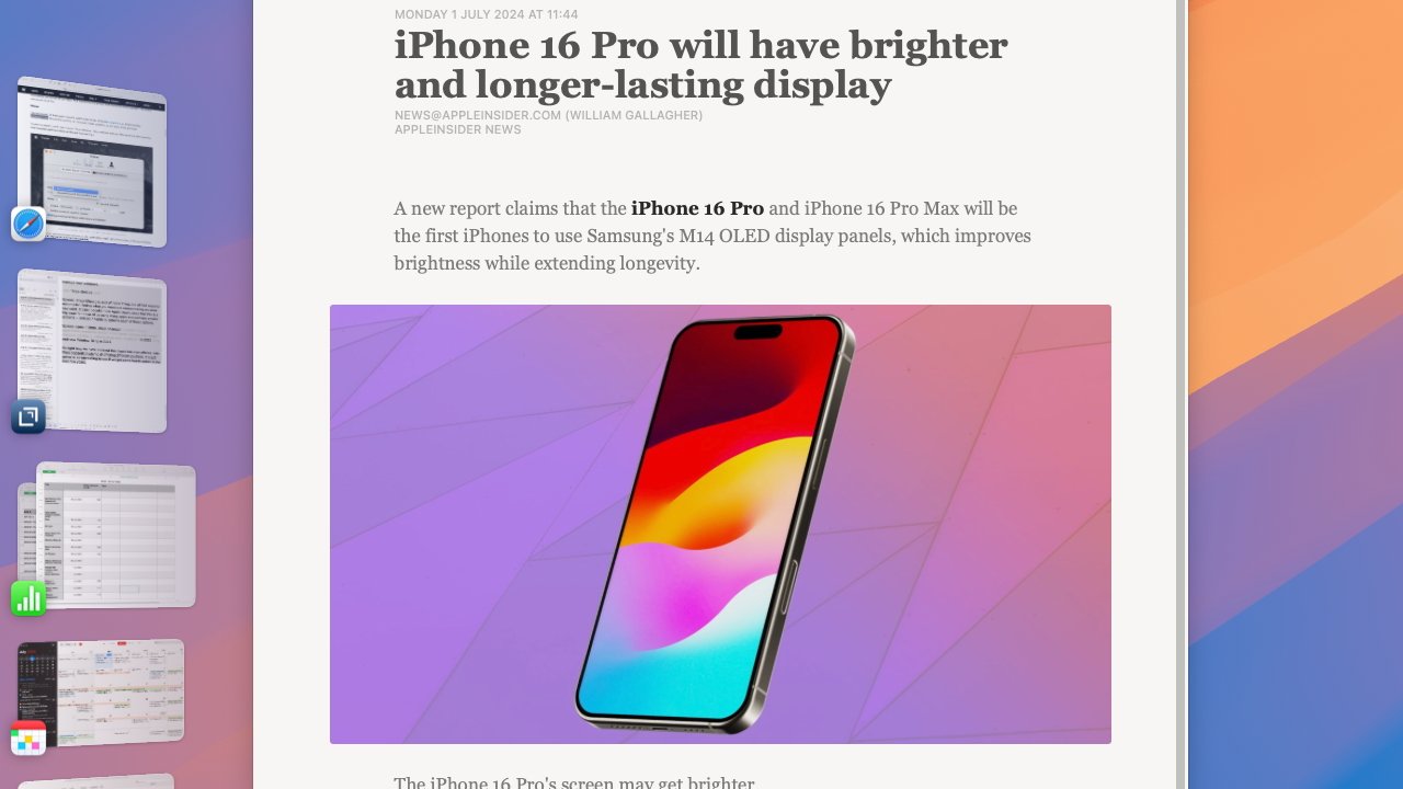
Stage Manager was introduced to the Mac with macOS Ventura, and it's also on the iPad. The idea is that you can quickly group apps together, so that if you're always working in Pages and Safari, they can be opened at the same time, and — within limits — positioned on screen where you like them.
And then with a single click, you can send Pages and Safari away, as Mail, Reminders and Apple Music all jump to the fore together.
Apple does push this window management tool more than its others, but chiefly on the iPad. If you connect an iPad to an external display, then that display will have Stage Manager running — whether you want it or not.
On the iPad's own screen, it's more like it is on the Mac. You go to Control Center, tap the Stage Manager button, and then you are in it, until you click that button again.
It is definitely a fast way of switching between sets of apps. And over time, Apple has made it easier to adjust the size of windows to suit what you need.
Plus it now more intelligently creates groups of apps based on what you have open before you click the Stage Manager button. Best of all, Stage Manager now correctly returns your windows to where they were after you switch off the feature.
Spaces
Stage Manager gets more promotion than most, Window Tiling gets highlighted because it's new, but Spaces is so ignored that you'd think it offended Apple in some way.
Yet when Steve Jobs launched it at WWDC 2006, he made it sound like a gift from the gods. "This is a big one," he said.
"If you're like me, you're doing a bunch of things at once, you've got a lot of apps running at once," he continued. "The tasks you're doing each require a few apps together, and wouldn't it be great if you could take those few apps required for a given task and create a space for them to be in?"
Spaces is the hardest to explain until you see it, then it's arguably the handiest of them all — especially because it's one you can use with both Window Tiling and Stage Manager.
What Spaces looks like is having a second, third, fourth or more Mac desktops. You open apps, drag icons onto the desktop, rearrange windows — and then with a swipe, those are all moved away and you have a new, empty desktop.
In that empty desktop, you open other apps, you open other documents. There's no constraint, no limit, it's up to you to decide what you want to see on each space — but the idea is that you can group together what you need for any particular task.
"Another task has its own space with its collection of apps," said Jobs, "[and you can] rapidly switch between those in a super intuitive manner."
It isn't super-intuitive. It requires a swipe from the left or right of the screen, and sometimes you instead bring up the Mac's widgets list.
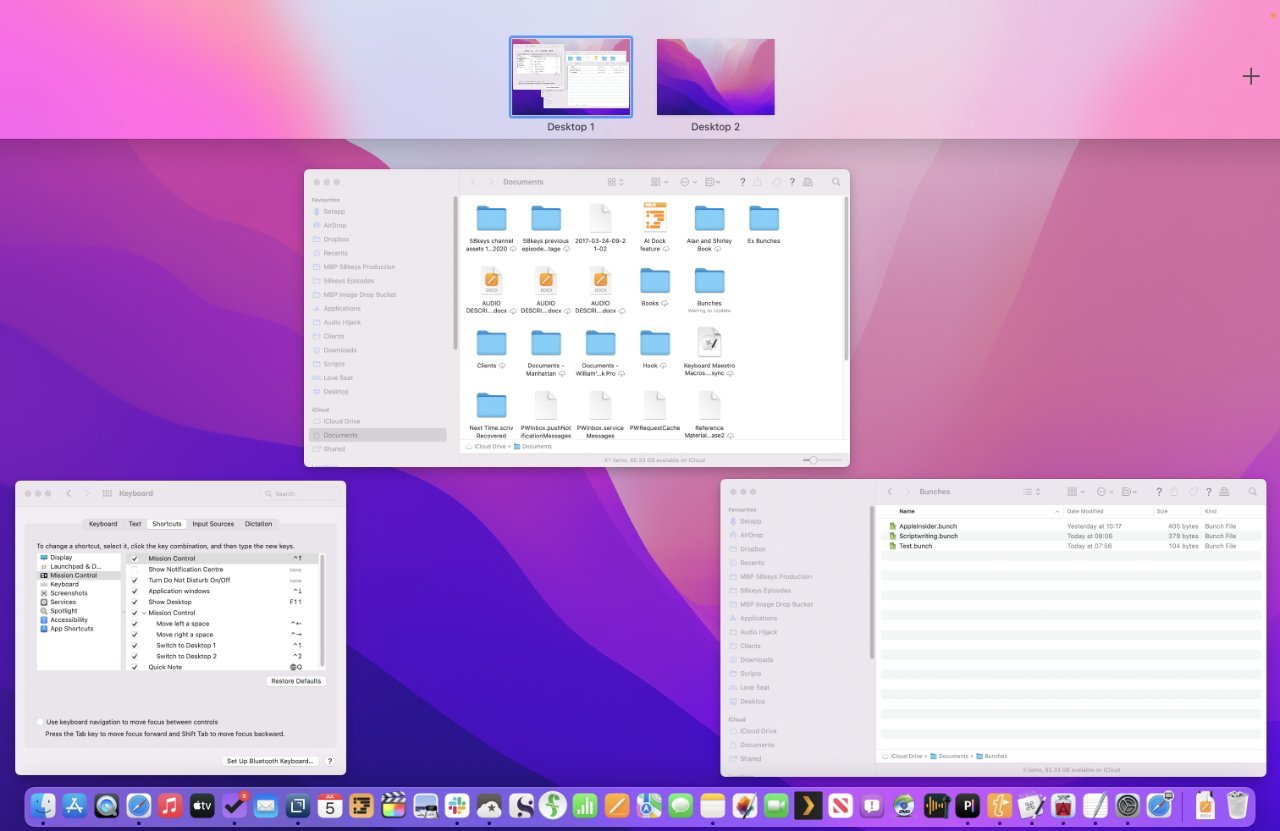
With Spaces, the main part of the screen here is a regular desktop. But swipe up on a trackpad and you can see a second or subsequent desktop
But once you get used to Spaces, it is a very fast way to manage your windows.
Three choices
Spaces, Stage Manager, and Window Tiling, are all fast ways to accomplish finding what you need and concentrating on what you want. It's just peculiar how Apple clearly sees that this is a big issue for those of us using many apps and perhaps smaller screens — and yet it tends to sideline each of these options.
Spaces came in 2006, Stage Manager in 2022, and now Window Tiling in 2024.
So right now we have the best that Apple has ever offered, with three separate systems all offering different solutions. It's just going to be interesting to see if we get some fourth option in the next few years.
