StandBy in the new iOS 17 may be Apple's first attempt at a true smart display. Here's how to turn your iPhone into a smart display when docked.
To use StandBy, there's nothing you need to do, other than connect your phone to power and place it horizontally. You can use any charger, whether connecting with a USB-C cable, a MagSafe charging stand, or a Lightning cable on older iPhones.
Unfortunately, you need to have power for StandBy to work. You can't merely turn your phone sideways in a stand and expect StandBy to enable.
Also, you need an iPhone that has an always-on display for it to work. Currently that means only the iPhone 14 Pro and iPhone 15 Pro can use StandBy; other models will launch it, but then turn the screen off after a few moments.
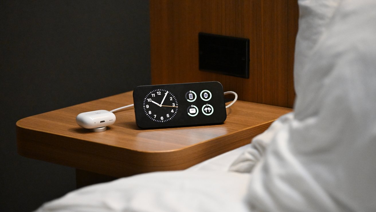
If you have an iPhone 14 Pro or iPhone 15 Pro, then MagSafe stands are preferable to charging cables as Apple is able to detect and identify individual MagSafe chargers. That means it knows the difference between your kitchen charger, your work charger, and your bedside charger.
It will then show the correct version of StandBy based on the location. So when you set up your kitchen StandBy mode to show photos, it will always show photos but it will show the clock and your battery status when you dock it in the bedroom.
Navigating Standby
When you first try StandBy, an animated alert appears to introduce you to the feature. It then drops you into the default view which shows two widgets at the same time.
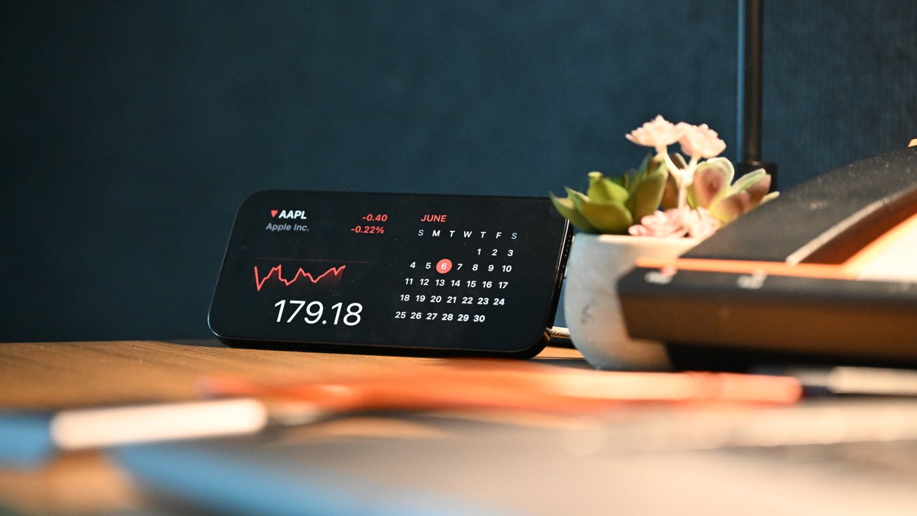
Several widgets are preloaded and you can swipe up and down to cycle through the various widgets added. You can change the widgets manually or there is a smart rotate option, similar to the Smart Stack widget on the Home Screen, that will change them for you.
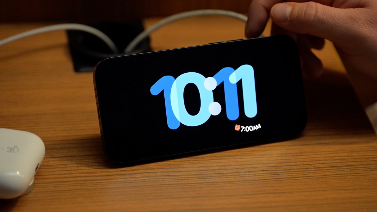
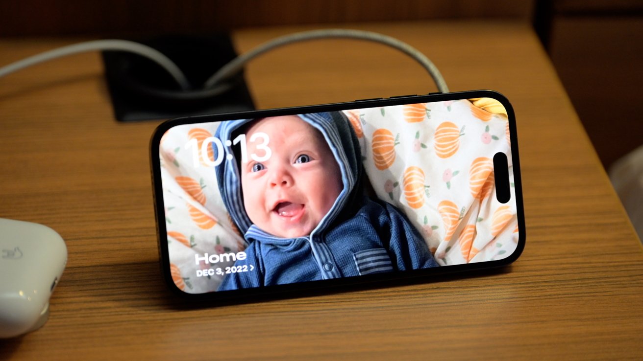
Aside from this dual-column view, you can swipe left and right to go to different layouts. There is one for photos and one for full-screen clocks.
The photos view pulls from your featured photos or you can create new slideshows by choosing photos manually. The photos will automatically cycle or you can tap the screen to progress.
There are multiple full-screen clocks that you can swipe through. Some have different fonts, another can show the world map, and another is a classy mechanical watch face.
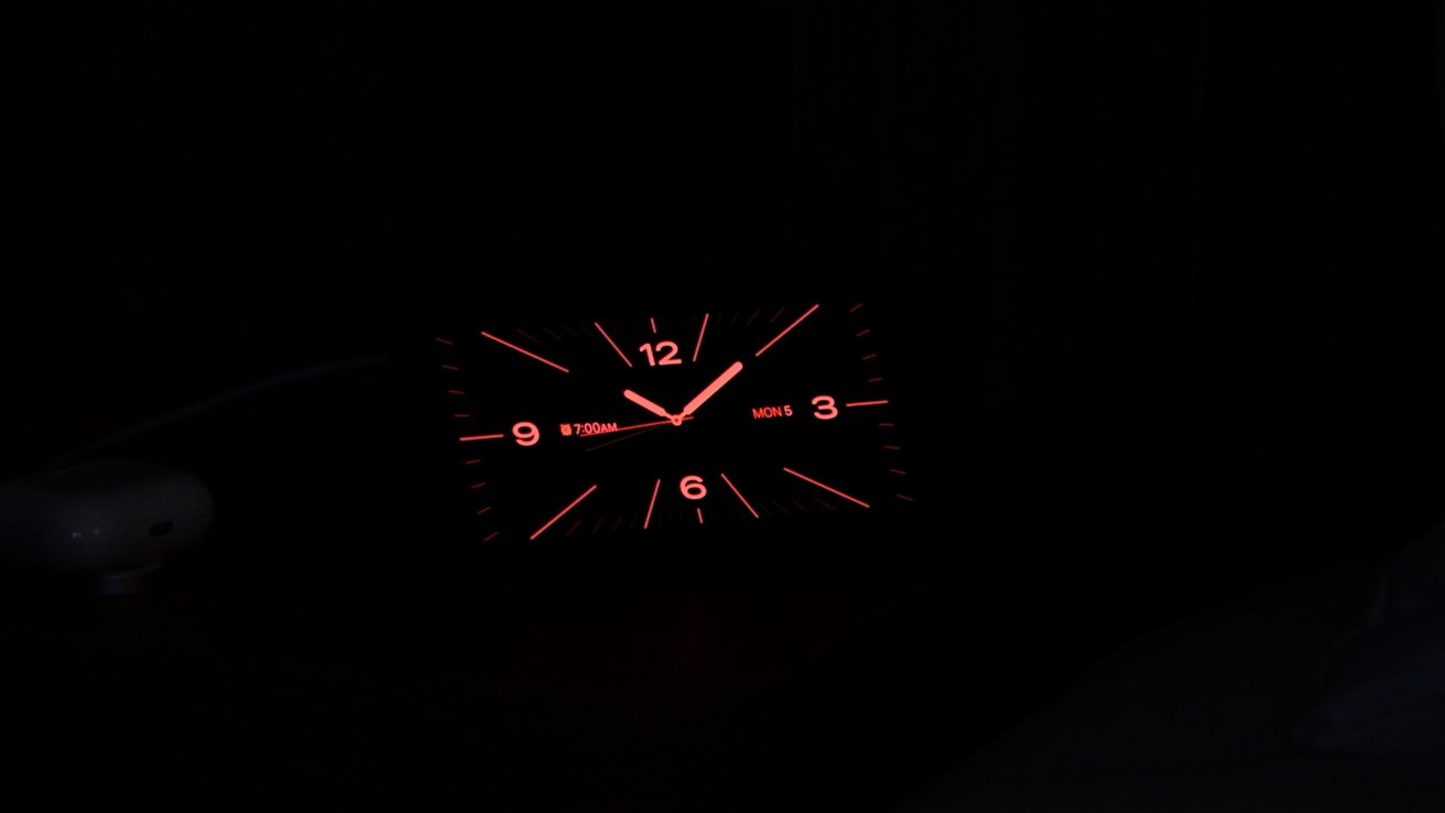
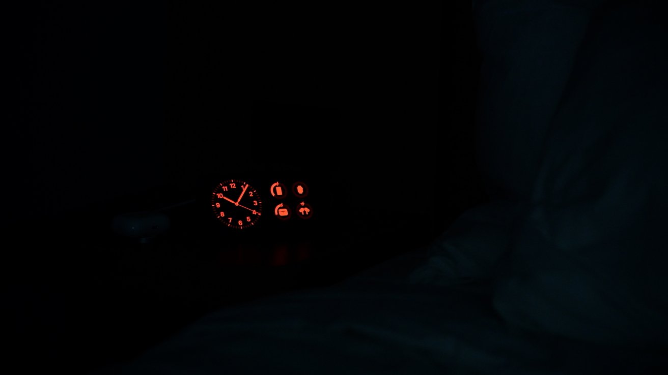
One of the coolest features is when the lights in the room go out, StandBy will intelligently dim the display and switch to an all-red appearance.
This helps reduce blue light from the display which promotes better sleep. Each of the widgets and views will work with this low-light feature.
Customizing StandBy mode
Aside from swiping between the different views, most of the customization comes from the dual-column widget view. You can add and remove any of the default supported widgets.
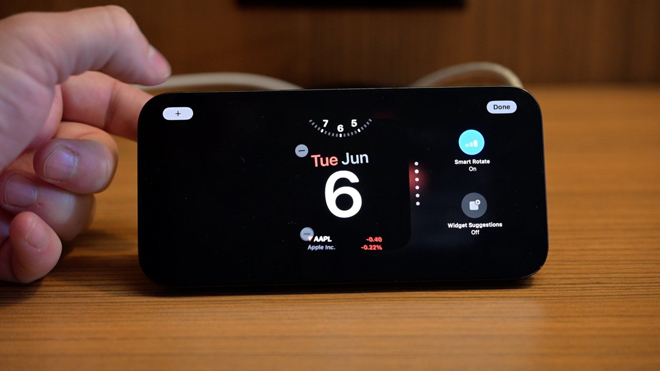
To edit the widget stacks, simply press and hold on the left or right widget. You can tap the - button then on any of the widgets to remove them or tap the + in the top-left corner to add a new one.
At launch, you can expect Apple's widgets to work — so everything from all your battery percentages to your Home control widgets, to Apple Music. There are a lot of stock Apple apps and most of them work well.
Some Apple apps are only partially supported. Those include Fitness, Game Center, and Sleep. Since they are only partially supported they can be added, but won't change color at nighttime.
You can tap and hold on a widget to change its position in the stack and you can turn off suggested widgets and smart rotate for each column independently.
Now that iOS 17 has launched, you can expect increasing numbers of third-party widgets to work too, as developers update their applications.
Tricks for StandBy
Outside of these various views, StandBy has some other neat tricks up its sleeve.
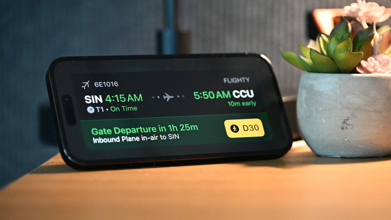
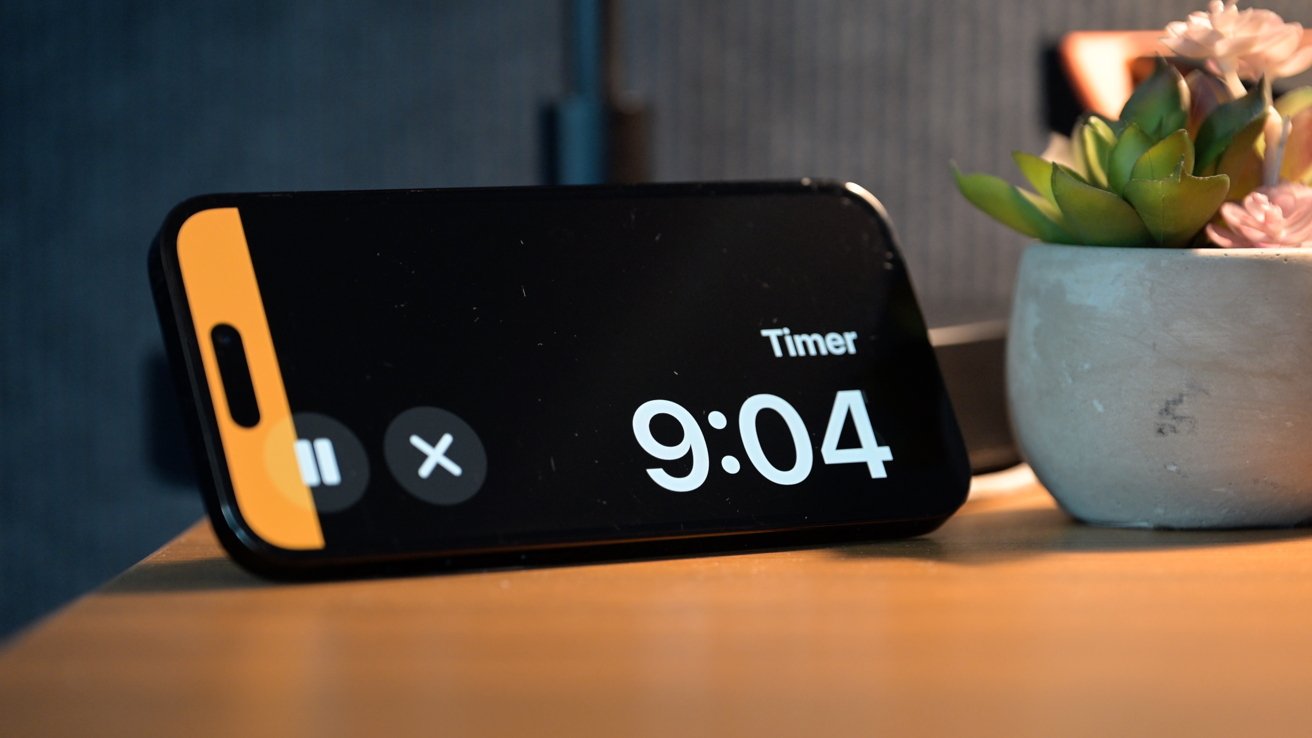
If you have a Live Activity going, there will be an icon at the top when placed into StandBy. If you tap the icon, it will be taken full-screen for you to monitor.
Think of watching for your incoming flight while packing in the office, watching a timer while in the kitchen, or monitoring your Uber Eats order while in the living room.
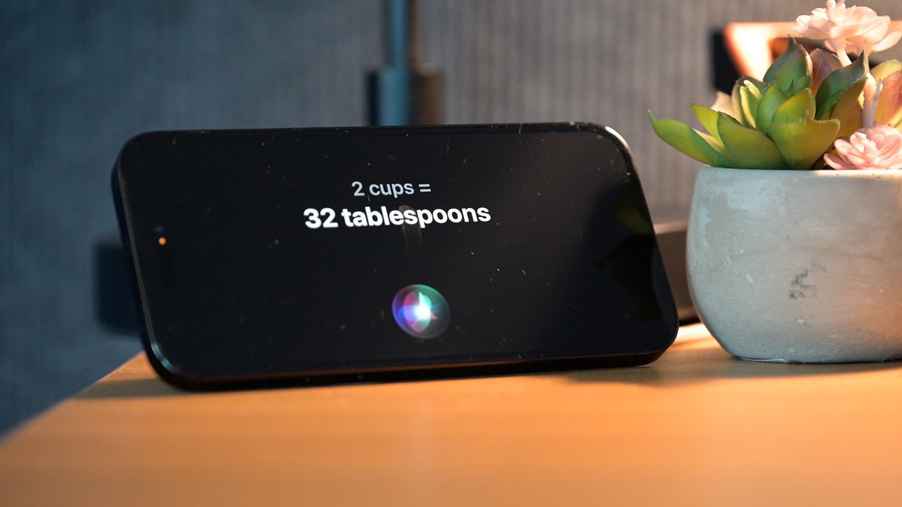
There is support for Siri too, now no longer requiring the "Hey" we might add. When you invoke Siri, the response will now show visually on the screen.
It's great when looking at conversions, sending a message, or asking other questions.
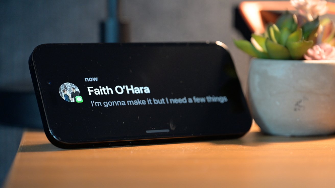
Finally, Apple has put neat animations in place when you have an incoming call or message. When a message comes in, the name shows with their contacts picture and their message animates in from the side.
Similarly, when you have a phone call, it too shows their contact photo and provides large buttons for you to take action and answer the call or send them to voicemail.
 Andrew O'Hara




 Marko Zivkovic
 Christine McKee
 Andrew Orr

 William Gallagher


 Mike Wuerthele

 Bon Adamson
-m.jpg)


