If you have to share a Mac, then macOS Sonoma has the potential to confuse because of an elegant yet easily missable design choice on the lock screen. Here's how to use the new user switch feature in the fall.
The change is to do with the new lock screen, easily the most immediately visible difference between macOS Sonoma and its predecessors.
It is specifically a change to the lock screen. To quick switch users from the menubar or Control Center, the procedure is as it was for macOS Ventura.
How it used to be on the lock screen
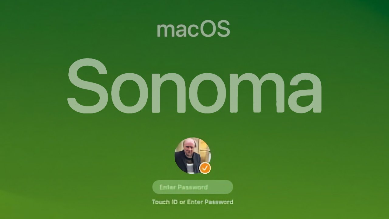
If you are the sole user of your Mac then when you start it up, you get a lock screen that now has a clock at the top, and an login area at the bottom. There's a picture of you in a small circle, if you bothered to add a photo of yourself, and — when you hover over the right area, or start typing — there is also a password field.
There's a small difference when you are currently logged in and want to switch to another user. In that case, if you choose the Apple menu and then Lock Screen, you get your regular login screen plus a Switch User button.
Pressing that Switch User button, or coming to the login screen from having restarted the Mac, you get a row of usernames and icons.
Functionally, it's very clear how to pick the user you want. But aesthetically, the icons do seem over-sized — and that's what Apple has changed.
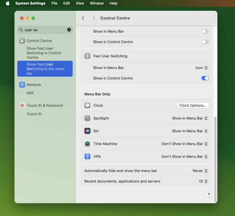 The lock screen login has been revised but it's still possible to put Fast User Switching in the menubar or Control Center
Small but significant change
Now whenever you get to the user login page, most of the time you will see a much smaller, neater icon for the user. It's still in a circle, but now that circle is at the foot of the screen.
And there may not appear to be any other users at all.
If you catch the login screen waking up, though, you will see an icon for other users briefly pop up behind the current one. It looks like the other users are waving, in how they lean out to one side, then quickly slide back in behind the current one again.
It looks good, it looks oddly happy, but it is also easy to miss unless you tend to watch your Mac starting up.
Whether you miss it or not, though, what you have to do now is click on the current user.
Once you do that, the user icons pop back into view and arrange themselves into a vertical column. The bottom one is the current user, right underneath your cursor so that you can click it fastest, but you can click on any of them.
Click on a user and you then get the option to enter a password or use Touch ID.
 William Gallagher





 Bon Adamson
 Marko Zivkovic
 Amber Neely
 Malcolm Owen


 Christine McKee


-m.jpg)
