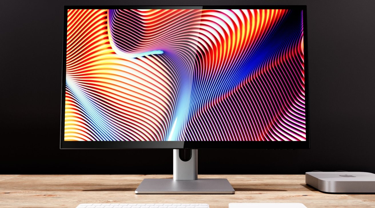
Alogic's first monitor, Clarity, echoes Apple's styling in many ways. While the Studio Display has incredible picture quality, Alogic aims for more flexibility.
Monitors aren't an area of computing where there's much room for companies to innovate. For new display vendors entering the space, that makes providing innovation, or at least something to separate its products from others on the market, that much harder to accomplish.
With the introduction of the Alogic Clarity, the company's first display, the company has come up with something that takes a lot of design cues from Apple. At the same time, it introduces some party tricks that could give productivity experts something to think about.
The Clarity is billed as an "enterprise-class display for households and businesses" and a "formidable alternative to some of the best-known and highest-priced monitors available today."
Naturally, with that bold statement and the Apple Studio Display-style appearance, the Alogic Clarity is practically begging to be placed against the tech giant's premium offering.
Specifications
| Specifications | Apple Studio Display | Alogic Clarity 27-inch |
|---|---|---|
| Size (inches) | 27 | 27 |
| Resolution (pixels) | 5120 by 2880 | 3840 by 2160 |
| Color range | P3 | 1.07 Billion Colors |
| Backlighting | LED | QD |
| HDR | None | HDR 600 |
| Peak brightness | 600 nits | 400 nits |
| Contrast Ratio | 1,200:1 | 1,000,000:1 |
| Refesh Rate | 60Hz | 60Hz |
| True Tone | Yes | No |
| Webcam | 12MP ultra-wide | No |
| Ports | 1xThunderbolt 3, 3xUSB-C | 2xHDMI 2.0, 1xDisplayPort 1.4, 1xUSB Type-C, 2xUSB-A, 1xUSB-B, Headphone Jack |
| Audio | 6-speaker system | Stereo 5W Speakers, Headphone Jack |
| Microphone | Yes, array of three | No |
| Nano-texture | Yes, Optional | No |
| Stand options | tilt, tilt + height, VESA | Tilt, rotation, and swivel stand, VESA |
| Other Features | 96W host charging | Rotatable with auto detection 178-degree viewing angle 90W Power Delivery |
| Price | $1,599 | $799.99 |
Alogic Clarity vs Apple Studio Display: Design and Dimensions
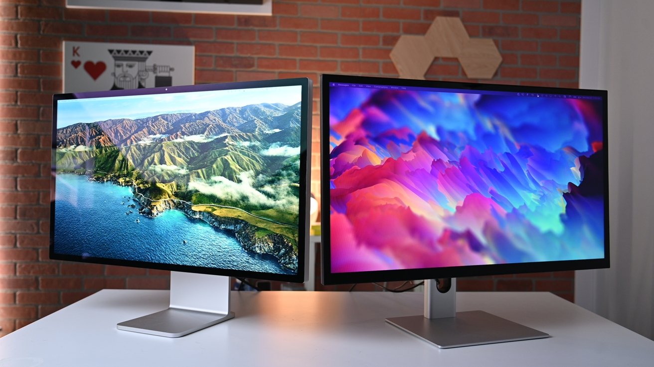
Both Alogic and Apple have gone with a design that is quite simple: a large 27-inch display with thin bezels placed on a stand with a hole in it. They both opt for black bezels and have similar color stylings, but that's where the two go in separate directions.
For a start, Alogic has gone for a different style of stand to Apple's creation, opting for a more tubular design than the flatter Apple version.
While Apple went for a flat slab-style screen unit to match its usual design aesthetic, Alogic's version certainly looks thin, but not if you look too closely from the side. The back section of the enclosure curves around and thickens the display, so it only looks thin at the main viewing angles.
The Apple Studio Display has a height of 18.8 inches, a width of 24.5 inches, and measures 6.6 inches deep with the default tilt-adjustable stand. On its alternate tilt- and height-adjustable stand, it has a maximum height of 23 inches and a minimum of 18.8 inches, a deeper 8.1-inch footprint, but the same width.
The Alogic Clarity is 565mm (22.2 inches) tall, 624mm (24.5 inches) wide, and 220mm (8.66 inches) deep, making it as wide as Apple's version and sits taller than the default tilt stand, but it takes up a little bit more depth of the desk itself. The stand's base is flat, so it shouldn't be much of a problem for most users in reality.
Alogic Clarity vs Apple Studio Display: The Screen
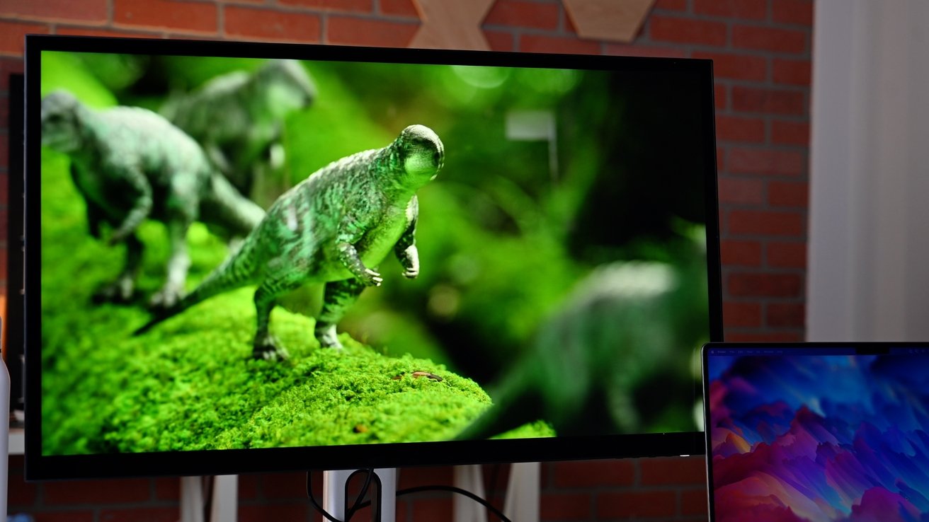
The two displays share the same screen size, at a diagonal of 27 inches. With a reasonably thin bezel, the two are framed reasonably similarly.
Things start to differ in resolution, as Apple's Studio Display has a 5K resolution of 5,120 by 2,880 pixels, versus the 4K Alogic at 3,840 by 2,160 pixels. This equals pixel densities of 218 pixels per inch for the Studio Display and 163ppi for the Clarity, which falls in Apple's favor.
Apple also leads in peak brightness, at 600 nits of peak brightness to 400nits for the Alogic. However, Alogic also claims its IPS monitor supports HDR 600 content, which effectively means it can output a peak of 600 nits for HDR content. Apple doesn't claim the Studio Display can handle HDR.
Both screens use standard and well-used TFT LCD technology with LED backlights rather than the miniLED you get with the Pro Display XDR.
The Clarity does differ in that it does offer the Pro Display XDR's localized dimming, albeit to just 24 zones. It also uses QLED (Quantum Dot LED) technology, to produce brighter and more vibrant colors than usual, further helping Alogic's cause.
The QLED technology and localized dimming that Alogic uses do offer a claimed contrast ratio of 1,000,000:1, which seems very high compared to the Studio Display's 1,200:1 contrast ratio.
Both displays operate with a 60Hz refresh rate, which is relatively limiting compared to many other monitors on the market capable of triple-digit refresh rates.
In terms of picture support, Apple says its display supports 1 billion colors with Wide Color (P3) and True Tone. It is also able to operate in several different reference modes, including various P3 options and sRGB.
Alogic says its display can handle 1.07 billion colors, with 100% sRGB coverage, 97% DCI-P3, and 99% Adobe RGB.
Alogic Clarity vs Apple Studio Display: Connectivity
Both monitors have ample connection options, though with pretty different approaches.
In the case of the Studio Display, there are just four connections on the back, consisting of a Thunderbolt 3 port to connect to a Mac and three USB-C ports for peripherals. These are all placed in an easy-to-see section on the back panel.
That Thunderbolt 3 connection is used for multiple elements, including video, data for the ports, and power delivery of up to 96W. The last point is handy if you want to have a single-cable connection to a MacBook Pro and want to recharge it.
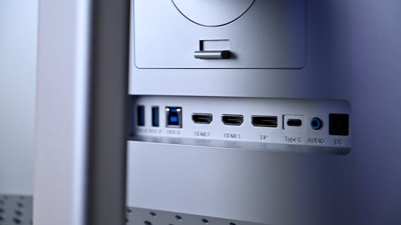
The Alogic Clarity goes down the more conventional display route in offering a mass of connection options. This includes a pair of HDMI ports, one DisplayPort, and USB-C, with the last one offering similar data, video, and power delivery at up to 90W.
There are a few other connections on the Clarity, with a USB-B port and two USB-A enabling it to function as a USB hub. There's also an audio jack, if you didn't want to use the built-in speakers.
Alogic positioned these ports on the back panel, right underneath where the stand connects to the display. This may be a little harder to access, but the stand's flexibility should make it easy enough to use.
Alogic Clarity vs Apple Studio Display: Cameras and Audio
The difference is simple on the video front: Apple included a camera in the Studio Display, but while Alogic didn't.
Apple's webcam is a 12-megapixel Ultra Wide imaging device, which benefits from advanced image signal processing from the M1 chip in Macs. It also supports Center Stage, Apple's system for keeping users in the middle of the cropped image for video conferencing purposes.
For audio inputs, Apple includes an array of three "studio-quality" microphones with a high signal-to-noise ratio and directional beamforming and even "Hey Siri" support.
You won't get any of that with the Alogic, unless you add a third-party webcam and microphone to the mix.
For audio outputs, Apple's Studio Display uses a six-speaker system with force-canceling woofers, a wide stereo sound, and support for Spatial Audio for Dolby Atmos content.
Alogic's Clarity is described as having two 5W speakers. There is, however, a headphone jack, so users can listen to music via the display or even connect external speakers.
Alogic Clarity vs Apple Studio Display: Stands and Rotation
Apple offers two different styles of stand for the Studio Display. The standard tilt-adjustable version consists of an L-shaped bracket with a simple hinge at the top. If you want to adjust the height, you could always spring an extra $400 for the tilt- and height-adjustable stand, which gives you enough vertical movement to go from 18.8 inches tall to 23 inches.
In an attempt to be more user-friendly, Alogic's stand offers a lot more without needing extra outlay. This includes adjusting the height, tilting the screen, swiveling it from side to side, and its bigger party trick, rotation.
This last element allows you to use the Alogic Clarity in portrait and landscape orientations using the supplied stand. What's more, a gravity sensor built into the display can detect how it rotates, adjusting the picture to match its orientation.
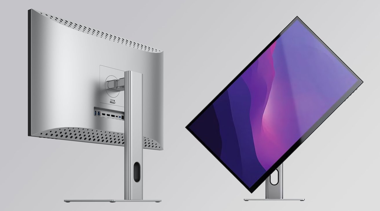 The ports on the back of the Alogic Clarity are easily accessible due to its flexible and rotatable stand.
 With the ergonomics of monitor movement, Alogic also adds IPS into the mix, boasting viewing angles of up to 178 degrees on horizontal and vertical viewing axes. It'll take a lot not to be able to see what's on the screen, regardless of where it is pointed or its orientation.
If you want to go down the route of a third-party VESA arm, you can, but you will have to get the required VESA mount from Apple.
Alogic Clarity vs Apple Studio Display: Pricing
Apple sells the standard Studio Display with the default tilt or the VESA mount for $1,599. If you want the tilt and height-adjustable stand, that's an extra $400.
There's one more option for the Studio Display: upgrading from standard glass to Nano-texture glass, which makes the glass less reflective. That's a $300 add-on, regardless of the mount.
If you go for the most expensive options for the Studio Display, you're spending $2,299.
Alogic sells the Clarity for $799.99.
Ergonomically Sound
It's hard not to see the Alogic Clarity as a decent monitor option for users, as there are a lot of good things brought to the table. That's even true against the Apple Studio Display.
Sure, the Studio Display has a 5K screen against the Clarity's 4K and a greater focus on offering users as many picture options as it can muster. The Alogic monitor can't really beat Apple there, but it's still got a decent-resolution display, good brightness and sufficient contrast, which most people should be fine with.
Audio isn't in Alogic's favor, nor is the lack of a camera, but the headphone jack is always a welcome addition.
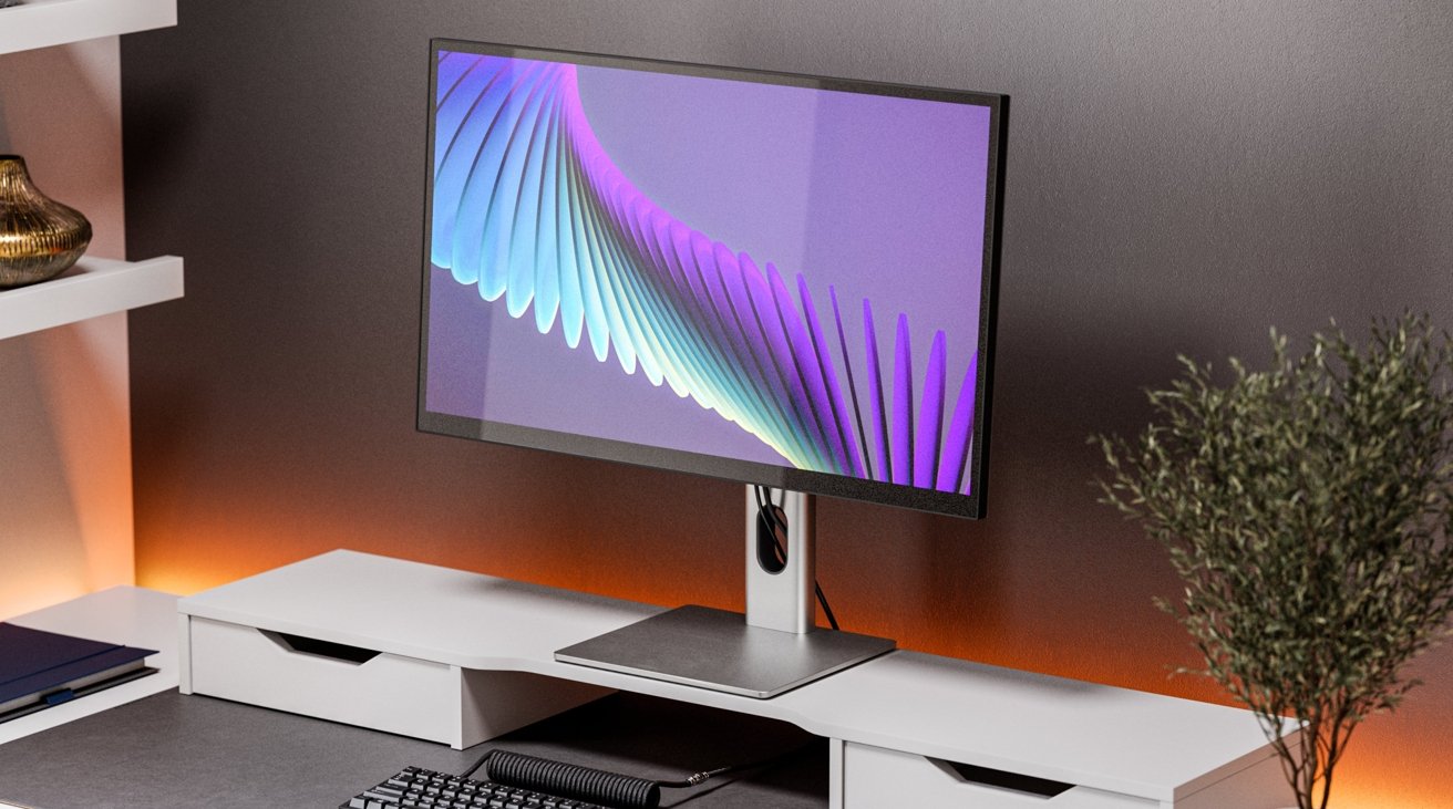
-xl.jpg) Alogic's Clarity is a good alternative to the Apple Studio Display if you want a cheaper and more ergonomic solution.
Alogic's Clarity is a good alternative to the Apple Studio Display if you want a cheaper and more ergonomic solution. Where the Alogic Clarity does succeed is in two definitive areas.
For a start, it's a lot cheaper than the Studio Display, as is a considerable chunk of the monitor market at large. If you're looking for an adequate display that looks Apple-ish without the Apple premium, the Alogic Clarity is a decent choice.
The other is in ergonomics. Including a stand that offers far more degrees of movement, with portrait orientations complete with automatic detection, this gives Alogic a checkmark in its column.
Sure, you could get some of the way with Apple's premium stand option or simply go for a third-party arm from the beginning, but since it's included in the basic mount, that's a big plus.
The brand loyal will stick with the Apple Studio Display. Those needing excellent picture quality will also look at the Studio Display and strongly consider if the expense of the Pro Display XDR is worth it.
For the budget-focused and those who want a good display that can move with the user's whims, the Alogic Clarity is transparently the better option.
Where to Buy
The Alogic Clarity is currently on sale in Australia, but the company hopes to start sales in the United States soon.
For a limited time, AppleInsider readers can save $50 on AppleCare for the Apple Studio Display at Apple Authorized Reseller Adorama. To activate the promotion, you must shop through this cost-saving activation link and enter promo code APINSIDER during checkout. Step-by-step activation instructions can be found on this help page.
Want to see how the offer stacks up against other Apple resellers? Find the latest prices and deals in our Apple Display Price Guide.
 Malcolm Owen




-m.jpg)

 Charles Martin

 William Gallagher
 Christine McKee
 Marko Zivkovic
 Mike Wuerthele



23 Comments
There isn’t anything that competes directly with the 5K iMac, LG UltraFine 5K 1st and 2nd Gen, and now apple studio display.
If you want something cheaper then don’t consider Apple gear to begin with. There’s a plethora of cheaper options available to you that will satisfy your need for low cost. Get a PC and a monitor for a third the price and quit agonizing over overpriced Apple gear. It’s really simple