The iOS 7 beta's user interface overhaul is a striking departure from past aesthetics, and one that has garnered a fair share of press, but a complete rebuilding of system animations is equally impactful despite going largely unnoticed.
While eye-catching static design choices like Jony Ive's "flat" iconography and a liberal use of Helvetica Neue Ultra Thin font may be the first things people notice about iOS 7, it's what they don't see that makes Apple's latest OS beautiful.
Animations are simple-yet-necessary tools designers use to create a great user experience. For example, the rubber-banding feature in iOS — recently in the news as part of Apple's ongoing patent dispute against Samsung — has been a key asset to the operating system since the first iPhone debuted in 2007.
The animation is seemingly minor, showing a slight bounce-back when the end of a scrollable page is reached, but without it, users would have no feedback from the system when navigating documents. This speaks in no small part to the responsiveness of an OS.
Other system animations are app-specific or are meant to be seen, such as the "jiggle mode" for editing and deleting apps from a home screen.
With iOS 7 beta, a number of new and interesting animation tweaks come into play. Some are overt, though many are so subtle they may never be noticed by a user. The examples below offer just a sampling of what the OS has to offer.
Lock Screen
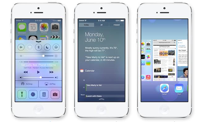
Starting with the Lock Screen, there are already a multitude of changed elements, including the "slide to unlock" bar, which no longer exists. User still need to "slide" or swipe right to unlock the iPhone, but the animation has been modified to move an entire layer of the screen instead of just a small slider. The Lock Screen also fades in from black when the iPhone wakes up, which is a nice touch.
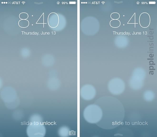
The Lock Screen now moves as a panel instead of a single slider when unlocking an iPhone.
Notification Center, which is now accessible from the Lock Screen as a system settings option, slides down as it did in iOS 6. The translucent panel that pops into view has some added physics, however, as it "thuds" to the bottom of the screen, bouncing back as if rebounding from a fall.
The motion is not quite as "elastic" as the usual rubber-banding bounce-back, but is similar in magnitude, with faster pull-downs getting a larger bounce than slow swipes. This particular animation offers quite a different "feel" than anything in previous iOS version. The physics of the bounce are harder, and convey a sense of weight and structure to the panel.
Swiping up from the opposite end of the screen brings the new Control Center into view, with the window gliding to just below the clock before slightly retracting in a very "rubber-bandy" movement. This panel, also accessible from anywhere in the OS, doesn't rely on magnitudes of motion, meaning it bounces back the same degree, no matter how fast or slow the swipe.
Located at the top of Control Center, and the bottom of the Notification Center, is a small animated line. When each panel is at rest, the line takes on the shape of a chevron which points either up or down depending on whether a window is open or closed. When the panels are moving, it becomes a straight line.
For example, at the Lock Screen, the two chevrons appear at the top and bottom of the screen, inviting users to pull down or swipe up to open Notification Center or Control Center. The chevrons recede to the edges of the display as the device is unlocked.
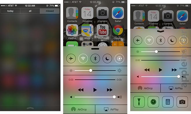
From left: Translucent Notification Center panel, Control Center pane in motion, Control Center pane up.
Home Screen
Users are met with another dramatic animation upon entering the home screen view, with app icons falling into place seemingly from above the display, while the dock glides up from the screen bottom. In iOS 6, icons swoop in from the screen edges in a more two-dimensional manner.

Click to view GIF.
When iOS 7 was demoed at WWDC 2013, there was mention of a so-called "parallax" home screen view. This animation, unlike other additions, uses the iPhone's internal sensors to determine the position a user is holding the device, and shifts the background in concert with any off-axis movement. The result is interesting and makes the icons appear to be hovering over the wallpaper.
While completely unnecessary, parallax view offers a certain level of liveliness to the home screen without being too much of a distraction. The effect is similar to one found in Google's Android, which shifts the background slightly when navigating between icon pages.
In addition to parallax view, Apple has added "zoom" animations that are activated when opening an app or app folder. For apps, the function is straightforward: a user presses an icon and the OS animates a zoom-in that appears to drill directly into the app. Important to note here is that the selected icon is enlarged along with all other icons on the page, with the final view ending in an open app. In contrast, the same action in iOS 6 has icons slide out of the way as an app window expands from the center of the screen.
Things are a bit more complex with folders. Instead of merely enlarging and homing in on a folder from its resting position, iOS 7 beta animates a zoom motion for both the folder and the swath of wallpaper directly behind it. The animation is quite clever, as app folders don't come close to taking up the entire screen, thus leaving much of the wallpaper showing. By slightly zooming in on the background, iOS doesn't break the illusion that its icons are floating in mid air.

Click to view GIF.
The new multitasking view makes copious use of physics. Swiping left or right on the app preview panes triggers slower, dampened movement, while doing the same with the icons beneath scrubs more quickly, almost at a one-to-one ratio with a user's thumb. The app panes are equidistant in this perspective, but the icons track by magnitude, meaning a quick flick expands the space between.
Also present is the space filling animation seen Music, which is activated when an app is manually terminated by swiping it toward the top of the screen.
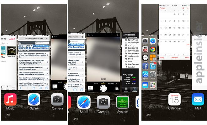
Multitasking view. Note icon spacing relative to that of app preview panes.
There are a few quirks to the system, however, one of which allows certain apps like weather to continue to run in multitasking view. It is not clear if Apple is planning to keep the "feature," though it does put extra strain on already precious CPU, memory and battery resources.
App-Specific Animations
After years of pleas, Apple has finally added another "active" icon to its first-party app lineup in Clock. With iOS 7, the Clock app's icon now reflects the correct time and even includes a moving second hand. Also changed is the font and style of the Calendar icon, though transitions between dates remains the same.
As for Apple's in-app animations, Weather is perhaps the most well conceived and uses rich effects to reflect changing weather patterns for user selected cities.
Minor tweaks have been made to Message, like an animated ellipsis to denote a friend is typing. Also new is an action when sending a message, which "throws" the text into the conversation above it. Speech bubbles now appear to float when scrolling through the conversation, seemingly bumping into one another. This carries a liveliness and dimensionality to the app as seen in other places of the OS, like the home screen.

From Left: Animated incoming message bubble, sent message from text box, scrolling messages.
For the most part, the beta feels snappier than iOS 6, with in-app pages and menus sliding quickly and with purpose. In some cases, no animation is applied to pop-up contextual menus, though this might change before public release.
One thing worth mentioning is the way apps in iOS 7 handle asset deletion. For example, in the Photos app, deleting a photo slides those following one space to the left, while trashing multiple photos at random renders a delet-and-fill type animation.
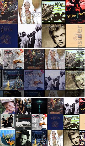
Another take on thumbnail rearrangement can also be found in the Music app, where moving in and out of the revamped landscape view uses fade-outs to keep album covers in order. Going from 8 full on-screen thumbnails, to 15, then 28, the Music app retains an alphabetized order. But instead of simply zooming in and out of a predefined map-like snapshot of the largest 28-album screen, the covers are rejiggered dynamically.
Work in Progress
Apple is obviously continuing work on iOS 7, and at least some of the animations mentioned above will change before the OS sees public release this fall.
Overall, though, the additions and tweaks create a sense of space, a design language one would expect to speak directly against the "flat" iconography found throughout the beta. In some respects, that notion holds true, especially in the case of pop-up menus which look out of place. However, for the most part, the flat design lends itself quite nicely to the multi-axis world that is iOS 7.
If the icons and typefaces were themselves attempting to mimic depth, the UI would likely become cluttered and unappealing. The animations don't dominate the user experience, but seamlessly manipulate graphics already bold in their simplicity. That is what makes the system so transparent, and therefore effective.
Those wanting to see iOS 7's effects in action can view a sampling on Apple's website.
For more on Apple's latest mobile operating system, see AppleInsider's ongoing Inside iOS 7 series:
Apple's new App Store simplifies app updating & discovery
Siri gets smarter with new system controls