Gesture controls are the touchscreen equivalent of keyboard shortcuts on a traditional computer — that is to say they are meant for pro users. For that reason, users shouldn't expect that Apple will kill off the iPhone home button entirely anytime soon, despite radical changes expected on the pro-focused "iPhone 8."
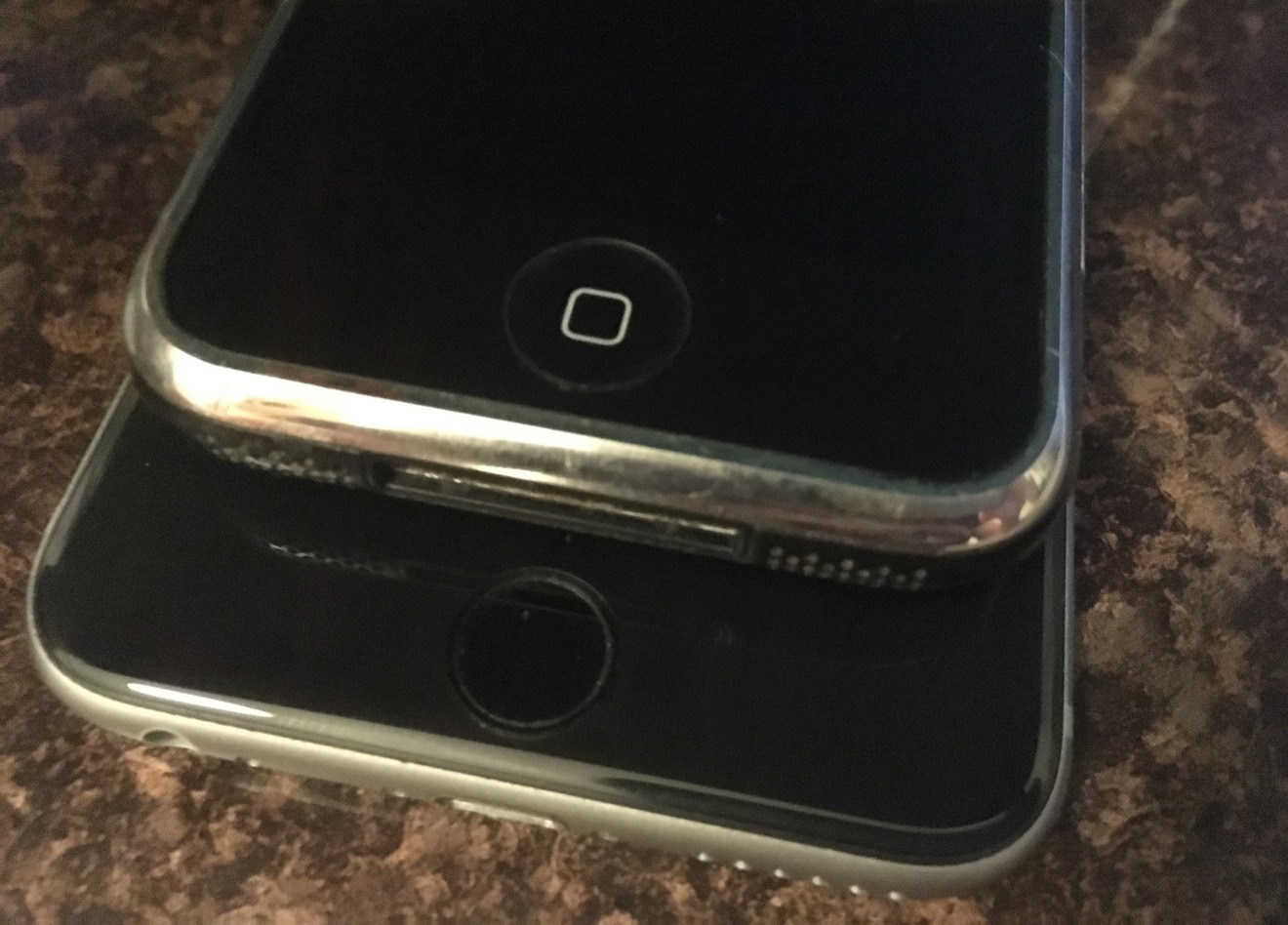
The home button has been a staple of the iPhone since the first model launched in 2007, but all signs point to the physical button being removed with this year's flagship "iPhone 8."
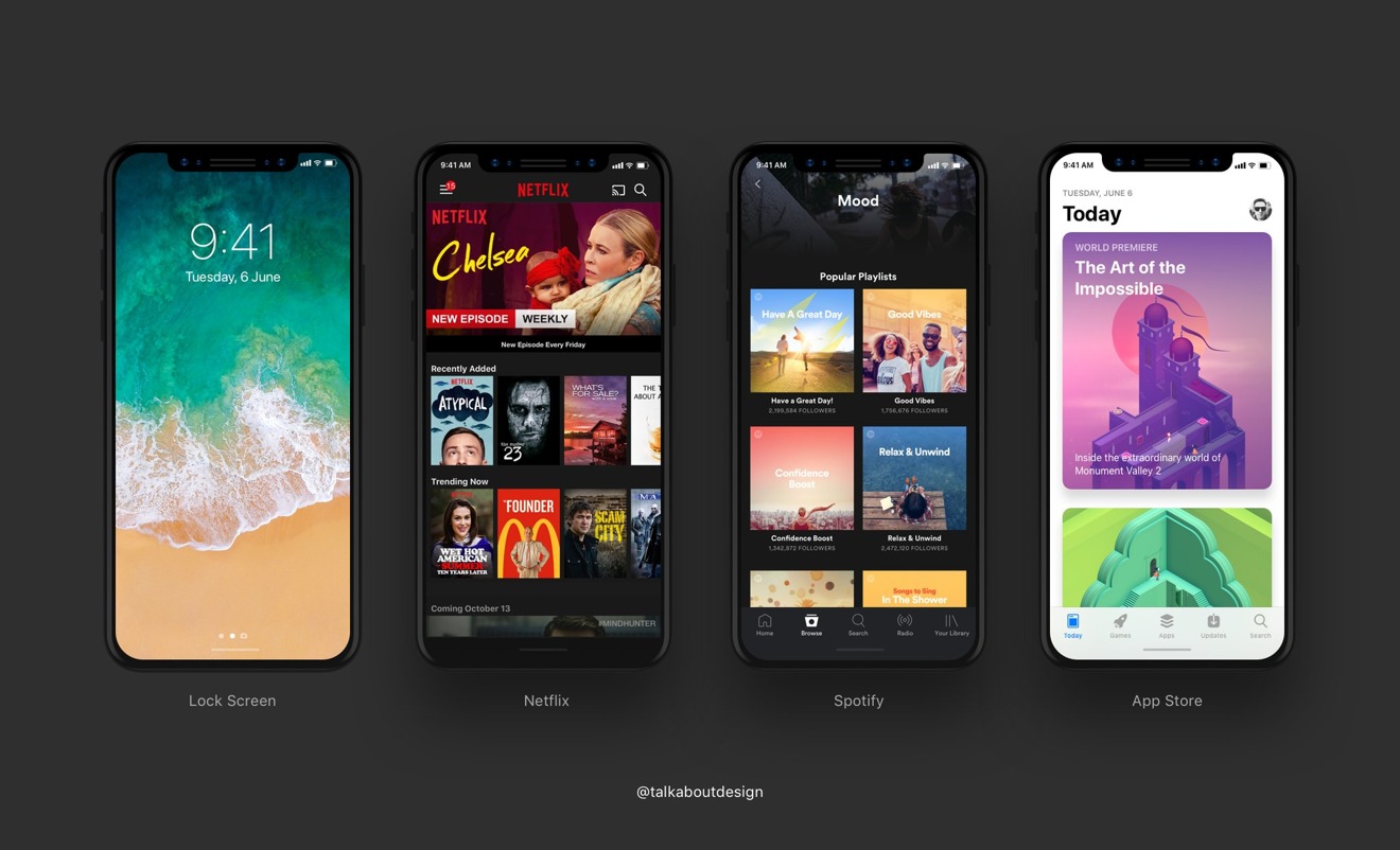
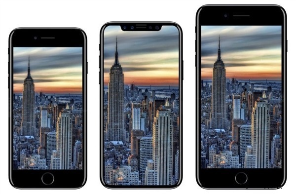
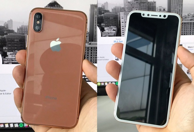
Many assumed that Apple would simply introduce a dynamic, virtual home button on the handset, which some have taken to calling an "iPhone Pro."
The logic: A software home button could function the same as a physical one, but disappear when needed to offer extra screen real estate. And with Apple's Taptic Engine, pressing a virtual home button can feel just as real as clicking a physical one.
A virtual home button would be the simplest transition — continuing with an established and simple user input method, but doing away with the physical button.
Those assumptions, however, may not be correct. The latest rumors claim that instead of tapping a virtual home button, users will invoke new gesture controls to accomplish tasks like returning to the home screen and switching between apps for multitasking.
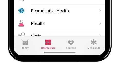 Software bar concept via Steven Troughton-Smith.
According to Bloomberg, a new "thin, software bar" will be shown at the bottom of the screen. Users can drag it up to the middle of the screen to open the phone.
While in an app, users will reportedly drag upward to invoke multitasking, and continue dragging to return to the home screen.
This may be convenient. It may even be faster and more intuitive. But for most users, that won't matter.
Premium (and pro) for a reason
This year's "iPhone Pro" is expected to have a $999 starting price and to be available in limited quantities. To offset that, Apple is also expected to introduce a new "iPhone 7s" lineup, likely priced at the traditional $649 entry.
The rumors about a radical new design and new gesture controls help make it clear that these two devices will likely be marketed for two very different types of users.
Given that Apple will likely sell upwards of 75 million iPhones this holiday quarter, many of those users are likely to prefer an experience that is comfortable and familiar. For them, the price of an "iPhone 8," combined with a shakeup in how the device will be used on a daily basis, could be enough to make the "iPhone 7s" a preferable purchase.
And that's key, because if the "iPhone 8" is so mind blowingly spectacular, why on earth would anyone want to buy an "iPhone 7s?" The products will need to stand out on their own, appealing to different markets. And the type of users who will spend over $1,000 on a phone might be more likely to embrace change — an iPhone pro user, if you will.
For the reset of the world, change can be difficult. Just ask Apple, who was caught off guard by demand for the legacy design of the iPhone SE — an established, familiar size and form factor that clearly resonated with a significant group of users.
Don't count out the value of simplicity
One of the reasons the first iPhone (and iPad) proved so successful came from simplicity. The touchscreen allows you to interact with content, but if you ever find yourself lost or in a bind, there is literally one button in front of you to press, and it returns you to the familiar home screen.
While the average AppleInsider reader may understand the intricacies of iOS, the reality is the majority of iPhone users don't know — or even care — how to use those types of advanced functions.
For many of those customers, the appeal of the iPhone is how simple it is. There is no need to worry about viruses, there is no need to dive deep to manage settings and customize, and yes, there is only one button to worry about.
The groundwork has already been laid on iPad
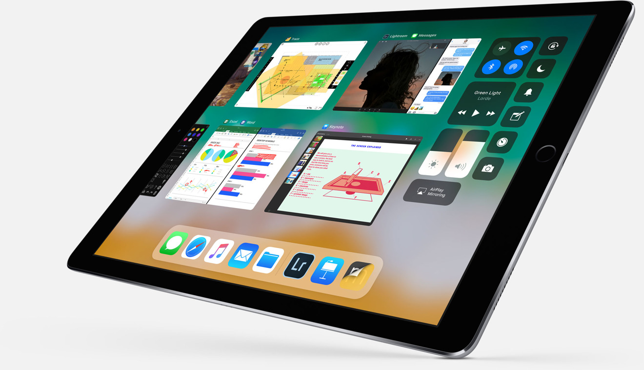
For years now, the iPad has boasted four- and five-finger multi-touch gestures for actions like returning to the home screen or switching between apps. That has led to speculation that the iPad, and not the iPhone, might be the first to ditch the home button.
That's not expected to be the case anymore, but it's easy to see where a future iPad Pro might boast an edge-to-edge display without a home button, just like the "iPhone 8" is expected to have.
It's also easy to see a situation where an iPad Pro sans home button exists alongside an entry-level iPad that retains a home button — not just because of costs, but also because that easy-to-use home button presents a lower barrier to entry for new iPad users.
Even stronger indications of the expected "iPhone Pro" interface were unveiled earlier this year, when iOS 11 was introduced for the iPad. Apple's touchscreen tablet will gain a number of unique features with iOS 11, most notably an app dock that can be invoked by swiping up from the bottom of the screen. Swiping further presents the iPad multitasking view.
As it turns out, this new swipe distance gesture sounds very similar to how the home button replacement is rumored to work on the "iPhone 8."
Having said that, who knows what the future brings?
All new skills are learned and adoption takes time. While simple, pinch-to-zoom was, at some point, a new concept for virtually all first-time iPhone users.
Heck, even the original iPhone's accelerometer-based auto-screen-rotate feature was viewed as magical back in 2007. Now it's just a basic function on seemingly any device.
For now, the iPhone home button brings comfort to many users. An iPhone without any sort of home button — physical or virtual — will be too radical of a change for a certain segment of customers. For them, Apple will happily sell an "iPhone 7s," or an iPhone SE.
Bleeding edge customers who need the latest and greatest and are willing to re-learn how to interact with their iPhone will flock to the latest model. The design shakeup would allow for a clear differentiation, and help justify the continued existence of the "iPhone 7s" lineup beyond pricing disparity.
It's hard to see Apple ditching the home button from all iPhone models at any point in the near future. In addition to the high costs associated with edge-to-edge OLED displays, the home button has become such a crucial part of the iOS user experience — and, as a result, customer's daily lives — that pushing to quickly abandon it doesn't make sense.
Such a monumental shift isn't akin to the switch from 30-pin to Lightning, which Apple pushed as quickly as possible. This is a radical rethink on how the iPhone user experience works, and many customers will be resistant to that change.
Years from now, the mentality could be very different, and home buttons could disappear entirely, just like mice — and, later, trackpads — replaced trackballs.
But at least for the foreseeable future, the iPhone home button is here to stay, and a user experience without it will be intended for pros only.
 Neil Hughes




-m.jpg)

 Malcolm Owen
 Sponsored Content
 Charles Martin

 William Gallagher




73 Comments
Interesting piece. Thanks.
No mention of the value of TouchID to applePay though.
And my dad refused trackpads and even mice in favor of the trackball. His hand shook as he got older. Yes, a disability, but far from an uncommon one.
nhughes
said:
This is beyond reproach at this point. It is incredibly obvious this phone was designed from the start without Touch ID. You don't end up with world class 3D imaging technology 2 years ahead of the closest runner up when stringing it along as a back up in case "Touch under the glass doesn't work out", to quote the absurdity put forth by the rumor mill a few months ago.
This article is correct. From here out this is a "Pro" model for advanced users. I'll enjoy it, but many types of users are not ready / not capable of handling this kind of UI.
There will be (other) iPhones with Home Buttons for a long, long time.
Any thoughts on the alleged longer power button? Wouldn't surprise me if it doubled as a home button.