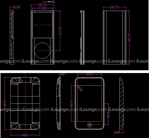
The drawings, published over at iLounge, show an iPod nano that will mark a return of the tall and narrow form factor, checking in at 0.75mm taller, 1.25mm narrower, and 0.42mm thinner than the second-generation iPod nanos introduced during the fall of 2006.
Although the drawings portray a more pronounced oval-shaped body than the second generation nanos, the player's aluminum enclosure will reportedly give way to a plastic covered screen that is flat, and doesn't share the same curvature as the iPod's body, as some earlier reports had suggested.
Meanwhile, the second-generation iPod touch is shown in the drawings to adopt several design cues from Apple's new iPhone 3G, including the use of a more tapered enclosure that will produce a thinning effect.
Compared to the existing iPod touch, the new model is said to be the same width, but 1mm taller and 0.4mm thicker. Also apparent from the drawings are the presence of physical volume controls on the side of the device (iPhone style), addressing one of the most widely cited shortcomings of the first-generation model.
Supposed drawings of next-gen iPods | Source : iLounge
While iLounge maintains that its drawings should be considered rumor and speculation, they largely correlate with existing reports of slim form factor nanos and slightly modified iPod touches.
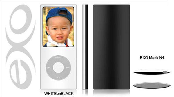
Separately, iPod casemaker XSKN is now promoting fourth-generation iPod nano protectors (below) on its website that match the aforementioned description.
Apple is set to unveil its new iPod offerings at a special event next Tuesday in San Francisco.
 Sam Oliver







 Malcolm Owen

 Andrew Orr
 Sponsored Content

 Wesley Hilliard

 Christine McKee









77 Comments
Could be real, but then again it's not that difficult to fake a CAD drawing.
People still use AutoCAD?!?!?! Those mockups are u-g-l-y and the drawing tools are pretty crappy. That really looks like AutoCAD from when I was in college!
So the iPod Touch is going to look just like an iPhone minus the phone features.... \ so original.... I wish they could keep the iPod Touch more unique to itself instead of matching the iPhone. Why not make it thinner and more square on the back.
I am not sure how you currently change the volume on a iPod Touch but wouldn't it be easy enough to adjust the volume right from the touch screen in any menu you are on or anywhere on the screen.... like maybe do a double tap on the screen and it comes up with a volume adjustment and you slide your fingers across. Just thinking out loud.
I think the new iPod Nanos are going to look real nice... I had another weird thought the other day. They should take the current phatt iPod Nanos and add a clip on the back of it just like the shuffle and turn it into a shuffle replacement.... that thing is already so small it be a perfect shuffle replacement with screen and yet small enough to jog with (if it had a clip).
touch currently allows double-tap to get a volume, but that means you have to fireup the screen and look at the device. The need is for physical volume control to allow blind adjustment.
I think its funny that after all the moaning about the 'phatty' last year, people are now complaing about how the revival of the slim design looks like a Zune. People have no memories.
I personally think the original Nano design was the best of anything except the touch, and think the slightly stretched revival will be great. Too bad I don't need one.
Bye bye, Fatty!
I never really liked the look of the scroll wheel sitting in all that white space.