Next iPhone software update to deliver Safari, App Store tweaks
 Slash Lane
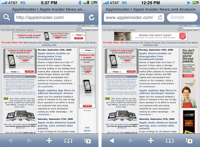
The update, expected to be released next month, has thus far shown no signs of including support for background push notification — a feature original promised for September, but pushed back slightly as development remains a work-in-progress.
Safari
People familiar with the first beta of version 2.2 have reported a handful of smaller changes, however, such as a redesign of Safari's address bar that presents web page titles more clearly.
It also sports a relocation of the Google search field, which is now displayed to the right of the URL field by default. Under existing versions of the iPhone OS, users must tap the address bar to reveal Google search capability.
iPhone Software v2.1 (left) compared to iPhone Software v2.2 (right).
App Store
Separately, developers have also noted a couple of changes to the App Store application shipping with the first beta of iPhone Software 2.2.
Among them is a new categories page that will feature large category icons — not yet functional — and more generous spacing between each listing.
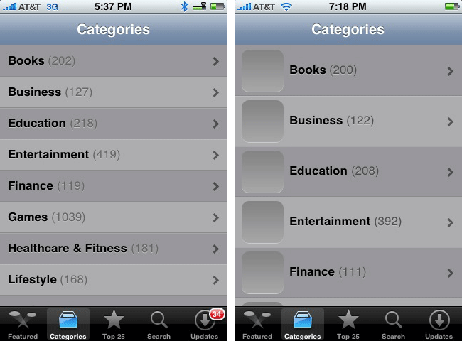
iPhone Software v2.1 (left) compared to iPhone Software v2.2 (right).
Apple is also reported to have tweaked display pages for individual applications, shifting the "Tell a Friend" option from the title bar to just below the reviews summary, and adding a "Report a Problem" function that will allow shoppers to inform the company of problematic apps.
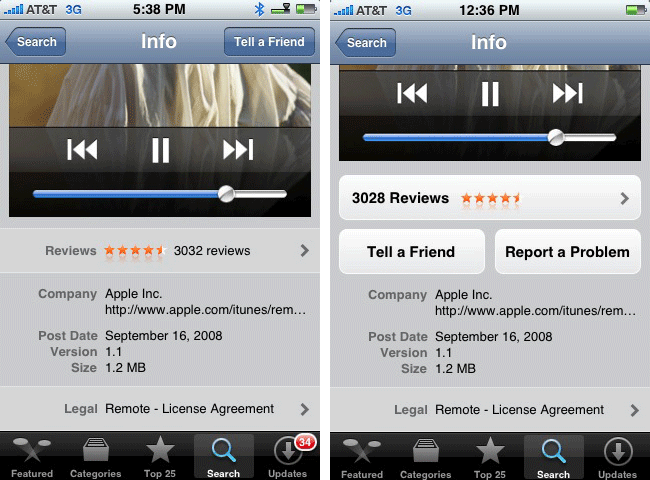
iPhone Software v2.1 (left) compared to iPhone Software v2.2 (right).
The changes to the App Store application remain a work-in-progress and are likely to be influenced by ongoing modifications to the App Store as a whole, several of which were covered earlier today.
AppleInsider reader 'Thinnovation' helped contribute to this report.


 Amber Neely
 Thomas Sibilly
 AppleInsider Staff
 William Gallagher
 Malcolm Owen
 Christine McKee


71 Comments
I bet before next Christmas (2009) Apple will bring out a Apple store App.
Seriously though, Apple need to get on and add that Copy & Paste; they're becoming a joke Among other smartphone users for this at this stage. Copy & paste of text using the magnifier (2 second hold still) will do.
I dislike the new Safari address bar. It simply reduces the visible portion of the URL, making it *harder* to see where you are. The Google field is completely useless and a massive waste of space; the smaller magnifying glass icon that brings it up as a full-width field is much better. I really hope they abandon this failed "redesign" and keep Safari the way it is now.
I dislike the new Safari address bar. It simply reduces the visible portion of the URL, making it *harder* to see where you are. The Google field is completely useless and a massive waste of space; the smaller magnifying glass icon that brings it up as a full-width field is much better. I really hope they abandon this failed "redesign" and keep Safari the way it is now.
My thoughts exactly. The google bar is available now when I want it, but is put away when I don't.
I dislike the new Safari address bar. It simply reduces the visible portion of the URL, making it *harder* to see where you are. The Google field is completely useless and a massive waste of space; the smaller magnifying glass icon that brings it up as a full-width field is much better. I really hope they abandon this failed "redesign" and keep Safari the way it is now.
They must've had some problems with naive subjects not understanding that the magnifying glass means "Google Search." You know this, but obviously others don't.
It makes sense to mimic the desktop safari look.
Also, we haven't seen it in action.
I bet before next Christmas (2009) Apple will bring out a Apple store App.
Seriously though, Apple need to get on and add that Copy & Paste; they're becoming a joke Among other smartphone users for this at this stage. Copy & paste of text using the magnifier (2 second hold still) will do.
The day I find a good journal app for the iPhone is the day I will really beg for a copy paste. Right now I get by fine without it.
My solution for copy:
"Double tap and drag" to select, autowraps selection on complete words, once the selection is done it's automatically copied.
My solution for paste and other things:
"Double tap and hold" could somewhat equal right click and bring up some slide-to-alternatives such as paste and other functions. This could look a bit like that japanese Kana keyboard that features that very neat 4-way slide select interface.