Apple's iCal to get 'Year' view, Mail to get iTunes-like interface in Mac OS X Lion
 AppleInsider Staff
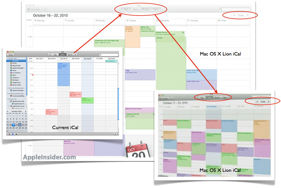
Craig Federighi, vice president of engineering for Mac OS X at Apple, offered a quick demo of Mac OS X 10.7 Lion on stage to members of the press, including features like Mission Control and Launch Pad. In addition, some of the more subtle design tweaks found in the current build of Lion could be glimpsed.
Apple emphasized that the upcoming operating system upgrade will bring iOS features "Back to the Mac," creating a more unified experience between products running Mac OS X and iOS.
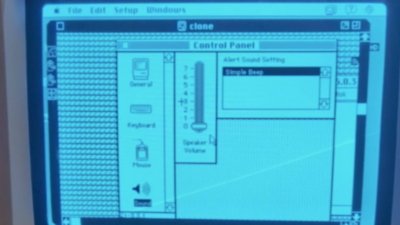
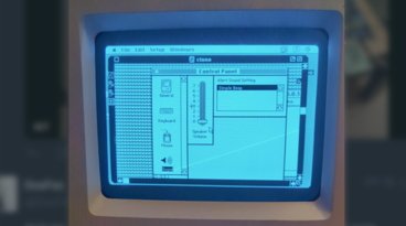
The new iCal application in Lion, shown in an early form Wednesday, has a new feature which appears as if it will let users to view their upcoming events in a "Year" view. The version of iPad Apple ships for iPad also offers a fourth view (in addition to Day, Week, and Month) called "List" view.
In general, the new iCal app in Lion sports a look and feel similar to the calendar application found on the iPad. Controls for flipping through days, weeks and months have also been relocated down and to the right, with buttons on each side of the "Today" button, aligned on the right side across from the date.
Changes to make Mac OS X more like the iOS mobile operating system that runs on the iPhone and iPad are a central theme with the upcoming release of 10.7 Lion. In addition to more subtle tweaks and design changes, Apple is also bringing major features such as multi-touch gestures, the App Store, Home screens, full-screen applications, and auto-save and auto-resume.
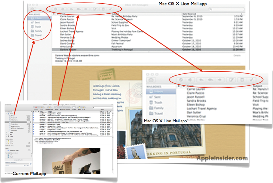
The updated Mail.app in Lion previewed Wednesday takes some design elements found in the recently released iTunes 10. Most noticeably, Lion's Mail.app has greyed out icons and a more toned-down color scheme, like the latest release of the company's digital media software.
Unlike iTunes 10, Lion's Mail.app does not have the uniquely positioned red close, yellow minimize and green zoom buttons laid out in a stacked vertical fashion. For now, the buttons appear next to each other horizontally, in the top left corner, as they are in previous releases of Mac OS X, and the vertical buttons remain unique to iTunes 10.
In addition to losing their colors, buttons for functions like composing a new message or replying have been made more square and less round, and are now aligned to the left.
For more, see AppleInsider's First Look: Apple's new Mac OS X 10.7 Lion.


 Amber Neely
 Thomas Sibilly
 William Gallagher
 Malcolm Owen
 Christine McKee


54 Comments
So what about the pictures Apple posted on its Mac OS X Lion page on Apple.com?
pic 1
pic 2
In these pictures running applications are no longer shown with a blue dot under their icons in the dock. Is this just a bad photoshop or is this a sign that something is going to change?
Oh my, I'm don't like the direction they're taking Mail in.
Seems very bland and characterless to me.
Looks like new Mail app has lost some colour - just like iTunes...
Regardless of whether or not you feel these are positive changes, at least Apple is making an effort (yet again) to have a consistent look and feel with each revision of Mac OS X. They came very close in Leopard and Snow Leopard, so perhaps Lion is finally the revision where everything looks alike, which always seems to be common request with each new Mac OS X version.
The only question is if iTunes 10's vertical traffic lights will prevail systemwide on Lion.
So what about the pictures Apple posted on its Mac OS X Lion page on Apple.com?
pic 1
pic 2
In these pictures running applications are no longer shown with a blue dot under their icons in the dock. Is this just a bad photoshop or is this a sign that something is going to change?
1) Welcome to the forum.
2) I, at the very least, appreciate your linking to large images.
3) I think you are on to something. Finder always had the dot to denote that it?s always running, but if Apple is moving to an ?Instant On? philosophy where apps auto-resume from their saved state and constantly auto-saved there is less of a reason to show those dots, at least from the standpoint of the typical user. Add in the fact that, at least on my MBP with an SSD, that pretty much every app already opened up nearly instantly, it seems that there is less and less reason to have the dot.