New Lock-Screen Alert Style
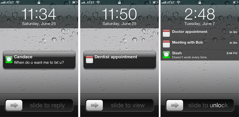
As previously discussed, users of iOS 5.0 this fall will be able to select between two distinct styles of notifications: traditional "Alert" notifications that overlay the screen (as they do in iOS 4.0) and require the user to dismiss them, and new "Banner" notifications that appear subtly at the top of the screen for a few seconds before rolling out of view and into the Notifications pull-down without any interaction.
With the release of iOS 5.0 beta 2, Apple has tweaked the display of traditional alerts that appear on the home screen, adorning them with slightly larger typeface and the icon of their associated application. After a few seconds without user interaction, however, these alerts will morph into the standard lock-screen alerts that tile one after the other on the lock-screen.
Receding Keyboard in iMessage
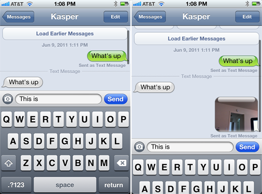
While it's not exactly clear whether the feature was present in the initial iOS 5.0 beta, developers evaluating the updated iMessage app in beta 2 note that the keyboard will gracefully recede downwards and out of view when scrolling upwards in a message history.
New iCloud icons and Active OTA Software Updates
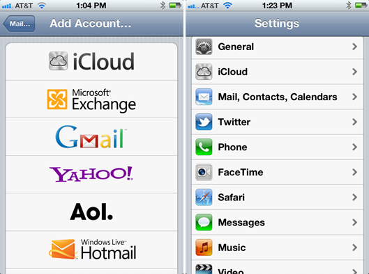
Also apparent in beta 2 is a switch from the purple iCloud icons Apple had in place throughout various panels in beta 1 to the brushed aluminum style present in iCloud marketing materials.
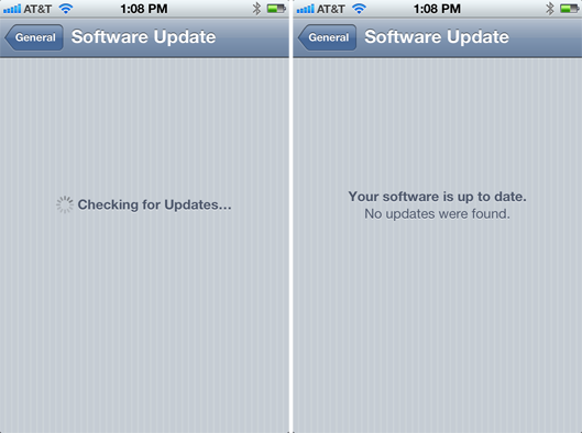
That same icon also shows up while adding a new iCloud mail account, which is now the default account creation type, relegating MobileMe to the end of the automated email account setup list. Also, the over-the-air Software Update mechanism appears active in beta 2.
For more on what to expect in iOS 5.0 this fall, check out AppleInsider's ongoing series: Inside iOS 5.0
73 Comments
Don't these beta-testers have to sign an NDA?
These kind of leaks hurt the entire Community, because the competition gets a head-start.
The "competition" isn't coming to AI to get this info. If they want it they will have direct access so AI posting this stuff doesn't affect anything.
To be nitpicky on these things, those bigger notifications on the homescreen are pretty ugly with the glossy bubble. To me it looks like design from windows vista, or the old design I thought they were getting away from. Design today is more about straight lines, flat tones, like when you see the list on the homescreen.. It's more elegant. I wish they would unify some of their design choices.
That metallic iCloud icon is straight up ugly. Not sure what they're thinking. I haven't seen the purple one but I feel it would be much nicer.As for the messaging keyboard dropping down, I can clarify how it works. If you are swiping in the message pane, the screen scrolls as normal, but as soon as you are swiping down and continue swiping into the keyboard, that is when it drops down. It's nice this way so you can scroll up a bit if you have to without the keyboard going away.
If the competition wants, they can easily get Apple developer accounts and have direct access to unreleased software. Which I think we can agree is even more useful than the odd screen shot on an internet forum.
Don't these beta-testers have to sign an NDA?
These kind of leaks hurt the entire Community, because the competition gets a head-start.
Competition can just send someone to sign up as a dev and get the beta..
The "competition" isn't coming to AI to get this info. If they want it they will have direct access so AI posting this stuff doesn't affect anything.
I dunno - I think the guy in the gaberdine suit is a spy!